# react-native-shbib-ui
> React-native UI component
Latest version **0.1.1** (published 2020-09-12) · ISC license · 0 weekly downloads
## Install
```sh
npm install react-native-shbib-ui
pnpm add react-native-shbib-ui
yarn add react-native-shbib-ui
bun add react-native-shbib-ui
```
## Health
**Score 15/100 (F)** — status: abandoned.
Positive: no vulnerabilities.
Warnings: low downloads; no types; no esm support; pre 1.0.
Negative: abandoned; low maintenance score.
## Facts
| | |
|---|---|
| Version | 0.1.1 |
| Published | 2020-09-12 |
| First published | 2020-09-06 |
| Weekly downloads | 0 |
| License | ISC |
| TypeScript types | none |
| Module format | CommonJS |
| Dependencies | 1 |
| Unpacked size | 581.9 KB |
| Known vulnerabilities | 0 |
| Install scripts | no |
| GitHub stars | 1 |
| Author | amr shbib |
| Maintainers | amrshbib |
| Keywords | react-native, reactjs, reactnative, rn, ui, component |
## Links
- npm: https://www.npmjs.com/package/react-native-shbib-ui
- Repository: https://github.com/amrshbib/react-native-shbib-ui
- Homepage: https://github.com/amrshbib/react-native-shbib-ui#readme
- Issues: https://github.com/amrshbib/react-native-shbib-ui/issues
- npm.io page: https://npm.io/package/react-native-shbib-ui
## Dependencies (1)
- [prop-types](https://npm.io/package/prop-types.md) ^15.7.2
## Alternatives
- [@progress/kendo-ooxml](https://npm.io/package/@progress/kendo-ooxml.md) — 152.1K weekly downloads
- [@progress/kendo-react-ripple](https://npm.io/package/@progress/kendo-react-ripple.md) — 8.0K weekly downloads
- [@progress/kendo-react-orgchart](https://npm.io/package/@progress/kendo-react-orgchart.md) — 4.3K weekly downloads
- [@praxisui/dynamic-fields](https://npm.io/package/@praxisui/dynamic-fields.md) — 2.4K weekly downloads
- [@progress/kendo-vue-listbox](https://npm.io/package/@progress/kendo-vue-listbox.md) — 932 weekly downloads
## Recent versions
- 0.1.1 (latest) — 2020-09-12
- 0.1.0 — 2020-09-12
- 0.0.1 — 2020-09-07
- 0.0.0 — 2020-09-06
## README
## Table of Contents
- [1. Getting Started](#1-getting-started)
- [2. Usage](#2-usage)
- [3. Components supported](#3-components-supported)
## 1. Getting Started:
**Installation**
_Install react-native-shbib-ui:_
```js
npm install react-native-shbib-ui --save
```
**or**
```js
yarn add react-native-shbib-ui
```
## 2. Usage:
_App.js_
```js
import {Button} from 'react-native-shbib-ui';
;
```
## 3. Components supported:
- [x] [Avatar](#avatar)
- [x] [Tab](#tab)
- [x] [Swiper](#swiper)
- [x] [Stepper](#stepper)
- [x] [Card](#card)
- [x] [MediaGrid](#mediagrid)
- [x] [Header](#header)
- [x] [Button](#button)
- [x] [Badge](#badge)
- [x] [Spinner](#spinner)
- [x] [Divider](#divider)
- [x] [CheckBox](#checkbox)
- [x] [RadioButton](#radiobutton)
- [x] [Progress](#Progress)
## Avatar
_Demo_
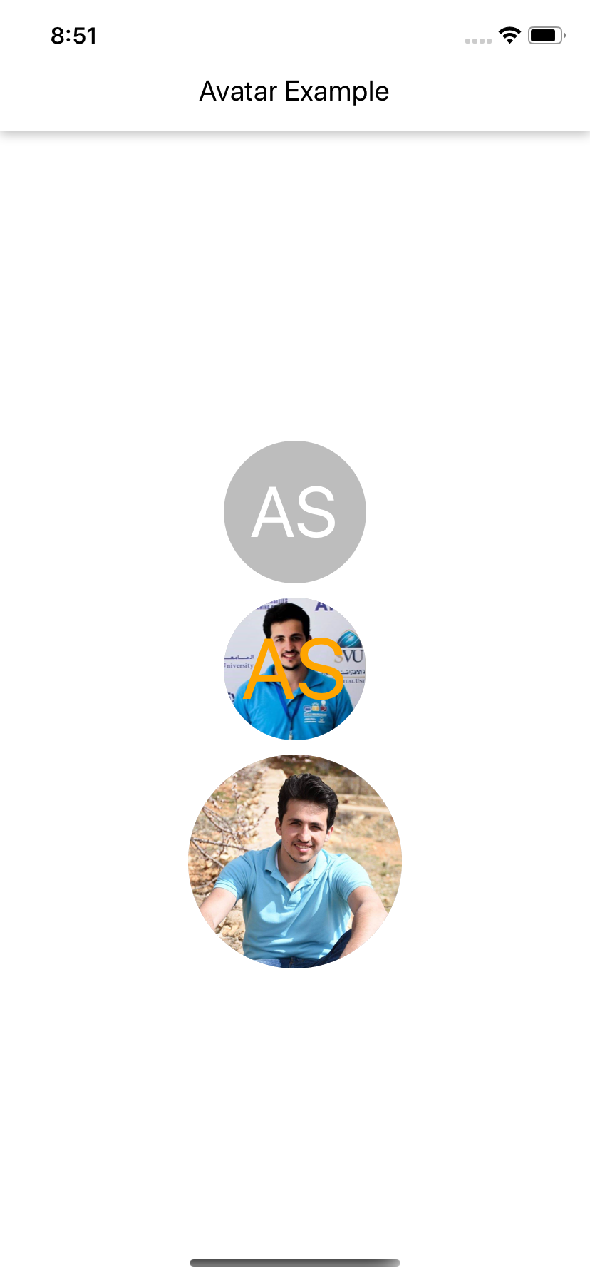 _App.js_
```js
import React from 'react';
import {Avatar} from 'react-native-shbib-ui';
import {View} from 'react-native';
export default class AvatarExample extends React.Component {
render() {
return (
);
}
}
const styles = {
root: {
flex: 1,
justifyContent: 'center',
},
avatarContainer: {
marginTop: 10,
},
};
```
_Props_
| Prop name | Description | Type | Default value |
| ---------------- | ----------------------------- | ----------- | ------------- |
| `containerStyle` | Container style for component | object | - |
| `avatarStyle` | Divider color | object | - |
| `titleStyle` | Title style | object | - |
| `source` | Image source | imageSource | - |
| `title` | Avatar title | string | - |
| `avatarSize` | Badge value | number | - |
| `titleSize` | Badge size | number | - |
| `titleColor` | Value font size | string | - |
## Tab
_Demo_
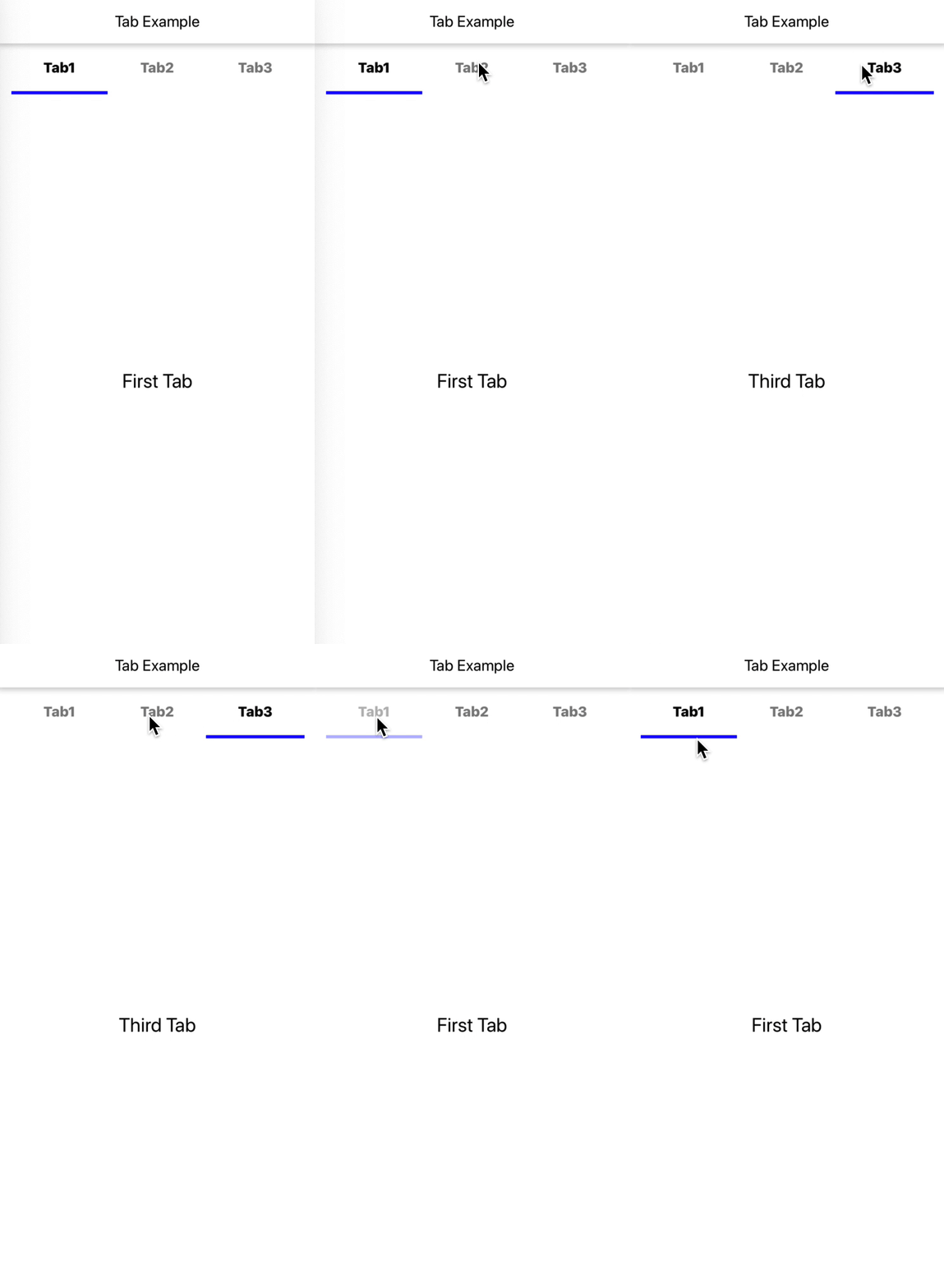 _App.js_
```js
import React from 'react';
import {Tab} from 'react-native-shbib-ui';
import {View, TouchableOpacity, Text} from 'react-native';
export default class TabExample extends React.Component {
render() {
return (
(
{item.title}
)}
renderTabNotActive={(item, setActiveTab) => (
{item.title}
)}
items={[
{
title: 'Tab1',
content: (
First Tab
),
},
{
title: 'Tab2',
content: (
Second Tab
),
},
{
title: 'Tab3',
content: (
Third Tab
),
},
]}
/>
);
}
}
const styles = {
tabContainer: {
marginTop: 50,
},
tabActive: {
alignItems: 'center',
justifyContent: 'center',
borderBottomWidth: 4,
borderBottomColor: 'blue',
paddingHorizontal: width * 0.1,
paddingVertical: 20,
},
tabNotActive: {
alignItems: 'center',
justifyContent: 'center',
borderBottomWidth: 4,
borderBottomColor: 'transparent',
paddingHorizontal: width * 0.1,
paddingVertical: 20,
},
textActive: {
fontSize: 18,
color: 'black',
textAlign: 'center',
fontWeight: '800',
},
textNotActive: {
fontSize: 18,
color: 'black',
textAlign: 'center',
fontWeight: '800',
color: 'grey',
},
text: {
flex: 1,
alignItems: 'center',
justifyContent: 'center',
},
textHint: {
fontSize: 25,
},
};
```
_Props_
| Prop name | Description | Type | Default value |
| -------------------- | ------------------------------- | -------- | ------------- |
| `containerStyle` | Container style for component | object | - |
| `items` | Tabs render | array | - |
| `renderTabActive` | Component render active tab | function | - |
| `renderTabNotActive` | Component render not active tab | function | - |
| `horizontal` | Renders items horizontally | boolean | - |
| `scrollEnabled` | | boolean | - |
| `bounces` | | boolean | - |
## Swiper
_Demo_
 _App.js_
```js
import React from 'react';
import {View, Image} from 'react-native';
import {Swiper} from 'react-native-shbib-ui';
export default class SwiperExample extends React.Component {
render() {
var data = [
{src: require('Image1.jpg')},
{src: require('Image2.jpg')},
{src: require('Image3.jpg')},
];
return (
{}}
activeDotColor={'#1976D2'}
inActiveDotColor={'grey'}
data={data}
initIndex={0}
renderItem={({item, index}) => (
)}
/>
);
}
}
```
_Props_
| Prop name | Description | Type | Default value |
| ------------------ | ------------------------------------------------------------- | -------- | ------------- |
| `containerStyle` | Container style for component | object | - |
| `data` | Chunk of data(object) | array | - |
| `renderItem` | Callback which takes a chunk of data and returns a component. | function | - |
| `onScroll` | Callback that is called when the Item is swiped | function | - |
| `activeDotColor` | Active dot color | string | - |
| `inActiveDotColor` | InActive dot color | string | - |
| `initIndex` | Set default active item | number | - |
## Stepper
_Demo_
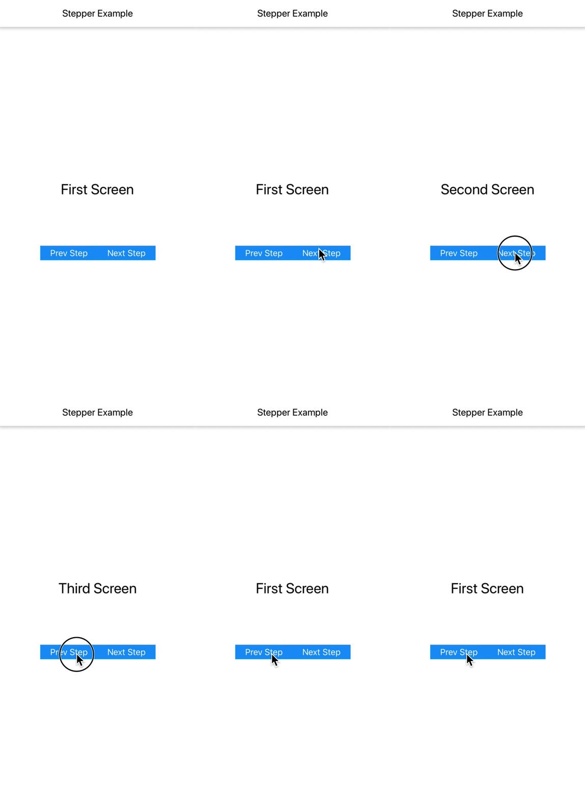 _App.js_
```js
import React from 'react';
import {View, Text} from 'react-native';
import {Button, Stepper} from 'react-native-shbib-ui';
export default StepperExample = () => {
FirstScreen = ({next, back}) => (
First Screen
);
SecondScreen = ({next, back}) => (
Second Screen
);
ThirdScreen = ({next, back}) => (
Third Screen
);
return (
);
};
const styles = {
root: {
flex: 1,
justifyContent: 'center',
},
screenContent: {
alignSelf: 'center',
alignItems: 'center',
},
text: {
fontSize: 30,
},
buttonContent: {
marginTop: 100,
flexDirection: 'row',
},
};
```
_Props_
| Prop name | Description | Type | Default value |
| ---------------- | ----------------------------- | ----------------- | ------------- |
| `containerStyle` | Container style for component | object | - |
| `steps` | Container style for component | array of function | - |
## Card
_Demo_
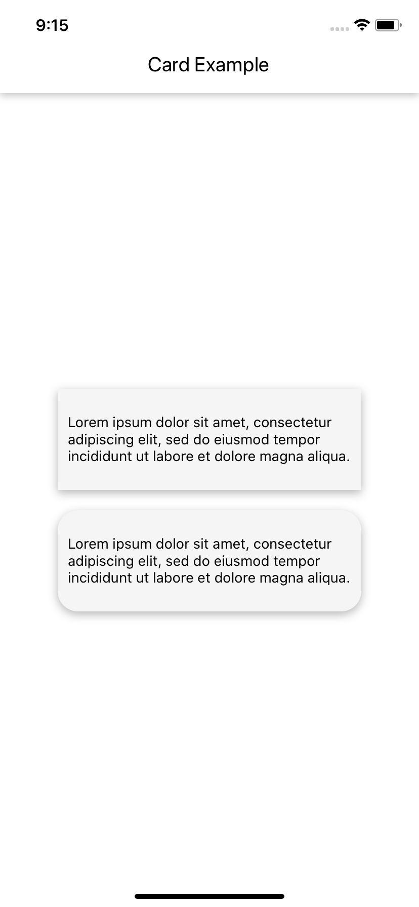 _App.js_
```js
import React from 'react';
import {View, Text} from 'react-native';
import {Card} from 'react-native-shbib-ui';
export default CardExample = () => {
const text =
'Lorem ipsum dolor sit amet, consectetur adipiscing elit, sed do eiusmod tempor incididunt ut labore et dolore magna aliqua.';
return (
{text}
{text}
);
};
const styles = {
root: {
flex: 1,
justifyContent: 'center',
},
cardContainer: {
alignSelf: 'center',
},
card1Styles: {
width: 300,
height: 100,
justifyContent: 'center',
alignItems: 'center',
},
card2Styles: {
marginTop: 20,
width: 300,
height: 100,
justifyContent: 'center',
alignItems: 'center',
borderRadius: 20,
},
};
```
_Props_
| Prop name | Description | Type | Default value |
| ---------------- | ----------------------------- | ------ | ------------- |
| `containerStyle` | Container style for component | object | - |
## MediaGrid
_Demo_
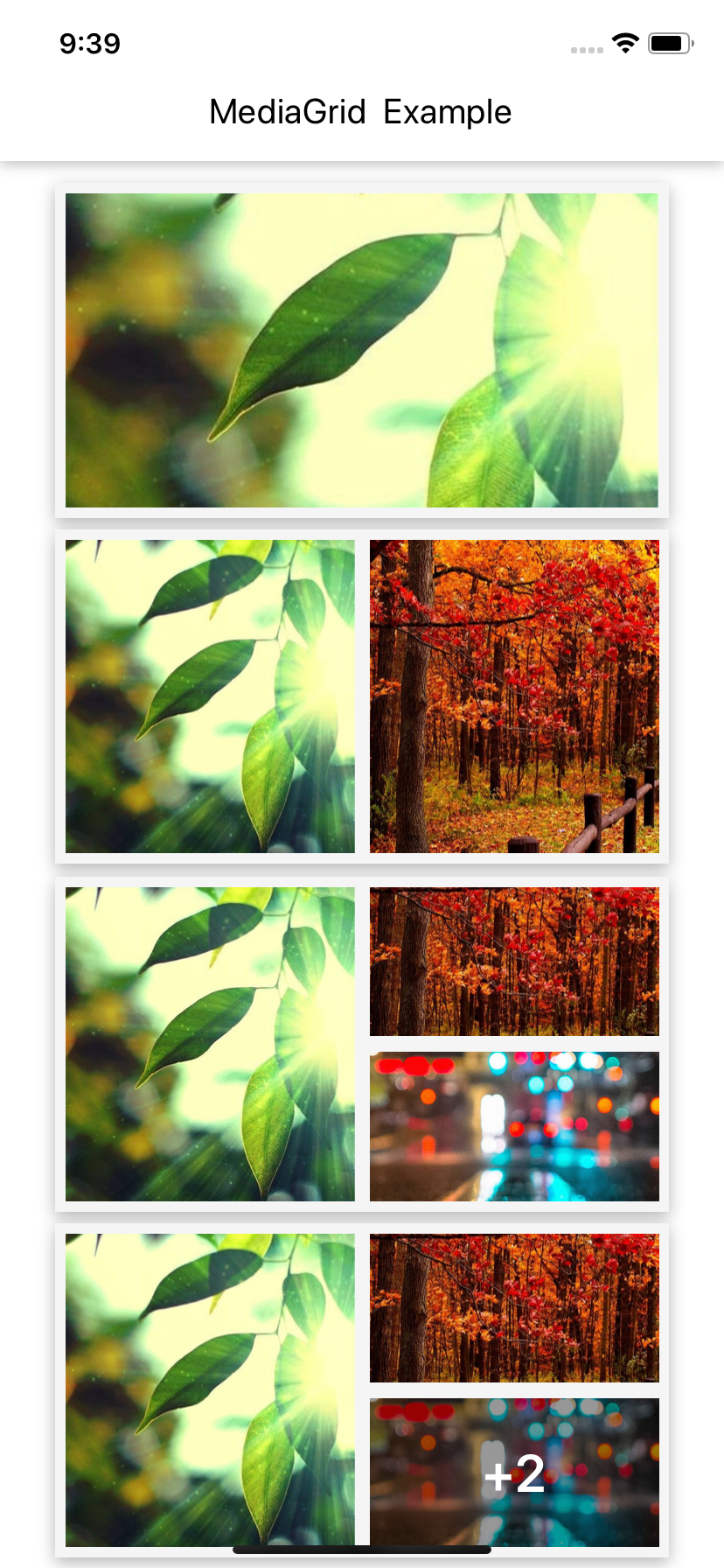 _App.js_
```js
import React from 'react';
import {MediaGrid, Card} from 'react-native-shbib-ui';
import {View} from 'react-native';
export default class MediaGridExample extends React.Component {
render() {
var data = [require('Image1.jpg')];
var data1 = [require('Image1.jpg'), require('Image2.jpg')];
var data2 = [
require('Image1.jpg'),
require('Image2.jpg'),
require('Image3.jpg'),
];
var data3 = [
require('Image1.jpg'),
require('Image2.jpg'),
require('Image3.jpg'),
require('Image4.jpg'),
require('Image5.jpg'),
];
return (
);
}
}
const styles = {
root: {
flex: 1,
justifyContent: 'center',
alignItems: 'center',
},
cardStyle: {
padding: 10,
marginTop: 10,
},
};
```
_Props_
| Prop name | Description | Type | Default value |
| ---------------- | ----------------------------- | ----------- | ------------- |
| `containerStyle` | Container style for component | object | - |
| `data` | Chunk of Image source | imageSource | - |
## Header
_Demo_
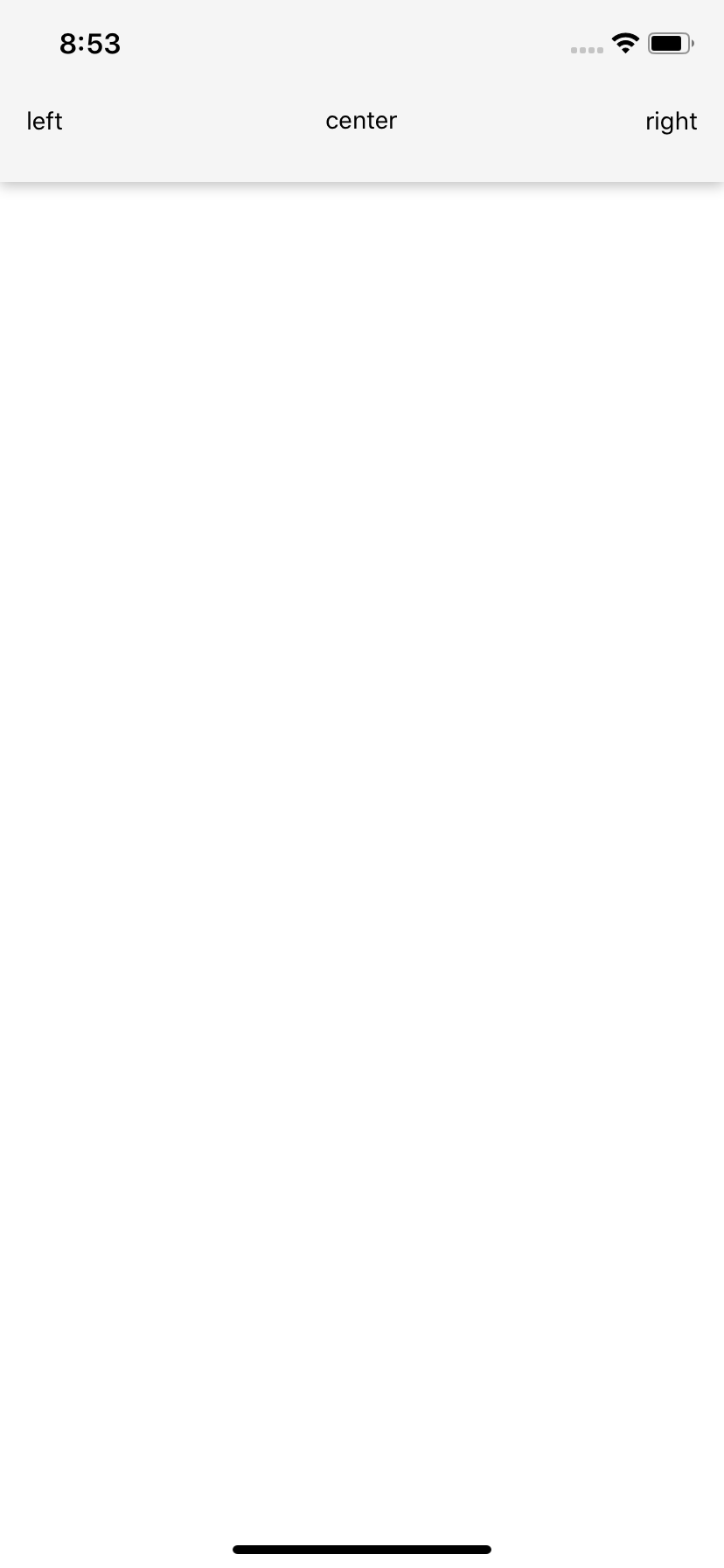 _App.js_
```js
import React from 'react';
import {Text} from 'react-native';
import {Header} from 'react-native-shbib-ui';
export default class HeaderExample extends React.Component {
render() {
return (
right}
centerComponent={() => center}
leftComponent={() => left}
/>
);
}
}
```
_Props_
| Prop name | Description | Type | Default value |
| ----------------- | ----------------------------------------- | -------- | ------------- |
| `containerStyle` | Container style for component | object | - |
| `style` | Style for header | object | - |
| `color` | Set background color for header | string | - |
| `size` | Set size for header | number | - |
| `customHeader` | Custom design of header | function | - |
| `leftComponent` | Components render to the left in Header | function | - |
| `centerComponent` | Components render to the center in Header | function | - |
| `rightComponent` | Components render to the right in Header | function | - |
## Button
_Demo_
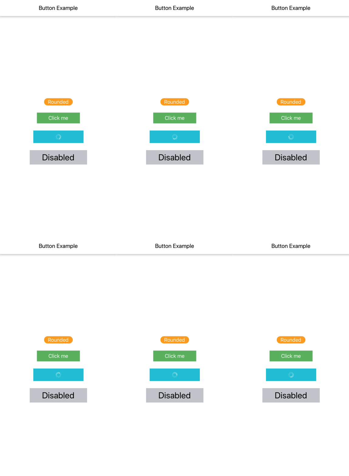 _App.js_
```js
import React from 'react';
import {View} from 'react-native';
import {Button} from 'react-native-shbib-ui';
export default class ButtonExample extends React.Component {
render() {
return (
);
}
}
const styles = {
root: {
flex: 1,
justifyContent: 'space-around',
},
};
```
_Props_
| Prop name | Description | Type | Default value |
| ---------------- | -------------------------------------------- | -------------------------- | ----------------------- |
| `containerStyle` | Styling for Component container | object | - |
| `disabledStyle` | Add additional styling for disabled button | object | - |
| `buttonStyle` | Add additional styling for button | object | - |
| `titleStyle` | Add additional styling for title | number | - |
| `loadingStyle` | Add additional styling for loading component | object | - |
| `title` | Title for button | string | Button |
| `onPress` | Handler to be called when the user press | function | false |
| `loading` | Display a loading spinner | boolean | - |
| `loadingColor` | Spinner color | string | 'white' |
| `loadingSize` | Spinner size | iOS:string, Android:number | iOS:'small', Android:20 |
| `rounded` | Rounded Button | boolean | false |
| `disabled` | Disables click option for button | boolean | false |
| `buttonColor` | Button color | string | - |
| `buttonSize` | Button size | number | |
| `titleColor` | Title color | string | - |
| `titleSize` | Title size | number | - |
| `activeOpacity` | Active opacity for button | number | 1 |
## Badge
_Demo_
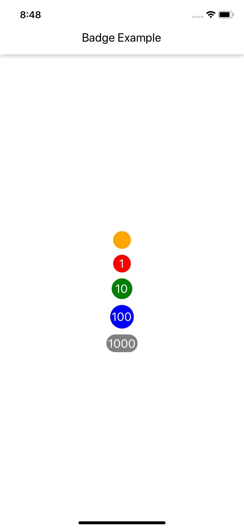 _App.js_
```js
import React from 'react';
import {View} from 'react-native';
import {Badge} from 'react-native-shbib-ui';
export default class BadgeExample extends React.Component {
render() {
return (
);
}
}
const styles = {
root: {
flex: 1,
justifyContent: 'center',
},
avatarContainer: {
marginTop: 10,
},
};
```
_Props_
| Prop name | Description | Type | Default value |
| ---------------- | ----------------------------- | ------ | ------------- |
| `containerStyle` | Container style for component | object | - |
| `badgeStyle` | Divider color | object | - |
| `valueStyle` | Divider border width | object | - |
| `value` | Badge value | string | - |
| `badgeSize` | Badge size | number | - |
| `valueSize` | Value font size | number | 20 |
| `badgeColor` | Badge color | string | - |
| `valueColor` | Value color | string | 'white' |
## Spinner
_Demo_
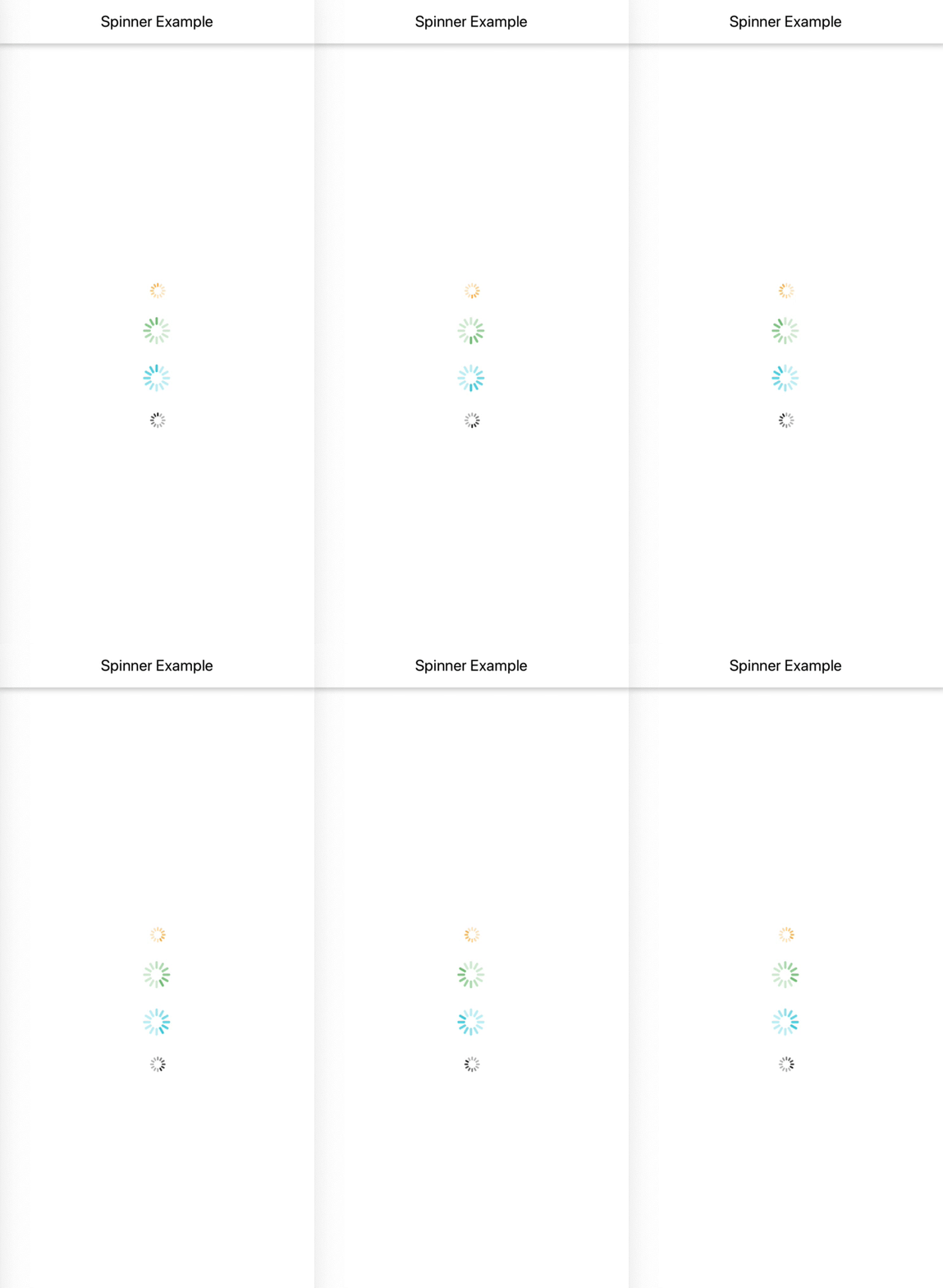 _App.js_
```js
import React from 'react';
import {View} from 'react-native';
import {Spinner} from 'react-native-shbib-ui';
export default class SpinnerExample extends React.Component {
render() {
return (
);
}
}
const styles = {
root: {
flex: 1,
justifyContent: 'space-around',
},
};
```
_Props_
| Prop name | Description | Type | Default value |
| ---------------- | ----------------------------- | ------ | ------------- |
| `containerStyle` | Container style for component | object | - |
| `color` | Set spinner color | string | - |
| `size` | Set size for spinner | number | - |
## Divider
_Demo_
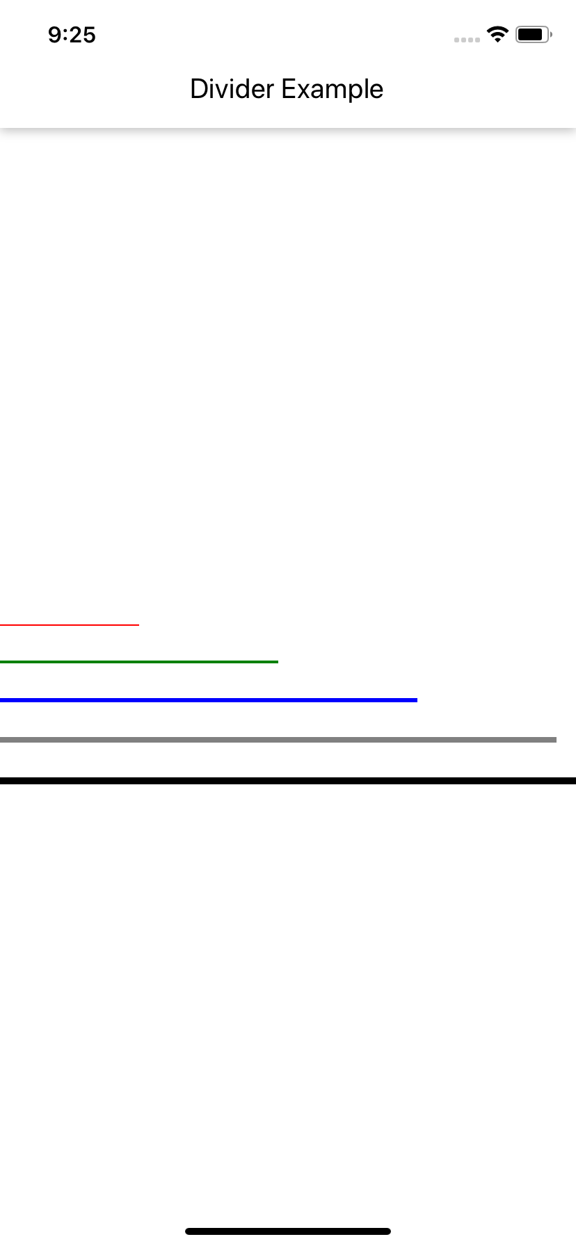 _App.js_
```js
import React from 'react';
import {View} from 'react-native';
import {Divider} from 'react-native-shbib-ui';
export default class DividerExample extends React.Component {
render() {
return (
);
}
}
const styles = {
root: {
flex: 1,
justifyContent: 'space-around',
},
};
```
_Props_
| Prop name | Description | Type | Default value |
| ---------------- | ----------------------------- | ------ | ------------- |
| `containerStyle` | Container style for component | object | - |
| `color` | Divider color | string | - |
| `borderWidth` | Divider border width | number | 1 |
| `width` | Divider width | number | - |
## CheckBox
_Demo_
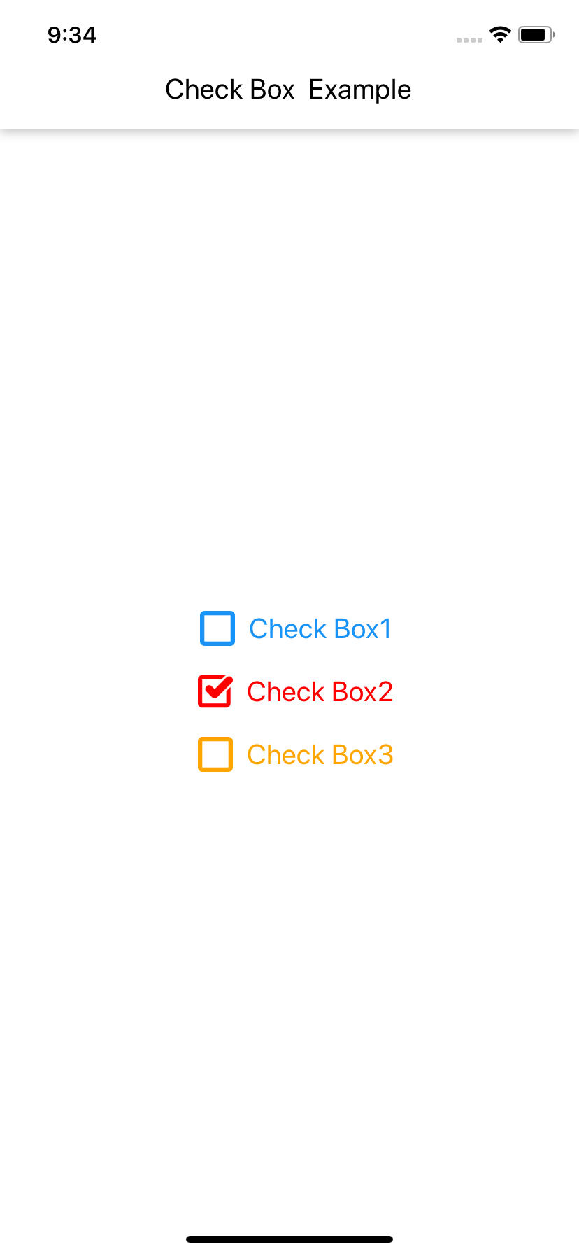 _App.js_
```js
import React from 'react';
import {View} from 'react-native';
import {CheckBox} from 'react-native-shbib-ui';
export default class CheckBoxExample extends React.Component {
render() {
return (
);
}
}
const styles = {
root: {
flex: 1,
justifyContent: 'center',
alignItems: 'center',
},
};
```
_Props_
| Prop name | Description | Type | Default value |
| ---------------- | ------------------------------------------------------------------- | -------- | ------------- |
| `containerStyle` | Container style for component | object | - |
| `checked` | State value of an item from set of choices | boolean | - |
| `onPress` | Handler to be called when the user selects / unselects the checkbox | function | - |
| `iconSize` | Icon size | number | - |
| `iconColor` | Icon color | string | - |
| `label` | Checkbox label | string | - |
| `labelSize` | Label size | number | - |
| `labelColor` | Label color | string | - |
## RadioButton
_Demo_
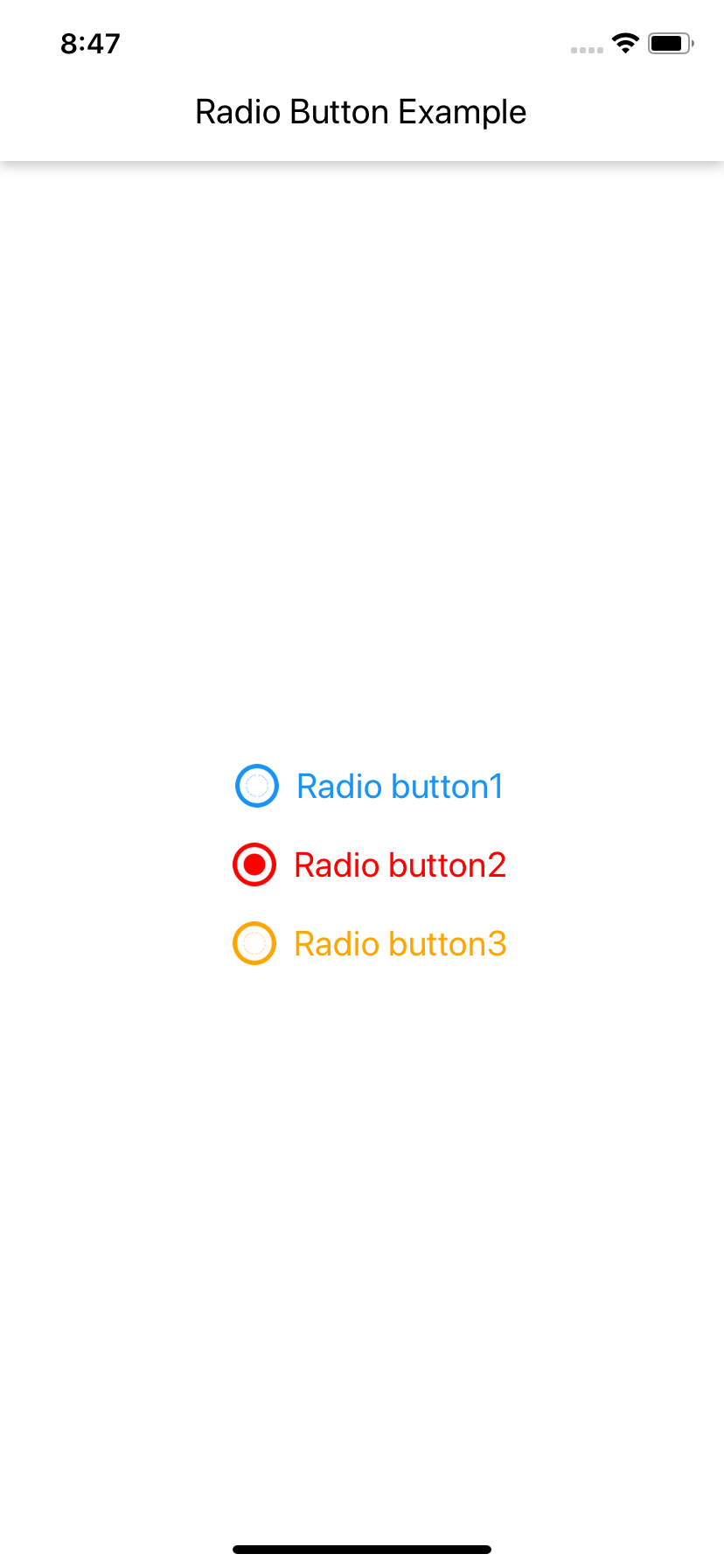 _App.js_
```js
import React from 'react';
import {View} from 'react-native';
import {RadioButton} from 'react-native-shbib-ui';
export default class RadioButtonExample extends React.Component {
render() {
return (
);
}
}
const styles = {
root: {
flex: 1,
justifyContent: 'center',
alignItems: 'center',
},
};
```
_Props_
| Prop name | Description | Type | Default value |
| ---------------- | ----------------------------------------------------------------------- | -------- | ------------- |
| `containerStyle` | Container style for component | object | - |
| `checked` | State value of an item from set of choices | boolean | - |
| `onPress` | Handler to be called when the user selects / unselects the radio button | function | - |
| `iconSize` | Icon size | number | - |
| `iconColor` | Icon color | string | - |
| `label` | Radio button label | string | - |
| `labelSize` | Label size | number | - |
| `labelColor` | Label color | string | - |
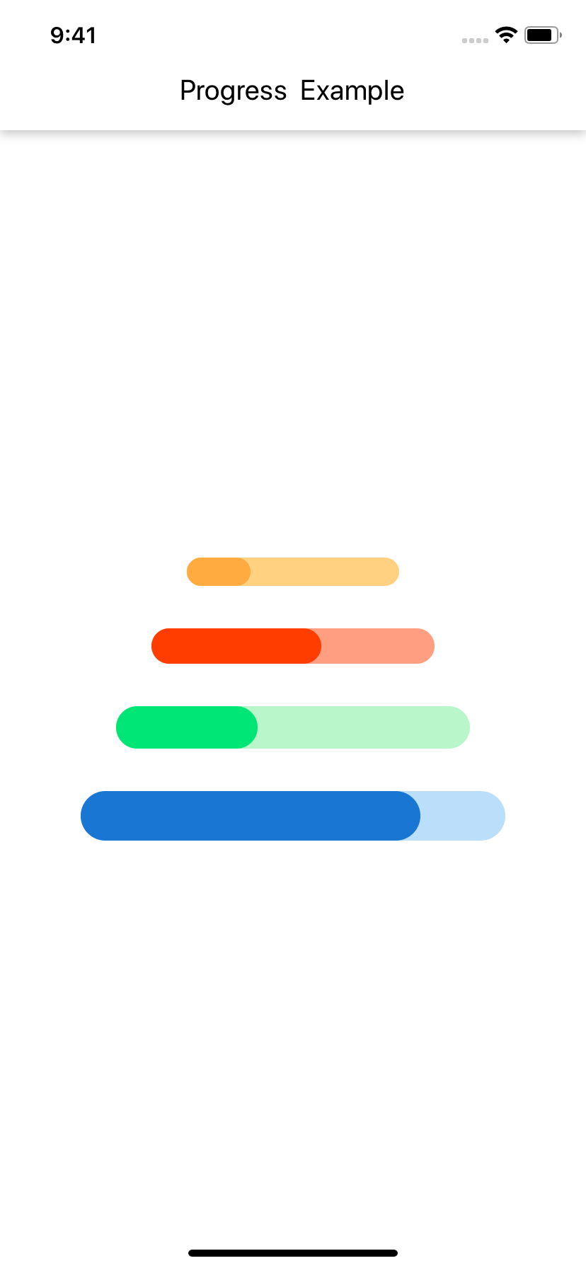
## Progress
_Demo_
 _App.js_
```js
import React from 'react';
import {Progress} from './src/react-native-shbib-ui';
import {View} from 'react-native';
export default class ProgressExample extends React.Component {
render() {
return (
);
}
}
const styles = {
root: {
flex: 1,
justifyContent: 'space-around',
alignItems: 'center',
},
};
```
_Props_
| Prop name | Description | Type | Default value |
| ---------------- | ----------------------------- | ------ | ------------- |
| `containerStyle` | Container style for component | object | - |
| `style` | Progress style | object | - |
| `value` | Progress fill | number | - |
| `primaryColor` | Fill color | string | - |
| `secondaryColor` | Background color | string | - |
| `width` | Progress width | number | - |
| `height` | Progress height | number | - |
---
_Source: https://npm.io/package/react-native-shbib-ui · Machine-readable twin of the npm.io package page. Health data is recomputed on every publish._