# react-native-tooltip-alert
> Add Tooltip alert to your project (Android & iOS)
Latest version **1.0.0** (published 2020-05-28) · MIT license · 0 weekly downloads
> **Deprecated.** This package is deprecated.
## Install
```sh
npm install react-native-tooltip-alert
pnpm add react-native-tooltip-alert
yarn add react-native-tooltip-alert
bun add react-native-tooltip-alert
```
## Health
**Score 10/100 (F)** — status: deprecated.
Negative: deprecated.
## Facts
| | |
|---|---|
| Version | 1.0.0 |
| Published | 2020-05-28 |
| First published | 2020-05-28 |
| Weekly downloads | 0 |
| License | MIT |
| TypeScript types | bundled |
| Module format | CommonJS |
| Dependencies | 0 |
| Unpacked size | 20.8 KB |
| Known vulnerabilities | 0 |
| Install scripts | no |
| GitHub stars | 5 |
| Author | NY Idanlevi1 |
| Maintainers | idanlevi2 |
| Keywords | bottom-sheet, action-sheet, raw-bottom-sheet, bottom-drawer, bottom-animated, drawer, picker, swipper, modal, dialog |
## Links
- npm: https://www.npmjs.com/package/react-native-tooltip-alert
- Repository: https://github.com/idanlevi1/react-native-tooltip-alert
- Homepage: https://github.com/idanlevi1/react-native-tooltip-alert#readme
- Issues: https://github.com/idanlevi1/react-native-tooltip-alert/issues
- npm.io page: https://npm.io/package/react-native-tooltip-alert
## Alternatives
- [react-native-root-siblings](https://npm.io/package/react-native-root-siblings.md) — 102.9K weekly downloads
- [post-robot](https://npm.io/package/post-robot.md) — 93.7K weekly downloads
- [@praxisui/dialog](https://npm.io/package/@praxisui/dialog.md) — 2.0K weekly downloads
- [easy-toggle-state](https://npm.io/package/easy-toggle-state.md) — 350 weekly downloads
- [ngx-lightbox-evp](https://npm.io/package/ngx-lightbox-evp.md) — 19 weekly downloads
## Recent versions
- 1.0.0 (latest) — 2020-05-28
## README
# react-native-tooltip-alert
[](//npmjs.com/package/react-native-tooltip-alert)
[
](//npmjs.com/package/react-native-tooltip-alert)
| Showcase iOS | Showcase Android |
| :--------------------------------------------------------------------------------------------------------------------: | :--------------------------------------------------------------------------------------------------------------------: |
| 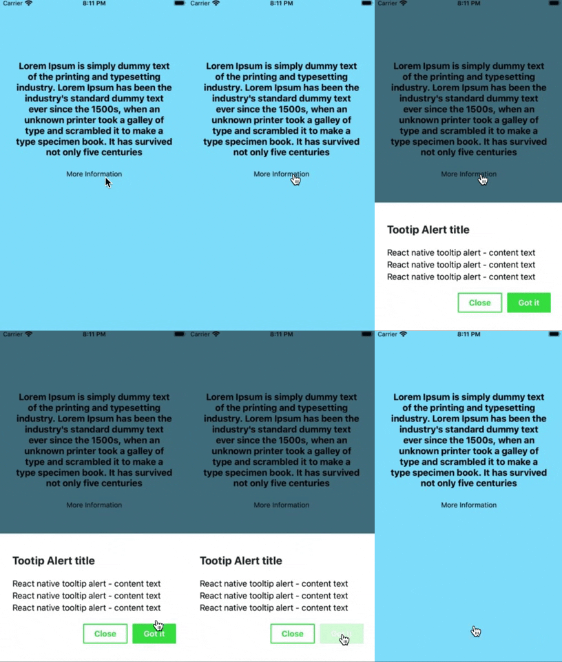 |
 |
## Installation
```
npm i react-native-tooltip-alert --save
```
### or
```
yarn add react-native-tooltip-alert
```
## Example
#### Class component
```jsx
import React, { Component } from "react";
import { View } from "react-native";
import TooltipAlert from "react-native-tooltip-alert";
export default class Example extends Component {
render() {
return (
Open Tooltip
);
}
}
```
#### Functional component
```jsx
import React, { useRef } from "react";
import { View } from "react-native";
import TooltipAlert from "react-native-tooltip-alert";
export default function Example() {
const refTooltipAlert = useRef();
return (
Open Tooltip
);
}
```
## Props
title, contentText, confirmButtonText, cancelButtonText, color, height
| Props | Type | Description | Default |
| ---------------- | -------- | ------------------------------------------------------- | -------- |
| title | string | Tooltip title text | "Title" |
| contentText | string | Tooltip content text | "Content text" |
| onConfirm | function | Callback when on confirm clicked (onClose call after) | null |
| onCancel | function | Callback when on cancel clicked (onClose call after) | null |
| confirmButtonText| string | Tooltip confirm button text | "Confirm"|
| confirmButtonText| string | Tooltip cancel button text | "Close" |
| height | number | Height of tooltip | 260 |
| closeOnPressMask | boolean | Press the area outside to close Bottom Sheet | true |
| closeOnPressBack | boolean | Press back android to close Bottom Sheet (Android only) | true |
| customStyles | object | Custom style to Bottom Sheet | {} |
### Available Custom Style
```
customStyles: {
wrapper: {...}, // The Root of Component (You can change the `backgroundColor` or any styles)
container: {...}, // The Container of Bottom Sheet
draggableIcon: {...} // The Draggable Icon (If you set closeOnDragDown to true)
}
```
## License
This project is licensed under the MIT License - see the [LICENSE.md](https://github.com/idanlevi1/react-native-tooltip-alert/blob/master/LICENSE) file for details
## Author
Made by [Idanlevi1](https://github.com/idanlevi1).
---
_Source: https://npm.io/package/react-native-tooltip-alert · Machine-readable twin of the npm.io package page. Health data is recomputed on every publish._