## Features
- Custom trigger element
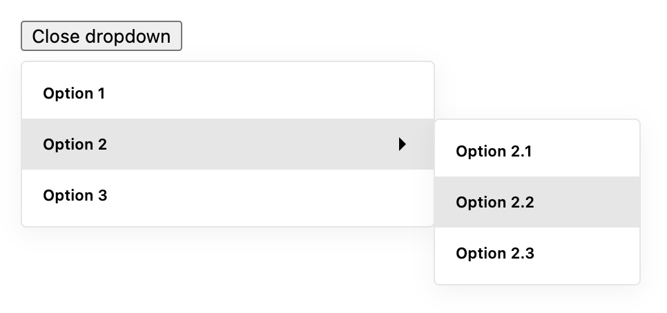
- Dropdown item with submenu
- Multi level submenu support
- Specific props to each dropdown item
- Auto positioning of dropdown menu
- Written in TypeScript 🤙
## Installation
```bash
# using npm
npm install react-nested-dropdown
# using pnpm
pnpm install react-nested-dropdown
# using yarn
yarn add react-nested-dropdown
```
## Basic usage
```tsx
import React from 'react';
import { Dropdown } from 'react-nested-dropdown';
import 'react-nested-dropdown/dist/styles.css';
const items = [
{
label: 'Option 1',
onSelect: () => console.log('Option 1 selected'),
},
{
label: 'Option 2',
items: [
{
label: 'Option 2.1',
onSelect: () => console.log('Option 2.1 selected'),
},
{
label: 'Option 2.2',
onSelect: () => console.log('Option 2.2 selected'),
},
],
},
];
export const App = () => {
return (
{({ isOpen, onClick }) => (
)}
);
};
```
## `Dropdown` props
| Prop | Type | Default | Description |
| ---------------- | -------------------------------------------------------------------------- | ------- | ---------------------------------------------------------------------------------------------------------------------------------------------------------------------------------------------------------------------------------------------------------------- |
| `items` | `DropdownItem[]` | `[]` | An array of dropdown items to render in the menu. |
| `containerWidth` | `number` or `string` | `300` | The width of the dropdown menu container. Can be a number for pixels or a string for any valid CSS width value. |
| `onSelect` | `(value: any, option: DropdownItem) => void` | `null` | A callback function that is called when an option is selected. It is passed the value of the selected option and the option object itself. |
| `children` | `(params: { onClick: () => void, isOpen: boolean }) => React.ReactElement` | `null` | A function that returns a React element to be used as the trigger for the dropdown menu. The function is passed an object with an `onClick` function to open and close the dropdown, and an `isOpen` boolean to indicate the current open state of the dropdown. |
| `className` | `string` | `null` | A custom class name to be applied to the root element of the component. |
| `renderOption` | `(option: DropdownItem) => React.ReactElement` | `null` | A function that returns a React element for rendering each option in the dropdown menu. It is passed the option object for the current item. |
| `closeOnScroll` | `boolean` | `true` | If set to `true`, the dropdown menu will close when the page is scrolled. |
## `DropdownItem` interface
| Prop | Type | Default | Description |
| --------------------- | -------------------- | ----------- | ---------------------------------------------------------------------------------------------------------------- |
| `label` | `string` | `''` | The label to display for the item. |
| `iconBefore` | `React.ReactNode` | `null` | An optional icon to display before the label. |
| `iconAfter` | `React.ReactNode` | `null` | An optional icon to display after the label. |
| `items` | `DropdownItem[]` | `null` | An optional array of nested items to create a submenu. |
| `itemsContainerWidth` | `number` or `string` | `150` | The width of the sub items menu container. Can be a number for pixels or a string for any valid CSS width value. |
| `value` | `any` | `undefined` | An optional value for the item. This value will be in `Dropdown`'s callback `onSelect` as first argument. |
| `onSelect` | `() => void` | `null` | An optional callback function to be called when the item is selected. |
| `disabled` | `boolean` | `false` | Whether the item should be disabled and unable to be selected. |
| `className` | `string` | `null` | An optional class name to be applied to the item element. |
---
_Source: https://npm.io/package/react-nested-dropdown · Machine-readable twin of the npm.io package page. Health data is recomputed on every publish._




 ## Features
- Custom trigger element
- Dropdown item with submenu
- Multi level submenu support
- Specific props to each dropdown item
- Auto positioning of dropdown menu
- Written in TypeScript 🤙
## Installation
```bash
# using npm
npm install react-nested-dropdown
# using pnpm
pnpm install react-nested-dropdown
# using yarn
yarn add react-nested-dropdown
```
## Basic usage
```tsx
import React from 'react';
import { Dropdown } from 'react-nested-dropdown';
import 'react-nested-dropdown/dist/styles.css';
const items = [
{
label: 'Option 1',
onSelect: () => console.log('Option 1 selected'),
},
{
label: 'Option 2',
items: [
{
label: 'Option 2.1',
onSelect: () => console.log('Option 2.1 selected'),
},
{
label: 'Option 2.2',
onSelect: () => console.log('Option 2.2 selected'),
},
],
},
];
export const App = () => {
return (
## Features
- Custom trigger element
- Dropdown item with submenu
- Multi level submenu support
- Specific props to each dropdown item
- Auto positioning of dropdown menu
- Written in TypeScript 🤙
## Installation
```bash
# using npm
npm install react-nested-dropdown
# using pnpm
pnpm install react-nested-dropdown
# using yarn
yarn add react-nested-dropdown
```
## Basic usage
```tsx
import React from 'react';
import { Dropdown } from 'react-nested-dropdown';
import 'react-nested-dropdown/dist/styles.css';
const items = [
{
label: 'Option 1',
onSelect: () => console.log('Option 1 selected'),
},
{
label: 'Option 2',
items: [
{
label: 'Option 2.1',
onSelect: () => console.log('Option 2.1 selected'),
},
{
label: 'Option 2.2',
onSelect: () => console.log('Option 2.2 selected'),
},
],
},
];
export const App = () => {
return (