# react-portal-tooltip
> Awesome React tooltips
Latest version **2.4.7** (published 2019-03-11) · MIT license · 0 weekly downloads
## Install
```sh
npm install react-portal-tooltip
pnpm add react-portal-tooltip
yarn add react-portal-tooltip
bun add react-portal-tooltip
```
## Health
**Score 23/100 (F)** — status: abandoned.
Positive: has types package; no vulnerabilities; high quality score.
Warnings: low downloads; no esm support.
Negative: abandoned; low maintenance score.
## Facts
| | |
|---|---|
| Version | 2.4.7 |
| Published | 2019-03-11 |
| First published | 2015-08-07 |
| Weekly downloads | 0 |
| License | MIT |
| TypeScript types | separate (@types/react-portal-tooltip) |
| Module format | CommonJS |
| Dependencies | 0 |
| Unpacked size | 97.8 KB |
| Known vulnerabilities | 0 |
| Install scripts | no |
| GitHub stars | 404 |
| Author | Romain Berger |
| Maintainers | redmega, romainberger, tanqhnguyen |
| Keywords | react, reactjs, component, tooltip, portal |
## Links
- npm: https://www.npmjs.com/package/react-portal-tooltip
- Repository: https://github.com/romainberger/react-portal-tooltip
- Issues: https://github.com/romainberger/react-portal-tooltip
- npm.io page: https://npm.io/package/react-portal-tooltip
## Alternatives
- [mobx-react](https://npm.io/package/mobx-react.md) — 2.8M weekly downloads
- [rc-tree](https://npm.io/package/rc-tree.md) — 2.6M weekly downloads
- [@react-oauth/google](https://npm.io/package/@react-oauth/google.md) — 1.3M weekly downloads
- [@wagmi/connectors](https://npm.io/package/@wagmi/connectors.md) — 877.0K weekly downloads
- [vee-validate](https://npm.io/package/vee-validate.md) — 836.4K weekly downloads
## Recent versions
- 2.4.7 (latest) — 2019-03-11
- 2.4.6 — 2019-03-01
- 2.4.5 — 2019-03-01
- 2.4.4 — 2019-02-28
- 2.4.3 — 2019-01-21
- 2.4.2 — 2018-12-18
- 2.4.1 — 2018-11-28
- 2.4.0 — 2018-03-29
- 2.3.0 — 2017-12-15
- 2.2.0 — 2017-12-15
- 2.1.4 — 2017-12-05
- 2.1.3 — 2017-12-05
- 2.1.2 — 2017-11-30
- 2.1.1 — 2017-11-15
- 2.1.0 — 2017-10-04
- … 42 more at https://npm.io/package/react-portal-tooltip/versions
## README
# React Portal Tooltip
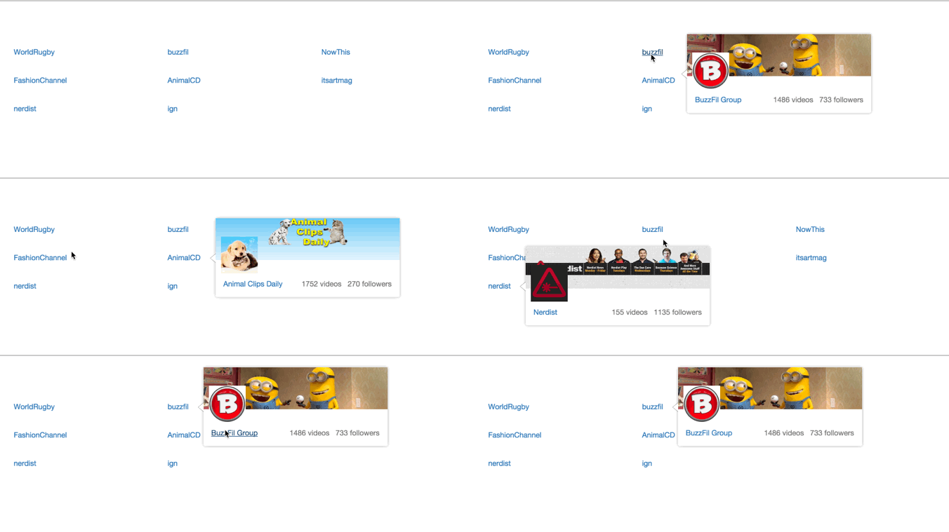
Awesome tooltips.
[](https://travis-ci.org/romainberger/react-portal-tooltip) [](https://www.npmjs.com/package/react-portal-tooltip)
[](https://www.npmjs.com/package/react-portal-tooltip)
## Installation
```shell
$ npm install react-portal-tooltip
```
**Warning** The versions 2.x on npm are compatible with React 16. Corresponding versions for older versions of React:
```shell
# For react v15
$ npm install react-portal-tooltip@1
# For react 0.14
$ npm install react-portal-tooltip@0.14
# For react 0.13
$ npm install react-portal-tooltip@0.13
```
## Documentation and demo
[http://romainberger.github.io/react-portal-tooltip/](http://romainberger.github.io/react-portal-tooltip/)
## Usage
```javascript
import React from 'react'
import ToolTip from 'react-portal-tooltip'
class MyComponent extends React.Component {
state = {
isTooltipActive: false
}
showTooltip() {
this.setState({isTooltipActive: true})
}
hideTooltip() {
this.setState({isTooltipActive: false})
}
render() {
return (
This is a cool component
This is the content of the tooltip

)
}
}
```
### Props
* `active`: boolean, the tooltip will be visible if true
* `position`: top, right, bottom or left. Default to right
* `arrow`: center, right, left, top or bottom (depending on the position prop). No arrow when the prop is not sepecified
* `align`: the alignment of the whole tooltip relative to the `parent` element. possible values : center, right, left. Default to center.
* `tooltipTimeout`: timeout for the tooltip fade out in milliseconds. Default to 500
* `parent`: the tooltip will be placed next to this element. Can be the id of the parent or the ref (see example below)
* `group`: string, necessary if you want several independent tooltips
* `style`: object, allows customizing the tooltip. Checkout the [example](https://github.com/romainberger/react-portal-tooltip/blob/master/example/src/style.js) for details.
* `useHover` bool, default to true. If true, the tooltip will stay visible when hovered.
### Parent prop
You can use an id or a ref to reference the parent:
#### id
```javascript
Hover me!!!
This is the content of the tooltip
```
#### ref
```javascript
{ this.element = element }} onMouseEnter={this.showTooltip} onMouseLeave={this.hideTooltip}>
Hover me!!!
This is the content of the tooltip
```
### Stateful ToolTip
If you only use the Tooltip for mouse enter / mouse leave, you may not want to handle the state yourself for all elements. In this case, you can use the stateful version which will do it for you:
Import the stateful version:
```js
import { StatefulToolTip } from "react-portal-tooltip"
```
Then create your parent and give it as a prop to the Tooltip:
```js
const button = Hover me to display the tooltip
return (
Stateful Tooltip content here!
)
```
`StatefulToolTip` takes the same props as `ToolTip`, plus a `className` prop that will be applied to the root element wrapping the parent ([see the example](https://github.com/romainberger/react-portal-tooltip/blob/master/example/src/stateful.js)).
[See the example live](http://romainberger.github.io/react-portal-tooltip/#/stateful).
## Development
```shell
# clone
$ git clone git@github.com:romainberger/react-portal-tooltip.git
# install the dependencies
$ npm install
# go to the example folder, then install more dependencies
$ cd example && npm install
# start the development server with hot reloading
$ npm start
# to build run this command from the root directory
$ npm build
```
## License
MIT
---
_Source: https://npm.io/package/react-portal-tooltip · Machine-readable twin of the npm.io package page. Health data is recomputed on every publish._