# react-progress-button
> Simple react.js component for a inline progress indicator
Latest version **5.1.0** (published 2017-09-29) · MIT license · 0 weekly downloads
## Install
```sh
npm install react-progress-button
pnpm add react-progress-button
yarn add react-progress-button
bun add react-progress-button
```
## Health
**Score 15/100 (F)** — status: abandoned.
Positive: no vulnerabilities.
Warnings: low downloads; no types; no esm support.
Negative: abandoned; low maintenance score.
## Facts
| | |
|---|---|
| Version | 5.1.0 |
| Published | 2017-09-29 |
| First published | 2015-04-28 |
| Weekly downloads | 0 |
| License | MIT |
| TypeScript types | none |
| Module format | CommonJS |
| Dependencies | 2 |
| Known vulnerabilities | 0 |
| Install scripts | no |
| GitHub stars | 523 |
| Author | Mathieu Dutour |
| Maintainers | mathieudutour |
| Keywords | react, progress, button, component, javascript, react-component |
## Links
- npm: https://www.npmjs.com/package/react-progress-button
- Repository: https://github.com/mathieudutour/react-progress-button
- Issues: https://github.com/mathieudutour/react-progress-button/issues
- npm.io page: https://npm.io/package/react-progress-button
## Dependencies (2)
- [prop-types](https://npm.io/package/prop-types.md) ^15.5.8
- [create-react-class](https://npm.io/package/create-react-class.md) ^15.5.2
## Alternatives
- [mobx-react](https://npm.io/package/mobx-react.md) — 2.8M weekly downloads
- [rc-tree](https://npm.io/package/rc-tree.md) — 2.6M weekly downloads
- [@react-oauth/google](https://npm.io/package/@react-oauth/google.md) — 1.3M weekly downloads
- [@wagmi/connectors](https://npm.io/package/@wagmi/connectors.md) — 877.0K weekly downloads
- [vee-validate](https://npm.io/package/vee-validate.md) — 836.4K weekly downloads
## Recent versions
- 5.1.0 (latest) — 2017-09-29
- 5.0.4 — 2017-05-11
- 5.0.3 — 2017-05-03
- 5.0.2 — 2017-03-09
- 5.0.1 — 2016-08-02
- 5.0.0 — 2016-05-21
- 4.0.1 — 2016-04-18
- 4.0.0 — 2016-02-05
- 3.2.0 — 2016-01-24
- 3.1.0 — 2016-01-23
- 3.0.0 — 2015-12-03
- 2.0.0 — 2015-10-06
- 1.1.0 — 2015-09-04
- 1.0.0 — 2015-09-02
- 0.2.0 — 2015-09-02
- … 11 more at https://npm.io/package/react-progress-button/versions
## README
# react-progress-button
[](https://travis-ci.org/mathieudutour/react-progress-button)
[](https://www.npmjs.com/package/react-progress-button)
[](https://david-dm.org/mathieudutour/react-progress-button)
[](https://david-dm.org/mathieudutour/react-progress-button#info=devDependencies)
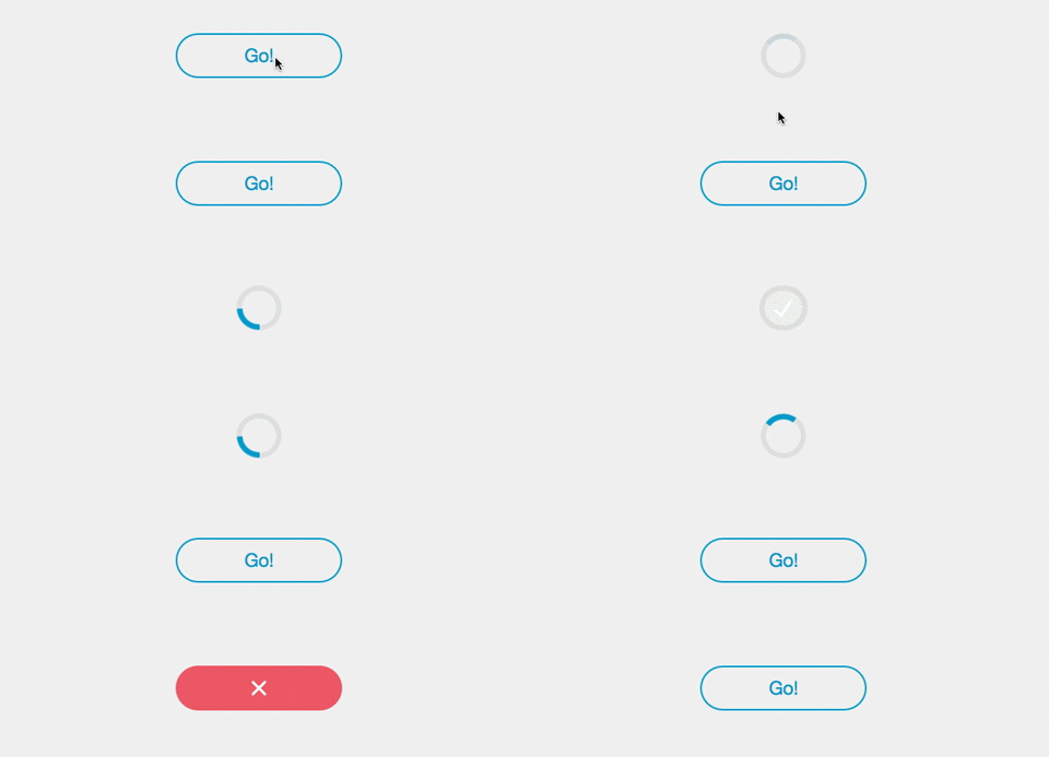
> Simple [React](http://facebook.github.io/react/index.html) component for a circular Progress Button.
### [Demo](https://mathieudutour.github.io/react-progress-button)
[](https://github.com/mathieudutour/react-progress-button/blob/master/example/index.html)
## Install
```bash
npm install react-progress-button --save
```
## Example
### Controlled usage:
```javascript
import ProgressButton from 'react-progress-button'
const App = React.createClass({
getInitialState () {
return {
buttonState: ''
}
},
render () {
return (
)
},
handleClick () {
this.setState({buttonState: 'loading'})
// make asynchronous call
setTimeout(() => {
this.setState({buttonState: 'success'})
}, 3000)
}
})
```
[Source](https://github.com/mathieudutour/react-progress-button/blob/master/example/index.html)
### Using Promises:
If the function passed in via the `onClick` prop return a Promise or if a promise
is passed as an argument of the `loading` method,
the component will automatically transition to its success or error
states based on the outcome of the Promise without the need for
external manipulation of state using a ref.
```javascript
import ProgressButton from 'react-progress-button'
const App = React.createClass({
render () {
return (
)
},
handleClick() {
return new Promise(function(resolve, reject) {
setTimeout(resolve, 3000)
})
}
});
```
[Source](https://github.com/mathieudutour/react-progress-button/blob/master/example/index-promises.html)
## API
### Props
All props are optional. All props other than that will be passed to the top element.
##### classNamespace
Namespace for CSS classes, default is `pb-` i.e CSS classes are `pb-button`.
##### durationError
Duration (ms) before going back to normal state when an error occurs,
default is 1200
##### durationSuccess
Duration (ms) before going back to normal state when an success occurs,
default is 500
##### onClick
Function to call when the button is clicked; if it returns a Promise
then the component will transition to the success/error state based on
the outcome of the Promise
##### onError
Function to call when going back to the normal state after an error
##### onSuccess
Function to call when going back to the normal state after a success
##### state
State of the button if you do not want to use the functions. Can be `''`, `loading`, `success`, `error` or `disabled`.
##### type
Type of the button (can be 'submit' for example).
##### form
Id of the form to submit (useful if the button is not directly inside the form).
##### shouldAllowClickOnLoading
Whether click event should bubble when in loading state
### Methods
##### loading()
Put the button in the loading state.
##### disable()
Put the button in the disabled state.
##### notLoading(), enable()
Put the button in the normal state.
##### success([callback, dontGoBackToNormal])
Put the button in the success state. Call the callback or the onSuccess prop when going back to the normal state.
##### error([callback])
Put the button in the error state. Call the callback or the onError prop when going back to the normal state.
## Styles
Look at [react-progress-button.css](https://github.com/mathieudutour/react-progress-button/blob/master/react-progress-button.css) for an idea on how to style this component.
If you are using webpack, you'll need to have ```css-loader``` installed and include
```
{
test: /\.css$/,
loader: "style!css"
}
```
in your webpack config. In your jsx file you can then import the CSS with ```import "../node_modules/react-progress-button/react-progress-button.css";``` although the path depends on how deeply nested your jsx is. If you wish to theme it yourself, copy the CSS to a convenient location and point the import path at the copy, which is part of your repo, unlike the original in ```node_modules```.
## License
MIT
---
_Source: https://npm.io/package/react-progress-button · Machine-readable twin of the npm.io package page. Health data is recomputed on every publish._