# react-slide-menu
> A React.js menu that slides in and out
Latest version **0.5.1** (published 2018-07-12) · MIT license · 0 weekly downloads
## Install
```sh
npm install react-slide-menu
pnpm add react-slide-menu
yarn add react-slide-menu
bun add react-slide-menu
```
## Health
**Score 25/100 (F)** — status: abandoned.
Positive: no vulnerabilities.
Warnings: low downloads; no types; no esm support; pre 1.0.
Negative: abandoned.
## Facts
| | |
|---|---|
| Version | 0.5.1 |
| Published | 2018-07-12 |
| First published | 2017-12-30 |
| Weekly downloads | 0 |
| License | MIT |
| TypeScript types | none |
| Module format | CommonJS |
| Dependencies | 4 |
| Unpacked size | 1.8 MB |
| Known vulnerabilities | 0 (+1 in 1 direct dependencies) |
| Install scripts | no |
| GitHub stars | 8 |
| Author | Q5 |
| Maintainers | lightning.lu10 |
| Keywords | react, menu, slide, react-slide-menu, navbar, navigation, component, sidebar |
## Links
- npm: https://www.npmjs.com/package/react-slide-menu
- Repository: https://github.com/quantfive/react-slide-menu
- Homepage: https://github.com/quantfive/react-slide-menu#readme
- Issues: https://github.com/quantfive/react-slide-menu/issues
- npm.io page: https://npm.io/package/react-slide-menu
## Dependencies (4)
- [hoek](https://npm.io/package/hoek.md) ^5.0.3
- [aphrodite](https://npm.io/package/aphrodite.md) ^1.2.5
- [react-animations](https://npm.io/package/react-animations.md) ^1.0.0
- [react-router-dom](https://npm.io/package/react-router-dom.md) ^4.2.2
## Alternatives
- [mobx-react](https://npm.io/package/mobx-react.md) — 2.8M weekly downloads
- [rc-tree](https://npm.io/package/rc-tree.md) — 2.6M weekly downloads
- [@react-oauth/google](https://npm.io/package/@react-oauth/google.md) — 1.3M weekly downloads
- [@wagmi/connectors](https://npm.io/package/@wagmi/connectors.md) — 877.0K weekly downloads
- [vee-validate](https://npm.io/package/vee-validate.md) — 836.4K weekly downloads
## Recent versions
- 0.5.1 (latest) — 2018-07-12
- 0.5.0 — 2018-01-01
- 0.4.3 — 2017-12-30
- 0.4.2 — 2017-12-30
- 0.4.1 — 2017-12-30
- 0.4.0 — 2017-12-30
- 0.3.2 — 2017-12-30
- 0.3.1 — 2017-12-30
- 0.3.0 — 2017-12-30
- 0.2.1 — 2017-12-30
- 0.2.0 — 2017-12-30
- 0.1.1 — 2017-12-30
## README
# React Slide Menu
[](https://travis-ci.org/UdiliaInc/create-react-library)
[]()
[]()
[![npm download][download-image]][download-url]
[download-image]: https://img.shields.io/npm/dm/react-slide-menu.svg?style=flat-square
[download-url]: https://www.npmjs.com/package/react-slide-menu
## Demo
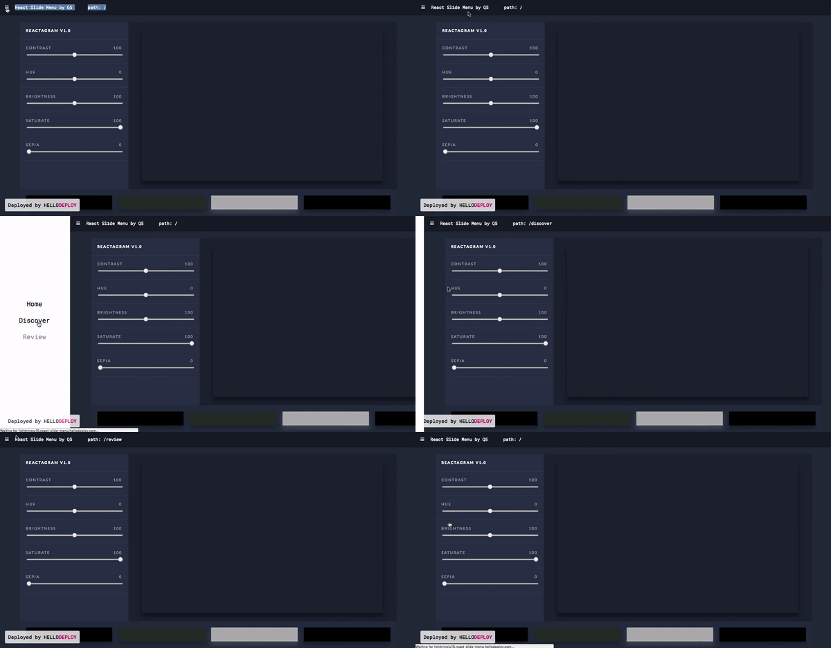
http://lightninglu10.react-slide-menu.hellodeploy.com/
## Install the package
Use NPM or Yarn
```sh
yarn add react-slide-menu
```
```sh
npm install --save react-slide-menu
```
## Usage
1 . Require react-atmosphere-menu after installation
```js
import SlideMenu from 'react-slide-menu'
```
2 . Wrap react-slide-menu around your app
```js
```
3 . Customize options
```js
var nav = [
{id: 'home', label: 'Home', path: '/'},
{id: 'about', label: 'About', path: '/about'},
{id: 'discover', label: 'Discover', path: '/discover'},
]
this.setState({slideMenuActive: false})}>
`.
closeMenu | Function | The function that closes your atmosphere menu. Should set the variable for the `active` prop to false.
## Extra Options / Styling options
Option|Type | Description
|:---|:---|:---
menuClassName | String | Extra class to style the AtmosphereMenu component. Default: `menu: { position: 'relative', overflow: 'hidden', },`
appClassName | String | Extra class to style your app when the menu is active.
companyClassName | String | Extra class to style the `companyName` text.
navItemClassName | String | Extra class to style each Navigation item. Default: `navItem: { marginBottom: '25px', opacity: '.7', ':hover': { opacity: '1',}},`
navLinkStyle | String | Extra prop to style the `` or `Link` element of each Navigation Item. Default: `linkStyle: { textDecoration: 'none', color: '#fff', fontWeight: '300', '@media only screen and (min-width: 768px)': { fontSize: '2em', }, '@media only screen and (min-width: 1440px)': { fontSize: '2.5em', }},`
linkClassName | String | Extra class to style the `` or `Link` element of each Navigation item. Has the same style default as above `navLinkStyle`.
navClassName | String | Extra class to style the whole Nav component.
## Inspired by
www.youtube.com
and
www.typeform.com
---
_Source: https://npm.io/package/react-slide-menu · Machine-readable twin of the npm.io package page. Health data is recomputed on every publish._