# react-sorcerer
> react-sorcerer
Latest version **5.1.0** (published 2023-01-11) · MIT license · 0 weekly downloads
## Install
```sh
npm install react-sorcerer
pnpm add react-sorcerer
yarn add react-sorcerer
bun add react-sorcerer
```
## Health
**Score 25/100 (F)** — status: abandoned.
Positive: has types; no vulnerabilities; high quality score.
Warnings: low downloads; no esm support.
Negative: abandoned; low maintenance score.
## Facts
| | |
|---|---|
| Version | 5.1.0 |
| Published | 2023-01-11 |
| First published | 2017-02-11 |
| Weekly downloads | 0 |
| License | MIT |
| TypeScript types | bundled |
| Module format | CommonJS |
| Dependencies | 0 |
| Unpacked size | 10.1 KB |
| Known vulnerabilities | 0 |
| Install scripts | no |
| GitHub stars | 11 |
| Author | Bryan Brophy |
| Maintainers | brybrophy |
| Keywords | react, progressive, images, loading, srcset |
## Links
- npm: https://www.npmjs.com/package/react-sorcerer
- Repository: https://github.com/brybrophy/react-sorcerer
- Issues: https://github.com/brybrophy/react-sorcerer/issues
- npm.io page: https://npm.io/package/react-sorcerer
## Alternatives
- [mobx-react](https://npm.io/package/mobx-react.md) — 2.8M weekly downloads
- [rc-tree](https://npm.io/package/rc-tree.md) — 2.6M weekly downloads
- [@react-oauth/google](https://npm.io/package/@react-oauth/google.md) — 1.3M weekly downloads
- [@wagmi/connectors](https://npm.io/package/@wagmi/connectors.md) — 877.0K weekly downloads
- [vee-validate](https://npm.io/package/vee-validate.md) — 836.4K weekly downloads
## Recent versions
- 5.1.0 (latest) — 2023-01-11
- 2.0.6 (beta) — 2017-02-13
- 5.0.2 — 2021-11-29
- 5.0.0 — 2021-04-07
- 4.0.9 — 2020-09-11
- 4.0.8 — 2020-09-11
- 4.0.7 — 2020-09-11
- 4.0.6 — 2020-09-11
- 4.0.5 — 2020-01-29
- 4.0.4 — 2020-01-29
- 4.0.3 — 2020-01-29
- 4.0.2 — 2020-01-29
- 4.0.1 — 2020-01-29
- 4.0.0 — 2020-01-29
- 3.0.3 — 2018-09-21
- … 20 more at https://npm.io/package/react-sorcerer/versions
## README
# React Sorcerer
   
React Sorcerer is a react component and companion hook that helps you use source sets for your img tags.
Source sets work by using a set of image sources to allow the browser to make a calculated decision and display the most optimal image for the current screen size. They increase site performance, and save your users bandwidth. They are like the Goldilocks of image optimization.
### Demo
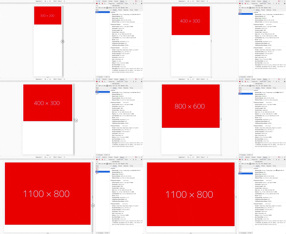
### Install
```
yarn add react-sorcerer
```
## Use as a Component
```jsx
import { Sorcerer } from 'react-sorcerer';
;
```
## Use as a Hook
```jsx
import { useSorcerer } from 'react-sorcerer';
const imgSrcData = useSorcerer({
alt: 'an image',
coverage: 100,
src: 'https://dummyimage.com/1024x800/f00/fff',
srcSetData: [
{
src: 'https://dummyimage.com/300x200/f00/fff',
width: 300,
},
{
src: 'https://dummyimage.com/400x300/f00/fff',
width: 400,
},
{
src: 'https://dummyimage.com/800x600/f00/fff',
width: 800,
},
{
src: 'https://dummyimage.com/1100x800/f00/fff',
width: 1100,
},
],
});
![]() ;
```
Note: The `coverage` prop is used to help the browser determine which image to use at each screen size based on the image's width. A full width image would have a `coverage` of 100. An image in a 4 column grid might have a `coverage` of 25.
### Props
| Name | Type | Required | Description |
| ---------- | ---------------------------------- | -------- | ----------------------------------------------------------- |
| alt | `string` | `true` | alt tag for the image |
| className | `string` | `false` | className for the image |
| coverage | `number` | `true` | an estimate of the display width of the image in percentage |
| src | `string` | `true` | the src of the main image |
| srcSetData | `{ src: string, width: number }[]` | `true` | an array of image sources and their width in pixels |
| style | `object` | `false` | style object for the image |
### License
MIT
Copyright (c) 2017 Bryan Brophy.
---
_Source: https://npm.io/package/react-sorcerer · Machine-readable twin of the npm.io package page. Health data is recomputed on every publish._