# react-state-tabs
Your zero-effort content hidden-visible tabs. [see examples live on codesandbox.io 🧰](https://codesandbox.io/s/react-state-tabs-examples-gucij)
### Features
- 🤯 Easy to use, Just two components and you're good to go.
- 🚫 Disable any tab you want.
- ♿ Accessibility, Screen readers and Keyboard Control.
- 🪅 Animated transition element.
### Quickstart ⤵️
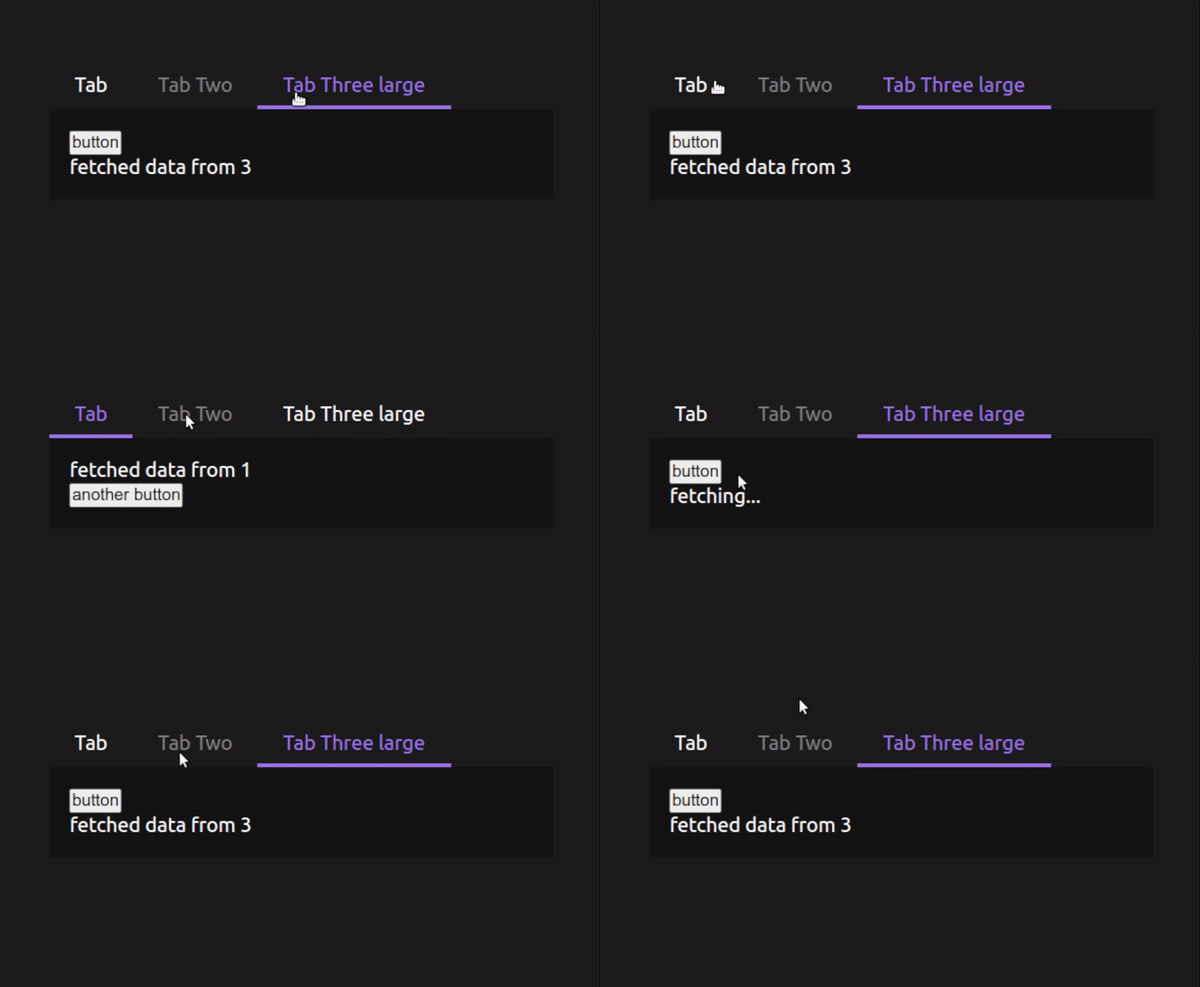
The example above is simply that
```jsx
/*
* lineCursorExample.tsx
*/
import { useState } from "react";
import { Tab, Tabs } from "react-state-tabs";
import "./lineTabExample.css";
function LineCursorExample() {
const [tabData, setTabData] = useState("");
const delay = (ms: number) => new Promise((res) => setTimeout(res, ms));
async function fetchSomeData(activeId: number) {
setTabData("fetching...");
await delay(1000);
return setTabData(`fetched data from ${activeId}`);
}
return (
{tabData}
{tabData}
{tabData}
);
}
export default LineCursorExample;
```
```css
/*
* lineCursorExample.css
*/
.mytab {
padding: 10px 20px;
}
.mytab--active {
color: #9f7eed;
}
.mytab--disabled {
color: gray;
cursor: default;
}
.mytab-content {
background-color: #141414;
padding: 1em;
}
.mytab-cursor {
background-color: #9f7eed;
height: 3px;
transition: all 0.3s ease;
-webkit-transition: all 0.3s ease;
-moz-transition: all 0.3s ease;
-ms-transition: all 0.3s ease;
-o-transition: all 0.3s ease;
}
```
### About the cursor (the bottom line)
There are two ways the animated cursor can behave: as a line (shown on the example above) or as a background.
- `line cursor`: just pass any className you want on the `cursorClassName` prop and define the height, background, or animations desired to your cursor and it's done.
- `background cursor`: in order to make the cursor animated and fill the active tab background pass a `cursorAsBackground={true}` prop and **remove/do not add** the *height property* from your `cursorClassName` styles.
## API
### ``
| Prop | Description | Type | Default |
| ------------------ | --------------------------------------------------- | -------------------------------------------- | ---------------- |
| defaultActiveTab? | set a tab to be active as default | `number \| undefined` | 1 |
| callbackOnMount? | callback when tab is mounted/changed | `(active: number) => void` | - |
| tabClassName? | className to all tab "buttons" | `string \| undefined` | - |
| activeClassName? | className to all *active* tab "buttons" | `string \| undefined` | - |
| disabledClassName? | className to all *disabled* tab "buttons"| `string \| undefined` | - |
| contentContainerClassName? | className to the container of the content being shown | `string \| undefined` | - |
| cursorClassName? | className to the animated cursor, be it line or background | `string \| undefined` | - |
| cursorAsBackground? | make the cursor height fit the active tab "buttons" | `boolean \| undefined` | false |
### ``
| Prop | Description | Type | Default |
| ------------------ | -------------------------------------------------- | -------------------------------------------- | ---------------- |
| id | unique ID to match active tab with content visible | `number *required` | - |
| tabName | name shown on tab button | `string *required` | - |
| disabled? | disable a specific tab | `boolean \| undefined` | - |
## License
MIT
---
_Source: https://npm.io/package/react-state-tabs · Machine-readable twin of the npm.io package page. Health data is recomputed on every publish._


 The example above is simply that
```jsx
/*
* lineCursorExample.tsx
*/
import { useState } from "react";
import { Tab, Tabs } from "react-state-tabs";
import "./lineTabExample.css";
function LineCursorExample() {
const [tabData, setTabData] = useState("");
const delay = (ms: number) => new Promise((res) => setTimeout(res, ms));
async function fetchSomeData(activeId: number) {
setTabData("fetching...");
await delay(1000);
return setTabData(`fetched data from ${activeId}`);
}
return (
The example above is simply that
```jsx
/*
* lineCursorExample.tsx
*/
import { useState } from "react";
import { Tab, Tabs } from "react-state-tabs";
import "./lineTabExample.css";
function LineCursorExample() {
const [tabData, setTabData] = useState("");
const delay = (ms: number) => new Promise((res) => setTimeout(res, ms));
async function fetchSomeData(activeId: number) {
setTabData("fetching...");
await delay(1000);
return setTabData(`fetched data from ${activeId}`);
}
return (