# react-sticky-children
> ReactJS component that applies CSS styles as it approaches the top of the viewport.
Latest version **0.1.1** (published 2022-03-05) · MIT license · 0 weekly downloads
## Install
```sh
npm install react-sticky-children
pnpm add react-sticky-children
yarn add react-sticky-children
bun add react-sticky-children
```
## Health
**Score 30/100 (F)** — status: abandoned.
Positive: has types; esm support; no vulnerabilities; high quality score.
Warnings: low downloads; pre 1.0.
Negative: abandoned; low maintenance score.
## Facts
| | |
|---|---|
| Version | 0.1.1 |
| Published | 2022-03-05 |
| First published | 2022-03-05 |
| Weekly downloads | 0 |
| License | MIT |
| TypeScript types | bundled |
| Module format | ESM + CommonJS |
| Dependencies | 0 |
| Unpacked size | 31.7 KB |
| Known vulnerabilities | 0 |
| Install scripts | no |
| GitHub stars | 2 |
| Author | Kevin Farrugia |
| Maintainers | kevinfarrugia |
| Keywords | react, component, intersection, observer, sticky |
## Links
- npm: https://www.npmjs.com/package/react-sticky-children
- Repository: https://github.com/kevinfarrugia/react-sticky-children
- Homepage: https://github.com/kevinfarrugia/react-sticky-children#readme
- Issues: https://github.com/kevinfarrugia/react-sticky-children/issues
- npm.io page: https://npm.io/package/react-sticky-children
## Alternatives
- [mobx-react](https://npm.io/package/mobx-react.md) — 2.8M weekly downloads
- [rc-tree](https://npm.io/package/rc-tree.md) — 2.6M weekly downloads
- [@react-oauth/google](https://npm.io/package/@react-oauth/google.md) — 1.3M weekly downloads
- [@wagmi/connectors](https://npm.io/package/@wagmi/connectors.md) — 877.0K weekly downloads
- [vee-validate](https://npm.io/package/vee-validate.md) — 836.4K weekly downloads
## Recent versions
- 0.1.1 (latest) — 2022-03-05
- 0.1.0 — 2022-03-05
## README
# react-sticky-children
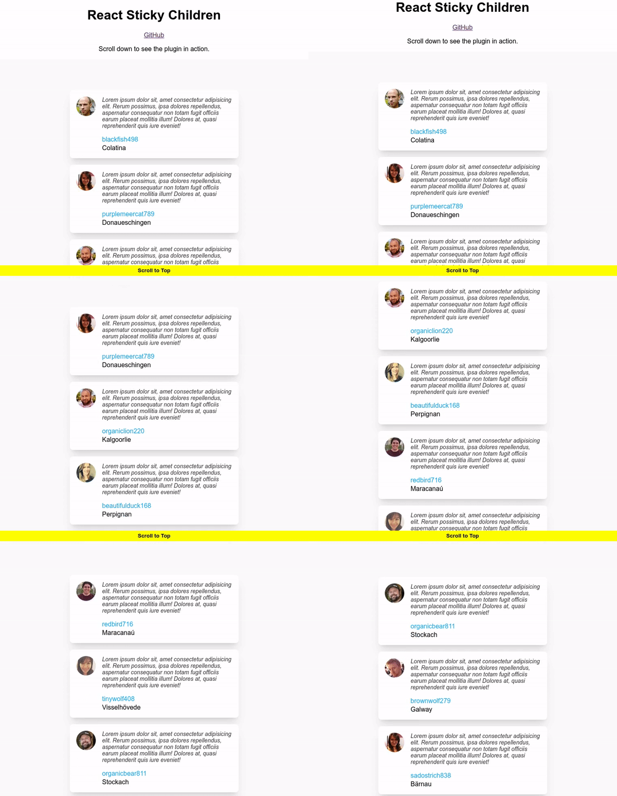
A [React](https://reactjs.org/) component that applies CSS styles as it approaches the top of the viewport.
### [Demo](https://react-sticky-children.vercel.app/) | [Playground](https://codesandbox.io/s/react-sticky-children-demo-2pgr6g)
## Installation:
```sh
npm -i -s react-sticky-children
```
## Usage
```
import { ReactStickyChildren } from 'react-sticky-children';
```
```
```
## Performance
The component aims to be lightweight and is only [1.2KB minified](https://bundlephobia.com/package/react-sticky-children). Additionally, it does not incur any additional re-renders and uses CSS styles for a jank-free user experience.
### Recommendations
- Use a `const` for your styles and place it outside of the component's render method.
- If you are animating your component, use CSS transitions on `opacity` and `transform` to take advantage of GPU compositing. [How to create high-performance CSS animations](https://web.dev/animations-guide/).
**Good**
```jsx
const initialStyle = { opacity: 0 };
const intersectingStyle = { opacity: 1 };
const MyComponent = () => (
);
```
**Bad**
```jsx
const MyComponent = () => (
);
```
## Options
| Option | Type | Description |
| ----------------- | ------------- | ----------------------------------------------------------------------------------------------------------------------------------------------------------------------------------------------------------------------------------------------------------------------------------------------- |
| initialStyle | CSSProperties | Initial style to be applied on the element when it is beneath or within the viewport. (Default: `{ opacity: 0, visibility: "hidden" }`) |
| intersectingStyle | CSSProperties | Style to be applied on the element when it intersects with the top of the viewport. (Default: `{ opacity: 1, visibility: "visible" }`) |
| root | Element | The IntersectionObserver interface's read-only `root` property identifies the Element or Document whose bounds are treated as the bounding box of the viewport for the element which is the observer's target. If the `root` is null, then the bounds of the actual document viewport are used. |
| top | number | Top margin from the root in px. (Default: `0`) |
| once | boolean | Disconnect the IntersectionObserver after one intersection. (Default: `false`) |
| className | string | CSS class attributed to be applied to the element. |
## FAQs
### Does this use the IntersectionObserver API?
Yes, beneath the hood it uses the IntersectionObserver API.
### Why would I use this component instead of the IntersectionObserver API?
This component aims to abstract some of the complexities with the IntersectionObserver API and provide a simple React component for toggling styles on components as they approach the top of the viewport.
### Can I execute JavaScript or `useEffect` hooks when the element intersects with the top of the viewport?
No. The scope of this plugin is only to toggle styles.
### Which browsers are supported?
As [IntersectionObserver](https://caniuse.com/intersectionobserver) is available on all modern browsers, `react-sticky-children` should also run on all modern browsers. Support for older browsers can be achieved by using the IntersectionObserver [polyfill](https://github.com/w3c/IntersectionObserver/tree/main/polyfill).
## Contributing
Anyone and everyone is welcome to contribute to this project and leave feedback. Please take a moment to review the [guidelines for contributing](CONTRIBUTING.md).
## License and Copyright
This software is released under the terms of the [MIT license](https://github.com/kevinfarrugia/react-sticky-children/blob/main/LICENSE).
---
_Source: https://npm.io/package/react-sticky-children · Machine-readable twin of the npm.io package page. Health data is recomputed on every publish._