# react-styled-carousel
> React styled-components carousel. No css is needed, fully configurable, SSR supported. Theming supported.
Latest version **0.5.1** (published 2019-03-13) · MIT license · 0 weekly downloads
## Install
```sh
npm install react-styled-carousel
pnpm add react-styled-carousel
yarn add react-styled-carousel
bun add react-styled-carousel
```
## Health
**Score 15/100 (F)** — status: abandoned.
Positive: no vulnerabilities.
Warnings: low downloads; no types; no esm support; pre 1.0.
Negative: abandoned; low maintenance score.
## Facts
| | |
|---|---|
| Version | 0.5.1 |
| Published | 2019-03-13 |
| First published | 2018-02-27 |
| Weekly downloads | 0 |
| License | MIT |
| TypeScript types | none |
| Module format | CommonJS |
| Dependencies | 3 |
| Unpacked size | 393.1 KB |
| Known vulnerabilities | 0 |
| Install scripts | no |
| GitHub stars | 44 |
| Author | Akhil Pentamsetti |
| Maintainers | itsmrakhil |
| Keywords | styled-components, carousel, react-carousel |
## Links
- npm: https://www.npmjs.com/package/react-styled-carousel
- Repository: https://github.com/ItsMrAkhil/react-styled-carousel
- Homepage: https://github.com/ItsMrAkhil/react-styled-carousel#readme
- Issues: https://github.com/ItsMrAkhil/react-styled-carousel/issues
- npm.io page: https://npm.io/package/react-styled-carousel
## Dependencies (3)
- [react](https://npm.io/package/react.md) ^16.2.0
- [lodash.sortby](https://npm.io/package/lodash.sortby.md) ^4.7.0
- [styled-components](https://npm.io/package/styled-components.md) ^4.1.3
## Alternatives
- [adhdev](https://npm.io/package/adhdev.md) — 11.1K weekly downloads
- [react-slide-button](https://npm.io/package/react-slide-button.md) — 310 weekly downloads
- [better](https://npm.io/package/better.md) — 42 weekly downloads
- [react-native-swipe-image](https://npm.io/package/react-native-swipe-image.md) — 22 weekly downloads
- [nl.fokkezb.pulltorefresh](https://npm.io/package/nl.fokkezb.pulltorefresh.md) — 11 weekly downloads
## Recent versions
- 0.5.1 (latest) — 2019-03-13
- 0.5.0 — 2019-03-13
- 0.4.12 — 2018-05-02
- 0.4.11 — 2018-03-29
- 0.3.11 — 2018-03-22
- 0.3.10 — 2018-03-22
- 0.3.9 — 2018-03-14
- 0.3.8 — 2018-03-14
- 0.3.7 — 2018-03-14
- 0.3.6 — 2018-03-13
- 0.3.5 — 2018-03-07
- 0.3.4 — 2018-03-07
- 0.3.3 — 2018-03-07
- 0.3.2 — 2018-03-07
- 0.3.1 — 2018-03-01
- … 3 more at https://npm.io/package/react-styled-carousel/versions
## README
# React Styled Slider
**React Styled Slider** is a react and styled component slider. It is fully configurable.
[](https://travis-ci.org/ItsMrAkhil/react-styled-carousel)
[](https://coveralls.io/github/ItsMrAkhil/react-styled-carousel?branch=coveralls)
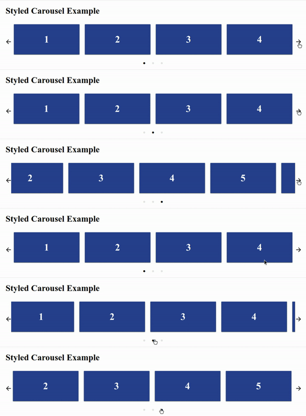
#### Features
- Mostly configurable
- Styled-Components
- No external CSS required.
- Server Side Rendering supported
> **Note:** **Server Side Rendering** works well without the styled-components collectStyles function also. But for better user experience please use **collectStyles** function from **styled-components**
#### Installation
```sh
$ npm install --save react-styled-carousel
```
#### Running example in local
```sh
$ git clone github.com/itsMrAkhil/react-styled-carousel
$ npm start
```
It'll open localhost:9000 port, where you can see live demo.
#### Example
```js
import React from 'react';
import ReactDOM from 'react-dom'
import Slider from 'react-styled-carousel';
const ExampleSlider = () => (
1
2
3
4
);
ReactDOM.render(, document.getElementById('root'));
```
#### Responsive
`react-styled-carousel` is responsive. Below is the example configuration of responsiveness.
> **Note:** If `responsive` prop is provided then, it'll override the cardsToShow prop. In other words cardsToShow will not work.
```js
import React from 'react';
import ReactDOM from 'react-dom'
import Slider from 'react-styled-carousel';
const responsive = [
{ breakPoint: 1280, cardsToShow: 4 }, // this will be applied if screen size is greater than 1280px. cardsToShow will become 4.
{ breakPoint: 760, cardsToShow: 2 },
];
const ExampleSlider = () => (
1
2
3
4
);
ReactDOM.render(, document.getElementById('root'));
```
#### Configurable Props
Props | Type | Default Value | Description
----- | ---- | ------------- | -----------
`showArrows` | `Boolean` | `true` | If `true` then only Arrows of navigation will be shown
`showDots` | `Boolean` | `true` | Show navigation or pagination dots below the slider
`infinite` | `Boolean` | `true` | Infinitely slide cards.
`Dot` | `React Node` | Default | Customized pagination button (`Active slide Dot` will get `active` as `Boolean` prop.)
`DotsWrapper` | `Styled Element` | Default | Customized wrapper for your component to change the view of dots wrapper like position, background, etc. `Note: It should be a styled ul, otherwise you may not see any Dot Components.`
`LeftArrow` | `React Node` | Default | Customized left arrow button. It'll get `disabled Boolean` prop if first Dot is active and infinite is false.
`RightArrow` | `React Node` | Default | Customized right arrow button. It'll get `disabled Boolean` prop if last Dot is active and infinite is false.
`children` | `React Node` | null | Cards are components which you want to show in the carousel
`cardsToShow` | `Number` | Children length | How many cards to be shown for a single slide.
`afterSlide` | `Function` | null | This function will be executed after every sliding is completed
`beforeSlide` | `Function` | null | This function will be executed before starting every sliding
`responsive` | `Array` | null | Use this for responsiveness [Documentation](#responsive)
`autoSlide` | `Number` or `Boolean` | `2000` | Used to make carousel auto slide for every given time interval. Or for 2000ms if the prop value is true.
`pauseOnMouseOver`| `Boolean` | `true` | Pause auto sliding on mouse over the carousel.
`hideArrowsOnNoSlides` | `Boolean` | `true` | Hide arrows if there is only one slide to show.
`margin`| `String` | `0px` | Any valid css margin value for giving margin around the slider
`padding` | `String` | `0px 20px` | Any valid css padding value for giving padding around the slider
License
----
MIT (**Free Software, Chill Yeah!**)
---
_Source: https://npm.io/package/react-styled-carousel · Machine-readable twin of the npm.io package page. Health data is recomputed on every publish._