# react-time-picker-roll

> A beautiful, smooth, and interactive time picker component for React applications with iOS-style rolling animation

Latest version **1.5.1** (published 2025-07-05) · MIT license · 0 weekly downloads

## Install

```sh
npm install react-time-picker-roll
pnpm add react-time-picker-roll
yarn add react-time-picker-roll
bun add react-time-picker-roll
```

## Health

**Score 40/100 (D)** — status: maintenance-mode.

Positive: has types; esm support; no vulnerabilities; high quality score.

Warnings: low downloads.

Negative: stale; low maintenance score.

## Facts

| | |
|---|---|
| Version | 1.5.1 |
| Published | 2025-07-05 |
| First published | 2024-07-01 |
| Weekly downloads | 0 |
| License | MIT |
| TypeScript types | bundled |
| Module format | ESM + CommonJS |
| Dependencies | 12 |
| Unpacked size | 2.4 MB |
| Known vulnerabilities | 0 |
| Install scripts | no |
| GitHub stars | 2 |
| Author | Abdelrahman Elmetwally |
| Maintainers | metwally98 |
| Keywords | react-time-picker-roll, React time picker roll, React time picker, time picker, time picker roll, time roll, React component, React time input, time selection, time input, React time widget, time selection tool, time picker component, custom time picker, time input control, React UI component, alarm time, alarm clock, iOS time picker, Android time picker, mobile time picker, digital clock, time management, time setting, clock picker, scheduler, React alarm, React clock, framer-motion, glassmorphism, interactive, smooth animations, TypeScript, responsive |

## Links

- npm: https://www.npmjs.com/package/react-time-picker-roll
- Repository: https://github.com/abdelrahmanm98/react-time-picker-roll
- Homepage: https://time-picker-demo.vercel.app
- Issues: https://github.com/abdelrahmanm98/react-time-picker-roll/issues
- npm.io page: https://npm.io/package/react-time-picker-roll

## Dependencies (12)

- [react](https://npm.io/package/react.md) ^18.3.1
- [react-dom](https://npm.io/package/react-dom.md) ^18.3.1
- [web-vitals](https://npm.io/package/web-vitals.md) ^2.1.4
- [@types/jest](https://npm.io/package/@types/jest.md) ^27.5.2
- [@types/node](https://npm.io/package/@types/node.md) ^16.18.101
- [@types/react](https://npm.io/package/@types/react.md) ^18.3.3
- [framer-motion](https://npm.io/package/framer-motion.md) ^12.23.0
- [react-scripts](https://npm.io/package/react-scripts.md) 5.0.1
- [@types/react-dom](https://npm.io/package/@types/react-dom.md) ^18.3.0
- [@testing-library/react](https://npm.io/package/@testing-library/react.md) ^13.4.0
- [@testing-library/jest-dom](https://npm.io/package/@testing-library/jest-dom.md) ^5.17.0
- [@testing-library/user-event](https://npm.io/package/@testing-library/user-event.md) ^13.5.0

## Alternatives

- [@luma.gl/experimental](https://npm.io/package/@luma.gl/experimental.md) — 77.1K weekly downloads
- [persona-harness](https://npm.io/package/persona-harness.md) — 4.7K weekly downloads
- [@tsparticles/effect-bubble](https://npm.io/package/@tsparticles/effect-bubble.md) — 4.6K weekly downloads
- [f3d](https://npm.io/package/f3d.md) — 730 weekly downloads
- [spark-html-motion](https://npm.io/package/spark-html-motion.md) — 298 weekly downloads

## Recent versions

- 1.5.1 (latest) — 2025-07-05
- 1.4.1 — 2025-07-05
- 1.3.1 — 2025-07-05
- 1.2.1 — 2025-07-05
- 1.1.1 — 2025-07-05
- 0.1.6 — 2025-07-05
- 0.1.5 — 2024-07-03
- 0.1.4 — 2024-07-03
- 0.1.3 — 2024-07-03
- 0.1.2 — 2024-07-03
- 0.1.1 — 2024-07-03
- 1.0.24 — 2024-07-03
- 1.0.23 — 2024-07-03
- 1.0.22 — 2024-07-02
- 1.0.21 — 2024-07-02
- … 19 more at https://npm.io/package/react-time-picker-roll/versions

## README

[![npm](https://img.shields.io/npm/v/react-time-picker-roll)](https://www.npmjs.com/package/react-time-picker-roll) ![downloads](https://img.shields.io/npm/dt/react-time-picker-roll?color=blue&logo=npm&logoColor=blue) ![NPM Downloads](https://img.shields.io/npm/d18m/react-time-picker-roll)

<div align="center">
  <img src="https://raw.githubusercontent.com/abdelrahmanm98/react-time-picker-roll/main/assets/Time-Picker1.png" alt="React Time Picker Roll Logo" width="200"/>
  
  # React Time Picker Roll
  
  A beautiful, smooth, and interactive time picker component for React applications with iOS-style rolling animation.
  
  [![Demo](https://img.shields.io/badge/Live%20Demo-View%20Here-blue?style=for-the-badge&logo=vercel)](https://time-picker-demo.vercel.app)

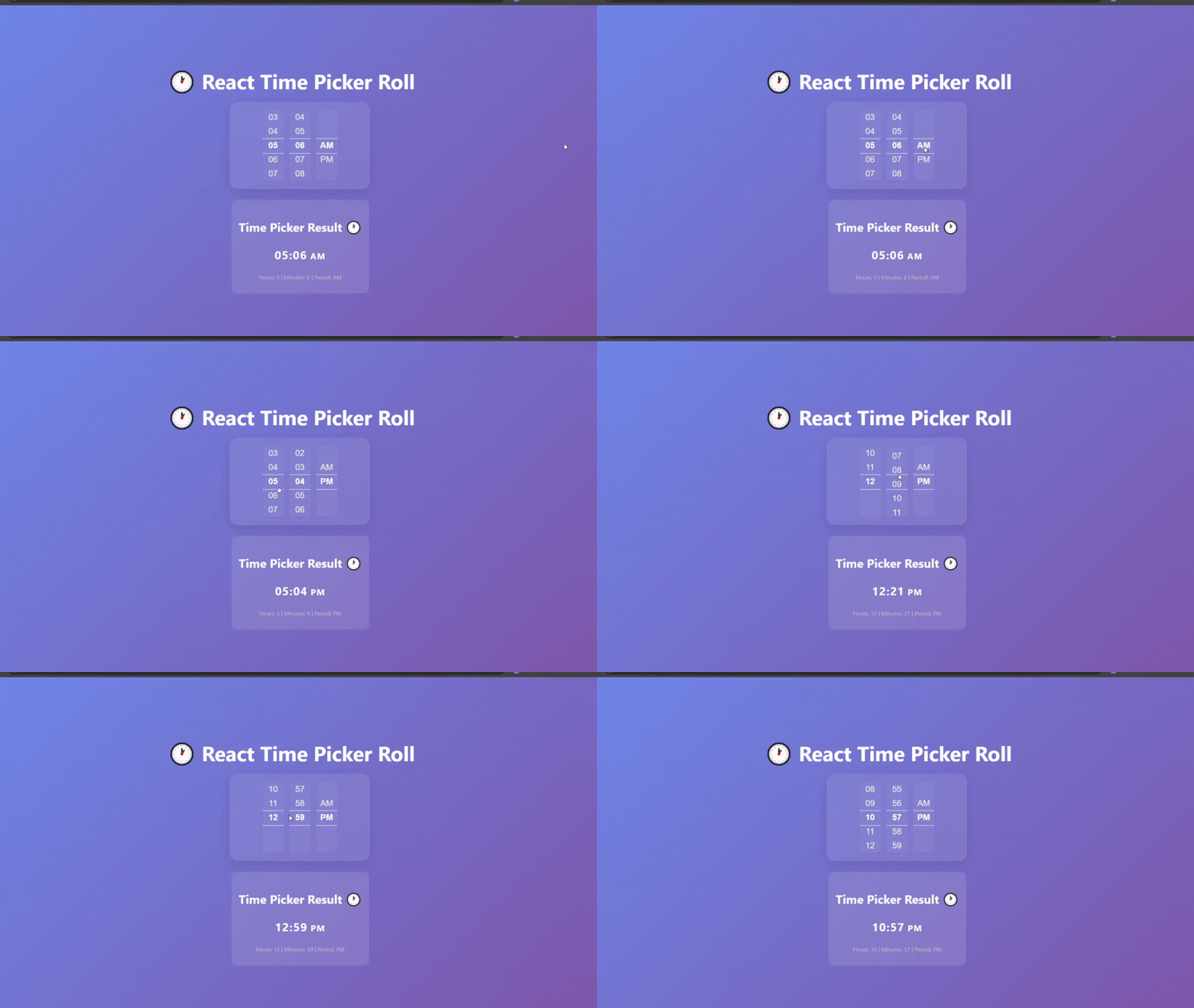
<b>Default usage (without input field):</b><br/>
<img src="https://raw.githubusercontent.com/abdelrahmanm98/react-time-picker-roll/main/assets/Time-Picker2.gif" alt="Time Picker Demo" width="350"/>

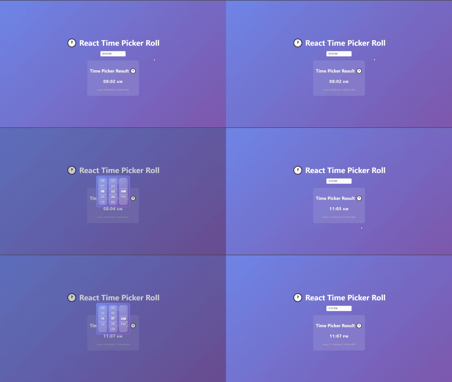
<b>With input field (asInput):</b><br/>
<img src="https://raw.githubusercontent.com/abdelrahmanm98/react-time-picker-roll/main/assets/Time-Picker2aslink2.gif" alt="Time Picker as Input Demo" width="350"/>

</div>

## ✨ Features

- 🎨 **Beautiful UI**: Modern glassmorphism design with smooth animations
- 🎯 **Interactive**: Drag to scroll, mouse wheel support, and touch-friendly
- ⚡ **Smooth Animations**: Powered by Framer Motion for fluid interactions
- 📱 **Responsive**: Works perfectly on desktop and mobile devices
- 🎪 **Customizable**: Easy to style and integrate into any design
- 🔧 **TypeScript**: Full TypeScript support with proper type definitions
- 🚀 **Lightweight**: Minimal bundle size with no heavy dependencies

---
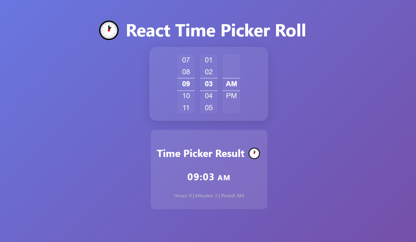

<b>Want to try or download the full purple-style demo project?</b><br/>
👉 <a href="https://github.com/abdelrahmanm98/react-time-picker-roll-demo"><b>View or Download the Demo Project on GitHub</b></a>

---

## 📦 Installation

```bash
npm install react-time-picker-roll
```

## 🚀 Quick Start

```jsx
import React, { useState } from 'react';
import { TimePickerComponent } from 'react-time-picker-roll';

const App = () => {
  const [time, setTime] = useState({ hours: 6, minutes: 0, period: 'AM' });

  return (
    <div>
      {/* Default usage */}
      <TimePickerComponent initialTime={time} onChange={setTime} />

      {/* Glassmorphism style */}
      <TimePickerComponent
        initialTime={time}
        onChange={setTime}
        variant='glass'
      />

      {/* Professional style */}
      <TimePickerComponent
        initialTime={time}
        onChange={setTime}
        variant='professional'
      />

      {/* Input field (modal picker) */}
      <TimePickerComponent initialTime={time} onChange={setTime} asInput />
    </div>
  );
};
```

> You can use the picker directly or as an input field (modal). See the GIFs above for both options.

## 📖 API Reference

### Props

| Prop          | Type                                                                 | Default                                  | Description                                                       |
| ------------- | -------------------------------------------------------------------- | ---------------------------------------- | ----------------------------------------------------------------- |
| `initialTime` | `{ hours: number; minutes: number; period: string }`                 | `{ hours: 6, minutes: 0, period: 'AM' }` | Initial time value                                                |
| `onChange`    | `(time: { hours: number; minutes: number; period: string }) => void` | -                                        | Callback function when time changes                               |
| `natural`     | `boolean`                                                            | `false`                                  | If true, removes background, shadow, and padding for a plain look |
| `variant`     | `'default' \| 'professional' \| 'glass'`                             | `'default'`                              | 'glass' for glassmorphism style, 'professional' for modern look   |
| `asInput`     | `boolean`                                                            | `false`                                  | If true, shows an input field and opens the picker in a modal     |

### Time Object Structure

```typescript
interface TimeValue {
  hours: number; // 1-12
  minutes: number; // 0-59
  period: string; // 'AM' | 'PM'
}
```

## 🎨 Customization

The component uses CSS modules for styling, but also provides global class names for easy targeting:

- `.rtp-time-picker` (main container)
- `.rtp-time-picker-column` (each column)
- `.rtp-time-item` (each time value)

You can customize the appearance by overriding these classes in your own CSS:

```css
.rtp-time-picker {
  /* Custom styles for the main container */
}

.rtp-time-picker-column {
  /* Custom styles for columns */
}

.rtp-time-item.selected {
  /* Custom styles for selected item */
}
```

## 🛠️ Development

```bash
# Install dependencies
npm install

# Start development server
npm start

# Build the library
npm run build

# Run tests
npm test
```

## 📄 License

This project is licensed under the MIT License - see the [LICENSE](LICENSE) file for details.

## 🤝 Contributing

Contributions are welcome! Please feel free to submit a Pull Request.

## 📞 Support

If you have any questions or need help, please open an issue on GitHub.

---

<div align="center">
  Made with ❤️ by <a href="https://github.com/abdelrahmanm98">Abdelrahman Elmetwally</a>
</div>

---
_Source: https://npm.io/package/react-time-picker-roll · Machine-readable twin of the npm.io package page. Health data is recomputed on every publish._