# repopup

> Easy to use as well as reusable and customizable react modals

Latest version **1.2.2** (published 2022-04-21) · MIT license · 0 weekly downloads

## Install

```sh
npm install repopup
pnpm add repopup
yarn add repopup
bun add repopup
```

## Health

**Score 30/100 (F)** — status: abandoned.

Positive: has types; esm support; no vulnerabilities; high quality score.

Warnings: low downloads.

Negative: abandoned; low maintenance score.

## Facts

| | |
|---|---|
| Version | 1.2.2 |
| Published | 2022-04-21 |
| First published | 2022-04-11 |
| Weekly downloads | 0 |
| License | MIT |
| TypeScript types | bundled |
| Module format | ESM + CommonJS |
| Dependencies | 0 |
| Unpacked size | 4.3 MB |
| Known vulnerabilities | 0 |
| Install scripts | no |
| GitHub stars | 0 |
| Author | satishnaikawadi2011 |
| Maintainers | satishnaikawadi2001 |
| Keywords | react, react-component, modal, react-modal, dialog, react-dialog, reusable, responsive, alert, react-alert, popup, react-popup, customizable |

## Links

- npm: https://www.npmjs.com/package/repopup
- Repository: https://github.com/satishnaikawadi2011/repopup
- Homepage: https://repopup-docs.vercel.app/
- Issues: https://github.com/satishnaikawadi2011/repopup/issues
- npm.io page: https://npm.io/package/repopup

## Alternatives

- [react-native-root-siblings](https://npm.io/package/react-native-root-siblings.md) — 102.9K weekly downloads
- [@praxisui/dialog](https://npm.io/package/@praxisui/dialog.md) — 2.0K weekly downloads
- [easy-toggle-state](https://npm.io/package/easy-toggle-state.md) — 350 weekly downloads
- [ngx-lightbox-evp](https://npm.io/package/ngx-lightbox-evp.md) — 19 weekly downloads
- [react-native-modal-translucent-axton](https://npm.io/package/react-native-modal-translucent-axton.md) — 4 weekly downloads

## Recent versions

- 1.2.2 (latest) — 2022-04-21
- 1.2.1 — 2022-04-17
- 1.2.0 — 2022-04-14
- 1.0.4 — 2022-04-13
- 1.0.3 — 2022-04-13
- 1.0.2 — 2022-04-13
- 1.0.1 — 2022-04-12
- 1.0.0 — 2022-04-11

## README

<p align="center">
  <a href="https://repopup-docs.vercel.app/" target="_blank">
    <img 
      src="https://res.cloudinary.com/dyfm31f1n/image/upload/v1650036003/repopup/icon-logo_mrbgeu.svg"
      alt="REPopup"
      title="REPopup"
      width="150"
    />
    <br/>
<img 
      src="https://res.cloudinary.com/dyfm31f1n/image/upload/v1650036077/repopup/text-logo_kndalr.png" align="center" width="400">
  </a>
</p>

<h1 align="center">REPopup</h1>
<p align="center">Easy to use and customizable react modals.</p>

<p align="center">
  <a href="https://www.npmjs.com/package/repopup">
    <img src="https://img.shields.io/npm/v/repopup"/>
  </a>
  <!-- <img src="https://img.shields.io/bundlephobia/min/repopup"/> -->
  <a href="https://github.com/satishnaikawadi2011/repopup/blob/main/LICENSE">
    <img src="https://img.shields.io/github/license/satishnaikawadi2011/repopup"/>
  </a>
</p>

<br/>

<p align="center">
  <a href="https://repopup-docs.vercel.app/" target="_blank">
    <img src="https://res.cloudinary.com/dyfm31f1n/image/upload/v1649741179/repopup/repopup-demo_t2ljam.png" alt="REPopup Preview" title="REPopup Preview">
  </a>
</p>

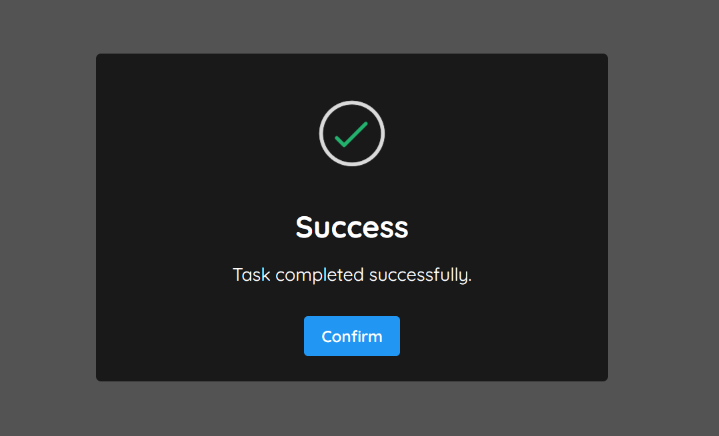
The aim of **REPopup** is to provide an all-in-one UI components related to modal and popup windows for creating apps in react. There are many great ui components made by developers all around open source. REPopup makes using modals and popups very easy by giving you a ready made as well as easily customizable kit with consistent api and look and feel.

## Features

- React modal components for easy and fast web development.
- Flexible modal positioning.
- Styled components and easy to customize.
- Works in major browsers without polyfills.
- Ready made and well designed InputDialog component.
- Alert component with five different variants.
- Supports TypeScript.
- And much more !

## Resources

- [Demo](https://repopup-docs.vercel.app/docs/usage#quick-start)
- [Documentation](https://repopup-docs.vercel.app/docs/overview)
- [Playground](https://repopup-docs.vercel.app/docs/playground/modal)
- [CodeSandbox](https://codesandbox.io/s/usage-forked-64di3c?file=/index.js)

## Installation

Install via <a href="https://www.npmjs.com/package/repopup">NPM</a>

```
npm install repopup
```

Install via <a href="https://yarnpkg.com/package/repopup">Yarn</a>

```
yarn add repopup
```

## Peer dependencies

### Install styled-components

Install via <a href="https://www.npmjs.com/package/repopup">NPM</a>


```bash
npm install styled-components
```
Install via <a href="https://yarnpkg.com/package/repopup">Yarn</a>

```bash
yarn add styled-components
```

_If you have any issues installing styled-components, check out their
installation guide
[here](https://styled-components.com/docs/basics#installation)._

## Getting Started

For complete usage, visit the <a href="https://repopup-docs.vercel.app/docs/overview">docs</a>.

> The below example demonstrates very basic and full usages of Modal component respectively.

- Initialize a open state with `boolean` value `false` and assign it as <strong>'open'</strong> prop. Now it will control wheather Modal should be open or closed.
- For `onRequestClose` prop, pass the `Function` which will set the open state to `false`

<br/>
    
### Install the REPopup and styled-components package from the NPM

```bash
npm install repopup styled-components
```

### Import the RepopupProvider and wrap your App component

```tsx
import { RepopupProvider } from 'repopup';
ReactDOM.render(
		<RepopupProvider theme="dark">
			<App />
		</RepopupProvider>,
	document.getElementById('root')
```

### Import the component and use it in your project

#### Basic Usage


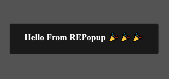
```tsx
import React, { useState } from 'react';
import { Modal } from 'repopup';

function App() {
  const [open,setOpen] = useState(false);

return (
  <div>
	<button onClick={() => setOpen(true)}>Open</button>
	<Modal 
      onRequestClose={() => setOpen(false)} 
      open={open} 
      title={`Hello From REPopup 🎉🎉🎉 `} 
     />
</div>
);
}

export default App;
```

##### Result
<p align="center">
  <a href="https://repopup-docs.vercel.app/" target="_blank">
    <img src="https://res.cloudinary.com/dyfm31f1n/image/upload/v1649758556/repopup/basic-usage_r6qslw.png" alt="REPopup Preview" title="REPopup Preview">
  </a>
</p>


#### Full Usage

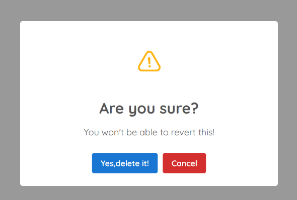
```tsx
import React, { useState } from 'react';
import { Modal } from 'repopup';

function App() {
  const [open,setOpen] = useState(false);

  return (
   <div>
	 <button onClick={() => setOpen(true)}>Open</button>
	      <Modal
				onRequestClose={() => setOpen(false)}
				open={open}
				title={`Are you sure?`}
				subtitle={`You won't be able to revert this!`}
				icon="warning"
				closeOnBackdropClick={true}
				showConfirmButton
				confirmButtonText={`Yes,delete it!`}
				onConfirm={() => console.log('Deleted successfully!!')}
				showDenyButton
				denyButtonText="Cancel"
				onDeny={() => setOpen(false)}
			/>
		</div>
  );
}

export default App;
```

##### Result
<p align="center">
  <a href="https://repopup-docs.vercel.app/" target="_blank">
    <img src="https://res.cloudinary.com/dyfm31f1n/image/upload/v1649759405/repopup/full-usage_m817tt.png" alt="REPopup Preview" title="REPopup Preview">
  </a>
</p>


## Available Props

|      Props      |          Type           |                                                            Description                                                            |   Default    |
| :-------------: | :---------------------: | :-------------------------------------------------------------------------------------------------------------------------------: | :----------: |
|   background  |        `string`         |  Popup window background (CSS background property).                                        |   `'#ffffff'`   |
|     cancelButtonText    |       `string`        |                                              Use this to change the text on the "Cancel"-button.                                               |  `Cancel`  |
|      childrenAfterDefaultContent     |        `ReactNode` \| `null`        |  Use this to place children after default content of the popup |`null`
|      childrenBeforeDefaultContent    |        `ReactNode` \| `null`        |  Use this to place children before default content of the popup |`null`
|    closeOnBackdropClick     | `boolean`  |                                                       Wheather or not to close the popup on clicking the backdrop                                                       | `true` |
|   color   | `string`  |                                                     Color for title and content                                                    | `'#000000'`  |
|   confirmButtonText  | `string` |                                                Use this to change the text on the "Confirm"-button.                                                | `'Confirm'`  |
|    customClass    | `IModalCustomClassType;` |                                                  A custom CSS class for the popup                                                  |  `{}`   |
|      denyButtonText      |        `string`         |                                               Use this to change the text on the "Deny"-button.                                             |  `'Deny'`  |
|    icon    |        `success`\| `error`\| `info`\| `warning`\| `question`\|  `null`       |                                                         varinat of a icon to be shown                                                         |     `null`     |
|      onCancel    |  `React.MouseEventHandler<HTMLButtonElement>` \| `undefined`  |                                                           Use this as a click handler for the "Cancel"-button.                                                           |     `() => {}`     |
|     onConfirm    |        `React.MouseEventHandler<HTMLButtonElement>` \| `undefined`        |                                                       Use this as a click handler for the "Confirm"-button                                                      |    `() => {}`     |
|    onDeny      |       `React.MouseEventHandler<HTMLButtonElement>` \| `undefined`        |                                                      Use this as a click handler for the "Deny"-button.                                                      |  `() => {}`     |
|     onRequestClose    |        `Function`        |                                                      Function that will be run when the modal is requested to be closed                                                       |   `required`   |
|     onSuccess     |        `React.MouseEventHandler<HTMLButtonElement>` \| `undefined`         |                                          Use this as a click handler for the "Success"-button.                                         |  `() => {}`  |
|    open   |        `boolean`        |                                                          Boolean describing if the modal should be shown or not.                                                           |   `required`    |
| placement |        `'top'`\| `'center'`	\| `'bottom'`\| `'center-start'`\| `'bottom-start'`\| `'top-start'`\| `'top-end'`\| `'bottom-end'`\| `'center-end'`        |                                           Use this to change Popup window position                                          |    `center`    |
|   showCancelButton    |        `boolean`        |                                                         If set to true, a "Cancel"-button will  be shown.                                                          |   `false`    |
|   showConfirmButton   |        `boolean`        |                                                         If set to true, a "Confirm"-button will  be shown.                                                         |   `false`    |
|   showDenyButton    |        `boolean`        |                                                        If set to true, a "Deny"-button will  be shown.                                                         |   `false`    |
|   showSuccessButton    |        `boolean`        |                                                         If set to true, a "Success"-button will  be shown.                                                        |   `false`    |
|    subtitle   |  `string`  |                                                         Used for a description for the popup.                                                         |        |
|     successButtonText     |   `string`    |                                                       Use this to change the text on the "Success"-button.                                                      |    `Ok`    |
|     title     |   `string`    |                                                     Used for the title of the popup                                                    |      |


## Support

<a href="https://www.buymeacoffee.com/satishnaikawadi" target="_blank">
  <img src="https://res.cloudinary.com/dyfm31f1n/image/upload/v1649760399/repopup/bmc-button_bridqp.png" alt="Buy Me A Coffee" style="height: 60px !important;width: 217px !important;" >
</a>

## License

**REPopup** is licensed under the [MIT License](https://github.com/satishnaikawadi2011/repopup/blob/main/LICENSE).

---
_Source: https://npm.io/package/repopup · Machine-readable twin of the npm.io package page. Health data is recomputed on every publish._