# rn-awesome-select
> A cross platform customizable modal select library for react native
Latest version **0.1.4** (published 2022-06-09) · MIT license · 0 weekly downloads
## Install
```sh
npm install rn-awesome-select
pnpm add rn-awesome-select
yarn add rn-awesome-select
bun add rn-awesome-select
```
## Health
**Score 30/100 (F)** — status: abandoned.
Positive: has types; esm support; no vulnerabilities; high quality score.
Warnings: low downloads; pre 1.0.
Negative: abandoned; low maintenance score.
## Facts
| | |
|---|---|
| Version | 0.1.4 |
| Published | 2022-06-09 |
| First published | 2021-12-20 |
| Weekly downloads | 0 |
| License | MIT |
| TypeScript types | bundled |
| Module format | ESM + CommonJS |
| Dependencies | 0 |
| Unpacked size | 43.3 KB |
| Known vulnerabilities | 0 |
| Install scripts | no |
| GitHub stars | 1 |
| Author | Mark |
| Maintainers | engr_mark |
| Keywords | react-native, ios, android, modal select, react-native select, react-native modal select, dropdown |
## Links
- npm: https://www.npmjs.com/package/rn-awesome-select
- Repository: https://github.com/developerslearnit/rn-awesome-select
- Homepage: https://github.com/developerslearnit/rn-awesome-select#readme
- Issues: https://github.com/developerslearnit/rn-awesome-select/issues
- npm.io page: https://npm.io/package/rn-awesome-select
## Alternatives
- [react-native-root-siblings](https://npm.io/package/react-native-root-siblings.md) — 102.9K weekly downloads
- [@praxisui/dialog](https://npm.io/package/@praxisui/dialog.md) — 2.0K weekly downloads
- [easy-toggle-state](https://npm.io/package/easy-toggle-state.md) — 350 weekly downloads
- [ngx-lightbox-evp](https://npm.io/package/ngx-lightbox-evp.md) — 19 weekly downloads
- [react-native-modal-translucent-axton](https://npm.io/package/react-native-modal-translucent-axton.md) — 4 weekly downloads
## Recent versions
- 0.1.4 (latest) — 2022-06-09
- 0.1.3 — 2021-12-24
- 0.1.2 — 2021-12-21
- 0.1.1 — 2021-12-20
- 0.1.0 — 2021-12-20
## README
# rn-awesome-select
A cross-platform (iOS / Android), modal select React Native component.
## Installation
```sh
npm install rn-awesome-select
```
## Screenshots
| IOS | ANDROID |
| --------------------------------------------------------------------------------------------------------------------------- | -------------------------------------------------------------------------------------------------------------------------------- |
| 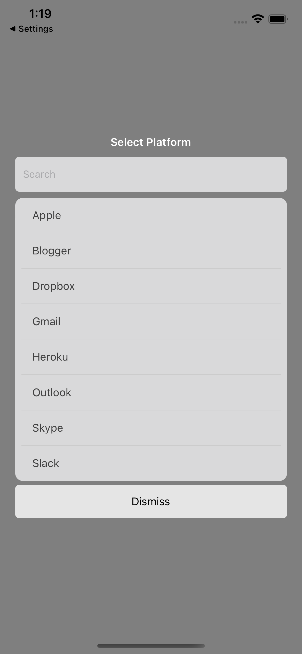 |
| 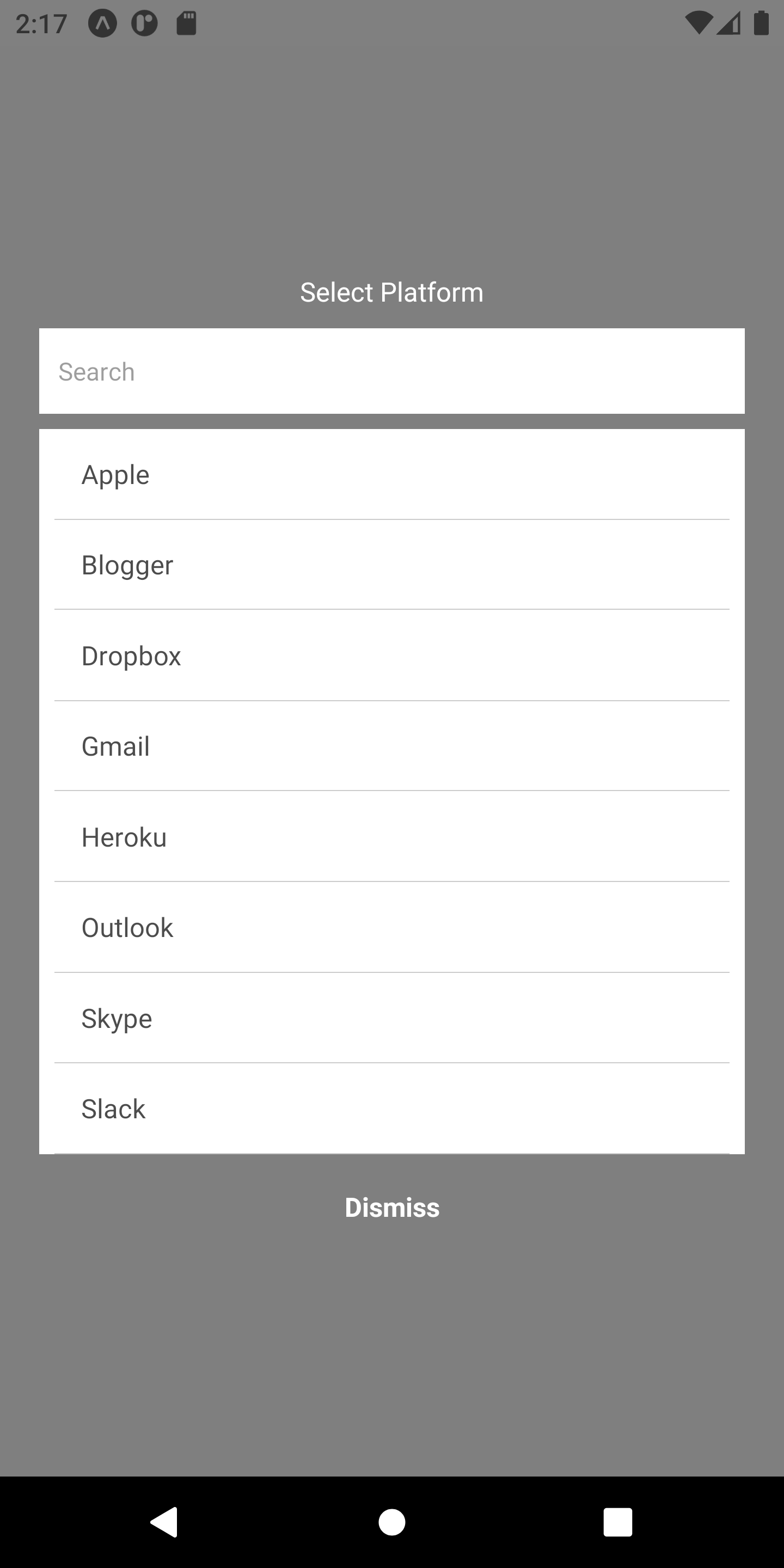 |
## Usage
```js
import RNModalSelect from 'rn-awesome-select';
// ...
const items = [
{
id: '1',
name: 'Apple',
},
{
id: '2',
name: 'Blogger',
},
{
id: '3',
name: 'Dropbox',
},
{
id: '4',
name: 'Gmail',
},
{
id: '5',
name: 'Heroku',
},
{
id: '6',
name: 'Outlook',
},
{
id: '7',
name: 'Skype',
},
{
id: '8',
name: 'Slack',
},
];
export default function App() {
const [visible, setVisible] = useState(false);
return (
setVisible(true)}
style={{
backgroundColor: 'blue',
padding: 10,
width: '60%',
alignItems: 'center',
}}
>
Select Item
{
console.log(item);
}}
onClose={() => setVisible(false)}
/>
);
}
```
## Datasource structure
The datasource (items) should be an array of objects with at least one property see example below:
```js
[
{
id: '1',
label: 'Apple',
},
];
```
If you have a different object structure than the example above, in that case, you can specify which one you want to use as the label by passing the `itemLabelFieldName="yourfieldName"`
##Props
| Prop | Description | Type | Required | Default |
| :----------------- | :----------------------------------------------------------- | :------ | :------- | :------ |
| items | Array of objects to display | Array | true | [] |
| itemLabelFieldName | The field name to be used as the label | string | false | label |
| enableSearch | Allow you to enable or disable search | boolean | false | false |
| title | The title of the select modal | string | true | null |
| showSelect | Set to true to show select modal | string | true | false |
| onItemSelected | The function that is called when an item is selected | func | true | null |
| onClose | The function that is called when the dismiss button is click | func | true | null |
## Custom styles
Custom styles allows you to change all the default style to suite your app theme.
##### overlayColor
Changes the overlay color of the modal. `Usage overlayColor='rgba(0,0,0,0.5)'`
##### containerStyle
Modifies the overall style of the select container. The default is `rgba(240,240,241,0.8)`. Accepts all view styles
##### titleTextStyle
The text style of the select title. Accepts all Text styles
##### searchInputWrapStyle
Styles of the search input wrapper. Accepts all View's styles
##### searchInputStyle
Styles of the search input. Accepts all TextInput styles
##### optionItemStyle
Styles of the select items. Accepts all TouchableOpacity styles
##### optionTextStyle
Styles of the option text. Accepts all Text styles
##### dismissButtonStyle
Styles of the dismiss button. Accepts all TouchableOpacity styles
##### dismissButtonTextStyle
Styles of the dismiss button text. Accepts all Text styles
## Contributing
See the [contributing guide](CONTRIBUTING.md) to learn how to contribute to the repository and the development workflow.
## License
MIT
---
_Source: https://npm.io/package/rn-awesome-select · Machine-readable twin of the npm.io package page. Health data is recomputed on every publish._
|
## Usage
```js
import RNModalSelect from 'rn-awesome-select';
// ...
const items = [
{
id: '1',
name: 'Apple',
},
{
id: '2',
name: 'Blogger',
},
{
id: '3',
name: 'Dropbox',
},
{
id: '4',
name: 'Gmail',
},
{
id: '5',
name: 'Heroku',
},
{
id: '6',
name: 'Outlook',
},
{
id: '7',
name: 'Skype',
},
{
id: '8',
name: 'Slack',
},
];
export default function App() {
const [visible, setVisible] = useState(false);
return (
setVisible(true)}
style={{
backgroundColor: 'blue',
padding: 10,
width: '60%',
alignItems: 'center',
}}
>
Select Item
{
console.log(item);
}}
onClose={() => setVisible(false)}
/>
);
}
```
## Datasource structure
The datasource (items) should be an array of objects with at least one property see example below:
```js
[
{
id: '1',
label: 'Apple',
},
];
```
If you have a different object structure than the example above, in that case, you can specify which one you want to use as the label by passing the `itemLabelFieldName="yourfieldName"`
##Props
| Prop | Description | Type | Required | Default |
| :----------------- | :----------------------------------------------------------- | :------ | :------- | :------ |
| items | Array of objects to display | Array | true | [] |
| itemLabelFieldName | The field name to be used as the label | string | false | label |
| enableSearch | Allow you to enable or disable search | boolean | false | false |
| title | The title of the select modal | string | true | null |
| showSelect | Set to true to show select modal | string | true | false |
| onItemSelected | The function that is called when an item is selected | func | true | null |
| onClose | The function that is called when the dismiss button is click | func | true | null |
## Custom styles
Custom styles allows you to change all the default style to suite your app theme.
##### overlayColor
Changes the overlay color of the modal. `Usage overlayColor='rgba(0,0,0,0.5)'`
##### containerStyle
Modifies the overall style of the select container. The default is `rgba(240,240,241,0.8)`. Accepts all view styles
##### titleTextStyle
The text style of the select title. Accepts all Text styles
##### searchInputWrapStyle
Styles of the search input wrapper. Accepts all View's styles
##### searchInputStyle
Styles of the search input. Accepts all TextInput styles
##### optionItemStyle
Styles of the select items. Accepts all TouchableOpacity styles
##### optionTextStyle
Styles of the option text. Accepts all Text styles
##### dismissButtonStyle
Styles of the dismiss button. Accepts all TouchableOpacity styles
##### dismissButtonTextStyle
Styles of the dismiss button text. Accepts all Text styles
## Contributing
See the [contributing guide](CONTRIBUTING.md) to learn how to contribute to the repository and the development workflow.
## License
MIT
---
_Source: https://npm.io/package/rn-awesome-select · Machine-readable twin of the npm.io package page. Health data is recomputed on every publish._