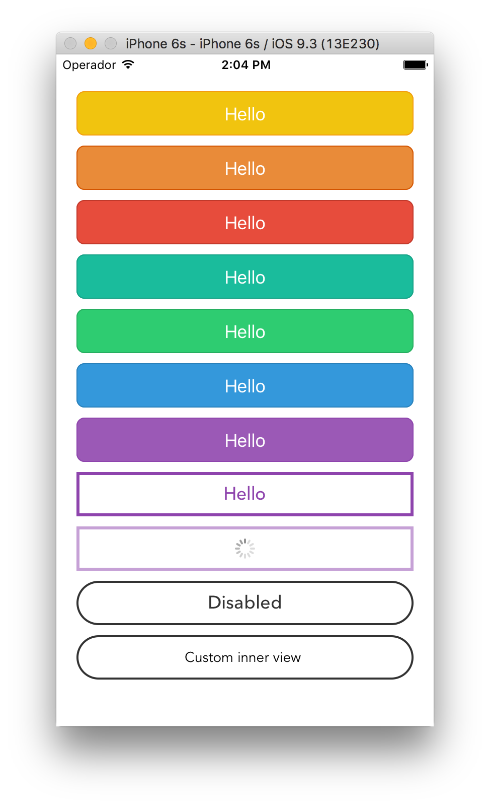
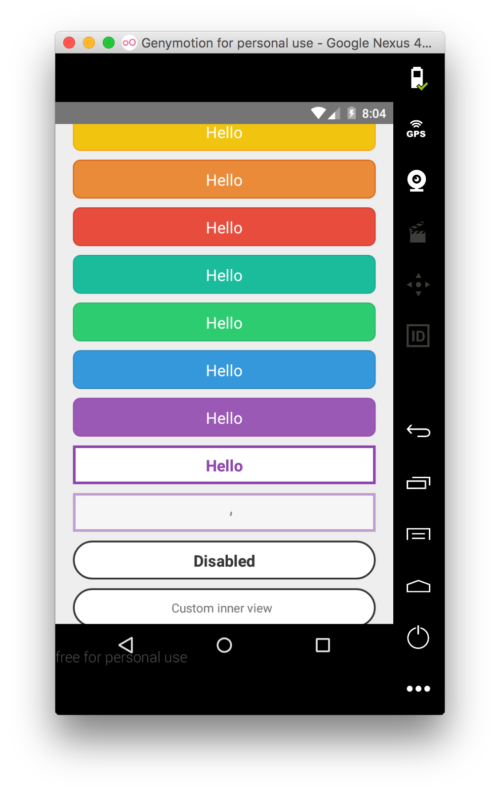
# sp-react-native-iconbutton
> A React Native button that can also have an `icon` within it through the `iconProps` property.
Latest version **2.29.1** (published 2016-07-19) · MIT license · 0 weekly downloads
## Install
```sh
npm install sp-react-native-iconbutton
pnpm add sp-react-native-iconbutton
yarn add sp-react-native-iconbutton
bun add sp-react-native-iconbutton
```
## Health
**Score 15/100 (F)** — status: abandoned.
Positive: no vulnerabilities.
Warnings: low downloads; no types; no esm support.
Negative: abandoned; low maintenance score.
## Facts
| | |
|---|---|
| Version | 2.29.1 |
| Published | 2016-07-19 |
| First published | 2016-03-24 |
| Weekly downloads | 0 |
| License | MIT |
| TypeScript types | none |
| Module format | CommonJS |
| Dependencies | 1 |
| Known vulnerabilities | 0 |
| Install scripts | no |
| GitHub stars | 6 |
| Author | Ioannis Kokkinidis |
| Maintainers | sudoplz |
| Keywords | react-native, ios, android, react-component, react, button |
## Links
- npm: https://www.npmjs.com/package/sp-react-native-iconbutton
- Repository: https://github.com/SudoPlz/sp-react-native-iconbutton
- Homepage: https://github.com/SudoPlz/sp-react-native-iconbutton#readme
- Issues: https://github.com/SudoPlz/sp-react-native-iconbutton/issues
- npm.io page: https://npm.io/package/sp-react-native-iconbutton
## Dependencies (1)
- [react-native-vector-icons](https://npm.io/package/react-native-vector-icons.md) 2.0.2
## Alternatives
- [mobx-react](https://npm.io/package/mobx-react.md) — 2.8M weekly downloads
- [rc-tree](https://npm.io/package/rc-tree.md) — 2.6M weekly downloads
- [@react-oauth/google](https://npm.io/package/@react-oauth/google.md) — 1.3M weekly downloads
- [@wagmi/connectors](https://npm.io/package/@wagmi/connectors.md) — 877.0K weekly downloads
- [vee-validate](https://npm.io/package/vee-validate.md) — 836.4K weekly downloads
## Recent versions
- 2.29.1 (latest) — 2016-07-19
- 2.29.0 — 2016-07-13
- 2.4.15 — 2016-06-03
- 2.4.14 — 2016-05-24
- 2.4.13 — 2016-05-13
- 2.4.12 — 2016-05-13
- 2.4.11 — 2016-04-19
- 2.4.10 — 2016-04-18
- 2.4.9 — 2016-04-12
- 2.4.8 — 2016-04-12
- 2.4.7 — 2016-04-12
- 2.4.6 — 2016-04-01
- 2.4.5 — 2016-04-01
- 2.4.4 — 2016-04-01
- 2.4.3 — 2016-03-24
## README
# sp-react-native-iconbutton
A React Native button that can also have an `icon` within it through the `iconProps` property.
It works both WITH an icon AND without so it can cover all your button needs.
Renders a ``TouchableOpacity`` under iOS and a ``TouchableNativeFeedback`` under Android.
## Install
``sp-react-native-iconbutton`` needs React Native 0.16 or higher.
Install the package:
```bash
$ npm i sp-react-native-iconbutton --save
```
Import the ``Button`` component:
```javascript
import Button from 'sp-react-native-iconbutton'
```
###Caution: This library is now compatible for react-native 29 and onwards.
Thats because it uses the `ActivityIndicator` which does not exist in previous versions of react-native.
If you wish to run it in previous react-native versions you will have to use the branch called `pre29`.
## Usage
Provide ``TouchableWithoutFeedback``' props to the component (including ``style``),
``textStyle``'s ``StyleSheet`` to customize the inner text and a children node
to render. You can also provide the ``isLoading`` prop that will dim the button
and disable it to prevent accidental taps.
```javascript
```
## API
| Prop | Type | Description |
|------|------|-------------|
| ``onPress`` | ``func`` | Function to execute when the ``onPress`` event is triggered. |
| ``onPressIn`` | ``func`` | Function to execute when the ``onPressIn`` event is triggered. |
| ``onPressOut`` | ``func`` | Function to execute when the ``onPressOut`` event is triggered. |
| ``onLongPress`` | ``func`` | Function to execute when the ``onLongPress`` event is triggered. |
| ``customIcon`` | ``func`` | A function that returns a custom React element that will serve as the icon. (If you use that, you should NOT use `iconProps` or `iconStyle`) |
| ``iconContainerStyle`` | ``ViewStylePropTypes`` | The StyleSheet to apply to the view that contains our icon be it a custom icon or a default (FontAwesome) icon. |
| ``iconStyle`` | ``ViewStylePropTypes`` | The StyleSheet to apply to the inner button text. (If you use that, you should NOT use `customIcon`) |
| ``iconProps`` | ``Object`` | If you pass iconProps you're actually telling the Button to create a FontAwesome icon, and you then pass those props to that icon. The properties to pass to your (FontAwesome) icon. You can pass [any prop](https://github.com/oblador/react-native-vector-icons#properties-1) that you could pass on `react-native-vector-icons` (If you use that, you should NOT use `customIcon`) |
| ``textStyle`` | ``TextStylePropTypes`` | The StyleSheet to apply to the inner button text. |
| ``disabledStyle`` | ``TextStylePropTypes`` | The StyleSheet to apply when disabled. |
| ``children`` | ``string`` | The ``string`` to render as the text button. |
| ``isLoading`` | ``bool`` | Renders an inactive state dimmed button with a spinner if ``true``. |
| ``isDisabled`` | ``bool`` | Renders an inactive state dimmed button if ``true``. |
| ``activityIndicatorColor`` | ``string`` | Sets the button of the ``ActivityIndicatorIOS`` or ``ProgressBarAndroid`` in the loading state. |
| ``background`` | ``TouchableNativeFeedback.propTypes.background`` | **Android only**. The background prop of ``TouchableNativeFeedback``. |
## License
MIT.
---
_Source: https://npm.io/package/sp-react-native-iconbutton · Machine-readable twin of the npm.io package page. Health data is recomputed on every publish._