# storybook-styled-components-theme-selector
Latest version **1.1.0** (published 2020-10-22) · MIT license · 0 weekly downloads
> **Deprecated.** This package is deprecated.
## Install
```sh
npm install storybook-styled-components-theme-selector
pnpm add storybook-styled-components-theme-selector
yarn add storybook-styled-components-theme-selector
bun add storybook-styled-components-theme-selector
```
## Health
**Score 10/100 (F)** — status: deprecated.
Negative: deprecated.
## Facts
| | |
|---|---|
| Version | 1.1.0 |
| Published | 2020-10-22 |
| First published | 2020-06-18 |
| Weekly downloads | 0 |
| License | MIT |
| TypeScript types | bundled |
| Module format | ESM + CommonJS |
| Node | >=10 |
| Dependencies | 1 |
| Unpacked size | 47.3 KB |
| Known vulnerabilities | 0 |
| Install scripts | no |
| Author | Rubén Illodo Brea |
| Maintainers | rubenillodo |
| Keywords | react, storybook, styled-components |
## Links
- npm: https://www.npmjs.com/package/storybook-styled-components-theme-selector
- Repository: https://github.com/rubenillodo/storybook-styled-components-theme-selector
- Homepage: https://github.com/rubenillodo/storybook-styled-components-theme-selector#readme
- Issues: https://github.com/rubenillodo/storybook-styled-components-theme-selector/issues
- npm.io page: https://npm.io/package/storybook-styled-components-theme-selector
## Dependencies (1)
- [query-string](https://npm.io/package/query-string.md) ^6.13.6
## Alternatives
- [mobx-react](https://npm.io/package/mobx-react.md) — 2.8M weekly downloads
- [rc-tree](https://npm.io/package/rc-tree.md) — 2.6M weekly downloads
- [@react-oauth/google](https://npm.io/package/@react-oauth/google.md) — 1.3M weekly downloads
- [@wagmi/connectors](https://npm.io/package/@wagmi/connectors.md) — 877.0K weekly downloads
- [vee-validate](https://npm.io/package/vee-validate.md) — 836.4K weekly downloads
## Recent versions
- 1.1.0 (latest) — 2020-10-22
- 1.1.0-alpha.1 (alpha) — 2020-10-22
- 1.0.0 — 2020-06-18
- 1.0.0-alpha.3 — 2020-06-18
- 1.0.0-alpha.2 — 2020-06-18
- 1.0.0-alpha.1 — 2020-06-18
## README
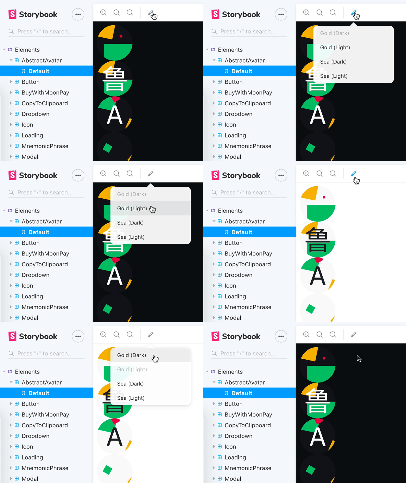
This is a Storybook addon that allows you to switch between multiple themes via the Storybook UI or
a query parameter in the URL.
## Quick start
```bash
yarn add --dev storybook-styled-components-theme-selector
```
```js
// .storybook/main.js
module.exports = {
stories: ['../**/*.stories.tsx'],
addons: [
'…',
'storybook-styled-components-theme-selector', // ⬅️
],
};
```
```js
// .storybook/preview.js
import React from 'react';
import { addDecorator } from '@storybook/react';
import { withThemesProvider } from 'storybook-styled-components-theme-selector';
import { Theme1 } from '../Theme1';
import { Theme2 } from '../Theme2';
import { SomeGlobalStyles } from '../somewhere';
const themes = [
{
...Theme1,
id: 'Theme1', // ⚠️ Your themes are expected to contain this property
name: 'Theme 1 (Light)', // Optionally display a nicer text in the Storybook UI
},
{
...Theme2,
id: 'Theme2',
name: 'Theme 2 (Dark)',
},
];
addDecorator(
withThemesProvider({
children: , // Optional
themes,
}),
);
```
## Set the theme using the URL
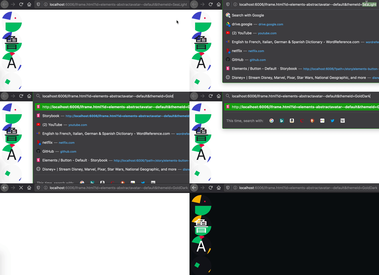
You may attach a `themeId` query parameter to the Storybook URL to set the theme for your story.
This could be particularly useful for automated testing (e.g. CSS regression testing with
screenshots) if you use Storybook's iframe URL. For example:
```
http://localhost:6006/iframe.html?id=elements-mycomponent--default&themeId=Theme1
```
```
http://localhost:6006/iframe.html?id=elements-mycomponent--default&themeId=Theme2
```
---
_Source: https://npm.io/package/storybook-styled-components-theme-selector · Machine-readable twin of the npm.io package page. Health data is recomputed on every publish._