# tnmi-components

> 常用组件封装

Latest version **1.0.1** (published 2023-03-03) · ISC license · 0 weekly downloads

## Install

```sh
npm install tnmi-components
pnpm add tnmi-components
yarn add tnmi-components
bun add tnmi-components
```

## Health

**Score 15/100 (F)** — status: abandoned.

Positive: no vulnerabilities.

Warnings: low downloads; no types; no esm support.

Negative: abandoned; low maintenance score.

## Facts

| | |
|---|---|
| Version | 1.0.1 |
| Published | 2023-03-03 |
| First published | 2023-03-03 |
| Weekly downloads | 0 |
| License | ISC |
| TypeScript types | none |
| Module format | CommonJS |
| Dependencies | 0 |
| Unpacked size | 671.6 KB |
| Known vulnerabilities | 0 |
| Install scripts | no |
| Author | syq |
| Maintainers | tnmi |

## Links

- npm: https://www.npmjs.com/package/tnmi-components
- npm.io page: https://npm.io/package/tnmi-components

## Recent versions

- 1.0.1 (latest) — 2023-03-03

## README

# zlit-components
> 常用组件封装
```javascript
yarn add zlit-components
// or
npm i -S zlit-components
// or
pnpm i -S zlit-components

// main.js全局注册
import zlit-components from 'zlit-components'
Vue.use(zlit-components)
```
[【zlTitle】页面标题组件](#zltitle------页面标题组件)

[【zlTabs】tab切换组件](#zltabs------tab切换组件)

[【zlTextarea】文本域组件](#zlTextarea------文本域组件)

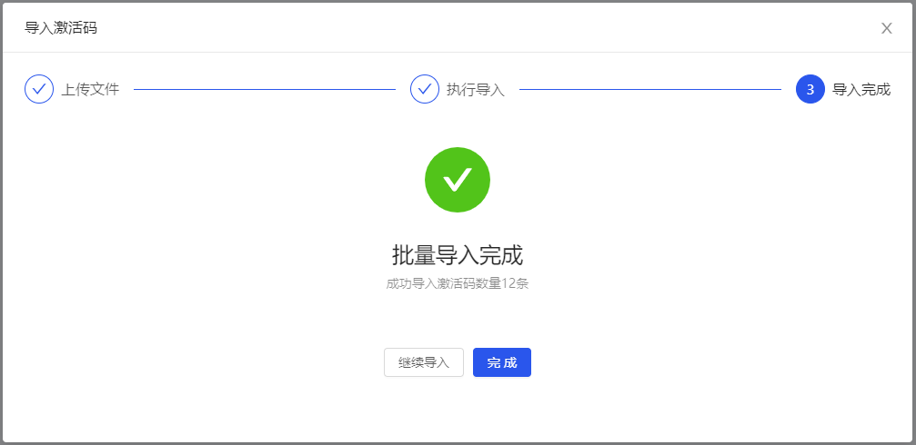
[【zlImportFile】分步骤导入excel文件组件](#zlimportfile------分步骤导入excel文件组件)

[【zlTableFilter】表格页面筛选区域组件](#zltablefilter------表格页面筛选区域组件)

[【zlTable】表格组件](#zltable------表格组件)

[【zlTableEllipsis】表格单元格文字过多鼠标浮层组件](#zltableellipsis------表格单元格文字过多鼠标浮层组件)

[【zlEmpty】空状态组件](#zlempty------空状态组件)

[【zlLoading】加载中组件](#zlloading------加载中组件)

[【zlRadioGroup】筛选单选按钮组组件](#zlradiogroup------筛选单选按钮组组件)

[【zlModal】弹框组件](#zlmodal------弹框组件)

### zlTitle------页面标题组件

##### 1. 全局注册

```javascript
// main.js
import { zlTitle } from 'zlit-components'
Vue.use(zlTitle)
```
##### 2. 组件内单独使用

```javascript
components: {
    zlTitle: () => import('zlit-components/components/zlTitle/index.vue')
}
```
##### 3. API属性

| 属性           | 说明                         | 类型    | 默认值            | 版本  |
| -------------- | ---------------------------- | ------- | ----------------- | ----- |
| top            | 标题距离浏览器窗口顶部的距离 | Number  | 56                | 1.0.0 |
| newPageTitle   | 页面标题                     | String  | $route.meta.title | 1.0.0 |
| visibleOk      | 保存按钮是否显示             | Boolean | true              | 1.0.0 |
| disabledOk     | 保存按钮是否禁用             | Boolean | false             | 1.0.0 |
| okText         | 保存按钮文字                 | String  | 保存              | 1.0.0 |
| visibleCancel  | 退出按钮是否显示             | Boolean | true              | 1.0.0 |
| disabledCancel | 退出按钮是否禁用             | Boolean | false             | 1.0.0 |
| cancelText     | 退出按钮文字                 | String  | 退出              | 1.0.0 |
| visibleDivider | 分割线是否显示               | Boolean | true              | 1.0.0 |

##### 4. 事件

| 事件名称 | 说明             | 回调参数   | 版本  |
| -------- | ---------------- | ---------- | ----- |
| ok       | 点击保存按钮回调 | function() | 1.0.0 |
| cancel   | 点击退出按钮回调 | function() | 1.0.0 |

##### 5. 插槽

| 插槽名称 | 说明                                                         | 版本  |
| -------- | ------------------------------------------------------------ | ----- |
| left     | 组件左侧位置插槽，用于扩展标题显示，一般展示简短描述语       | 1.0.0 |
| middle   | 组件中间位置插槽，一般用作扩展显示步骤条、tab切换            | 1.0.0 |
| right    | 组件右侧位置插槽，此插槽位于保存按钮的左侧，用于扩展显示额外的按钮 | 1.0.0 |

##### 6. 使用示例

> 具体操作请根据适用场景以及业务逻辑来取舍


![zlTitle](http://image.zlit.com.cn//group1/M00/00/18/rBpEPWL8sg6AQHAGAAA9u7Bvh5s454.png)

```vue
// template
<zl-title
	newPageTitle="这是标题这是标题这是标题"
    :top="80"
	:visibleOk="true"
	:disabledOk="false"
	okText="确定"
	:visibleCancel="true"
	:disabledCancel="false"
	cancelText="关闭"
	:visibleDivider="true"
	@ok="okHandler"
	@cancel="cancelHandler">
    <template #left>
		<span class="tips">这是描述</span>
    </template>
    <template #middle>
		<div class="stepsBox">
    		<a-steps
                :current="1"
                size="small">
        		<a-step title="创建" />
        		<a-step title="编辑" />
        		<a-step title="完成" />
        	</a-steps>
        </div>
    </template>
    <template #right>
		<a-button>右插槽</a-button>
		<a-button>右插槽</a-button>
    </template>
</zl-title>

// script
<script>
export default {
    data() {
        return {}
    },
    methods: {
        okHandler() {
            // do something...
        },
        cancelHandler() {
            // do something...
        }
    },
    components: {
        zlTitle: () => import('zlit-components/components/zlTitle/index.vue')
    }
}
</script>

// style
<style lang='less' scoped>
span.tips {
	color: rgba(0, 0, 0, 0.6);
	font-size: 14px;
}
div.stepsBox {
	width: 500px;
}
</style>
```

### zlTabs------tab切换组件

> 多用于列表页面数据筛选条件切换，也可用作tab选项卡切换，但推荐使用UI库tab选项卡切换组件

##### 1. 全局注册

```javascript
// main.js
import { zlTabs } from 'zlit-components'
Vue.use(zlTabs)
```

##### 2. 组件内单独使用

```javascript
components: {
    zlTabs: () => import('zlit-components/components/zlTabs/index.vue')
}
```

##### 3. API属性

| 属性       | 说明                                       | 类型   | 默认值                         | 版本  |
| ---------- | ------------------------------------------ | ------ | ------------------------------ | ----- |
| tabList    | tab列表                                    | Array  | []，详细说明[见下方](#tabList) | 1.0.0 |
| tabIndex   | 执行选中的tab下标，内部已实现v-model语法糖 | Number | 0                              | 1.0.0 |
| styleModel | 组件样式风格，目前只有两种风格。【1 \| 2】 | Number | 1                              | 1.0.0 |

* <span id="tabList">tabList 属性值说明，</span>

```javascript
// 数据格式：[{ title: 'tab名称', .... }]，其中 title 字段是必须，其余根据业务逻辑随意扩展
tabList: [
    { title: '我的题库' },
    { title: '我的收藏' },
    { title: '历史记录' }
]
```

##### 4. 事件

| 事件名称  | 说明                                                         | 回调参数                | 版本  |
| --------- | ------------------------------------------------------------ | ----------------------- | ----- |
| tabChange | 点击tab的回调函数，包含两个参数。record：当前选中的tab信息；index：当前选中tab的下标 | function(record, index) | 1.0.0 |

##### 5. 使用示例

> 具体操作请根据适用场景以及业务逻辑来取舍

###### （1）示例一

![zlTabs](http://image.zlit.com.cn//group1/M00/00/1F/rBpEPWPsUBWABCklAAAR4q2dxg0385.jpg)

###### （2）示例二

![zlTabs](http://image.zlit.com.cn//group1/M00/00/1F/rBpEPWPsT3-AHaAuAAARLrWhRVE091.jpg)

```vue
// template
<zl-tabs
	:tabList="tabList"
	v-model="tabIndex"
	@tabChange="tabChange" />

// script
<script>
export default {
    data() {
        tabIndex: 2,
        // 数据格式：[{ title: 'tab名称', .... }]，其中 title 字段是必须，其余根据业务逻辑随意扩展
      	tabList: [
        	{ title: '我的题库' },
        	{ title: '我的收藏' },
        	{ title: '历史记录' }
      	]
    },
    methods: {
        /**
         * 切换tab回调函数
         * @param record  当前选中的tab信息
         * @param index   当前选中tab的下标
         */
    	tabChange(record, index) {
            // do something...
      		console.log(record, index)
    	}
    },
    components: {
        zlTabs: () => import('zlit-components/components/zlTabs/index.vue')
    }
}
</script>
```
### zlTextarea------文本域组件

> 在UI库文本域基础上增加了字数统计功能，所有属性、事件均与UI库一致

##### 1. 全局注册

```javascript
// main.js
import { zlTextarea } from 'zlit-components'
Vue.use(zlTextarea)
```

##### 2. 组件内单独使用

```javascript
components: {
    zlTextarea: () => import('zlit-components/components/zlTextarea/index.vue')
}
```

##### 3. API属性

| 属性             | 说明                                | 类型    | 默认值 | 版本  |
| ---------------- | ----------------------------------- | ------- | ------ | ----- |
| value            | 文本域的值，内部已实现v-model语法糖 | String  | ''     | 1.0.0 |
| maxLength        | 限制文本域字符输入的最大长度        | Number  | 100    | 1.0.0 |
| visibleStatistic | 控制是否显示字数统计区域            | Boolean | true   | 1.0.0 |
| ...  | 其余API和[UI库](https://1x.antdv.com/components/input-cn/#API)相同 | ...    | ...       | ...   |

##### 4. 使用示例

> 具体操作请根据适用场景以及业务逻辑来取舍

![zlTextarea](http://image.zlit.com.cn//group1/M00/00/1F/rBpEPWPt6eOAPHEjAAALQvDK5ww561.jpg)

```vue
// template
<zl-textarea v-model="textareaValue" />

// script
<script>
export default {
    data() {
        textareaValue: undefined
    },
    components: {
        zlTextarea: () => import('zlit-components/components/zlTextarea/index.vue')
    }
}
</script>
```

### zlImportFile------分步骤导入excel文件组件

> 项目依赖 `spark-md5` 第三方包，用于文件加密，需要在项目中另行安装
>
> yarn add spark-md5
>
> npm i spark-md5 -S
>
> pnpm i spark-md5 -S

##### 1. 全局注册

```javascript
// main.js
import { zlImportFile } from 'zlit-components'
Vue.use(zlImportFile)
```

##### 2. 组件内单独使用

```javascript
components: {
    zlImportFile: () => import('zlit-components/components/zlImportFile/index.vue')
}
```

##### 3. API属性

| 属性       | 说明                                                         | 类型    | 默认值                      | 版本  |
| ---------- | ------------------------------------------------------------ | ------- | --------------------------- | ----- |
| visible    | 导入组件是否显示，内部已实现v-model语法糖                    | Boolean | false                       | 1.0.0 |
| apiProps   | 执行导入的相关接口命名，详细参数见下方。                     | Object  | 详细说明[见下方](#apiProps) | 1.0.0 |
| moduleName | 当前导入模块的名称，如”学生“、”激活码“等描述性文字，用于组件内展示 | String  | ''                          | 1.0.0 |
| tipsInfo   | 第一步操作提示信息，存在默认值                               | Object  | 详细说明[见下方](#tipsInfo) | 1.0.0 |

* <span id="apiProps">apiProps属性值说明，以下为默认值</span>

```javascript
{
    apiModuleName: undefined, // api接口文件名
    doImportCheckName: undefined, // 执行导入检查数据的方法名
    doImportName: undefined, // 执行导入的方法名
    cancelImportName: undefined, // 取消导入的方法名，若后台没有提供此方法，可不传
    downloadName: undefined // 下载模板的方法名
}
```

* <span id="tipsInfo">tipsInfo属性值说明，以下为默认值</span>

```javascript
{
    downloadTips: '请按照数据模板的格式准备导入数据，模板中的表头名称不可更改，表头行不能删除，单次导入的数据不超过10MB',
    uploadTips: '文件后缀名必须为xls或xlsx(即Excel格式)，文件大小不得大于10MB'
}
```

##### 4. 事件

| 事件名称 | 说明                                                         | 回调参数   | 版本  |
| -------- | ------------------------------------------------------------ | ---------- | ----- |
| finished | 导入文件完成后的回调函数，可以在此回调中执行更新数据列表等操作。 | function() | 1.0.0 |

##### 5. 使用示例

> 具体操作请根据适用场景以及业务逻辑来取舍
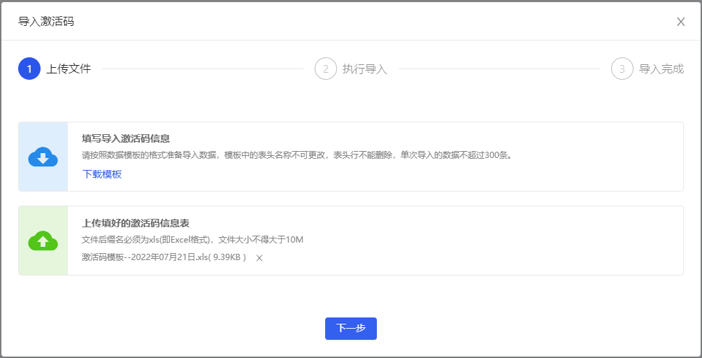

![zlImportFile_1](http://image.zlit.com.cn//group1/M00/00/18/rBpEPWL8sg2ARNR9AABYQhkV00o452.png)
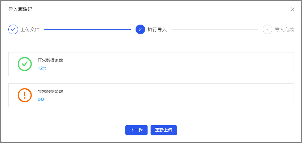
![zlImportFile_2_success](http://image.zlit.com.cn//group1/M00/00/18/rBpEPWL8sg2AL7WVAAA4cNrbYWQ553.png)
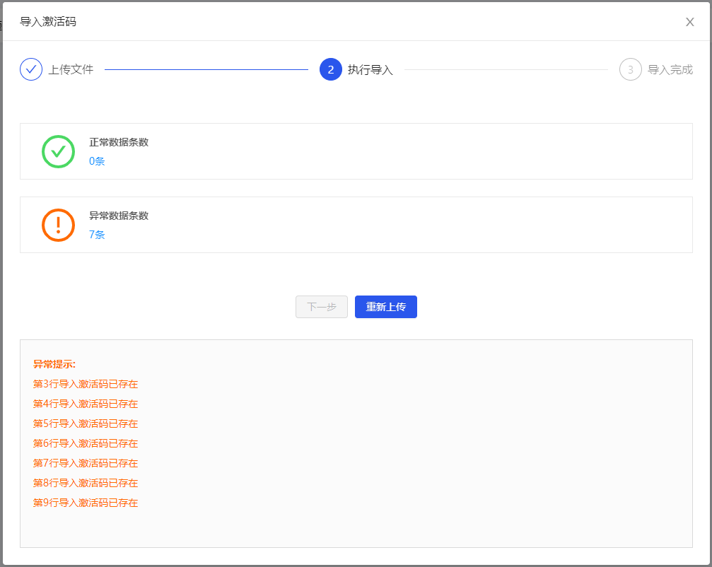
![zlImportFile_2_fail](http://image.zlit.com.cn//group1/M00/00/18/rBpEPWL8sg2AYadCAABkwiVGIG8300.png)
![zlImportFile_3](http://image.zlit.com.cn//group1/M00/00/18/rBpEPWL8sg2AVgiyAAA8o-Upkhw594.png)

```vue
// template
<a-button
	type="primary"
    @click="visibleImport = true">
    导入激活码
</a-button>
<zl-import-file
    :apiProps="{
		apiModuleName: 'mmipsSystemSetApi',
        doImportCheckName: 'importCheck',
        doImportName: 'import',
        cancelImportName: 'cancelImport',
        downloadName: 'downImportTemplate'
	}"
    moduleName="激活码"
    v-model="visibleImport"
    @finished="finished" />

// script
<script>
export default {
    data() {
        visibleImport: false
    },
    methods: {
        finished() {
        	// do something...
        }
    },
    components: {
        zlImportFile: () => import('zlit-components/components/zlImportFile/index.vue')
    }
}
</script>
```

### zlTableFilter------表格页面筛选区域组件

##### 1. 全局注册

```javascript
// main.js
import { zlTableFilter } from 'zlit-components'
Vue.use(zlTableFilter)
```

##### 2. 组件内单独使用

```javascript
components: {
    zlTableFilter: () => import('zlit-components/components/zlTableFilter/index.vue')
}
```

##### 3. API属性

| 属性                  | 说明                                                         | 类型    | 默认值 | 版本  |
| --------------------- | ------------------------------------------------------------ | ------- | ------ | ----- |
| visibleFilter         | 控制表单区域是否显示                                         | Boolean | true   | 1.0.0 |
| visibleTableOperation | 控制【表格类型】页面按钮操作区是否显示，显示在组件左侧 | Boolean | true | 1.0.0 |
| visibleAdd            | 控制添加按钮是否显示                                         | Boolean | true   | 1.0.0 |
| addText               | 添加按钮的文字描述                                           | String  | 添加   | 1.0.0 |
| visibleDelete         | 控制删除按钮是否显示                                         | Boolean | true   | 1.0.0 |
| deleteText            | 删除按钮的文字描述                                           | String  | 删除   | 1.0.0 |
| selected      | 表格中复选框选中的数据，用于处理是否需要显示批量操作按钮，仅限表格页面布局使用 | Array   | 详细说明[见下方](#selected) | 1.0.0 |
| visibleCardOperation | 控制【卡片类型】页面按钮操作区是否显示，显示在组件右侧 | Boolean | false  | 1.0.0 |
| visibleCardBatchSwitch | 控制卡片类型页面批量操作【切换按钮】是否显示<br />前提条件 `visibleCardOperation` 的值必须为true | Boolean | true | 1.0.0 |
| visibleListSwitch | 控制表格布局、卡片列表布局的【切换按钮】是否显示<br />前提条件 `visibleCardOperation` 的值必须为true | Boolean | true | 1.0.0 |
| orderList | 表格或列表数据排序切换菜单的数据 | Array | 详细说明[见下方](#orderList) | 1.0.0 |

* <span id="selected">selected属性值说明</span>

```javascript
// 一般传入的值为选中数据的id集合
[1, 2, 3, ...]
```

* <span id="orderList">orderList属性值说明，以下为默认值</span>

```javascript
// title、value字段为必须，其余根据业务路基随意扩展
[
    { title: '最近更新', value: 1 },
    { title: '最早更新', value: 2 },
    { title: '名称A-Z', value: 3 }
]
```

##### 4. 事件

| 事件名称        | 说明                                                         | 回调参数         | 版本  |
| --------------- | ------------------------------------------------------------ | ---------------- | ----- |
| resetFilterForm | 重置按钮点击事件                                             | function()       | 1.0.0 |
| add             | 添加按钮点击事件                                             | function()       | 1.0.0 |
| del             | 删除按钮点击事件                                             | function()       | 1.0.0 |
| openBatch       | 卡片类型页面：批量操作按钮点击事件                           | function()       | 1.0.0 |
| closeBatch      | 卡片类型页面：取消批量操作按钮点击事件                       | function()       | 1.0.0 |
| switchLayout    | 切换表格、卡片页面布局按钮的回调，参数为当前切换布局的类型值 | function(type)   | 1.0.0 |
| selectAll       | 全选按钮点击事件，参数为checkbox的事件对象                   | function(e)      | 1.0.0 |
| switchSort      | 切换排序方式的回调，参数为当前切换排序的值                   | function(record) | 1.0.0 |

##### 5. 插槽

| 插槽名称            | 说明                                               | 版本  |
| ------------------- | -------------------------------------------------- | ----- |
| filterFormModelItem | 组件筛选区域的插槽，用于接收表单DOM                | 1.0.0 |
| nonBatchOperation   | 组件非批量操作按钮区域的插槽，【表格布局页面】     | 1.0.0 |
| batchOperation      | 组件批量操作按钮区域的插槽，【表格布局页面】       | 1.0.0 |
| cardBatchOperation  | 组件批量操作按钮区域的插槽，【卡片式列表布局页面】 | 1.0.0 |

##### 6. 使用示例

> 具体操作请根据适用场景以及业务逻辑来取舍
>
> 以下data、methods中声明的变量或方法仅为展示示例使用，切勿直接复制使用，请根据实际场景对变量、方法等进行规范命名。

###### （1）示例一

> 表格布局页面，显示筛选、重置、添加、删除、批量操作。

![zlTableFilter_1](http://image.zlit.com.cn//group1/M00/00/18/rBpEPWL8sg2AUQlGAAAdqalfOC4065.png)

```vue
// template，部分属性采用了组件的默认值
<zl-table-filter
	addText="添加学生"
    deleteText="移除"
    :selected="selected"
    @resetFilterForm="resetFilterForm"
    @add="add"
	@del="del">
    <template #filterFormModelItem>
		<a-form-model-item label="学生名称">
            <a-input-search
                style="width: 200px"
                placeholder="请输入学生名称"
                allowClear />
        </a-form-model-item>
    </template>
    <template #nonBatchOperation>
		<a-button
			type="primary"
            ghost>
            扩展非批量操作按钮
        </a-button>
    </template>
    <template #batchOperation>
		<a-button
            type="primary"
            ghost>
            扩展批量操作按钮
        </a-button>
    </template>
</zl-table-filter>

// script
<script>
export default {
    data() {
        return {
          // 以下表示表格选中的2条数据，当数组长度为0时，批量操作按钮将会隐藏
          selected: [1, 2]
        }
	},
  	methods: {
        // 重置按钮点击事件
        resetFilterForm() {
          	console.log('点击重置')
        },
        // 添加按钮点击事件
        add() {
          	console.log('点击添加')
        },
        // 删除按钮点击事件
        del() {
          	console.log('点击删除')
        }
  	},
  	components: {
    	zlTableFilter: () => import('zlit-components/components/zlTableFilter/index.vue')
  	}
}
</script>
```

###### （2）示例二

> 使用 `visibleCardOperation` 属性设置显示表格、卡片布局切换按钮

![zlTableFilter_2](http://image.zlit.com.cn//group1/M00/00/18/rBpEPWL8sg2AMGBMAAAcSppGRL8301.png)

![zlTableFilter_3](http://image.zlit.com.cn//group1/M00/00/18/rBpEPWL8sg2ALI_5AAAfYgnJwus508.png)

```vue
// template，部分属性采用了组件的默认值
<zl-table-filter
	:visibleCardOperation="true"
    @resetFilterForm="resetFilterForm"
    @add="add"
    @del="del"
    @openBatch="openBatch"
    @closeBatch="closeBatch"
    @switchLayout="switchLayout"
    @selectAll="selectAll"
    @switchSort="switchSort">
    <template #filterFormModelItem>
		<a-form-model-item label="学生名称">
			<a-input-search
				style="width: 200px"
            	placeholder="请输入学生名称"
            	allowClear />
        </a-form-model-item>
	</template>
	<template #cardBatchOperation>
        <a-button
            type="primary"
            ghost>
            扩展按钮1
        </a-button>
        <a-button
            type="primary"
            ghost>
            扩展按钮2
        </a-button>
    </template>
</zl-table-filter>

// script
<script>
    export default {
    data() {
        return {}
	},
  	methods: {
        // 重置按钮点击事件
        resetFilterForm() {
          	console.log('点击重置')
        },
        // 添加按钮点击事件
        add() {
          	console.log('点击添加')
        },
        // 删除按钮点击事件
        del() {
          	console.log('点击删除')
        },
        // 批量操作按钮点击事件
        openBatch() {
          	console.log('点击批量操作')
        },
        // 取消按钮点击事件
        closeBatch() {
          	console.log('点击取消')
        },
        // 切换页面布局事件
        switchLayout(type) {
          	console.log(`切换页面布局为：${type}方式`)
        },
        // 全选按钮点击事件
        selectAll(e) {
          	console.log('点击全选', e)
        },
        // 切换排序事件
        switchSort(record) {
          	console.log('切换排序', record)
        }
  	},
  	components: {
    	zlTableFilter: () => import('zlit-components/components/zlTableFilter/index.vue')
  	}
}
</script>
```

###### （3）示例三

> 使用 `visibleCardBatchSwitch` 属性设置隐藏卡片式列表批量操作按钮

![zlTableFilter_4](http://image.zlit.com.cn//group1/M00/00/18/rBpEPWL8sg2AH07FAAAY5Owf1EA852.png)

```vue
// template，部分属性采用了组件的默认值
<zl-table-filter
	:visibleCardOperation="true"
    :visibleCardBatchSwitch="false"
    @resetFilterForm="resetFilterForm"
    @add="add"
    @del="del"
    @switchLayout="switchLayout"
    @switchSort="switchSort">
    <template #filterFormModelItem>
		<a-form-model-item label="学生名称">
			<a-input-search
				style="width: 200px"
            	placeholder="请输入学生名称"
            	allowClear />
        </a-form-model-item>
	</template>
</zl-table-filter>

// script
<script>
    export default {
    data() {
        return {}
	},
  	methods: {
        // 重置按钮点击事件
        resetFilterForm() {
          	console.log('点击重置')
        },
        // 添加按钮点击事件
        add() {
          	console.log('点击添加')
        },
        // 删除按钮点击事件
        del() {
          	console.log('点击删除')
        },
        // 切换页面布局事件
        switchLayout(type) {
          	console.log(`切换页面布局为：${type}方式`)
        },
        // 切换排序事件
        switchSort(record) {
          	console.log(`切换排序`, record)
        }
  	},
  	components: {
    	zlTableFilter: () => import('zlit-components/components/zlTableFilter/index.vue')
  	}
}
</script>
```

###### （4）示例四

> 使用 `visibleListSwitch` 属性设置隐藏表格、卡片列表布局切换按钮

![zlTableFilter_5](http://image.zlit.com.cn//group1/M00/00/18/rBpEPWL8sg2AAmZ7AAAY8BGTvCI798.png)

```vue
// template，部分属性采用了组件的默认值
<zl-table-filter
	:visibleCardOperation="true"
    :visibleListSwitch="false"
    @resetFilterForm="resetFilterForm"
    @add="add"
    @del="del"
    @openBatch="openBatch"
    @closeBatch="closeBatch"
    @selectAll="selectAll"
    @switchSort="switchSort">
    <template #filterFormModelItem>
		<a-form-model-item label="学生名称">
			<a-input-search
				style="width: 200px"
            	placeholder="请输入学生名称"
            	allowClear />
        </a-form-model-item>
	</template>
</zl-table-filter>

// script
// script
<script>
    export default {
    data() {
        return {}
	},
  	methods: {
        // 重置按钮点击事件
        resetFilterForm() {
          	console.log('点击重置')
        },
        // 添加按钮点击事件
        add() {
          	console.log('点击添加')
        },
        // 删除按钮点击事件
        del() {
          	console.log('点击删除')
        },
        // 批量操作按钮点击事件
        openBatch() {
          	console.log('点击批量操作')
        },
        // 取消按钮点击事件
        closeBatch() {
          	console.log('点击取消')
        },
        // 全选按钮点击事件
        selectAll(e) {
          	console.log('点击全选', e)
        },
        // 切换排序事件
        switchSort(record) {
          	console.log(`切换排序`, record)
        }
  	},
  	components: {
    	zlTableFilter: () => import('zlit-components/components/zlTableFilter/index.vue')
  	}
}
</script>
```

###### （5）示例五

> 隐藏筛选区，多用于配合其他筛选布局

![zlTableFilter_6](http://image.zlit.com.cn//group1/M00/00/18/rBpEPWL8sg2AQufYAAAO_vqMQCQ685.png)

```vue
// template，部分属性采用了组件的默认值
<zl-table-filter
	:visibleFilter="false"
    :visibleCardOperation="true"
    @add="add"
    @del="del"
    @openBatch="openBatch"
    @closeBatch="closeBatch"
    @switchLayout="switchLayout"
    @selectAll="selectAll"
    @switchSort="switchSort"></zl-table-filter>

// script
<script>
    export default {
    data() {
        return {}
	},
  	methods: {
        // 添加按钮点击事件
        add() {
          	console.log('点击添加')
        },
        // 删除按钮点击事件
        del() {
          	console.log('点击删除')
        },
        // 批量操作按钮点击事件
        openBatch() {
          	console.log('点击批量操作')
        },
        // 取消按钮点击事件
        closeBatch() {
          	console.log('点击取消')
        },
        // 切换页面布局事件
        switchLayout(type) {
          	console.log(`切换页面布局为：${type}方式`)
        },
        // 全选按钮点击事件
        selectAll(e) {
          	console.log('点击全选', e)
        },
        // 切换排序事件
        switchSort(record) {
          	console.log(`切换排序`, record)
        }
  	},
  	components: {
    	zlTableFilter: () => import('zlit-components/components/zlTableFilter/index.vue')
  	}
}
</script>
```

### zlTable------表格组件

> 基于UI库表格组件的二次封装，包括部分默认值、表格文字超出鼠标显示浮层处理等，需要配合 `tableMixins.js` 使用。

##### 1. 全局注册

```javascript
// main.js
import { zlTable } from 'zlit-components'
Vue.use(zlTable)
```

##### 2. 组件内单独使用

```javascript
components: {
    zlTable: () => import('zlit-components/components/zlTable/index.vue')
}
```

##### 3. API属性

| 属性            | 说明                                                         | 类型               | 默认值   | 版本  |
| --------------- | ------------------------------------------------------------ | ------------------ | -------- | ----- |
| rowKey          | 表格行 key 的取值                                            | String \| Function | id       | 1.0.0 |
| columns         | 表格列配置项，和[UI库](https://1x.antdv.com/components/table-cn/#Column)相同，新增`isHtml`属性，详细说明[见下方](#tableColumns) | Array              | []       | 1.0.0 |
| selectedRowKeys | 表格选中的数据keys，内部已实现v-model语法糖                  | Array              | []       | 1.0.0 |
| nonSelect       | 是否关闭表格选择                                             | Boolean            | false    | 1.0.0 |
| tableType       | 表格选择类型，单选或多选，`checkbox` `radio` | String         | checkbox     | 1.0.0 |
| ...             | 其余API和[UI库](https://1x.antdv.com/components/table-cn/#API)相同 | ...                | ...      | ...   |

* <span id="tableColumns">columns新增属性值`isHtml`说明</span>

> 使用 `ellipsis` `isHtml` 前提必须存在 `scopedSlots` 属性，内部借助了UI库表格插槽渲染
>
> `ellipsis`：设置为true时，表格文字长度不够展示时，显示气泡浮层展示全部，覆盖了UI库默认的样式
>
> `isHtml`：设置为true时，内容将以innerHTML形式渲染

```javascript
// 所有配置项内容与UI库保持一致
const tableColumns = [
    { title: '课程名称', dataIndex: 'title', width: 160 },
    {
        title: '详细内容',
        dataIndex: 'content',
        width: 220,
        scopedSlots: { customRender: 'content' },
        ellipsis: true,
        isHtml: true
    },
    ...
    { title: '操作', dataIndex: 'operation', width: 160, scopedSlots: { customRender: 'operation' } }
]
```

##### 4. 事件

| 事件名称 | 说明                       | 回调参数                              | 版本  |
| -------- | -------------------------- | ------------------------------------- | ----- |
| change   | 分页、排序、筛选变化时触发 | function(pagination, filters, sorter) | 1.0.0 |

##### 5. 插槽

> 表格插槽为根据列配置项动态配置的，唯一不同点是，组件内部封装使用了插槽props，所以使用时需要对象解构，与UI库不同。详情见使用示例。

##### 6. 使用示例

> 具体操作请根据适用场景以及业务逻辑来取舍

###### （1）示例一

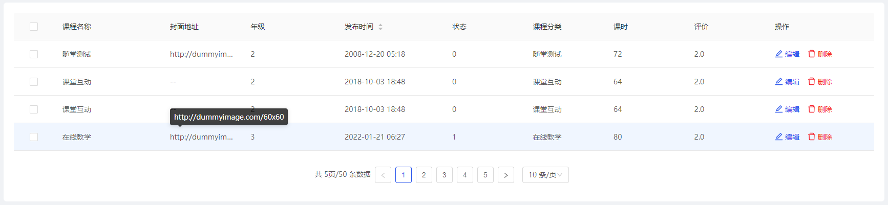
> 配置列内容超出显示鼠标浮层，在列配置项中设置 `isHtml` `ellipsis` `scopedSlots` 实现内容以innerHTML渲染，且超出显示文字样式统一化

![zlTable_1](http://image.zlit.com.cn//group1/M00/00/18/rBpEPWL8sg2AAiHXAAB5FVnjjHQ233.png)

```vue
// template
<zl-table
	:loading="tableLoading"
	:pagination="tablePagination"
	:dataSource="tableDataSource"
	:columns="tableColumns"
	v-model="selectedRowId"
    @change="
        (pagination, filters, sorter) => {
            handleTableChange(pagination, sorter)
        }
    ">
    <!-- 使用解构获取数据，存在3个值，text,record,index -->
    <template #operation="{ record }">
		<a-space :size="16">
			<span
				class="ctrl-iconfont-primary"
          		@click="showEditModal(record)">
       		 	<a-icon type="edit"/>编辑
        	</span>
    		<a-popconfirm
				placement="topRight"
                title="删除后不可恢复，是否确认删除？"
                @confirm="singleDel(record)"
                okType="danger"
                okText="删除">
        		<span class="ctrl-iconfont-danger">
            		<a-icon type="delete"/>删除
       			</span>
        	</a-popconfirm>
		</a-space>
	</template>
</zl-table>

// script 仅为示例数据
<script>
// 表格常用混入，内置部分变量、方法等
import tableMixins from '@/Mixins/tableMixins'
const tableColumns = [
    { title: '课程名称', dataIndex: 'title', width: 160 },
  	{
        title: '封面地址',
        dataIndex: 'previewUrl',
        width: 120,
        scopedSlots: { customRender: 'previewUrl' },
        ellipsis: true,
        isHtml: true
    },
  	{ title: '年级', dataIndex: 'grade', width: 140 },
  	{ title: '发布时间', dataIndex: 'publishTime', width: 160, sorter: true, field: 'F_publishTime' },
  	{ title: '状态', dataIndex: 'state', width: 120 },
  	{ title: '课程分类', dataIndex: 'curricularTaxonomy', width: 120 },
  	{ title: '课时', dataIndex: 'classHour', width: 120 },
  	{ title: '评价', dataIndex: 'evaluate', width: 120 },
  	{ title: '操作', dataIndex: 'operation', width: 160, scopedSlots: { customRender: 'operation' } }
]
export default {
    mixins: [tableMixins],
    data() {
        return {
            tableColumns
        }
    },
    methods: {
        getList() {
            this.CRUDPublic.doSelect({
                apiModulesName: 'testApi',
                apiMethodName: 'getList',
                ...
            }).then(res => {
                // 数据二次处理
                console.log(res)
            }).catch(err => {
                console.log(err)
            })
        },
        showEditModal(record) {
         	console.log(record)
        },
        singleDel(record) {
          	console.log(record)
        }
    },
    components: {
        zlTable: () => import('zlit-components/components/zlTable/index.vue')
    }
}
</script>
```

###### （2）示例二

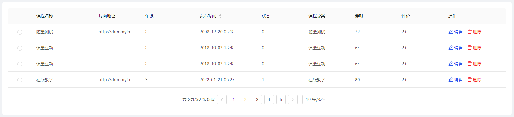
> 设置`tableType='radio'` 启用行单选模式

![zlTable_2](http://image.zlit.com.cn//group1/M00/00/18/rBpEPWL8sg2AJs1TAABtSrAici8356.png)

```vue
// template
<zl-table
    tableType="radio"
	:loading="tableLoading"
	:pagination="tablePagination"
	:dataSource="tableDataSource"
	:columns="tableColumns"
	v-model="selectedRowId"
    @change="
        (pagination, filters, sorter) => {
            handleTableChange(pagination, sorter)
        }
    ">
    <!-- 同示例一 -->
</zl-table>
// script 同示例一
```

###### （3）示例三

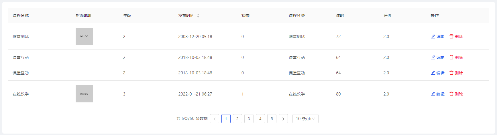
> 设置 `nonSelect='true'`，关闭表格单选、多选操作，使用列配置项中的插槽 `scopedSlots: { customRender: 'previewUrl' }` 自定义渲染数据展示

![zlTable_3](http://image.zlit.com.cn//group1/M00/00/18/rBpEPWL8sg2AKPbpAABjjyQV3E8031.png)

```vue
// template
<zl-table
    :nonSelect="true"
	:loading="tableLoading"
	:pagination="tablePagination"
	:dataSource="tableDataSource"
	:columns="tableColumns"
    @change="
        (pagination, filters, sorter) => {
            handleTableChange(pagination, sorter)
        }
    ">
    <!-- 会覆盖组件内部的默认渲染，完全自定义 -->
    <template #previewUrl="{ record }">
		<img
     		:src="record.previewUrl"
     		alt="" />
    </template>
</zl-table>
// script 同示例一
```

### zlTableEllipsis------表格单元格文字过多鼠标浮层组件

> 用于表格中单元格文字内容过多时，鼠标移入单元格显示的浮层提示组件，此效果为UI统一指定

##### 1. 全局注册

```javascript
// main.js
import { zlTableEllipsis } from 'zlit-components'
Vue.use(zlTableEllipsis)
```

##### 2. 组件内单独使用

```javascript
components: {
    zlTableEllipsis: () => import('zlit-components/components/zlTableEllipsis/index.vue')
}
```

##### 3. API属性

| 属性   | 说明                    | 类型    | 默认值 | 版本  |
| ------ | ----------------------- | ------- | ------ | ----- |
| text   | 文本内容                | String  | ''     | 1.0.0 |
| isHtml | 是否以innerHTML渲染文本 | Boolean | false  | 1.0.0 |

##### 4. 使用示例

> 具体操作请根据适用场景以及业务逻辑来取舍
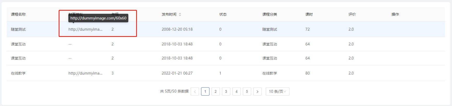
>
> 使用UI库表格组件，实现文字过多显示处理
>
> 注：【zlTable】组件内部已实现文字过多展示的处理，只需要配置对应列配置项即可。

![zlTableEllipsis](http://image.zlit.com.cn//group1/M00/00/18/rBpEPWL8sg2AMyQ0AABjdIKvt0I174.png)

```vue
//template
<a-table
    rowKey="id"
    :loading="tableLoading"
    :pagination="tablePagination"
    :dataSource="tableDataSource"
    :columns="tableColumns">
    <template #previewUrl="text">
	<zl-table-ellipsis
		:text="text"
		:isHtml="true" />
    </template>
</a-table>

// script 仅为示例数据
<script>
// 表格常用混入，内置部分变量、方法等
import tableMixins from '@/Mixins/tableMixins'
const tableColumns = [
    { title: '课程名称', dataIndex: 'title', width: 160 },
  	{
        title: '封面地址',
        dataIndex: 'previewUrl',
        width: 120,
        scopedSlots: { customRender: 'previewUrl' },
        ellipsis: true,
        isHtml: true
    },
  	{ title: '年级', dataIndex: 'grade', width: 140 },
  	{ title: '发布时间', dataIndex: 'publishTime', width: 160, sorter: true, field: 'F_publishTime' },
  	{ title: '状态', dataIndex: 'state', width: 120 },
  	{ title: '课程分类', dataIndex: 'curricularTaxonomy', width: 120 },
  	{ title: '课时', dataIndex: 'classHour', width: 120 },
  	{ title: '评价', dataIndex: 'evaluate', width: 120 },
  	{ title: '操作', dataIndex: 'operation', width: 160, scopedSlots: { customRender: 'operation' } }
]
export default {
    mixins: [tableMixins],
    data() {
        return {
            tableColumns
        }
    },
    methods: {
        getList() {
            this.CRUDPublic.doSelect({
                apiModulesName: 'testApi',
                apiMethodName: 'getList',
                ...
            }).then(res => {
                // 数据二次处理
            }).catch(err => {
                console.log(err)
            })
        }
    },
    components: {
        zlTableEllipsis: () => import('zlit-components/components/zlTableEllipsis/index.vue')
    }
}
</script>
```

### zlEmpty------空状态组件

> 组件的width、height是自动的，继承父容器width、height

##### 1. 全局注册

```javascript
// main.js
import { zlEmpty } from 'zlit-components'
Vue.use(zlEmpty)
```

##### 2. 组件内单独使用

```javascript
components: {
    zlEmpty: () => import('zlit-components/components/zlEmpty/index.vue')
}
```

##### 3. API属性

| 属性        | 说明                                            | 类型              | 默认值              | 版本  |
| ----------- | ----------------------------------------------- | ----------------- | ------------------- | ----- |
| description | 自定义描述内容，传入 `false` 时则不显示描述内容 | String \| Boolean | 暂无数据            | 1.0.0 |
| image       | 自定义占位图路径                                | String            | 显示默认图片        | 1.0.0 |
| imageStyle  | 控制占位图的css样式                             | Object            | { height: '100px' } | 1.0.0 |

##### 4. 插槽

| 插槽名称    | 说明                                            | 版本  |
| ----------- | ----------------------------------------------- | ----- |
| description | 自定义描述内容的插槽，会覆盖 `description` 属性 | 1.0.0 |
| image       | 占位图插槽，会覆盖 `image` 属性                 | 1.0.0 |
| footer      | 额外扩展插槽，用于显示多余内容，使用频率较低    | 1.0.0 |

##### 5. 使用示例

> 具体操作请根据适用场景以及业务逻辑来取舍

###### （1）示例一

> 使用默认空状态组件

![zlEmpty_1](http://image.zlit.com.cn//group1/M00/00/18/rBpEPWL8sg2AYrCmAAAdZKpAWJI099.png)

```vue
// template
<zl-empty />

// script
<script>
export default {
  	components: {
    	zlEmpty: () => import('zlit-components/components/zlEmpty/index.vue')
	}
}
</script>
```

###### （2）示例二

> 自定义占位图

![zlEmpty_2](http://image.zlit.com.cn//group1/M00/00/18/rBpEPWL8sg2AG41JAAAi0UpqxAA895.png)

```vue
// template
// 方式一：使用image属性自定义占位图
<zl-empty :image="require('@i/img/systemDefault/nothing.png')" />

// 方式二：使用image插槽自定义占位图
<zl-empty>
	<template #image>
    	<img
             :src="require('@i/img/systemDefault/nothing.png')"
             alt="" />
    </template>
</zl-empty>

// script
<script>
export default {
  	components: {
    	zlEmpty: () => import('zlit-components/components/zlEmpty/index.vue')
	}
}
</script>
```

###### （3）示例三

> 自定义描述内容

![zlEmpty_3](http://image.zlit.com.cn//group1/M00/00/18/rBpEPWL8sg2APTFDAAAclwuGla0507.png)

```vue
// template
// 方式一：使用description属性自定义占位图
<zl-empty description="暂无学生" />

// 方式二：使用description插槽自定义占位图
<zl-empty>
	<template #description>
    	<span>暂无学生</span>
    </template>
</zl-empty>

// script
<script>
export default {
  	components: {
    	zlEmpty: () => import('zlit-components/components/zlEmpty/index.vue')
	}
}
</script>
```

###### （4）示例四

> 修改占位图css样式

![zlEmpty_4](http://image.zlit.com.cn//group1/M00/00/18/rBpEPWL8sg2ALlP1AAAzvDER0LA105.png)

```vue
// template
<zl-empty
	:imageStyle="{
		height: '200px'
	}" />

// script
<script>
export default {
  	components: {
    	zlEmpty: () => import('zlit-components/components/zlEmpty/index.vue')
	}
}
</script>
```

###### （5）示例五

> 使用footer插槽添加额外的元素，比如按钮、提示信息等

![zlEmpry_5](http://image.zlit.com.cn//group1/M00/00/18/rBpEPWL-88iARIeqAAAXiPZq0jA588.png)

```vue
// template
<zl-empty>
    <template #footer>
		<a-button type="primary">点击添加</a-button>
    </template>
</zl-empty>

// script
<script>
export default {
  	components: {
    	zlEmpty: () => import('zlit-components/components/zlEmpty/index.vue')
	}
}
</script>
```

### zlLoading------加载中组件

##### 1. 全局注册

```javascript
// main.js
import { zlLoading } from 'zlit-components'
Vue.use(zlLoading)
```

#####  2. 组件内单独使用

```javascript
components: {
    zlLoading: () => import('zlit-components/components/zlLoading/index.vue')
}
```

#####  3. API属性

| 属性 | 说明                                                         | 类型   | 默认值    | 版本  |
| ---- | ------------------------------------------------------------ | ------ | --------- | ----- |
| tip  | 自定义文字描述                                               | String | 加载中... | 1.0.0 |
| ...  | 其余API和[UI库](https://1x.antdv.com/components/spin-cn/#API)相同 | ...    | ...       | ...   |

#####  4. 插槽

| 插槽名称 | 说明                          | 版本  |
| -------- | ----------------------------- | ----- |
| default  | 用于放置列表容器或其他DOM容器 | 1.0.0 |

#####  5. 使用示例

> 具体操作请根据适用场景以及业务逻辑来取舍

###### （1）示例一

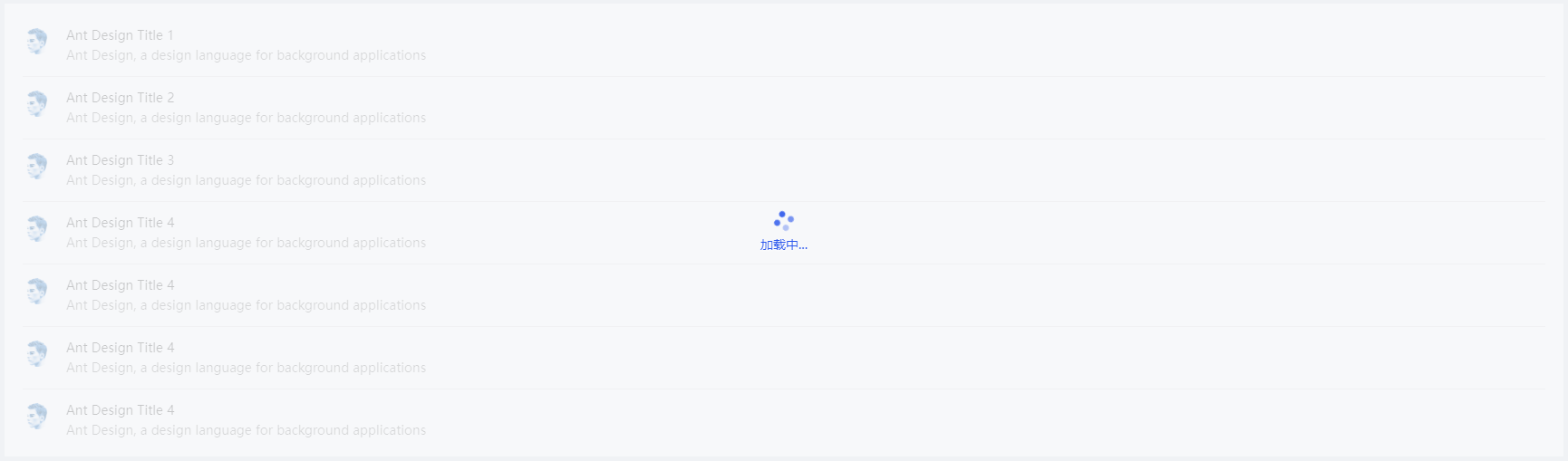
> 使用默认加载中尺寸

![zlLoading_1](http://image.zlit.com.cn//group1/M00/00/18/rBpEPWL8ufOABgVRAAB8ijuWx6Y543.png)

```vue
// template，仅为示例布局
<zl-loading :spinning="spinning">
	<div class="spin-content">
		<a-list
			item-layout="horizontal"
          	:data-source="data">
          	<a-list-item
            	slot="renderItem"
            	slot-scope="item">
            	<a-list-item-meta description="Ant Design, a design language for background applications">
              		<a
                		slot="title"
                		href="https://www.antdv.com/">
                		{{ item.title }}
              		</a>
              		<a-avatar
                	slot="avatar"
                	src="https://zos.alipayobjects.com/rmsportal/ODTLcjxAfvqbxHnVXCYX.png" />
            	</a-list-item-meta>
          	</a-list-item>
        </a-list>
	</div>
</zl-loading>

// script
<script>
export default {
    data() {
        return {
            spinning: true,
            // 仅为示例数据
            data: [
                { title: 'Ant Design Title 1' },
                { title: 'Ant Design Title 2' },
                { title: 'Ant Design Title 3' },
                { title: 'Ant Design Title 4' },
                { title: 'Ant Design Title 4' },
                { title: 'Ant Design Title 4' }
            ]
        }
    },
  	components: {
    	zlLoading: () => import('zlit-components/components/zlLoading/index.vue')
	}
}
</script>

// style
<style scoped>
.spin-content {
	height: 500px;
    padding: 12px 20px;
    background: #fff;
}
</style>
```

###### （2）示例二

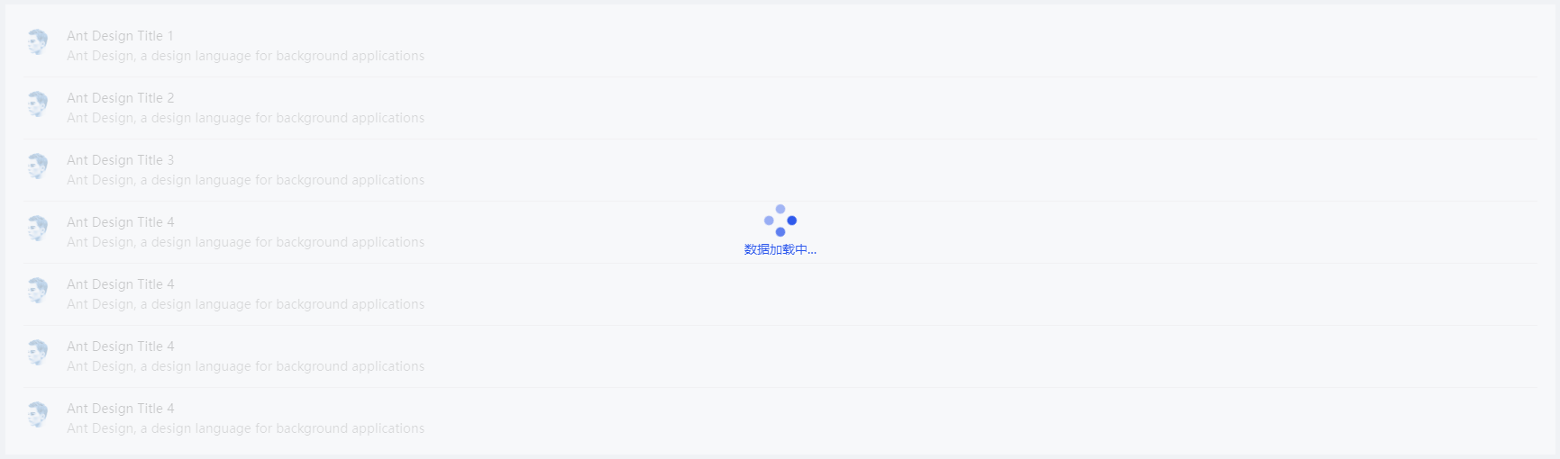
> 改变icon尺寸以及描述文字

![zlLoading_2](http://image.zlit.com.cn//group1/M00/00/18/rBpEPWL8ufiAAFv4AACA2mbNrQA852.png)

```vue
// template，仅为示例布局
<zl-loading
	:spinning="spinning"
    size="large"
    tip="数据加载中...">
    <div class="spin-content">
        <a-list
        	item-layout="horizontal"
            :data-source="data">
            <a-list-item
            	slot="renderItem"
            	slot-scope="item">
            	<a-list-item-meta description="Ant Design, a design language for background applications">
              		<a
                		slot="title"
                		href="https://www.antdv.com/">
                		{{ item.title }}
              		</a>
              		<a-avatar
                		slot="avatar"
                		src="https://zos.alipayobjects.com/rmsportal/ODTLcjxAfvqbxHnVXCYX.png" />
                </a-list-item-meta>
            </a-list-item>
        </a-list>
    </div>
</zl-loading>

// script、style同示例一
```

### zlRadioGroup------筛选单选按钮组组件

##### 1. 全局注册

```javascript
// main.js
import { zlRadioGroup } from 'zlit-components'
Vue.use(zlRadioGroup)
```

##### 2. 组件内单独使用

```javascript
components: {
    zlRadioGroup: () => import('zlit-components/components/zlRadioGroup/index.vue')
}
```

##### 3. API属性

| 属性         | 说明                                           | 类型                    | 默认值                           | 版本  |
| ------------ | ---------------------------------------------- | ----------------------- | -------------------------------- | ----- |
| groupInfo    | 按钮组数据                                     | Object                  | {}，详细说明[见下方](#groupInfo) | 1.0.0 |
| customValue  | 当前选中按钮的value值，内部已实现v-model语法糖 | Number\|String\|Boolean | ''                               | 1.0.0 |
| labelAlign   | label标签的文本对齐方式                        | String                  | left                             | 1.0.0 |
| visibleColon | label标签后跟随的冒号是否显示                  | Boolean                 | false                            | 1.0.0 |

* <span id="groupInfo">groupInfo属性值说明，</span>

```javascript
/*
 * 数据格式：
 * 根属性中必须包含title、list字段，其中list为对象数组，其余根据业务逻辑随意扩展
 * list中的每个对象元素必须包含title、value字段，其余根据业务逻辑随意扩展
 */
groupInfo: {
    title: '分类',
    list: [
        { title: '全部', value: undefined },
        { title: '春节', value: 1 }
    ]
}
```

##### 4. 事件

| 事件名称       | 说明                                                         | 回调参数                | 版本  |
| -------------- | ------------------------------------------------------------ | ----------------------- | ----- |
| selectedHandle | 点击按钮的回调函数，包含两个参数。record：选中按钮的信息；index：选中按钮的下标 | function(record, index) | 1.0.0 |

##### 5. 使用示例

> 具体操作请根据适用场景以及业务逻辑来取舍

###### （1）示例一

> 分类较多，在固定容器范围内显示不全时，样式展示，组件内部会自行计算

![zlRadioGroup_1](http://image.zlit.com.cn//group1/M00/00/18/rBpEPWL8sg2AfDzVAAAKgkoa2qU813.png)

![zlRadioGroup_2](http://image.zlit.com.cn//group1/M00/00/18/rBpEPWL8sg2AHyMtAAAOZP9njjc166.png)

```vue
// template
<zl-radio-group
	v-model="festival"
	:groupInfo="festivalInfo"
	@selectedHandle="selectedHandle" />

// script
<script>
export default {
    data() {
        return {
            // 仅为示例数据
            festival: undefined,
            festivalInfo: {
                title: '分类',
                list: [
                    { title: '全部', value: undefined },
                    { title: '春节', value: 1 },
                    { title: '元宵节', value: 2 },
                    { title: '清明节', value: 3 },
                    { title: '端午节', value: 4 },
                    { title: '中秋节', value: 5 },
                    { title: '国庆节', value: 6 }
                ]
            }
        }
    },
    methods: {
    	selectedHandle(record, index) {
      		console.log(record, index)
    	}
  	},
  	components: {
    	zlRadioGroup: () => import('zlit-components/components/zlRadioGroup/index.vue')
	}
}
</script>
```

###### （2）示例二

> label标签文本右对齐，固定容器内可全部展示

![zlRadioGroup_3](http://image.zlit.com.cn//group1/M00/00/18/rBpEPWL8sg2AF4egAAAICU-mP_0555.png)

```vue
// template
<zl-radio-group
	labelAlign="right"
	v-model="state"
	:groupInfo="stateInfo"
	@selectedHandle="selectedHandle" />

// script
<script>
export default {
    data() {
        return {
            // 仅为示例数据
            state: undefined,
            stateInfo: {
                title: '状态',
                list: [
                    { title: '全部', value: undefined },
          			{ title: '未发布', value: 1 },
         			{ title: '发布中', value: 2 },
          			{ title: '已发布', value: 3 }
                ]
            }
        }
    },
    methods: {
    	selectedHandle(record, index) {
      		console.log(record, index)
    	}
  	},
  	components: {
    	zlRadioGroup: () => import('zlit-components/components/zlRadioGroup/index.vue')
	}
}
</script>
```

### zlModal------弹框组件

##### 1. 全局注册

```javascript
// main.js
import { zlModal } from 'zlit-components'
Vue.use(zlModal)
```

#####  2. 组件内单独使用

```javascript
components: {
    zlModal: () => import('zlit-components/components/zlModal/index.vue')
}
```

#####  3. API属性

| 属性            | 说明                                                         | 类型    | 默认值 | 版本  |
| --------------- | ------------------------------------------------------------ | ------- | ------ | ----- |
| disabled        | 是否禁用继续添加复选框、取消、保存按钮                       | Boolean | false  | 1.0.0 |
| visibleOk       | 是否显示保存按钮                                             | Boolean | true   | 1.0.0 |
| visibleCancel   | 是否显示取消按钮                                             | Boolean | true   | 1.0.0 |
| visibleContinue | 是否显示继续添加复选框                                       | Boolean | false  | 1.0.0 |
| continueType    | 继续添加文字描述，用于展示“勾选后，可连续添加多个[continueType]”。<br />如：“勾选后，可连续添加多个学科”，前提 `visibleContinue` 为true | String  | ''     | 1.0.0 |
| ...             | [以下API不支持修改](#modalApi)其余API和[UI库](https://1x.antdv.com/components/modal-cn/#API)相同 | ...     | ...    | ...   |

* <span id="modalApi">不支持修改的API</span>

confirmLoading：组件内部采用了disabled属性进行同时更改

getContainer：组件内部已统一更改

okButtonProps：UI风格统一处理

cancelButtonProps：UI风格统一处理

#####  4. 事件

| 事件名称 | 说明                                                         | 回调参数             | 版本  |
| -------- | ------------------------------------------------------------ | -------------------- | ----- |
| ok       | 点击保存按钮回调，参数为继续添加复选框是否为选中，true或者false | function(isContinue) | 1.0.0 |
| cancel   | 点击退出按钮回调                                             | function()           | 1.0.0 |

#####  5. 插槽

| 插槽名称    | 说明                                                         | 版本  |
| ----------- | ------------------------------------------------------------ | ----- |
| title       | 弹框标题                                                     | 1.0.0 |
| closeIcon   | 弹框关闭的icon                                               | 1.0.0 |
| extraFooter | 弹框页脚左侧位置显示区域，前提 `visibleContinue` 为false，预留插槽，使用频率较低 | 1.0.0 |
| extraBtn    | 取消按钮与保存按钮中间位置的插槽，用于扩展显示额外的按钮     | 1.0.0 |
| default     | 默认插槽，用于展示弹框body区域内容                           | 1.0.0 |

#####  6. 使用示例

> 具体操作请根据适用场景以及业务逻辑来取舍

###### （1）示例一

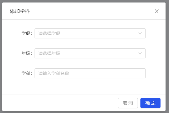
> 基本使用方式

![zlModal_1](http://image.zlit.com.cn//group1/M00/00/18/rBpEPWL8sg2AAEOUAAAjRggIdFI795.png)

```vue
// template
<a-button @click="visible = true">点击</a-button>
<zl-modal
	title="添加学科"
	:visible="visible"
	:disabled="disabled"
	:afterClose="
		() => {
			Object.assign($data, $options.data())
		}
	"
	@ok="okHandler"
    @cancel="cancelHandler">
    <div class="content">
    	<a-form-model
			ref="formModel"
            :label-col="{ span: 4 }"
            :wrapper-col="{ span: 18 }">
            <a-form-model-item
            	label="学段"
                prop="stage">
                <a-select
                	placeholder="请选择学段"
                    allowClear>
                    <a-select-option :value="1">小学</a-select-option>
                    <a-select-option :value="2">初中</a-select-option>
                    <a-select-option :value="3">高中</a-select-option>
                </a-select>
            </a-form-model-item>
            <a-form-model-item
				label="年级"
                prop="grade">
                <a-select
                    placeholder="请选择年级"
                    allowClear>
                    <a-select-option :value="1">一年级</a-select-option>
                    <a-select-option :value="2">二年级</a-select-option>
                    <a-select-option :value="3">三年级</a-select-option>
                </a-select>
            </a-form-model-item>
            <a-form-model-item
                label="学科"
                prop="subjectName">
                <a-input
                	placeholder="请输入学科名称"
                    autocomplete="off"
                    allowClear />
			</a-form-model-item>
        </a-form-model>
    </div>
</zl-modal>

// script
<script>
export default {
    data() {
        return {
            // 仅为示例数据
            visible: false,
      		disabled: false
        }
    },
    methods: {
    	okHandler() {
			// 模拟接口请求
            this.disabled = true
            setTimeout(() => {
                Object.assign(this, {
                    visible: false,
                    disabled: false
                })
            }, 1500)
        },
        cancelHandler() {
          	this.visible = false
        }
  	},
  	components: {
		zlModal: () => import('zlit-components/components/zlModal/index.vue')
	}
}
</script>
```

###### （2）示例二

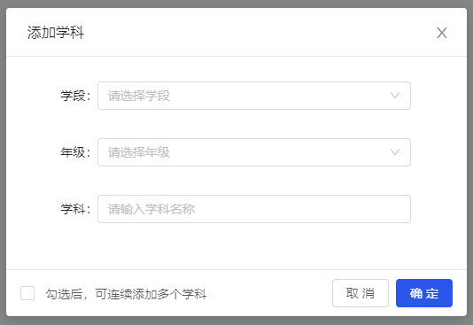
> 显示继续添加复选框，通常添加数据时显示，编辑数据时隐藏，实际使用过程中请结合业务逻辑进行处理

![zlModal_2](http://image.zlit.com.cn//group1/M00/00/18/rBpEPWL8sg2AQYXXAAAploFFtMI879.png)

```vue
// template
<a-button @click="visible = true">点击</a-button>
<zl-modal
	title="添加学科"
    :visible="visible"
    :disabled="disabled"
    :visibleContinue="visibleContinue"
    continueType="学科"
    :afterClose="
		() => {
        	Object.assign($data, $options.data())
        }
    "
    @ok="okHandler"
    @cancel="cancelHandler">
    <div class="content">// 同示例一</div>
</zl-modal>

// script
<script>
export default {
    data() {
        return {
            // 仅为示例数据
            visible: false,
      		disabled: false,
            visibleContinue: true
        }
    },
    methods: {
    	okHandler(isContinue) {
			if (isContinue) {
                // 继续添加只重置表单、不关闭modal弹框
                // 模拟接口请求
                this.disabled = true
                setTimeout(() => {
                  	this.disabled = false
                }, 1500)
            } else {
                // 模拟接口请求
                this.disabled = true
                setTimeout(() => {
                    Object.assign(this, {
                        visible: false,
                        disabled: false
                    })
                }, 1500)
            }
        },
        cancelHandler() {
          	this.visible = false
        }
  	},
  	components: {
		zlModal: () => import('zlit-components/components/zlModal/index.vue')
	}
}
</script>
```

###### （3）示例三

> 不展示页脚

![zlModal_3](http://image.zlit.com.cn//group1/M00/00/18/rBpEPWL8sg2AchZfAAAMTJ-JHso654.png)

```vue
// template
<a-button @click="visible = true">点击</a-button>
<zl-modal
	title="没有页脚"
    :visible="visible"
    :footer="null"
    @cancel="cancelHandler">
    <div class="content">展示其他内容</div>
</zl-modal>

// script
<script>
export default {
    data() {
        return {
            // 仅为示例数据
            visible: false
        }
    },
    methods: {
        cancelHandler() {
          	this.visible = false
        }
  	},
  	components: {
		zlModal: () => import('zlit-components/components/zlModal/index.vue')
	}
}
</script>
```

###### （4）示例四

> 使用插槽渲染

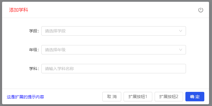
![zlModal_4](http://image.zlit.com.cn//group1/M00/00/18/rBpEPWL8sg2AEb1WAAAwCY2ize8541.png)

```vue
// template
<a-button @click="visible = true">点击</a-button>
<zl-modal
	:visible="visible"
    :disabled="disabled"
    :width="700"
    :afterClose="
		() => {
			Object.assign($data, $options.data())
        }
    "
    @ok="okHandler"
    @cancel="cancelHandler">
    <template #title>
		<p style="color: red">添加学科</p>
    </template>
    <template #closeIcon>
		<i class="iconfont icon-a-guanbi2"></i>
    </template>
    <template #extraFooter>
		<p style="color: blue">这是扩展的提示内容</p>
    </template>
    <template #extraBtn>
		<a-button :disabled="disabled">扩展按钮1</a-button>
		<a-button :disabled="disabled">扩展按钮2</a-button>
    </template>
    <div class="content">// 同示例一</div>
</zl-modal>

// script
<script>
export default {
    data() {
        return {
            // 仅为示例数据
            visible: false,
      		disabled: false
        }
    },
    methods: {
    	okHandler() {
			// 模拟接口请求
            this.disabled = true
            setTimeout(() => {
                Object.assign(this, {
                    visible: false,
                    disabled: false
                })
            }, 1500)
        },
        cancelHandler() {
          	this.visible = false
        }
  	},
  	components: {
		zlModal: () => import('zlit-components/components/zlModal/index.vue')
	}
}
</script>
```

---
_Source: https://npm.io/package/tnmi-components · Machine-readable twin of the npm.io package page. Health data is recomputed on every publish._