# vindicce-coverflow-react-native
> A coverflow component in React native
Latest version **0.0.4** (published 2022-02-10) · MIT license · 0 weekly downloads
## Install
```sh
npm install vindicce-coverflow-react-native
pnpm add vindicce-coverflow-react-native
yarn add vindicce-coverflow-react-native
bun add vindicce-coverflow-react-native
```
## Health
**Score 15/100 (F)** — status: abandoned.
Positive: no vulnerabilities.
Warnings: low downloads; no types; no esm support; pre 1.0.
Negative: abandoned; low maintenance score.
## Facts
| | |
|---|---|
| Version | 0.0.4 |
| Published | 2022-02-10 |
| First published | 2022-02-10 |
| Weekly downloads | 0 |
| License | MIT |
| TypeScript types | none |
| Module format | CommonJS |
| Dependencies | 1 |
| Unpacked size | 16.3 KB |
| Known vulnerabilities | 0 |
| Install scripts | no |
| GitHub stars | 39 |
| Author | Renan Henrique - TheGipsyDanger |
| Maintainers | kinghenrique |
## Links
- npm: https://www.npmjs.com/package/vindicce-coverflow-react-native
- Repository: https://github.com/Bhoos/react-native-coverflow
- Homepage: https://github.com/Vindicce/vindicce-coverflow-react-native
- Issues: https://github.com/Vindicce/vindicce-coverflow-react-native/issues
- npm.io page: https://npm.io/package/vindicce-coverflow-react-native
## Dependencies (1)
- [prop-types](https://npm.io/package/prop-types.md) ^15.6.0
## Recent versions
- 0.0.4 (latest) — 2022-02-10
- 0.0.3 — 2022-02-10
- 0.0.2 — 2022-02-10
- 0.0.1 — 2022-02-10
## README

## Installation
```bash
yarn add vindicce-coverflow-react-native
```
## Usage
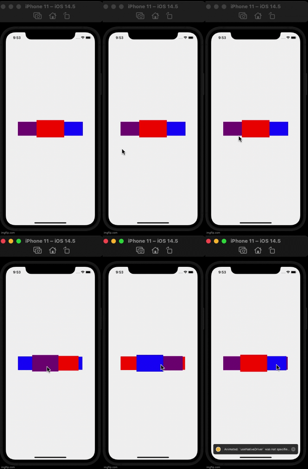
Here is a quick example, using the default CoverFlow.
```tsx
import React from 'react';
import { View } from 'react-native';
import CoverFlow from 'vindicce-coverflow-react-native';
export const App = () => {
return (
alert("onChange")}
onPress={() => alert("onPress")}
spacing={100}
midRotation={0}
scaleDown={0.8}
scaleFurther={0.75}
perspective={800}>
);
};
```
## Props
| Props Name | type | description |
| -------------------- | ------------------------- | ----------------------------------------------------------------------- |
| `onChange :callback(index)` | `() => number` | A callback invoked whenever the selection changes. |
| `onPress :callback(index)` | `() => number` | A callback invoked when the central card is pressed. |
| `initialSelection` | `number:default 0` | The card that needs to be centered initially. |
| `spacing` | `number:default 100` | The number of pixels between the center card and the its adjacent card. |
| `wingSpan` | `number:default 0` | The number of pixels between the adjacent card and its next card. |
| `rotation` | `number:default 0` | The angle in degrees at which the non centered cards needs to be rotated. |
| `midRotation` | `number:default 50` | The angle at which the center card needs to rotate to during transition. Use this value to make sure that during the central card transition, the cards do not overlap. |
| `perspective` | `number:default 800` | The perspective value for 3D projection. A lower value means viewing from a short distance. |
| `scaleDown` | `number:default 0.8` | A scale factor for the card adjacent to the center. |
| `scaleFurther` | `number:default 0.75` | A diminising scale factor for the card next to the adjacent card. |
---
_Source: https://npm.io/package/vindicce-coverflow-react-native · Machine-readable twin of the npm.io package page. Health data is recomputed on every publish._