# vue-event-card
> A Vue.js interactive card design component to show essentials and description for an event.
Latest version **0.1.4-1** (published 2019-10-06) · MIT license · 0 weekly downloads
## Install
```sh
npm install vue-event-card
pnpm add vue-event-card
yarn add vue-event-card
bun add vue-event-card
```
## Health
**Score 15/100 (F)** — status: abandoned.
Positive: no vulnerabilities.
Warnings: low downloads; no types; no esm support; pre 1.0.
Negative: abandoned; low maintenance score.
## Facts
| | |
|---|---|
| Version | 0.1.4-1 |
| Published | 2019-10-06 |
| First published | 2019-10-06 |
| Weekly downloads | 0 |
| License | MIT |
| TypeScript types | none |
| Module format | CommonJS |
| Dependencies | 3 |
| Unpacked size | 2.8 MB |
| Known vulnerabilities | 0 (+1 in 1 direct dependencies) |
| Install scripts | no |
| GitHub stars | 4 |
| Author | Dhruv Misra |
| Maintainers | dhruvmisra |
| Keywords | vue, vue event, vue card, vue event card, card, event, card design, interactive design |
## Links
- npm: https://www.npmjs.com/package/vue-event-card
- Repository: https://github.com/dhruvmisra/vue-event-card
- Homepage: https://github.com/dhruvmisra/vue-event-card#readme
- Issues: https://github.com/dhruvmisra/vue-event-card/issues
- npm.io page: https://npm.io/package/vue-event-card
## Dependencies (3)
- [vue](https://npm.io/package/vue.md) ^2.6.10
- [core-js](https://npm.io/package/core-js.md) ^2.6.5
- [vue-router](https://npm.io/package/vue-router.md) ^3.0.3
## Alternatives
- [async-exit-hook](https://npm.io/package/async-exit-hook.md) — 3.7M weekly downloads
- [evnty](https://npm.io/package/evnty.md) — 7.2K weekly downloads
- [eleventy-plugin-asciidoc](https://npm.io/package/eleventy-plugin-asciidoc.md) — 3.5K weekly downloads
- [@jswork/next-get2get](https://npm.io/package/@jswork/next-get2get.md) — 945 weekly downloads
- [@dashersw/axon](https://npm.io/package/@dashersw/axon.md) — 934 weekly downloads
## Recent versions
- 0.1.4-1 (latest) — 2019-10-06
- 0.1.4 — 2019-10-06
- 0.1.3 — 2019-10-06
- 0.1.2-1 — 2019-10-06
- 0.1.2 — 2019-10-06
- 0.1.1 — 2019-10-06
- 0.1.0 — 2019-10-06
## README
Vue Event Card





_A Vue.js interactive card design component to show essentials and description for an event._
---
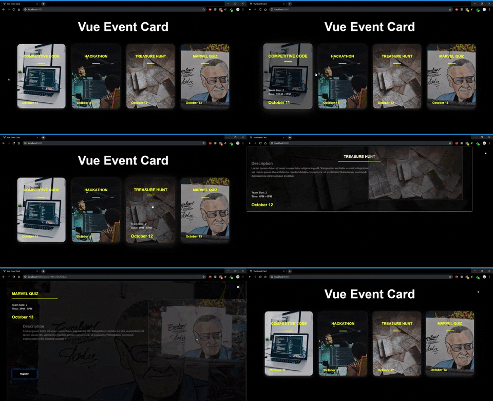
The Vue Event Card is a fluid and modern design to showcase your events in a clean and interactive way, and handling user actions.
Completely responsive and easy to use, making sure both desgin and setup are minimal.
Created for Vue.js by [Dhruv Misra](https://github.com/dhruvmisra)
# Live Demo
A live demo can be found [here](https://dhruvmisra.github.io/vue-event-card/).
# Installation
`npm i --save vue-event-card`
_This package in also dependent on the vue-router_
`npm i --save vue-router` or `vue add router`
## Global Usage
Register the component globally using the Vue.use() method.
```js
// main.js
import Vue from 'vue'
import App from './App.vue'
import router from './router'
//Import the plugin
import CardGrid from 'vue-event-card'
//Use the plugin
Vue.use(CardGrid);
Vue.config.productionTip = false
new Vue({
router,
render: h => h(App)
}).$mount('#app')
```
## Local Usage
Import the component and register it locally in the `components` option
```html
```
Once registered, you can use the component by passing an array of events:
```html
```
## Props
| Prop | Type | Default | Description |
|-------------- |------------------ |------------ |------------------------------------------------------------------------- |
| `events` | Array (Required) | - | The array of event objects |
| `buttonText` | String | "Register" | The text which appears inside the button |
| `hideTitle` | Boolean | false | Hide the title on collapsed card
(Will show in the expanded state) |
| `hideButton` | Boolean | false | Hide button in the expanded state |
## Emits
| Emitted Action | Description |
|----------------- |------------------------------------------------------------------------ |
| `buttonClicked` | Fired when the user clicks the button. Used to handle the click event. |
## Events Array
The events array should be an array of objects. Individual objects should contain the following fields:
```js
events: [
{
name: "Event name",
date: "October 11, 2019",
description: "Blah blah blah blah",
html: 'This is some valid
HTML
',
outerImage: "assets/images/event.jpg",
innerImage: "https://i.imgflip.com/3cjfgr.jpg",
details: {
'Team Size': '2',
'Time': '10AM - 1PM'
}
},
...
]
```
## Event Object
| Name | Type | Description |
|--------------- |--------------------- |------------------------------------------------------------------------------------------------------------------- |
| `name` | String (Required) | Name of the event (_`Should be unique`_) |
| `date` | String | Date of the event |
| `description` | String | ...you know. |
| `html` | String | Valid HTML code to render inside the card. |
| `outerImage` | String (Image path) | The image appearing in the card in it's collapsed state.
Also the image in the background in expanded state. |
| `innerImage` | String (Image path) | The image appearing inside the card in expanded state. |
| `details` | Object | Key-value pairs to show essential details on hovering the card. |
# Things to keep in mind
## Image paths
Image paths can be defined for images in the project relative to `src` folder
```js
outerImage: 'assets/images/marvel.jpg' //converts to: /src/assets/images/marvel.jpg
```
> **How these paths works?**
> The given image path is prefixed with `@/` and then the image is imported using require() to get the webpack relative path.
Image paths can also be a URL
```js
outerImage: 'https://i.imgflip.com/3cjfgr.jpg' //should start with https:// or http://
```
## Details Object
This object should contain key-value pairs for the information to be shown on hover
```js
details: {
'Field A': 'Value A',
'Field B': 'Value B',
'Field C': 'Value C',
...
}
```
This will have this affect:

## Date Field
Preferred format for the date string:
`[Month] [Date], [Year]`
The comma (,) is important as the component takes the first part of the string before comma to display. I am planning to switch to UNIX timestamps or maybe another slight animation for the year.
This is my first NPM package for Vue.js, would love to hear your suggestions
Feel free to point out bugs or request features
Nothing but :heart: for the community
---
_Source: https://npm.io/package/vue-event-card · Machine-readable twin of the npm.io package page. Health data is recomputed on every publish._