# vue-full-loading
> Full overlay with spinner for Vue
Latest version **1.2.1** (published 2018-04-29) · MIT license · 0 weekly downloads
## Install
```sh
npm install vue-full-loading
pnpm add vue-full-loading
yarn add vue-full-loading
bun add vue-full-loading
```
## Health
**Score 15/100 (F)** — status: abandoned.
Positive: no vulnerabilities.
Warnings: low downloads; no types; no esm support.
Negative: abandoned; low maintenance score.
## Facts
| | |
|---|---|
| Version | 1.2.1 |
| Published | 2018-04-29 |
| First published | 2017-05-21 |
| Weekly downloads | 0 |
| License | MIT |
| TypeScript types | none |
| Module format | CommonJS |
| Dependencies | 1 |
| Unpacked size | 204.1 KB |
| Known vulnerabilities | 0 (+1 in 1 direct dependencies) |
| Install scripts | no |
| Author | PygmySlowLoris Team |
| Maintainers | edujugon, guidoec |
| Keywords | vue, loading, loader, full loading, spinner |
## Links
- npm: https://www.npmjs.com/package/vue-full-loading
- Repository: https://github.com/PygmySlowLoris/vue-full-loading
- Homepage: https://github.com/PygmySlowLoris/vue-full-loading#readme
- Issues: https://github.com/PygmySlowLoris/vue-full-loading/issues
- npm.io page: https://npm.io/package/vue-full-loading
## Dependencies (1)
- [vue](https://npm.io/package/vue.md) ^2.2.1
## Recent versions
- 1.2.1 (latest) — 2018-04-29
- 1.2.0 — 2018-02-25
- 1.1.5 — 2018-02-14
- 1.0.5 — 2018-02-13
- 1.0.4 — 2018-02-13
- 1.0.3 — 2017-05-24
- 1.0.2 — 2017-05-22
- 1.0.1 — 2017-05-22
- 1.0.0 — 2017-05-21
## README
# Vue Full Loading
Full overlay with spinner for Vue.
Perfect for performing a task in the background avoiding any other action on the screen.
Can be easily handled by your central event bus
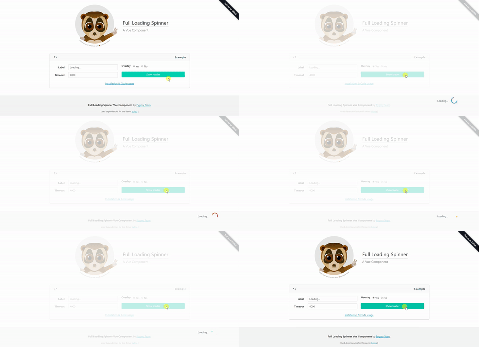
Live Demo
## Installation
```
npm install vue-full-loading --save
```
## Properties
| Properties | Type | Values |
| :--------------- | :------- | :--------- |
| `label` | String | Default 'Loading...' |
| `show` | Boolean | Default false
Options: true or false. |
| `overlay` | Boolean | Default true
Options: true or false. |
| `overlay-class` | String | Default 'white-overlay' |
| `loader-class` | String | Default 'loader-wrapper' |
| `event-bus` | Object | Default null
Central event Bus |
| `event-show` | String | Default 'show-full-loading'|
| `event-hide` | String | Default 'hide-full-loading'|
## Slots
Want to add your own loading content/style? No problem, you can use the available slots to do so.
Available slots:
* `loading-container` - This is the container for the loading text/spinner
* `loading-text` - Only for the loading text
* `loading-spinner` - Only for the spinner
## Examples
Include the component in your `.vue` file.
```
```
You also can manage this component by your eventBus with custom event names.
```
```
> Notice that if no event names passed it will use the default ones.
Match your data with your components props.
```
```
---
_Source: https://npm.io/package/vue-full-loading · Machine-readable twin of the npm.io package page. Health data is recomputed on every publish._