# vue2-custom-carousel
> The simplest and most lightweight carousel ever, made with flexbox and CSS "scroll-snap-type" and "scroll-behavior" for smooth scrolling.
Latest version **1.0.8** (published 2020-09-18) · MIT License license · 0 weekly downloads
## Install
```sh
npm install vue2-custom-carousel
pnpm add vue2-custom-carousel
yarn add vue2-custom-carousel
bun add vue2-custom-carousel
```
## Health
**Score 15/100 (F)** — status: abandoned.
Positive: no vulnerabilities.
Warnings: low downloads; no types; no esm support.
Negative: abandoned; low maintenance score.
## Facts
| | |
|---|---|
| Version | 1.0.8 |
| Published | 2020-09-18 |
| First published | 2020-07-25 |
| Weekly downloads | 0 |
| License | MIT License |
| TypeScript types | none |
| Module format | CommonJS |
| Dependencies | 2 |
| Unpacked size | 437 KB |
| Known vulnerabilities | 0 (+1 in 1 direct dependencies) |
| Install scripts | no |
| GitHub stars | 1 |
| Author | Gustavo da Cruz Vieira |
| Maintainers | gustavodacrvi |
| Keywords | Vue.js, Vue2, Vue, carousel, slider, component, customizable, responsive, flexbox, scroll-snap-type, scroll-behavior |
## Links
- npm: https://www.npmjs.com/package/vue2-custom-carousel
- Repository: https://github.com/Gustavodacrvi/vue2-custom-carousel
- npm.io page: https://npm.io/package/vue2-custom-carousel
## Dependencies (2)
- [vue](https://npm.io/package/vue.md) ^2.6.11
- [core-js](https://npm.io/package/core-js.md) ^3.6.5
## Alternatives
- [adhdev](https://npm.io/package/adhdev.md) — 11.1K weekly downloads
- [react-slide-button](https://npm.io/package/react-slide-button.md) — 310 weekly downloads
- [better](https://npm.io/package/better.md) — 42 weekly downloads
- [react-native-swipe-image](https://npm.io/package/react-native-swipe-image.md) — 22 weekly downloads
- [nl.fokkezb.pulltorefresh](https://npm.io/package/nl.fokkezb.pulltorefresh.md) — 11 weekly downloads
## Recent versions
- 1.0.8 (latest) — 2020-09-18
- 1.0.6 — 2020-07-29
- 1.0.5 — 2020-07-29
- 1.0.4 — 2020-07-25
- 1.0.3 — 2020-07-25
- 1.0.2 — 2020-07-25
- 1.0.1 — 2020-07-25
- 1.0.0 — 2020-07-25
## README
# vue2-custom-carousel
## TABLE OF CONTENTS
* [Example](#example)
* [Pagination Template Slot Props](#pagination-template-slot-props)
* [Navigation Template Slot Props](#navigation-template-slot-props)
* [Component Props](#component-props)
* [Component Methods](#component-methods)
* [Component Events](#component-events)
* [Flexbox Usage](#flexbox-usage)
* [Carousel Snap](#carousel-snap)
The simplest and most lightweight carousel ever, made with flexbox and CSS "scroll-snap-type" and "scroll-behavior" for smooth scrolling.
### Example
Vue2-custom-carousel does not provide default CSS/template themes, you must build them yourself and wrap them up in another component using your own styles.
```
```
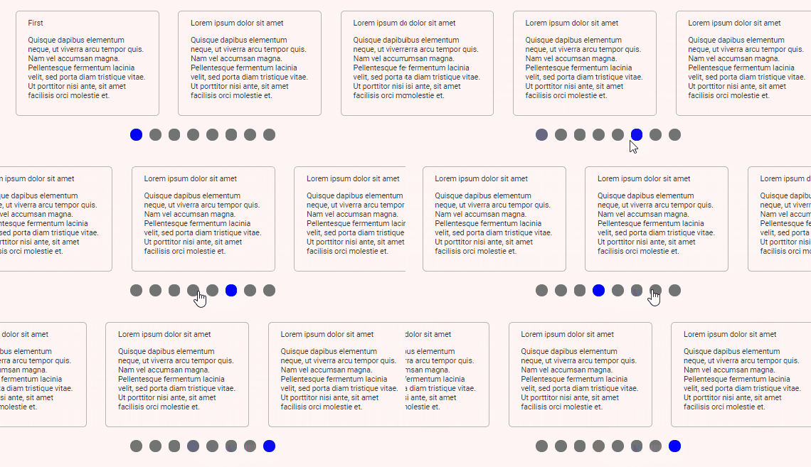
In this example, we use the functional component to display the items and the **pagination** template slot to display the dots, the template provides the active boolean which we use to differentiate the active element. The carousel uses **scroll-behavior: smooth;** for smooth scrolling.
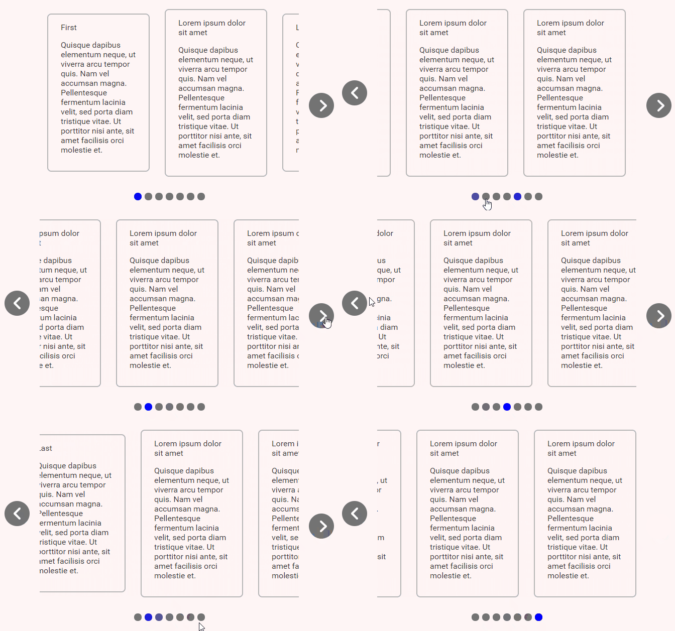
We can easily add button navigators using this code and doing the proper positioning.
```
```
```
.Button {
position: absolute;
top: 50%;
transform: translateY(-50%) rotate(-180deg);
right: unset;
left: -20px;
}
.right {
transform: unset;
left: unset;
right: -20px;
}
```
## Pagination Template Slot Props
| Property | Description |
| ------------- |:-------------|
| number | The current index. |
| scroll | Scroll trigger function, you should use it on the **@click.native='scroll'** event. |
| active | Will be true at the active navigation. |
## Navigation Template Slot Props
| Property | Description |
| ------------- |:-------------|
| show | Will be false on the corners of the carousel. |
| scroll | Scroll trigger function, you should use it on the **@click.native='scroll'** event. |
## Component Props
| Property | Description |
| ------------- |:-------------|
| value/v-model | Sets and updates the current page. The current page will never be bigger than the number of pages or less than 0, that is, if set to a value greater than the number of carousel pages, **values** settles itself to the maximum value, **value** doesn't respond to negative values, instead, it sets itself back to 0. |
## Component Methods
| Method | Parameters | Return Value | Description |
| ------------- |:-------------:|:-------------|:-------------|
| scroll | (paginationIndex: number) | finalPageIndex: number | Goes to the given page index. The return value will never be bigger than the number of pages or less than 0, that is, if set to a value greater than the number of carousel pages, it settles itself to the maximum value, **scroll** doesn't respond to negative values, instead, it sets itself back to 0. |
| next | nothing | nothing | Goes to the next page. |
| previous | nothing | nothing | Goes to the previous page. |
| focus | (elm: HTMLElement) | nothing | Focuses on the element. |
## Component Events
### **calculated** event
Runs every time the component calculates the data, runs on **mounted**, **updated**, on window resize, and on container scroll event.
#### Data
```
{
numberOfPages: number;
activePage: number;
showRightNavigation: boolean;
showLeftNavigation: boolean;
}
```
### **trigger** event
Runs every time the scroll changes **manually**, this can happen when clicking in one of the pagination options, when clicking on the navigation buttons or whenever the component methods are used.
#### Data
```
newScroll: number;
```
## Flexbox Usage
The items are by default centralized using flexbox, this means **width** and **display** won't work as expected and you might want to use **flex-shrink: 0;**, you can overwrite the flexbox styles this way:
```
...