# vue2-wheel-picker
> Wheel picker, Wheel datepicker plugin using by Vue2.x
Latest version **0.1.3** (published 2019-12-26) · MIT license · 0 weekly downloads
## Install
```sh
npm install vue2-wheel-picker
pnpm add vue2-wheel-picker
yarn add vue2-wheel-picker
bun add vue2-wheel-picker
```
## Health
**Score 15/100 (F)** — status: abandoned.
Positive: no vulnerabilities.
Warnings: low downloads; no types; no esm support; pre 1.0.
Negative: abandoned; low maintenance score.
## Facts
| | |
|---|---|
| Version | 0.1.3 |
| Published | 2019-12-26 |
| First published | 2019-11-06 |
| Weekly downloads | 0 |
| License | MIT |
| TypeScript types | none |
| Module format | CommonJS |
| Dependencies | 0 |
| Unpacked size | 922.3 KB |
| Known vulnerabilities | 0 |
| Install scripts | no |
| GitHub stars | 5 |
| Author | samy |
| Maintainers | lenvonsam |
| Keywords | vue2, vue2-wheel-picker, vue2-wheel-date-picker, vue2-wheel-selector |
## Links
- npm: https://www.npmjs.com/package/vue2-wheel-picker
- Repository: https://github.com/lenvonsam/vue2-wheel-picker
- Homepage: https://github.com/lenvonsam/vue2-wheel-picker#readme
- Issues: https://github.com/lenvonsam/vue2-wheel-picker/issues
- npm.io page: https://npm.io/package/vue2-wheel-picker
## Recent versions
- 0.1.3 (latest) — 2019-12-26
- 0.1.2 — 2019-11-30
- 0.1.1 — 2019-11-06
## README
# Vue2 Wheel Picker
A vue2.x based development, similar to the ios wheel style selection mobile plug-in, currently support time selection, single choice, multiple choice
## Installation
* by npm
```bash
$ npm install vue2-wheel-picker
```
* by yarn
```
$ yarn add vue2-wheel-picker
```
## Online Demo
Web Site Visit: https://lenvonsam.github.io/vue2-wheel-picker/
Mobile Visit:

Screenshots:
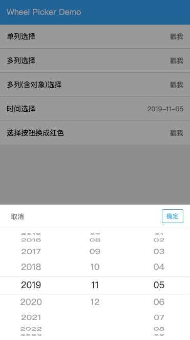
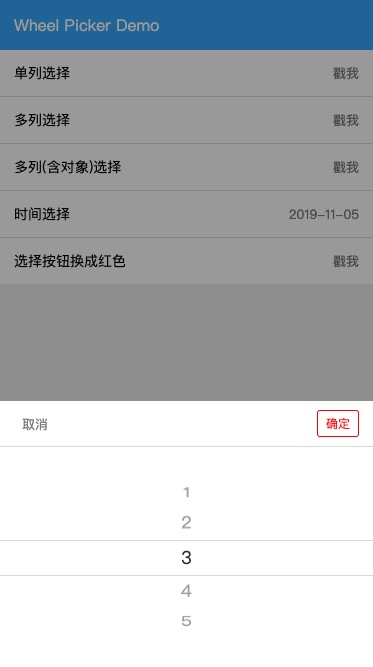
## Usage
### Global Config
```js
import Vue from 'vue'
import wheelpicker from 'vue2-wheel-picker'
Vue.use(wheelpicker)
```
This plug-in automatically injects $wheelPicker Object and registers global components, including wheelPicker and wheelDatepicker.
### Component Config
```js
import { WheelPicker, WheelDatepicker } from 'vue2-wheel-picker/picker'
export default {
...
components: {
'wheel-picker': WheelPicker,
'wheel-datepicker': WheelDatepicker
}
...
}
```
### WheelPicker Properties
```html
```
|Property|Required|Type|Default|Description|
|---|:---:|---|:---:|---|
|value|false|Boolean|false|to display and close the component|
|listData|true|Array||to display component's content|
|listValue|false|Array||to initail the component value and get the selected component value|
|colLen|false|Number|1|The number of columns displayed by the component|
|rowKeys|false|Array||Specifies each column object keys|
|confirmText|false|String|确定|confirm button text|
|cancelText|false|String|取消|cancel button text|
|confirmColor|false|String|#3db0fc|confirm button color(rgb,rgba,hex)|
|cancelColor|false|String|#888|cancel button color(rgb, rgba, hex)|
|bottomColor|false|String|#ddd|the color of button group bottom line|
### WheelDatepicker Properties
```html
```
|Property|Required|Type|Default|Description|
|---|:---:|---|:---:|---|
|value|false|Boolean|false|to display and close the component|
|dateValue|false|String|YYYY-MM-DD|to initail the component value and get the selected component value, the value format depend on separator|
|separator|false|String|-|Date separator|
|yearCount|false|Number|15|The difference between the current year and the beginning year|
|confirmText|false|String|确定|confirm button text|
|cancelText|false|String|取消|cancel button text|
|confirmColor|false|String|#3db0fc|confirm button color(rgb,rgba,hex)|
|cancelColor|false|String|#888|cancel button color(rgb, rgba, hex)|
|bottomColor|false|String|#ddd|the color of button group bottom line|
### Components Methods
|Method|params|Required|Descrpiton|
|---|---|:---:|---|
|change|value|false|return selected value|
### API Properties
It can also $wheelPicker Object to display wheelPicker and wheelDatepicker.
```js
this.$wheelPicker.show({
mode: 'date',
cb (type) {
console.log('type', type)
}
})
```
#### Common Properties
|Properties|Required|Type|Default|Description|
|---|:---:|---|:---:|---|
|mode|false|String|picker|display different mode wheel picker|
|confirmText|false|String|确定|confirm button text|
|cancelText|false|String|取消|cancel button text|
|confirmColor|false|String|#3db0fc|confirm button color(rgb,rgba,hex)|
|cancelColor|false|String|#888|cancel button color(rgb, rgba, hex)|
|bottomColor|false|String|#ddd|the color of button group bottom line|
#### Date Mode Properties
|Properties|Required|Type|Default|Description|
|---|:---:|---|:---:|---|
|dateValue|false|String|YYYY-MM-DD|to initail the component value and get the selected component value, the value format depend on separator|
|separator|false|String|-|Date separator|
|yearCount|false|Number|15|The difference between the current year and the beginning year|
#### Picker Mode Properties
|Properties|Required|Type|Default|Description|
|---|:---:|---|:---:|---|
|listData|true|Array||to display component's content|
|listValue|false|Array||to initail the component value and get the selected component value|
|colLen|false|Number|1|The number of columns displayed by the component|
|rowKeys|false|Array||Specifies each column object keys|
### Api Methods
|Method|params|Required|Descrpiton|
|---|---|:---:|---|
|cb|value|false|return selected value|
## Examples
### Single String Picker
```js
export default {
data () {
return {
listData: ['orange', 'apple', 'banana'],
listValue: ['apple']
}
},
mounted () {
this.$wheelPicker.show({
listData: this.listData,
listValue: this.listValue,
cb (value) {
console.log('picker value:>>', value)
}
})
}
}
```
### Multi Object columns Picker
```js
export default {
data () {
return {
listData: [[{'fruit': 'orange'}, {'fruit': 'banana'}], [{'animal': 'dog'}, {'animal': 'cat'}]],
listValue: ['orange', 'cat']
}
},
mounted () {
this.$wheelPicker.show({
listData: this.listData,
listValue: this.listValue,
colLen: this.listData.length,
// when row type is object, rowkeys must not be null
rowkeys: ['fruit', 'animal'],
confirmColor: 'red',
cb (value) {
console.log('picker value:>>', value)
}
})
}
}
```
### Date Picker
```js
export default {
mounted () {
// when dateValue not set value, the date wheel picker will set current date automatically
this.$wheelPicker.show({
mode: 'date',
cb (value) {
console.log('picker value:>>', value)
}
})
}
}
```
### Using Picker by Component
```html
```
```js
import { WheelPicker } from 'vue2-wheel-picker/picker'
export default {
data () {
return {
listData: ['1', '2', '3', '4', '5', '6'],
listValue: ['1'],
pickerShow: false
}
},
components: {
wheelPicker: WheelPicker
},
methods: {
clickMe () {
this.pickerShow = true
},
pickerChange (val) {
console.log('choose value', val)
}
}
}
```
## TO DO LIST
* China City Picker
* Theme Picker(ios, android...)
## License
[MIT License](http://en.wikipedia.org/wiki/MIT_License)
---
_Source: https://npm.io/package/vue2-wheel-picker · Machine-readable twin of the npm.io package page. Health data is recomputed on every publish._