# whyseco-modal-simple

> This is a simple quick and customizable modal component that you can use in your App. The modal is based on bootstrap.

Latest version **1.0.21** (published 2020-05-19) · MIT license · 0 weekly downloads

## Install

```sh
npm install whyseco-modal-simple
pnpm add whyseco-modal-simple
yarn add whyseco-modal-simple
bun add whyseco-modal-simple
```

## Health

**Score 15/100 (F)** — status: abandoned.

Positive: no vulnerabilities.

Warnings: low downloads; no types; no esm support.

Negative: abandoned; low maintenance score.

## Facts

| | |
|---|---|
| Version | 1.0.21 |
| Published | 2020-05-19 |
| First published | 2020-05-19 |
| Weekly downloads | 0 |
| License | MIT |
| TypeScript types | none |
| Module format | CommonJS |
| Dependencies | 0 |
| Unpacked size | 333.7 KB |
| Known vulnerabilities | 0 |
| Install scripts | no |
| GitHub stars | 0 |
| Author | “Belvilus |
| Maintainers | yannrobin |
| Keywords | react, bootstrap, simple, modal, dialog |

## Links

- npm: https://www.npmjs.com/package/whyseco-modal-simple
- Repository: https://github.com/veensy/Modal-Simple
- Homepage: https://github.com/veensy/Modal-Simple#readme
- Issues: https://github.com/veensy/Modal-Simple/issues
- npm.io page: https://npm.io/package/whyseco-modal-simple

## Alternatives

- [mobx-react](https://npm.io/package/mobx-react.md) — 2.8M weekly downloads
- [rc-tree](https://npm.io/package/rc-tree.md) — 2.6M weekly downloads
- [@react-oauth/google](https://npm.io/package/@react-oauth/google.md) — 1.3M weekly downloads
- [@wagmi/connectors](https://npm.io/package/@wagmi/connectors.md) — 877.0K weekly downloads
- [vee-validate](https://npm.io/package/vee-validate.md) — 836.4K weekly downloads

## Recent versions

- 1.0.21 (latest) — 2020-05-19
- 1.0.20 — 2020-05-19
- 1.0.19 — 2020-05-19

## README

## Modal-Simple

This is a simple quick and customizable modal component that you can use in your App.
The modal is based on bootstrap.

## Installation

```
    npm i modal-simple react-bootstrap 
```

and don't forget to add the bootstrap's stylesheet `<link>` into your `<head>` before all other stylesheets to load CSS :

[LINK TO BOOTSTRAP STYLESHEET](https://getbootstrap.com/docs/4.3/getting-started/introduction/)

## Demo

<p>If you just want to try out Modal-Simple, you can also use :</p>

<a href="https://codesandbox.io/s/modalsimple-dsm09 "><img src="https://codesandbox.io/static/img/play-codesandbox.svg" alt="codesandbox"/></a>

<p>or use our :</p><a href="https://veensy.github.io/Modal-Simple/"><img src="https://storybook.js.org/images/logos/logo-storybook.svg" alt="storybook"/></a>

## Examples

1.  **Simple use**


    ```javascript
    <Modal title={{ text: "title" }} bodyText="something" />
    ```

![exempl-1](https://raw.githubusercontent.com/veensy/Modal-Simple/master/public/images/modal-1.png)

2.  **Simple Custom**

    ```javascript
    <Modal
      open={{
        text: "Open me",
        className: "open",
        variant: "secondary"
      }}
      title={{ text: "title" }}
      closeBtn={{ show: false }}
    >
      <strong>test 2</strong>

      <Modal.Footer validate={{ text: "Validate", variant: "primary" }} />
    </Modal>
    ```

![exemple-2](https://raw.githubusercontent.com/veensy/Modal-Simple/master/public/images/modal-2.png)

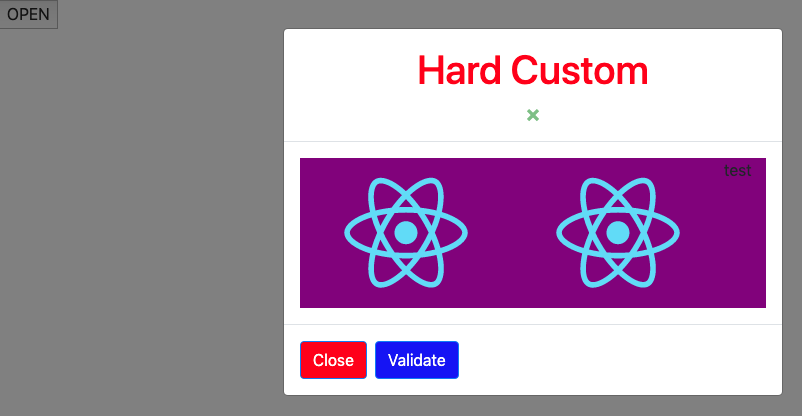
3.  **Hard custom**

    ```javascript
    state = { show: false };
    modalState = () => {
    this.setState({ show: !this.state.show });
    };
    render() {
        return (
        <div className="App">
            <button className="open" onClick={this.modalState}>
            "Open"
            </button>
            <Modal
                show = {this.state.show}
                onHide = {this.modalState}
                closeBtn = {{ show: true, className: "btn-close" }}
                className = {{
                    modal: "modal-block-App",
                    header: "header-block",
                    body: "body-block",
                    footer: "footer-block"
                }}
                <Modal.Header>
                    <h1 className='title'>Hard Custom</h1>
                </Modal.Header>
                <Modal.Body>
                    <div className="d-flex flex-row body-block">
                        <img src={logo} alt="logo"/>
                        <img src={logo} alt="logo"/>
                        test
                    </div>
                </Modal.Body>

                <Modal.Footer
                    validate = {{
                        text: "Validate",
                        action: this.modalState,
                        className: "btn-valid"
                    }} ,
                    cancel = {{
                        text: "Close",
                        action: this.modalState,
                        className: "btn-cancel"
                    }}
                />
            </Modal>
        </div>
        )
    }
    ```


    ```

![exemple-3](https://raw.githubusercontent.com/veensy/Modal-Simple/master/public/images/modal-3.png)

## API

**Modal**

|   Name    |   Type   |                                Default                                |                                                         Description                                                          |
| :-------: | :------: | :-------------------------------------------------------------------: | :--------------------------------------------------------------------------------------------------------------------------: |
|   show    | boolean  |                                 false                                 |                                           When true the modal will<br>show itself.                                           |
|  onHide   | function |                                                                       | A callback fired when the<br>header closeButton or <br>non-static backdrop is <br>clicked. Required if either<br> specified. |
|   title   |  object  |                  text: string <br>className: string                   |                                         Specify the header<br> title and className.                                          |
| closeBtn  |  object  |                 show : Boolean <br>className : string                 |                           Specify if you need the <br> close button appear <br>and apply a class.                            |
| className |  object  | modal: string<br>header: string<br>body: string<br>footer: string<br> |                               Add a className to each<br> part to be able to <br>custom them.                                |
|  footer   | boolean  |                                 true                                  |                              if you don't want<br> the block footer appear<br> set it to false.                              |
|   open    |  object  |         text: string <br>className: string<br>variant: string         |                            You can custom the provide<br> button by your own text<br> and style.                             |

**Modal.Footer**

|   Name   |  Type  |                                 Default                                 |                              Description                              |
| :------: | :----: | :---------------------------------------------------------------------: | :-------------------------------------------------------------------: |
| validate | object | text: string<br> action: function<br>className:string<br>variant:string | You can custom the provide<br> button by your own text<br> and style. |
|  cancel  | object | text: string<br> action: function<br>className:string<br>variant:string | You can custom the provide<br> button by your own text<br> and style. |

---
_Source: https://npm.io/package/whyseco-modal-simple · Machine-readable twin of the npm.io package page. Health data is recomputed on every publish._