@2hats/react-native-circular-progress v0.1.2
react-native-circular-progress
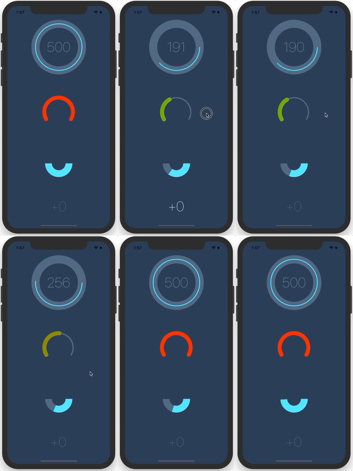
React Native component for creating animated, circular progress with ReactART. Useful for displaying users points for example. Works on iOS & Android.
Looking for a circular slider? Take a look at my other component – react-native-circular-slider :alarm_clock:
Example app

Installation
- Install library
npm i --save react-native-circular-progress - Link ART library to your ReactNative project (how to link a library?). You'll find ReactART library in
node_modules/react-native/Libraries/ART/ART.xcodeproj
Usage
Import CircularProgress or AnimatedCircularProgress.
import { AnimatedCircularProgress } from 'react-native-circular-progress';Use as follows:
<AnimatedCircularProgress
  size={120}
  width={15}
  fill={100}
  tintColor="#00e0ff"
  backgroundColor="#3d5875" />
You can also define a function, that'll receive current progress and for example display it inside the circle:
<AnimatedCircularProgress
  size={200}
  width={3}
  fill={this.state.fill}
  tintColor="#00e0ff"
  backgroundColor="#3d5875">
  {
    (fill) => (
      <Text style={styles.points}>
        { this.state.fill }
      </Text>
    )
  }
</AnimatedCircularProgress>
Finally, you can manually trigger a duration-based timing animation by putting a ref on the component and calling the performLinearAnimation(toValue, duration) function like so:
<AnimatedCircularProgress
  ref='circularProgress'
  ...
/>
this.refs.circularProgress.performLinearAnimation(100, 8000); // Will fill the progress bar linearly in 8 secondsConfiguration
You can configure the passing by following props:
- size – width and height of the circle
- width - thickness of the line
- fill - current, percentage fill (from 0 to 100)
- prefill - percentage fill before the animation (from 0 to 100)
- tintColor - color of a progress line
- backgroundColor - color of a background for progress line
- rotation - by default, progress starts from the angle = 90⦝, you can change it by setting value from -360 to 360
- tension - the tension value for the spring animation (see here)
- friction - the friction value for the spring animation (see here)
- linecap - the shape to be used at the ends of the circle. Possible values: butt (default), round or square. (see here)
- children(fill) - you can pass function as a child to receive current fill
Working example app
You can find working example in the example directory of this repository. You can run it by:
iOS
git clone https://github.com/bgryszko/react-native-circular-progress.git
cd  react-native-circular-progress/example/ProgressChart
npm install
open ios/ProgressChart.xcodeproj
XCode will open. Click Run button and that's it.
Android
Open your emulator and run:
git clone https://github.com/bgryszko/react-native-circular-progress.git
cd  react-native-circular-progress/example/ProgressChart
npm install
react-native run-android
Author
Bartosz Gryszko (b@gryszko.com)
For new components and updates follow me on twitter.
License
MIT
Special thanks
Special thanks to Chalk+Chisel for creating working environment where people grow. This component was created for one of the projects we're working on.


