@aftermath-finance/sui-bridge-react v1.0.2
Native Sui Bridge Widget for React
This repository contains React components that allow users to bridge Ethereum and Sui networks. Library is fully typed and self contained.
Installation
Library is assuming your project is using react and react-dom as dependencies.
npm install @aftermath-finance/sui-bridge-reactUsage
Basic standalone usage.
import { Bridge, BridgeConfig } from "@aftermath-finance/sui-bridge-react";

const config: BridgeConfig = {
  appKitProjectId: "your-project-id",
  isMainnet: false,
};

export function App() {
  return (
    <>
      <Bridge {...config} />
    </>
  );
}
Bridge uses AppKit by Reown (WalletConnect). You have to pass your project ID to the configuration or bridge will not work.
By default, Bridge uses Sepolia. To use it on mainnet, add the following configuration.
const config: BridgeConfig = {
  isMainnet: true,
};
If your app has already installed wagmi, you can pass it's instance.
const config: BridgeConfig = {
  wagmi: wagmiInstance,
  queryClient: queryClientInstance,
};
Available tokens
Currently the library supports bridging native ETH and wETH. More tokens might be added in the future.
You can customize the list of available tokens by passing optional tokenIds prop. By default all tokens are enabled. Native ETH is always enabled, only ERC20 tokens can be customized. Currently wETH and USDT are supported.
| tokenId | symbol |
|---|---|
| n/a | ETH |
| 2 | wETH |
| 4 | USDT |
const config: BridgeConfig = {
  tokenIds: [2, 4],
};
By passing an empty array, only ETH will be available.
Customization

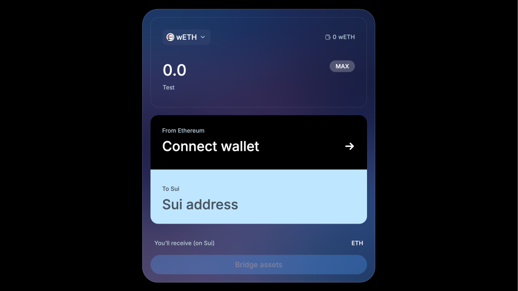
This will display the example.png image in your documentation.
BridgeConfig allows you to remove the background image to make the widget flat. More customization options will be added soon.
const config: BridgeConfig = {
  style: {
    hasBackgroundImage: true,
  },
};
To customize the widget's theme, you can change root CSS variables. Here is the primary theme.
/* Main */
--primary-color: #4da2ff;
--secondary-color: #1f1f1f;

/* Background */
--background-primary: #030f1c;
--background-secondary: rgba(247 247 248 / 4%);
--background-accent1: #4da2ff;
--background-accent1-hover: #1988ff;
--background-accent2: #c0e6ff;
--background-tertiary: rgba(247 247 248 / 24%);
--background-tertiary-hover: rgba(247 247 248 / 40%);
--background-inverted: #fff;

/* Stroke */
--stroke-primary: rgba(247 247 248 / 8%);
--stroke-secondary: rgba(247 247 248 / 16%);

/* Content */
--content-primary: #f7f7f8;
--content-secondary: #abbdcc;
--content-tertiary: #91a3b1;
--content-inverted: #030f1c;
--content-inverted-secondary: #485563;
--content-negative: #e23c50;

/* Image */
--background-image: url("/background.jpg");

/* Fonts */
--font-family: "Inter", "Roboto", "Helvetica Neue", "Arial Nova", "Nimbus Sans",
  "Arial", sans-serif;

/* Spacing */
--border-radius-base: 16px;
--spacing-base: 16px;
--width: 480px;
--height: 564px;
Development
You can test the library locally using Vite.
npm run build
npm run dev
Testing components is done using storybook.
npm run storybookLicense
Apache-2.0
Developed by DarkSpace.studio in coordination with Sui Foundation and Mysten. Hosted by Aftermath Finance.