Angular Material Extra Components (DatetimePicker, TimePicker, ColorPicker, FileInput ...) for @angular/material 7.x, 8.x, 9.x, 10.x, 11.x, 12.x, 13.x, 14.x, 15.x, 16.x


Description
Angular Material Library provide extra components for every project (Datetime picker, Time picker, Color picker...).
Please do not hesitate to contact us if you have any question or suggestion.
Feel free to open the issues or provide a PR.
If you like this project, support angular-material-components by starring.
And thank you so much for your coffee

DEMO Angular Material Components
@see LIVE DEMO AND DOCUMENTATION
Choose the version corresponding to your Angular version:
| Angular | @angular-material-components/datetime-picker |
|---|---|
| 16 | 16.x+ |
| 15 | 15.x+ OR 9.x+ for legacy import |
| 14 | 8.x+ |
| 13 | 7.x+ |
| 12 | 6.x+ |
| 11 | 5.x+ |
| 10 | 4.x+ |
| 9 | 2.x+ |
| 8 | 2.x+ |
| 7 | 2.x+ |
Datetime Picker

npm install --save @angular-material-components/datetime-picker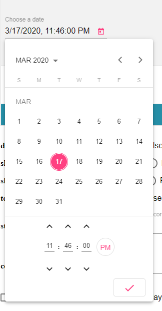
@see DEMO stackblitz for Angular 7, Angular 8
@see DEMO stackblitz for Angular 9
Color Picker

npm install --save @angular-material-components/color-picker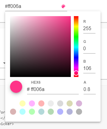 @see DEMO stackblitz
File Input

npm install --save @angular-material-components/file-input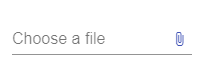
Theming
- @see @angular/material Using a pre-built theme
- Add the Material Design icon font to your index.html
<link href="https://fonts.googleapis.com/icon?family=Material+Icons&display=block" rel="stylesheet">License
MIT