@ap.cx/design-system-variables v1.0.8
Design-System-Variables
Status
🔥 Work in progress at an early stage, not production ready
Variables Design System for Grid, Layout, Media Queries, Responsive Design, Typography Rhythm and colors. A “ready to use” set of variables for Design System.
Align on a vertical grid drived by the typography.
Demo
https://thierryc.github.io/Design-System-Variables
Typography drived variables for CSS in JS.
Spacer is 1/3 or 2/3 of the (paragraphe) line heights.
Margins and gutters are also based on the (paragraphe) line height.
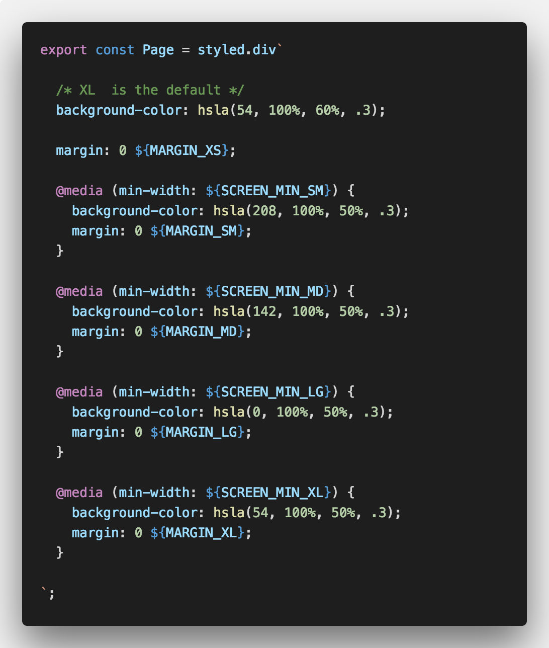
styled-components

Masters Variables:
Typography
- Font Family (Heading and Body)
- Line height
Rhythm Scale
- Rhythm (FIBONACCI)
Colors
Color object have accessibility data.
'DisplayColor' is the color for the text on it. It can be black or white.
"contrastBlack": "7.16",
"contrastWhite": "2.93",
"displayColor": "black",
"accessibility": {
    "aa": true,
    "aaLarge": true,
    "aaa": true,
    "aaaLarge": true
}
Background Colors
Main Colors
- Blue Hue
- Green Hue
- Yellow Hue
- Red Hue
Variables:
Typography
- 1 heading font (Lora serif font)
- 1 body font (Nato sans serif font)
- 1 code font
Colors
- 4 brand colors
- 4 messages colors (success, warning, danger, info)
- 10 other color
- and useful colors like twitter and Facebook
Grid
The grid is 1/3 of the lineHeight. (~ 8px)
Layout, Columns, gutters, and margins
Columns
Content is placed in the areas of the screen that contain columns. Column width is defined using percentages.
- COL_NUMB_SX = 4;
- COL_NUMB_SM = 4;
- COL_NUMB_MD = 8;
- COL_NUMB_LG = 12;
- COL_NUMB_XL = 12;
Gutters
Gutters are the spaces between columns. They help separate content. Gutter widths are fixed values at each breakpoint range.
- GUTTER_SX = 1 * grid (~8px)
- GUTTER_SM = 1 * grid (~8px)
- GUTTER_MD = 2 * grid (~16px)
- GUTTER_LG = 3 * grid (~24px)
- GUTTER_XL = 3 * grid (~24px)
Margins
Margins are the space between content and the left and right edges of the screen.
- MARGIN_SX = 2 * grid (~16px)
- MARGIN_SM = 2 * grid (~16px)
- MARGIN_MD = 3 * grid (~24px)
- MARGIN_LG = 4 * grid (~24px)
- MARGIN_XL = 4 * grid (~32px)
How to use
Variables list
Create your onw set
Get Cap height of a font
Video Sketch soon
https://github.com/sebdesign/cap-height
License
MIT © Thierry Charbonnel
7 years ago
7 years ago
7 years ago
7 years ago
7 years ago
7 years ago
7 years ago
7 years ago
7 years ago