@apognu/diagascode v0.0.11
Diagrams as Code (diagascode)
diagascode is a Javascript library and a Node script used to generate clean and customization diagrams from Javascript code.
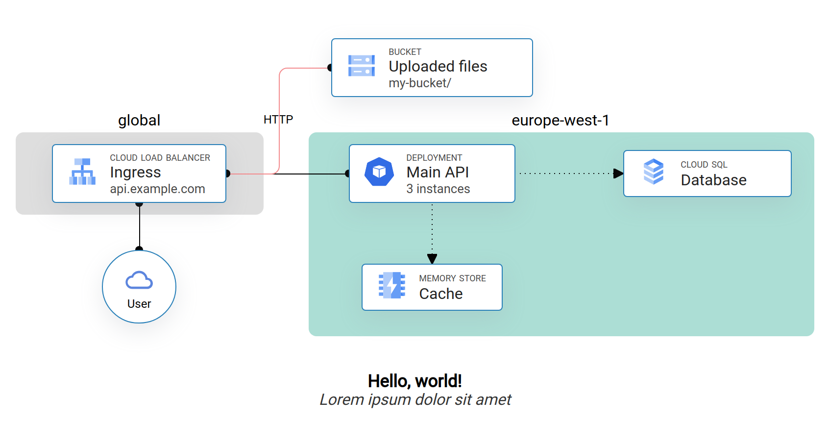
It can be used to get diagrams such as this one:

Concepts
diagascode uses Web technologies to draw the diagrams components, and use CSS grid to lay them out. Consequently, all components will be placed on a defined grid from provided coordinates.
Each component view is taken from one or several user-provided template where provided values are replaed to draw the final component.
When a component is defined, other component can be referred from it, either to position it relative to another, or to draw connections.
Example
You can look into the examples directory to see a sample implementation of the project. After having imported diagascode in your package.json, you need to create an index.html file containing at the very least one template (denoted with the template class) and an import of your Javascript file describing your diagram.
You are free to add other elements as well, such as fonts and stylesheets to theme your components.
The Javascript file included in the HTML should import the library and, after page load, instantiate all the components needed to be drawn. The next section will explain how to do that.
To run the example, move there and run npm exec diagascode to generate an image, or npm exec vite to launch a Web server serving the diagram.
Canvas
A canvas represents one diagram, it starts by being instantiated, and ends by being drawn. In between, you can add settings and components to it.
General options about the canvas can be configured before any node:
import { Canvas } from '@apognu/diagascode';

window.onload = () => {
  const canvas = new Canvas({
    id: "area-id", // defaults to 'dac-area'
    title: "Diagram title",
    subtitle: "Some diagram subtitle",
    baseFontSize: 16,
    background: "red",
    padding: 32,
    columnGap: 32,
    rowGap: 32,
    draggable: false
  });

  // Add components
  canvas.add(...);

  canvas.draw();
}
dragable: true makes nodes dragable when used on a webpage. The title and subtitle will appear underneath the diagram and will bear the IDs dac-title and dac-subtitle.
Zones
You can create zones that encompass several grid cells by instantiating a Zone. Any zone created will be sized to reach a quarter of the configured grid gaps. A zone will bear the class dac-zone and a zone title will have dac-zone-title. When a zone is created, a suitable padding is added to the document so that edge zones are not cropped.
You can customize the appearance of the zone's background and border colors, as well as adding a title.
canvas.add(new Zone(
  { col: 2, row: 4, colSpan: 2, rowSpan: 2},
  { background: "red", border: "black", title: "A zone title"}
));
Nodes
Position
The only required argument (albeit somehow of low use) to create a node is its position:
const node1 = canvas.add(Node({ row: 1, col: 1 }));This will get the default template of ID dac-dedault-template from your HTML, duplicate it and place it at the specified coordinates in the CSS grid.
You can use a reference to another node to position a node:
const node1 = canvas.add(Node({ row: 1, col: 1 }));
const node2 = canvas.add(Node({ row: node1.row + 1, col: node1.col }));
You can also make a component span several columns or rows by setting the rowSpan or colSpan attributes:
const node1 = canvas.add(Node({ row: 1, col: 1, colSpan: 2, rowSpan: 2 }));Data binding
The second parameter to the Node constructor is a dictionary of key to value. The Node will go over its template, and will set the content of any tag bearing a class equal to the key to the specific value.
<img /> tags are handled separately to set the src attribute instead of the text content of the tag.
Any custom template must bear the class dac-template.
<div id="dac-default-template" class="dac-template">
  <p class="title"></p>
  <p class="subtitle"></p>
</div>
const node1 = new Node(
{ col: 1, row: 1 },
{ title: 'Lorem ipsum', subtitle: 'Dolor sit amet' }
);Connections
The third parameter to creating a Node is the list of connected nodes. In its simplest form, it can be a list of node reference:
const node1 = canvas.add(Node({ row: 1, col: 1 }, {}, []));
const node2 = canvas.add(Node({ row: 1, col: 2 }, {}, [node1]); // Will be connected to node1).
Each connected node can also be provided as a Typescript tuple of [node_ref, options]. These options are mainly used to customize the appearance of the connecting line. Is has this form (where all items are optional):
{
  anchor?: string[],
  handles?: {
    size?: number, // Size of the "port"
    sourceColor?: string, // Color of the source port
    destColor?: string, // Color of the destination (peer) port
    arrow?: boolean, // Whether to replace the port with an arrow
    direction?: "from" | "to", // On which component to place the arrow
  },
  connection?: {
    cornerRadius?: number, // Corner radius for this connection (defaults to none)
    dashed?: boolean, // Whether to draw the line as dashed instead of full
    color?: string, // Color of the line
    size?: number, // Width of the line
    label?: string, // Label to draw in the middle of the line
  },
}
For example:
const node1 = canvas.add(Node({ row: 1, col: 1 }, {}, []));
const node2 = canvas.add(new Node(
  { col: 2, row: 1 },
  { title: 'Lorem ipsum', subtitle: 'Dolor sit amet' },
  [
    [node1, { connection: { dashed: true } }],
  ],
));
Appearance
The last argument to Node is used to customize the appearance of the component, it supports the following options:
{
  template?: string, // The ID of the template to use, defaults to `dac-default-template`.
  class?: string, // Add a class to the resulting component to be styled with CSS
  background?: string, // Override the component background color.
  borderColor?: string, // Override the component border color.
  borderSize?: string, // And border size.
}