@aristotle-metadata-enterprises/aristotle_tooltip v1.2.4
Features
- :heavy_check_mark: Adaptable: use any Aristotle Metadata Registry!
- :globe_with_meridians: IE11+ Support * : compatible with 99% of desktop and 98% of mobile users.
- :mouse: Light: weighs just 60kb, including image assets.
- :dog: Dogfooded: This library is used in our production Aristotle Registries. Updates guaranteed!
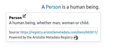
Example

Quick Start
Package Manager
Install the aristotle-tooltip package:
frankie@aristotle:~$ npm i @aristotle-metadata-enterprises/aristotle_tooltipIn your application, import the aristotle_tooltip module, and the core css:
import aristotleTooltip from '@aristotle-metadata-enterprises/aristotle_tooltip'
import 'aristotle_tooltip/dist/tooltip.css'
This assumes you're using a module bundler like Webpack, Rollup or Parcel.
CDN
<script src="https://cdn.jsdelivr.net/npm/@aristotle-metadata-enterprises/aristotle_tooltip@latest/dist/aristotletooltip.min.js"></script>
<link rel="stylesheet" href="https://cdn.jsdelivr.net/npm/@aristotle-metadata-enterprises/aristotle_tooltip@latest/dist/tooltip.css">
Place the script at the very bottom of the <body>. It must be placed before your own scripts, because of how the underlying Tippy.js library adds the tooltips.
Usage
To add a tooltip for a piece of content on your webpage:
A <a href="#" data-aristotle-concept-id="498427">person</a> is known by the company they keepCustom styling for Aristotle links can set by applying CSS rules that target attribute decorators:
a[data-aristotle-concept-id] {
  border-bottom: 1px dotted #155799;
}
a[data-aristotle-concept-id]:hover {
  text-decoration: none;
  border-bottom: 1px solid #155799;
}
Setup
let options = {
  'url': 'https://registry.aristotlemetadata.com',
  'definitionWords': 50,
  'longDefinitionWords': 75,
};
aristotleTooltip(options);
Options
| Option | Default | Explanation |
|---|---|---|
url | registry.aristotlemetadata.com | The URL of an Aristotle Metadata Registry |
definitionWords | 50 | The number of words to display in the initial popup |
longDefinitionWords | 75 | The number of words to display when 'see more..' is pressed |
placement | bottom | The positioning of the tooltip |
trigger | mouseenter focus | Events used to trigger the tooltip |
externalLinkVisible | true | Whether to display an external link icon next to the name of the metadata item |
selector | document.body | Element or css selector for creating tooltips under, tooltips not under this element will be ignored |
interactive | true | Whether interactive content such as links should be displayed |
Setting up a Development Environment
We're an open source project that welcomes any new contributions. To setup a development environment, simply fork the repo, clone it locally, and from within the aristotle-tooltip project, run:
oscar@aristotle:~$ npm install
oscar@aristotle:~$ npm run build:dev
IE11 Compatibility
A Promise polyfill is required for IE11 compatibility.aristotle-tooltip has been tested to work with ES6 Promise
ES6 Promise with a CDN
<script src="https://cdn.jsdelivr.net/npm/es6-promise@4/dist/es6-promise.auto.js"></script>