@artibet/react-sidebar-layout v1.14.1
Overview
react-sidebar-layout is a react component that helps you quickly scaffold your new dashboard application. Menu options along with their actions are described in arrays of objects. The overall appearance are fully customizable through theme templates and props.
The layout supports:
- A fully customizable and responsive sidebar.
- A topbar with simple options and dropdown menus.
- A sidebar logo
- A topbar logo
There are two predefined themes (a dark theme and a light one) for illustrative purposes. Feel free to create and use your own with this theme template as a guide. Moreover, you can easily modify individual theme options through the customize prop.
Installation
react-sidebar-layout apart from react and react-dom, it uses @mui/material library components. The following list of packages are peer dependencies and should be already installed before installing the component:
- react >= 17.0.0
- react-dom >= 17.0.0
- @mui/material >= 5.11.0
- @emotion/react >= 11.10.0
- @emotion/styled >= 11.10.0
- @mui/icons-material >= 5.11.0
- @fontsource/roboto >= 4.5.0
The latest versions can be installed as follows:
npm
npm install react
npm install react-dom
npm install @mui/material
npm install @emotion/react
npm install @emotion/styled
npm install @mui/icons-material
npm install @fontsource/roboto
yarn
yarn add react
yarn add react-dom
yarn add @mui/material
yarn add @emotion/react
yarn add @emotion/styled
yarn add @mui/icons-material
yarn add @fontsource/roboto
@mui/material library is designed to use the Roboto font by default. You should import it in your app's entry point:
import '@fontsource/roboto/300.css';
import '@fontsource/roboto/400.css';
import '@fontsource/roboto/500.css';
import '@fontsource/roboto/700.css';
Finally, install react-sidebar-layout component itself:
npm
npm install @artibet/react-sidebar-layoutyarn
yarn add @artibet/react-sidebar-layoutExamples
Bare layout
Create a brand new react application. You can use classic npx or vite (vite is used for these demo examples):
npx
npx create-react-app demo-appvite
npm create vite demo-appFollow the installation instructions as described above.
Remove any .css import from entry point (index.js or main.jsx) and add roboto font family. Your entry point file should look like this:
import React from 'react'
import ReactDOM from 'react-dom/client'
import App from './App'
import '@fontsource/roboto/300.css'
import '@fontsource/roboto/400.css'
import '@fontsource/roboto/500.css'
import '@fontsource/roboto/700.css'

ReactDOM.createRoot(document.getElementById('root')).render(
  <React.StrictMode>
    <App />
  </React.StrictMode>,
)
Into App.js(jsx) import react-sidebar-layout and return it without any props. Again, remove any .css file import:
import React from 'react'
import { SidebarLayout } from '@artibet/react-sidebar-layout'

function App() {

  return (
    <SidebarLayout />
  )
}

export default App
Now run the application. The default theme is the dark one and you should see something like this:

You can switch to the light default theme with the theme prop:
<SidebarLayout
  theme='light'
/>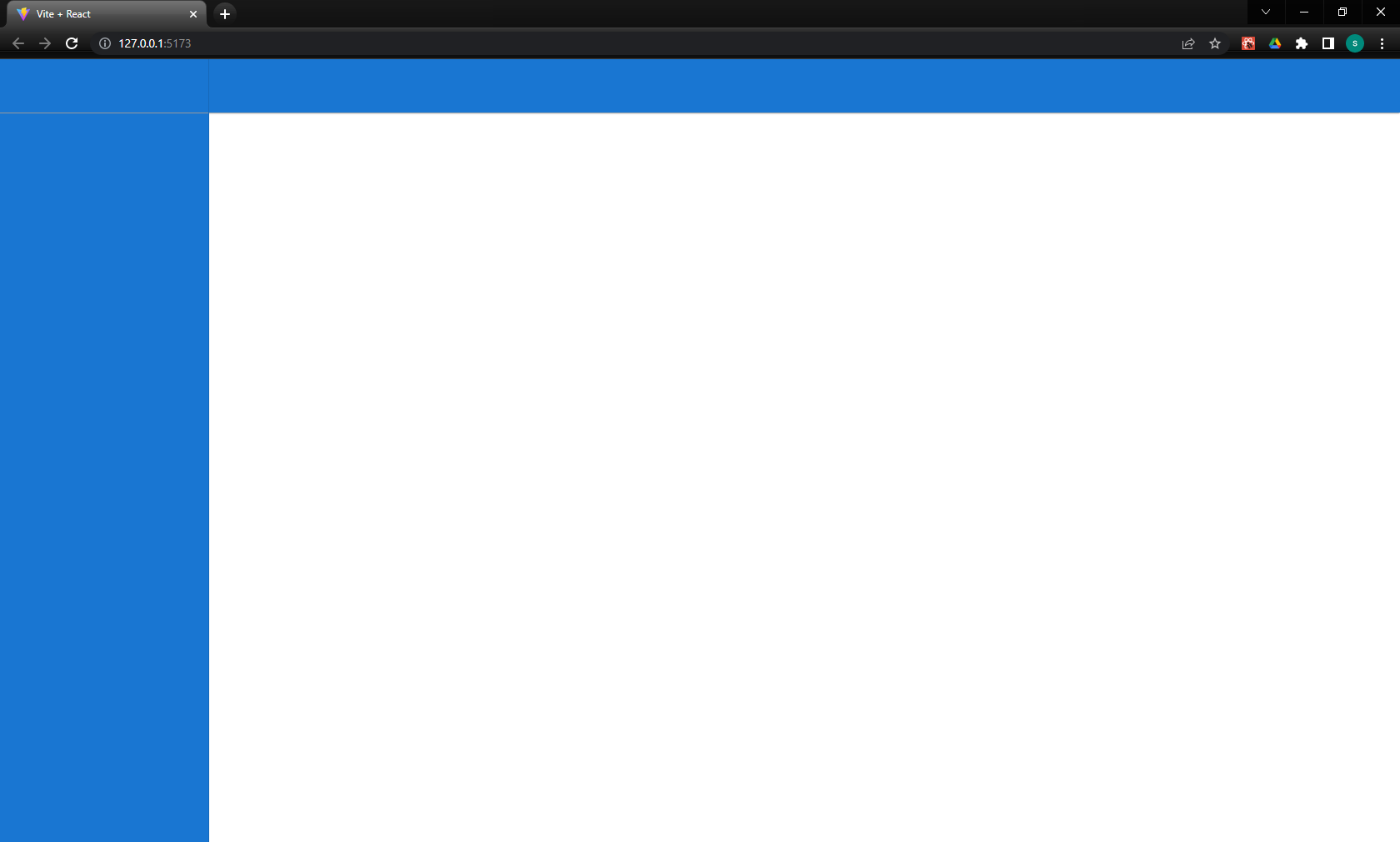
This is the bare minimum of the layout. There is a sidebar area on the left, a logo area on the left top, a topbar area along the top and the main content area. The default breakpoint is sm (small). Try to reduce the window size and observe the responsiveness of the layout. There is also an optional footer that you can add to the layout:
<SidebarLayout
  theme='dark'
  footer={<div />}
/>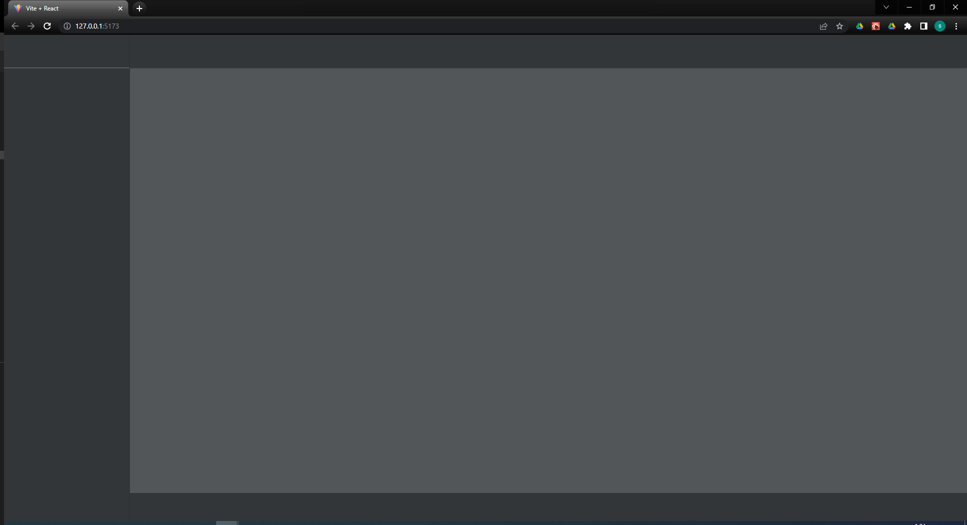
The footer prop accepts a react component or a function that return a react component. This function gets an object with the following keys that can be used to customize the footer:
| Name | Type | Description |
|---|---|---|
| height | number | The height of the footer in pixels |
| padding | number | The padding of the footer is pixes |
| textColor | string | The forground color of the thext on the footer |
| textSize | number | The font size in pixels |
| backgroundColor | string | The background color of the footer |
Sidebar Logo
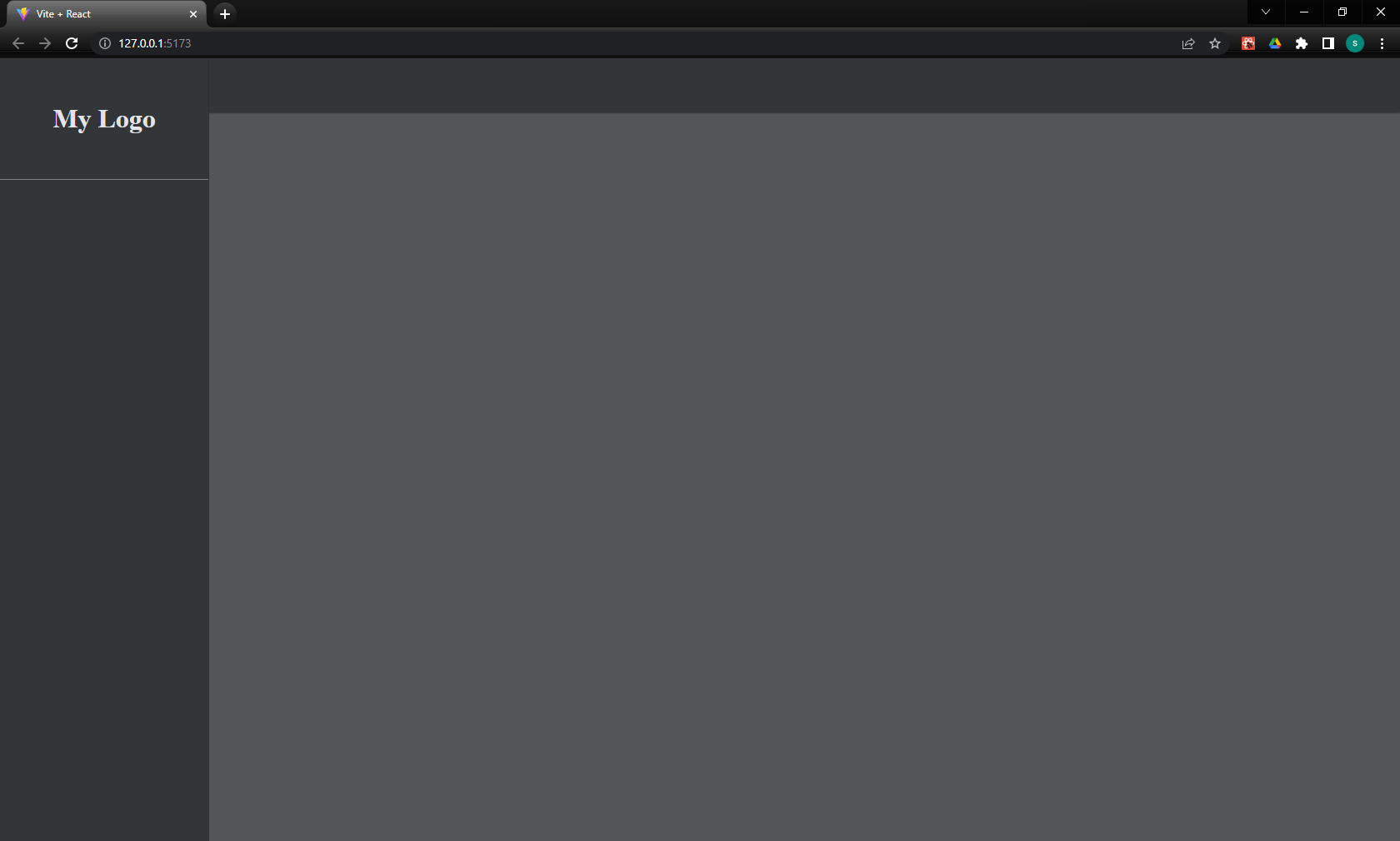
Now let's add the application's logo. The layout component supports two kind of logos. One that is placed at the top of the sidebar (sidebarLogo prop) and one that is placed at the left side of the topbar (topbarLogo prop). The latter is displayed normally when the screen size is bellow breakpoint but this behavior can be altered through props.
The logo can be anything that react renders. For this demo purposes we use a simple h1 tag. A good design practice is to create the logo as a separate react component and pass it to SidebarLayout as prop:
<SidebarLayout
  sidebarLogo={<h1>My Logo</h1>}
/>
The sidebarLogo prop can also be a function. In this case it gets an object of current sidebar theme values to help you customize the logo to fit the color scheme of the sidebar. For example:
<SidebarLayout
  sidebarLogo={(props) => <h1 style={{ color: props.textColor }}>My Logo</h1>}
/>
The supported sidebarLogo props are:
| Name | Type | Description |
|---|---|---|
| sidebarWidth | number | The width of the sidebar |
| textColor | string | The foreground color of the text at the sidebar |
| backgroundColor | string | The background color of the sidebar |
| iconColor | string | The color of the icons at the sidebar |
| iconSize | number | The size of the icons at the sidebar |
Topbar Logo
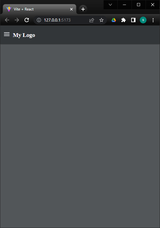
The react-sidebar-layout supports a logo at the topbar. Usually this logo is displayed only when the windows size is bellow breakpoint and it is an alternative to the applications logo (obviously it can be the same with smaller size and/or color). Let's create a smaller instance of the app's logo:
<SidebarLayout
  sidebarLogo={<h1>My Logo</h1>}
  topbarLogo={<h3>My Logo</h3>}
/>
To see this logo shrink the screen to reach the default breakpoint (sm):
Just like with sidebarLogo prop we can use a function that return the logo component:
<SidebarLayout
  topbarLogo={(props) => <h3 style={{ color: props.textColor }}>My Logo</h3>}
/>
The supported topbarLogo props are:
| Name | Type | Description |
|---|---|---|
| textColor | string | The foreground color of the text at the topbar |
| backgroundColor | string | The background color of the topbar |
| iconColor | string | The color of the icons at the topbar |
| iconSize | number | The size of the icons at the topbar |
If you want the topbar logo to be always visible you can either edit the respective option in the theme file or set it with the customize prop:
<SidebarLayout
  sidebarLogo={<h1>My Logo</h1>}
  topbarLogo={<h3>My Logo</h3>}
  customize={{
    topbar: {
      logoAlwaysVisible: true
    }
  }}
/>
Sidebar Menu Items
To create sidebar menu items you must pass an array of objects into sidebarMenuItems prop. The supported key properties of these objects are the following:
| Name | Type | default | Description |
|---|---|---|---|
| label | string | The displayed text | |
| icon | react component | The menu icon | |
| onClick | function | The action taken on menu click event | |
| hidden | boolean or function | false | When set to true the menu item is not visible |
| active | boolean or function | false | When set to true the menu item is highlighted |
| group | array | An array of submenu items. The component supports only one grouping level |
For example, let's create two menu items. One for Home and one for Users:
import React from 'react'
import { SidebarLayout } from '@artibet/react-sidebar-layout'
import HomeIcon from '@mui/icons-material/Home'
import SupervisorAccountIcon from '@mui/icons-material/SupervisorAccount'

function App() {

  const sidebarMenuItems = [
    {
      label: "Home",
      icon: <HomeIcon />,
      onClick: () => console.log('Home')
    },
    {
      label: "Users",
      icon: <SupervisorAccountIcon />,
      onClick: () => console.log('Users')
    }
  ]

  return (
    <SidebarLayout
      sidebarLogo={<h1>My Logo</h1>}
      topbarLogo={<h3>My Logo</h3>}
      sidebarMenuItems={sidebarMenuItems}
    />
  )
}


export default App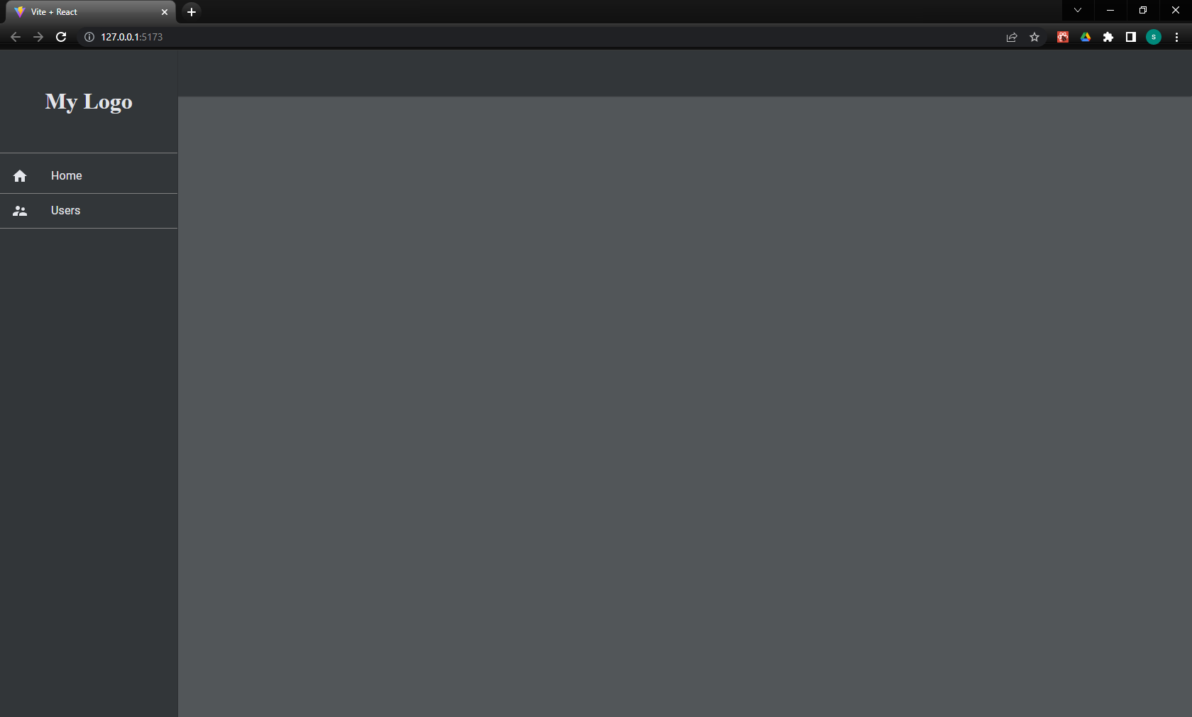
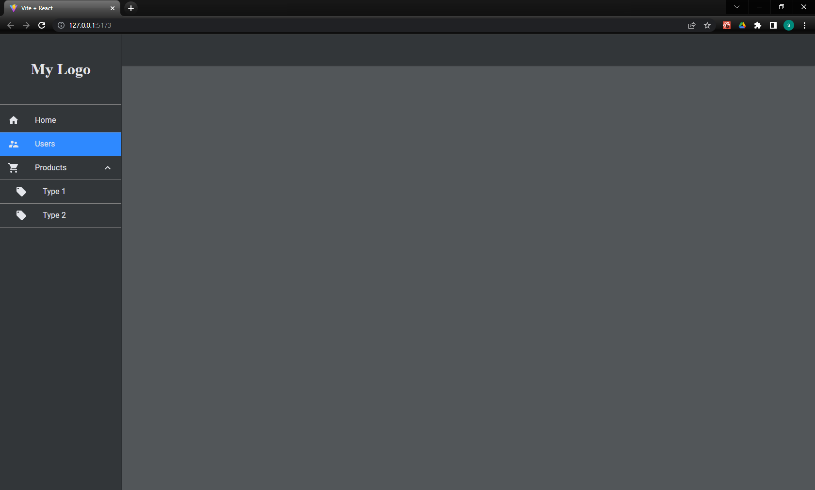
Now let's add a third menu option "Products" with two sub menus "Type 1" and "Type 2". For illustrative purposes we make Users menu active:
import ShoppingCartIcon from '@mui/icons-material/ShoppingCart';
import LocalOfferIcon from '@mui/icons-material/LocalOffer';

// ...

const sidebarMenuItems = [
  {
    label: "Home",
    icon: <HomeIcon />,
    onClick: () => console.log('Home')
  },
  {
    label: "Users",
    icon: <SupervisorAccountIcon />,
    onClick: () => console.log('Users'),
    active: true
  },
  {
    label: "Products",
    icon: <ShoppingCartIcon />,
    group: [
      {
        label: "Type 1",
        icon: <LocalOfferIcon />,
        onClick: () => console.log('Type 1 product')
      },
      {
        label: "Type 2",
        icon: <LocalOfferIcon />,
        onClick: () => console.log('Type 2 product')
      },
    ]
  }
]

// ...
Topbar Menu Items
The topbar menu items are placed on far right side. They can be dropdown menus or simple click buttons. The procedure is similar to that of the sidebar's. We pass an array of objects into topbarMenuItems prop.
The supported key properties of these objects are the following:
| Name | Type | default | Description |
|---|---|---|---|
| label | string | The displayed text | |
| icon | react component | The menu icon | |
| onClick | function | The action taken on menu click event | |
| hidden | boolean or function | false | When set to true the menu item is not visible |
| tooltip | string | A small text displayed on mouse hover | |
| group | array | An array of submenu items. The component supports only one grouping level | |
| dropdownArrow | boolean | false | If the group key is present it shows or hides the dropdown arrow icon |
| divider | boolean | If set to true and the object is part of a group then a divider line is rendered. The other keys are ignored |
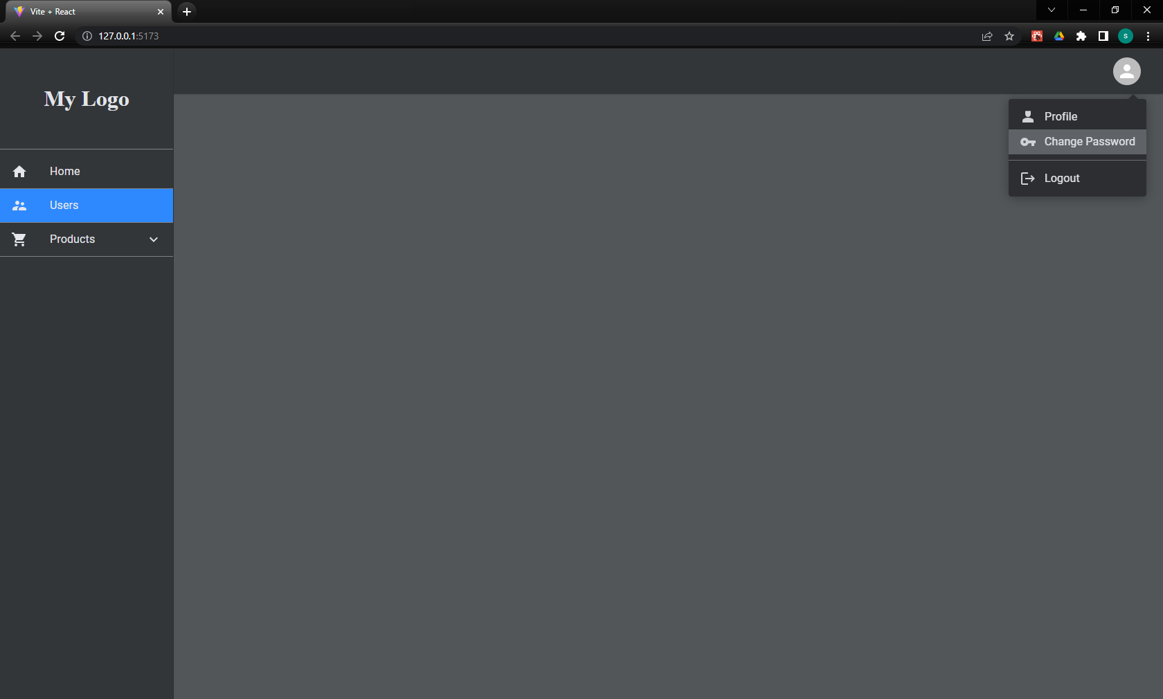
We will first create an account dropdown menu with an avatar and three options: "Profile", "Change Password" and "Logout". We also add a divider line before "Logout":
import { Avatar } from '@mui/material';
import Person4Icon from '@mui/icons-material/Person4';
import VpnKeyIcon from '@mui/icons-material/VpnKey';
import LogoutIcon from '@mui/icons-material/Logout';

// ...

 const topbarMenuItems = [
  {
    icon: <Avatar />,
    tooltip: 'Account Menu',
    group: [
      {
        label: 'Profile',
        icon: <Person4Icon />,
        onClick: () => console.log('Profile'),
      },
      {
        label: 'Change Password',
        icon: <VpnKeyIcon />,
        onClick: () => console.log('Change Password'),
      },
      { divider: true },
      {
        label: 'Logout',
        icon: <LogoutIcon />,
        onClick: () => console.log('Logout'),
      }
    ]
  },
]

// ...

<SidebarLayout
  sidebarLogo={<h1>My Logo</h1>}
  topbarLogo={<h3>My Logo</h3>}
  sidebarMenuItems={sidebarMenuItems}
  topbarMenuItems={topbarMenuItems}
/>

// ...
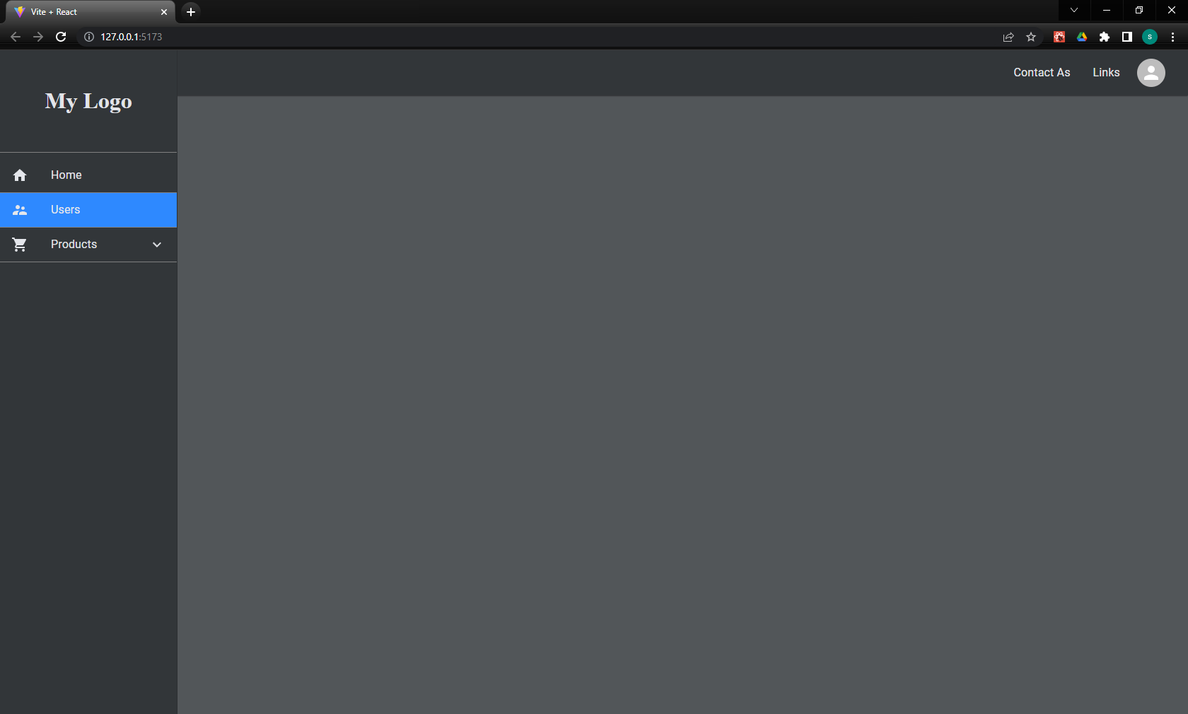
Next, we add two simple options on the left of the avatar. "Contact Us" and "Links":
const topbarMenuItems = [
  {
    label: 'Contact As',
    onClick: () => console.log('Contact us')
  },
  {
    label: 'Links',
    onClick: () => console.log('Links')
  },
  {
    icon: <Avatar />,
    tooltip: "User menu",
    group: [
      {
        label: 'Profile',
        icon: <Person4Icon />,
        onClick: () => console.log('Profile'),
      },
      {
        label: 'Change Password',
        icon: <VpnKeyIcon />,
        onClick: () => console.log('Change Password'),
      },
      { divider: true },
      {
        label: 'Logout',
        icon: <LogoutIcon />,
        onClick: () => console.log('Logout'),
      }
    ]
  },
]
API
SidebarLayout props
| Name | Type | default | Description |
|---|---|---|---|
| theme | string or object | 'dark' | The theme for the layout |
| sidebarLogo | react component | The sidebar logo | |
| topbarLogo | react component | The topbar logo | |
| sidebarMenuItems | array | The menu items on the sidebar | |
| topbarMenuItems | array | The menu items on the topbar | |
| footer | react component | The footer of the layout | |
| customize | object | Customize particular theme values |
The customize prop supports the following keys:
- sidebar
- topbar
- popupMenu
- mainContent
- footer
Each key is in turn an object corresponding to the key of the theme template.
Hooks
useSidebarLayoutContext
This hook exports the following properties that you can use to customize the main content of your application:
| Name | Type | Description |
|---|---|---|
| theme | object | The active theme properties as described into theme template |
| muiTheme | object | The Material UI theme properties |
| topbarHeight | number | The height of the topbar in pixels. It changes dynamically on breakpoint |
| isSidebarOpen | boolean | When the screen size is bellow breakpoint it shows if the sidebar is temporary visible or not |
| isAboveBreakpoint | boolean | If true the screen size is large enough and the sidebar is visible otherwise is hidden |
11 months ago
1 year ago
11 months ago
1 year ago
1 year ago
1 year ago
1 year ago
1 year ago
2 years ago
2 years ago
2 years ago
2 years ago
2 years ago
3 years ago
3 years ago
3 years ago
3 years ago
3 years ago
3 years ago
3 years ago
3 years ago
3 years ago
3 years ago
3 years ago
3 years ago
3 years ago
3 years ago
3 years ago
3 years ago
3 years ago
3 years ago
3 years ago
3 years ago
3 years ago
3 years ago
3 years ago