@babybeet/angular-tooltip v1.1.1
angular-tooltip 
Easily show tooltips programmatically and/or declaratively in Angular.
Table of contents
- Angular compatibility
- Installation
- Accessibility
- Tooltip placement
- Using
TooltipDirective - Using
TooltipService - Example Usage
Angular compatibility
| This library | Angular |
|---|---|
| 1.x.x | 16 - 18 |
Installation
npmnpm i -S @babybeet/angular-tooltippnpmpnpm i -S @babybeet/angular-tooltipyarnyarn add @babybeet/angular-tooltip
Accessibility
The tooltip component that gets created handles wiring up aria-describedby attribute for accessability between the tooltip trigger and the tooltip content, so it's completely transparent to you as the API user.
Tooltip placement
There are 2 supported placement values: vertical and horizontal. vertical will either place the tooltip at the bottom or top of the anchor element depending on which side has enough space for the tooltip to not be cutoff. Similarly, horizontal will either place the tooltip at the right or left of the anchor element depending on which side has enough space for the tooltip to not be cutoff. By default, vertical is used and the tooltip is placed at the bottom of the anchor.
Using TooltipDirective
Because TooltipDirective is a standalone directive, you must import it into your @NgModule or your standalone component before using it.
TooltipDirective can be applied to any elements in your templates to trigger a tooltip on hover/keyboard navigation (when users focus on the tooltip trigger by pressing the tab key)/long presses on mobile devices.
Supported input bindings
lcTooltip
Sets the tooltip message to show.
lcTooltipPlacement
Sets the position where the tooltip is placed. Valid values are vertical and horizontal. vertical is the default if not specified.
lcTooltipTheme
Sets the theme. Must be either dark or light. dark is the default if not provided.
Code example with TooltipDirective
@Component({
  imports: [TooltipDirective],
  selector: 'your-component',
  standalone: true,
  template: `
        <button
            lcTooltip='Hello World'
            <!-- if "lcTooltipPlacement" is not specified, "vertical" is assumed -->
            lcTooltipPlacement='vertical'
            <!-- if "lcTooltipTheme" is not specified, "dark" is assumed -->
            lcTooltipTheme='dark'>
            Hover me
        </button>
    `
})
export class YourComponent {}
Result
| Theme | |
|---|---|
| Dark | 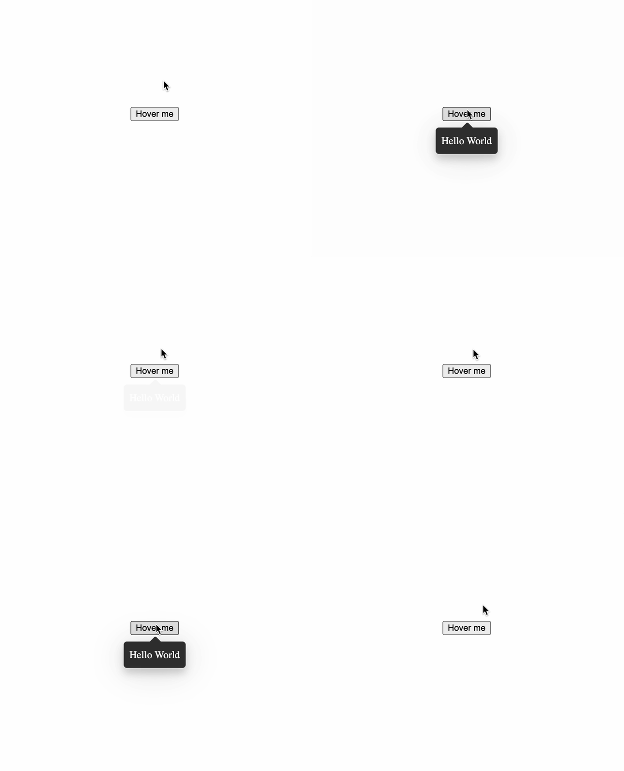 |
| Light | 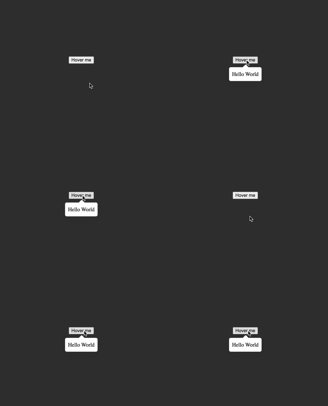 |
The tooltip also repositions itself to the top if it overflows the bottom edge of the viewport for vertical placement, similar behavior also applies for the other horizontal placement.
 |
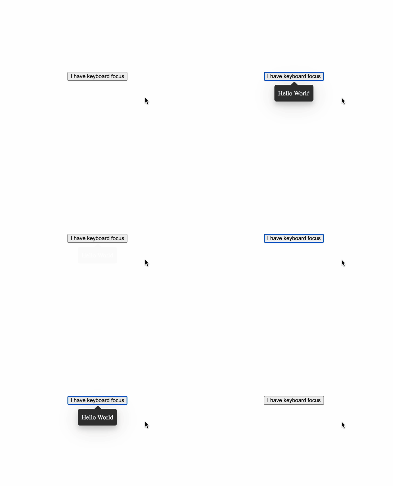
The tooltip is also displayed when the trigger element receives keyboard focus when the you press the tab key.
 |
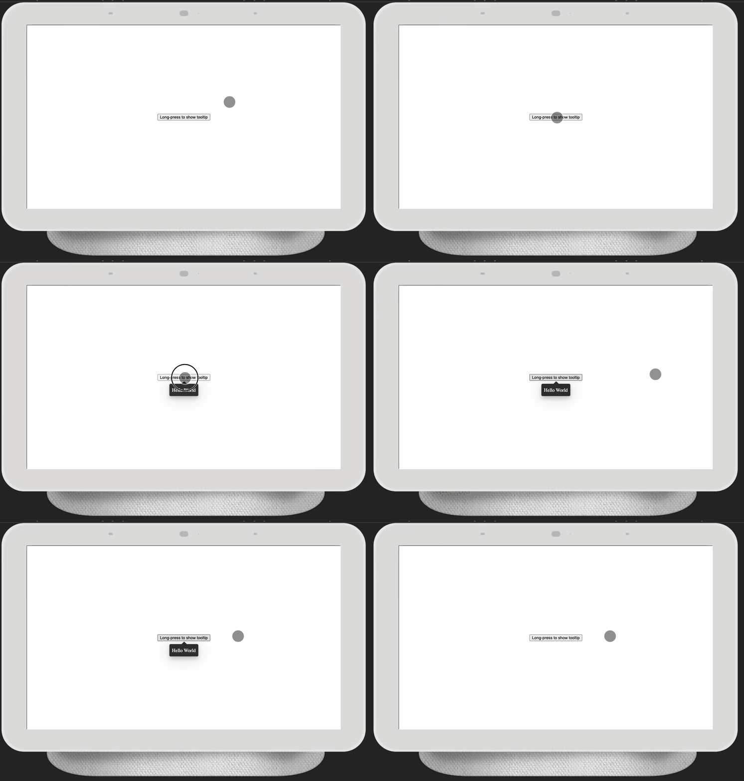
On mobile devices, you can activate the tooltip by long-pressing the trigger element.
 |
Using TooltipService
TooltipService
This class allows to programmatically show a tooltip anchored at an element. See {@see TooltipConfiguration} for the different options to configure the tooltip. Please note that even though this class can create as many tooltips as desired, it cannot selectively close a tooltip, it can only close all currently opened tooltips.
class TooltipService {
  /**
   * Set the default theme that will be used for all tooltip created in the future.
   *
   * @param theme The new theme to be used as the default.
   */
  static setDefaultTheme(theme: Theme): void;

  /**
   * Show a tooltip anchored at `anchor` with a configuration object specified by `configuration`.
   * Ensure that the last opened tooltip has been closed before calling this method.
   *
   * @param anchor The target at which to place the tooltip.
   * @param configuration The configuration object for this tooltip instance.
   */

  show(anchor: Element, configuration: TooltipConfiguration): void;

  /**
   * Show a tooltip anchored at the provided x/y coordinates with a configuration object specified by `configuration`.
   * Ensure that the last opened tooltip has been closed before calling this method.
   *
   * @param x The x coordinate to place the tooltip.
   * @param y The y coordinate to place the tooltip.
   * @param configuration The configuration object for this tooltip instance.
   */
  showAt(x: number, y: number, configuration: TooltipConfiguration): void;

  /**
   * Hide all opened tooltips.
   */
  hide(): void;
}
TooltipConfiguration
The configuration object for the current tooltip. The optional type parameter C describes the type of the optional context object passed to TemplateRef<C> content, otherwise, it's ignored for other types of content.
interface TooltipConfiguration<C extends Record<string, unknown> | unknown = unknown> {
  /**
   * The optional class name to add to this tooltip.
   */
  className?: string;
  /**
   * The required content to show, it accepts a `TemplateRef`, a `@Component()` class, or a string.
   */
  content: TemplateRef<C> | Type<unknown> | string;
  /**
   * The optional context object that is referenced by the template ref.
   */
  context?: C;
  /**
   * Where to position the tooltip. Default is `vertical`.
   */
  placement?: Placement;
  /**
   * The optional theme for this tooltip. Default is `light`.
   */
  theme?: Theme;
}
Placement
Describes the direction in which the tooltip is placed with respect to its anchor.
type Placement =
  /**
   * The tooltip will be placed either at the bottom or at the top with respect to its anchor
   * depending on how much available space there is in that direction. By default,
   * the tooltip will be placed at the bottom of its anchor for this placement.
   */
  | 'horizontal'

  /**
   * The tooltip will be placed either at the left or at the right with respect to its anchor
   * depending on how much available space there is in that direction. By default,
   * the tooltip will be placed at the right of its anchor for this placement.
   */
  | 'vertical';
Theme
type Theme = 'light' | 'dark';Example Usage
Code example with a string content
// Import the service into your class to start using it
import { TooltipService, Placement, Theme } from '@babybeet/angular-tooltip';

@Component({
  selector: 'test-component',
  template: `
    <button
      #button
      type="button"
      (pointerover)="onShowTooltip(#button)"
      (pointerout)="onHideTooltip()">
      Hover me!!!
    </button>
  `
})
export class TestComponent {
  constructor(private readonly tooltipService: TooltipService) {}

  onShowTooltip(trigger: HTMLButtonElement) {
    this.tooltipService.show(trigger, {
      content: 'This is a tooltip',
      className: 'optional-class-name',
      placement: 'horizontal',
      theme: 'light'
    });
  }

  onHideTooltip() {
    this._tooltipService.hide();
  }
}
Result
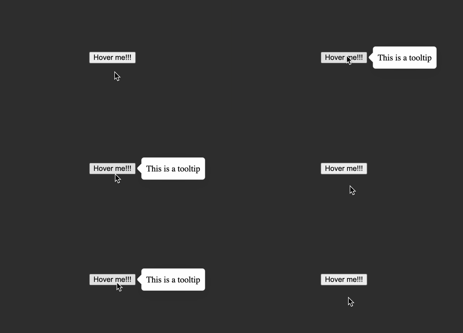 |
Code example with a TemplateRef content
// Import the service into your class to start using it
import { TooltipService, Placement, Theme } from '@babybeet/angular-tooltip';

@Component({
  selector: 'test-component',
  template: `
    <button
      #button
      type="button"
      (pointerover)="onShowTooltip(button, templateRefContent)"
      (pointerout)="onHideTooltip()">
      Hover me
    </button>

    <ng-template
      #templateRefContent
      let-name>
      <span>
        Hello <strong>{{ name }}</strong>
      </span>
    </ng-template>
  `
})
export class TestComponent {
  constructor(private readonly tooltipService: TooltipService) {}

  onShowTooltip(button: HTMLButtonElement, templateRefContent: TemplateRef<unknown>) {
    this.tooltipService.show(button, {
      content: templateRefContent,
      /*
       * Passing the context object value to the template
       */
      context: {
        $implicit: 'TemplateRef'
      },
      placement: 'vertical',
      theme: 'dark'
    });
  }

  onHideTooltip() {
    this._tooltipService.hide();
  }
}
Result
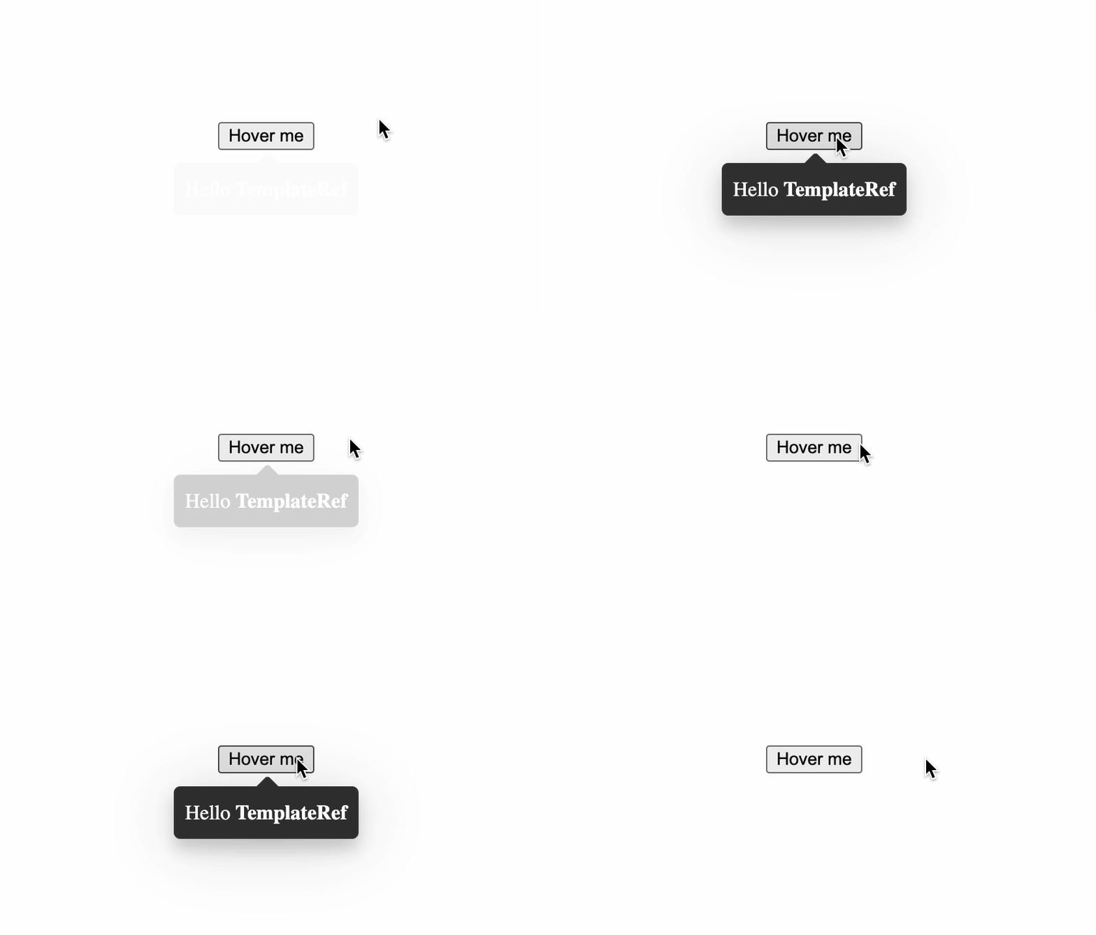 |
The above examples are contrived at best, a better use case would be for when you need to manually create many <circle> and <path> SVG elements to render a network of some sort, and you need to display details about each node or edge when you hover over them, in this case, you can use TooltipService APIs to programmatically show/hide tooltips on mouseover (pointerover)/mouseout(pointeout).