1.0.16 • Published 2 years ago
@bearlee/mdx-editor v1.0.16
EasyMDE(easy-markdown-editor) + @mdx-js
This component is made with EasyMDE(easy-markdown-editor) and @mdx-js
Good to notice...
I started this project for understanding/studying mdx.
It is totally okay if you want to reference my code for building better one (if it was any help, I would be very happy to get a github star⭐ )
How to use
You can simply give two props to MDXEditor component.
1. components => Object(key: MDX Component name, value: MDX Component)
2. defaultString => mdx string
Example
import { MDXEditor } from "@bearlee/mdx-editor";
import from "@bearlee/mdx-editor/style.css";

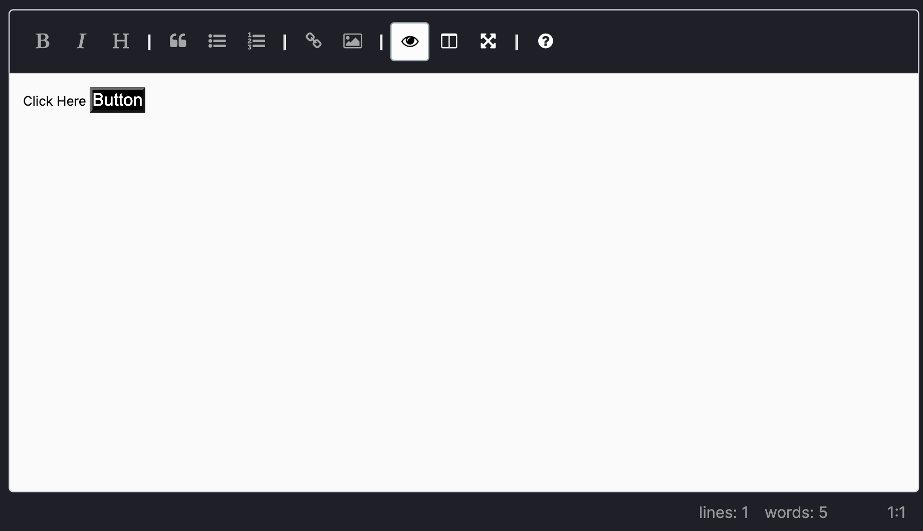
const MyButton = ({color}: {color: string}) => <button style={{ background: color }}>Button</button>;

const Example = () => {
  return <MDXEditor
    components={{ MyButton }}
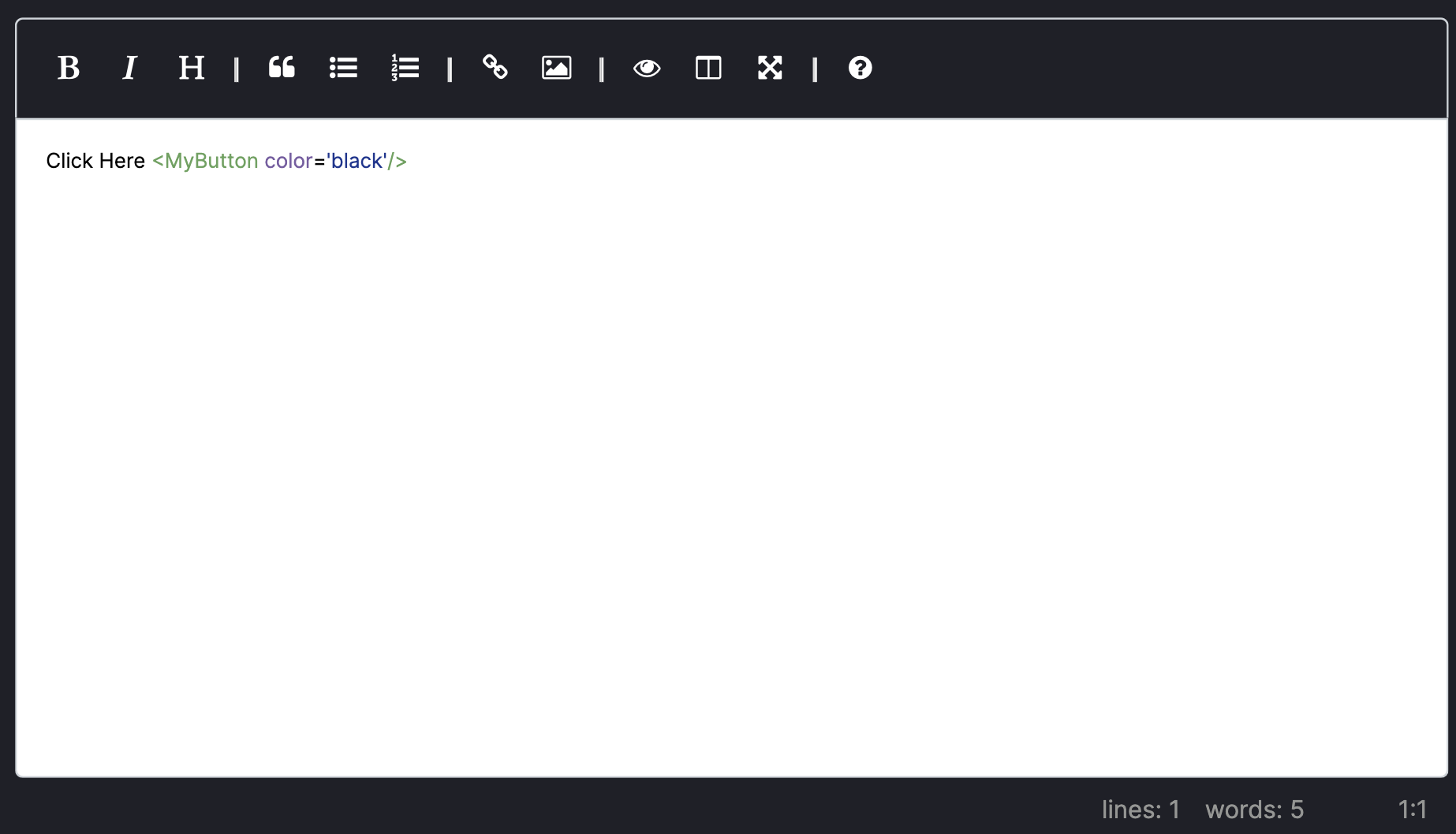
    defaultString="Click Here <MyButton color='black'/>"
  />
};
MDX String Image

MDX Preview Image

Future Work
I used MDXProvider directly in MDXEditor component for easy use. However, I know that using Provider inside a component is not a good choice.
- remove
MDXProviderinMDXEditor - add props for setting
EasyMDE