@candoa/chatbot
Headless React Chatbot Widget with TypeScript & TailwindCSS Support
A powerful, customizable React chatbot component that provides headless architecture with built-in hooks for modern chat experiences. Perfect for developers who want full control over their AI chatbot UI while leveraging robust state management.
Perfect for developers searching for:
- React chatbot component
- Headless chatbot widget
- TypeScript chatbot library
- TailwindCSS chat widget
- Customizable AI chat interface
- React hooks for chat functionality
Features
Headless Architecture
- Complete UI flexibility while handling complex state management
- Build your own chat interface with any CSS framework (TailwindCSS, styled-components, etc.)
- Zero UI assumptions - you control every pixel
Developer Experience
- TypeScript Support: Full type safety and IntelliSense
- React Hooks: Modern React patterns with
useChatbothook - TailwindCSS Ready: Pre-built examples with TailwindCSS classes
- SSR Compatible: Works with Next.js, Remix, and other SSR frameworks
- Minimal Dependencies: Lightweight bundle size
Chat Features
- Conversation Persistence: Automatic saving and loading of conversation history
- Greeting Messages: Support for initial bot messages when starting a new chat
- Conversation Management: Load, clear, and manage chat sessions with ease
- Error Handling: Built-in error state management
- Real-time Updates: Smooth typing indicators and message updates
Why Choose This React Chatbot?
vs. Other React Chat Libraries
- Truly Headless: Unlike other chatbot widgets, we don't force any UI decisions
- TypeScript First: Built with TypeScript for better developer experience
- Modern React: Uses latest React patterns and hooks
- Framework Agnostic: Works with Next.js, Vite, Create React App, Remix
- Styling Freedom: Use TailwindCSS, CSS Modules, styled-components, or any CSS solution
Common Use Cases
- Customer Support Chatbots - Add AI support to your SaaS
- Documentation Assistants - Help users navigate your docs
- E-commerce Chat - Product recommendations and support
- Educational Platforms - Interactive learning assistants
- Internal Tools - Employee help desks and knowledge bases
If this package helps you, please consider giving it a star on GitHub!
Installation
# npm
npm install @candoa/chatbot

# yarn
yarn add @candoa/chatbot

# pnpm
pnpm add @candoa/chatbot
Get Started
Option 1: Complete AI Solution
For a complete AI chatbot solution with knowledge base training, analytics, and conversation management:
- Learn more: candoa.app
Features include:
- Train your AI on your own data
- Get your project ID
- Access conversation analytics
- Manage customer interactions
Option 2: Fork & Connect Your Backend
This package is open source! Feel free to fork it and connect to your own backend infrastructure.
Usage
import { useChatbot } from '@candoa/chatbot'

function MyChatbot() {
  const { state, actions } = useChatbot('your-project-id', {
    greetings: ['Hello! How can I assist you today?'],
  })

  return (
    <div>
      {/* Your custom chat UI using state and actions */}
      {state.messages.map((message) => (
        <div key={message.id}>{message.text}</div>
      ))}
      <button onClick={() => actions.sendMessage('Hello')}>Send Message</button>
    </div>
  )
}
shadcn/ui Example
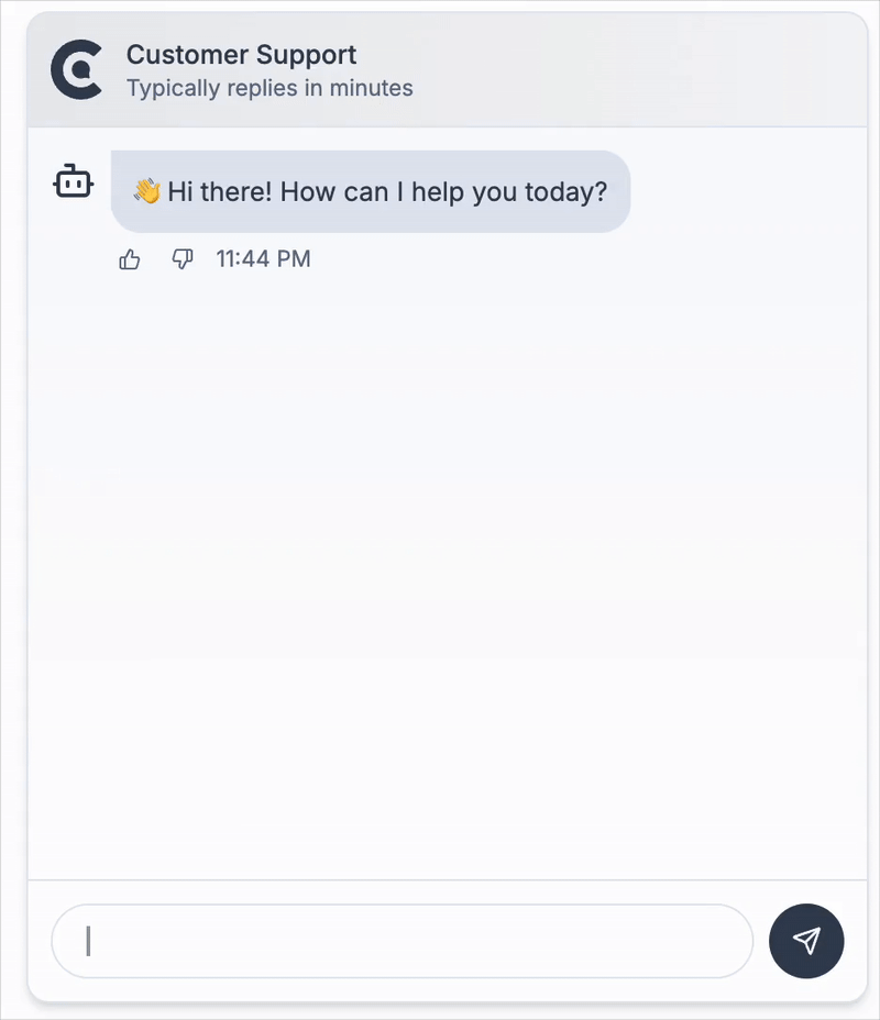
Here's a complete example using shadcn/ui components for a modern, accessible chat interface:
Note: This is a styling example using shadcn/ui components. Make sure you have shadcn/ui installed and configured in your project.
'use client'

import { ChatbotWidget } from '@candoa/chatbot'
import {
  Popover,
  PopoverContent,
  PopoverTrigger,
} from '@/components/ui/popover'
import { Button } from '@/components/ui/button'
import { Input } from '@/components/ui/input'
import { ScrollArea } from '@/components/ui/scroll-area'
import { MessageSquare, RefreshCw, Send, X } from 'lucide-react'
import { cn } from '@/lib/utils'
import { useEffect, useRef } from 'react'

export function ClientChatbot() {
  return (
    <ChatbotWidget
      projectId="your-project-id"
      greetings={['Hello! How can I assist you today?']}
    >
      {({
        isOpen,
        messages,
        error,
        isTyping,
        onSendMessage,
        onToggleOpen,
        onClose,
        onClearError,
        onClearMessages,
      }) => {
        const messagesEndRef = useRef<HTMLDivElement>(null)
        const previousMessageCount = useRef(messages.length)

        // Auto-scroll to bottom when messages change or when chat opens
        useEffect(() => {
          if (isOpen) {
            // Check if this is a new message being added
            const isNewMessage = messages.length > previousMessageCount.current

            if (isNewMessage || isTyping) {
              setTimeout(() => {
                if (messagesEndRef.current) {
                  messagesEndRef.current.scrollIntoView({
                    behavior: 'auto',
                    block: 'end',
                  })
                }
              }, 50)
            }

            previousMessageCount.current = messages.length
          }
        }, [messages.length, isTyping, isOpen])

        return (
          <Popover
            open={isOpen}
            onOpenChange={onToggleOpen}
          >
            <PopoverTrigger asChild>
              <Button
                size="icon"
                className="fixed bottom-6 right-6 z-40 h-14 w-14 rounded-full shadow-lg"
              >
                <MessageSquare className="scale-150" />
              </Button>
            </PopoverTrigger>
            <PopoverContent
              align="end"
              sideOffset={16}
              alignOffset={0}
              className="w-96 p-0 mr-2 rounded-xl shadow-lg border bg-background text-foreground"
              side="top"
            >
              {/* Chat Header */}
              <div className="flex items-center justify-between border-b p-3">
                <div className="flex items-center gap-2">
                  <div className="h-8 w-8 rounded-full bg-primary flex items-center justify-center">
                    <MessageSquare className="h-4 w-4 text-primary-foreground" />
                  </div>
                  <div>
                    <h3 className="font-semibold text-sm">Customer Support</h3>
                    <p className="text-xs text-muted-foreground">
                      Typically replies in minutes
                    </p>
                  </div>
                </div>
                <div className="flex items-center gap-1">
                  <Button
                    variant="ghost"
                    size="icon"
                    className="h-7 w-7"
                    onClick={onClearMessages}
                    title="Clear chat history"
                  >
                    <RefreshCw className="h-4 w-4" />
                    <span className="sr-only">Clear Chat</span>
                  </Button>
                  <Button
                    variant="ghost"
                    size="icon"
                    className="h-7 w-7"
                    onClick={onClose}
                  >
                    <X className="h-4 w-4" />
                    <span className="sr-only">Close</span>
                  </Button>
                </div>
              </div>

              {/* Chat Messages */}
              <div className="h-[400px] space-y-4 overflow-y-auto p-4">
                {messages.map((message) => (
                  <div
                    key={message.id}
                    className={cn('flex', {
                      'justify-end': message.isUser,
                      'justify-start': !message.isUser,
                    })}
                  >
                    <div
                      className={cn(
                        'max-w-[75%] rounded-lg px-3 py-2 text-sm',
                        {
                          'bg-primary text-primary-foreground': message.isUser,
                          'bg-muted text-muted-foreground': !message.isUser,
                        },
                      )}
                    >
                      {message.text}
                    </div>
                  </div>
                ))}

                {isTyping && (
                  <div className="flex justify-start">
                    <div className="rounded-lg bg-muted p-3">
                      <div className="flex space-x-1">
                        <div className="w-2 h-2 rounded-full bg-foreground/30 animate-bounce"></div>
                        <div className="w-2 h-2 rounded-full bg-foreground/30 animate-bounce delay-150"></div>
                        <div className="w-2 h-2 rounded-full bg-foreground/30 animate-bounce delay-300"></div>
                      </div>
                    </div>
                  </div>
                )}

                {/* Invisible element to scroll to */}
                <div ref={messagesEndRef} />
              </div>

              {/* Error message */}
              {error && (
                <div className="text-xs text-destructive m-3 p-2 bg-destructive/10 rounded-md flex justify-between items-center">
                  <span>{error}</span>
                  <Button
                    variant="ghost"
                    size="sm"
                    onClick={onClearError}
                    className="h-auto py-1 px-1.5 text-xs"
                  >
                    Dismiss
                  </Button>
                </div>
              )}

              {/* Chat Input */}
              <div className="p-3 border-t">
                <form
                  className="flex w-full gap-2"
                  onSubmit={(e) => {
                    e.preventDefault()
                    const input = e.currentTarget.elements.namedItem(
                      'message',
                    ) as HTMLInputElement
                    if (input.value) {
                      onSendMessage(input.value)
                      input.value = ''
                    }
                  }}
                >
                  <Input
                    type="text"
                    autoFocus
                    name="message"
                    placeholder="Ask me anything..."
                    className="flex-1 h-9 text-sm text-foreground placeholder:text-muted-foreground focus:outline-none focus:ring-2 focus:ring-ring focus:ring-offset-2 selection:bg-primary selection:text-primary-foreground"
                    autoComplete="off"
                  />
                  <Button
                    type="submit"
                    size="icon"
                    className="h-9 w-9 rounded-full"
                  >
                    <Send className="h-4 w-4" />
                    <span className="sr-only">Send</span>
                  </Button>
                </form>
              </div>
            </PopoverContent>
          </Popover>
        )
      }}
    </ChatbotWidget>
  )
}
This example demonstrates:
- shadcn/ui Integration: Uses Popover, Button, Input, and other shadcn/ui components
- Auto-scroll Functionality: Automatically scrolls to the bottom when new messages arrive or chat opens
- Theme Awareness: Automatically adapts to light/dark themes using CSS variables
- Accessibility: Proper ARIA labels and keyboard navigation
- Modern Design: Clean, professional interface with proper spacing and typography
- Responsive Layout: Works well on different screen sizes
- Conversation Persistence: Maintains chat history across page refreshes
Getting Your Project ID
To use the chatbot with Candoa's AI solution, get your project ID from candoa.app:
- Sign up or log in to your Candoa CRM
- Click on your profile name in the top navigation
- In the profile dropdown, you'll see a Projects tab
- Under the Projects tab, you'll find your Project ID
The project ID connects your chatbot to your trained AI model and knowledge base.
Using Your Own Backend (Optional)
By default, the chatbot connects to Candoa's hosted AI service. If you prefer to use your own backend implementation, you can specify a custom API URL:
With the useChatbot hook:
const { state, actions } = useChatbot('your-project-id', {
  greetings: ['Hello! How can I assist you today?'],
})
With the ChatbotWidget component:
<ChatbotWidget
  projectId="your-project-id"
  greetings={['Hello! How can I assist you today?']}
>
  {/* Your render prop content */}
</ChatbotWidget>
Your backend needs to implement the chatbot API endpoints (/api/chatbot and /api/messages) to handle chat requests and conversation history.
API Reference
useChatbot Hook
The core hook that powers the chatbot functionality.
const { state, actions } = useChatbot(projectId, options)Parameters
projectId(string): Unique identifier for the projectoptions(object):title(string, optional): Chat titlegreetings(string[], optional): Initial greeting messagesicon(React component, optional): Icon component for the chatinitialConversationId(string, optional): Load a specific conversation initiallyapiUrl(string, optional): Base URL for API calls to your backend (e.g., 'https://your-api-domain.com').
Returns
An object with two properties:
state(object):isOpen(boolean): Whether the chat is openmessages(Message[]): Current chat messageserror(string | null): Error message, if anyisTyping(boolean): Whether the bot is "typing"hasActiveConversation(boolean): Whether there is an active conversation
actions(object):setIsOpen(function): Open or close the chatsendMessage(function): Send a message to the botclearMessages(function): Clear the conversation historyclearError(function): Clear any error messagesloadConversation(function): Load a conversation by ID
ChatbotWidget Component
A render prop component that provides a complete chatbot interface.
<ChatbotWidget projectId={projectId} {...options}>
  {(renderProps) => (
    // Your custom UI using renderProps
  )}
</ChatbotWidget>
Props
projectId(string): Unique identifier for the projecttitle(string, optional): Chat titlegreetings(string[], optional): Initial greeting messagesicon(React component, optional): Icon component for the chatapiUrl(string, optional)children(function): Render prop function that receives the chatbot state and actions
Render Props
The render prop function receives an object with the following properties:
isOpen(boolean): Whether the chat is openmessages(Message[]): Current chat messageserror(string | null): Error message, if anyisTyping(boolean): Whether the bot is "typing"hasActiveConversation(boolean): Whether there is an active conversationonSendMessage(function): Send a message to the botonToggleOpen(function): Toggle the chat open/closed stateonClose(function): Close the chatonClearMessages(function): Clear the conversation historyonClearError(function): Clear any error messagesonLoadConversation(function): Load a conversation by ID
Types
type Message = {
  id: string
  text: string
  isUser: boolean
  timestamp: Date
}
License
MIT Candoa