@cicciosgamino/qr-code-element v0.1.0
🦓 \<qr-code-element>
v0.1.0 - 22-02-2023
QR-Code WebComponent based on Project Nayuki Qr Code Library. Nayuki project aims to be the best, clearest library for generating QR Codes. Get more info at official page:
https://www.nayuki.io/page/qr-code-generator-library
Nayuki Qr Code Library v1.8.0 - Javascript
SVG SVG is the default graphic format the Qr Code is build-up in the \<qr-code-element> . Define the size of the WebComponent with a CSS custom properties:
/* size the qr code if svg */
qr-code-element {
  --size: 7rem;
}
Keep in mind that you can style the background and tile colors of the Qr Code with the attribute bkColor and tileColor as you can see in attributes table.
When the QrCode is render in SVG format the scale attribute can be use to set a ratio between the Qr Code dimension and the border.
Canvas Set the attribute graphic-element to canvas and the qr code will be render in a HTMLCanvasElement. The size of the canvas is managed mainly from the scale attribute, so try to change the scale attribute until you find the right size. When you have the scale you want to use you can adjust the pixel size of the qr code with the CSS applied to the \<qr-code-element> , do NOT use only the CSS to get a big size of the qr code, penalty loss in graphic definition.
<qr-code-element
    text="Hello World"
    graphic-element="canvas"
    scale="10"
    error-correction="medium">
<qr-code-element>
qr-code-element {
--size: 11rem;
}Examples

<qr-code-element
    text="Hello World"
    error-correction="medium">
</qr-code-element>
🚀 Usage
- Install package
npm install --save @cicciosgamino/qr-code-element- Import
<!-- Import Js Module -->
<script type="module">
  // Importing this module registers <qr-code-element> as an HTMLElement
  //
  // Note this import is a bare module specifier, so it must be converted
  // to a path using a server such as @web/dev-server or vite
  import '@cicciosgamino/qr-code-element'
</script>- Place in your HTML
<qr-code-element
  text="Hello World"
  error-correction="medium"
  mask-pattern="-1">
</qr-code-element>- Use the component with LitElement
import * from '@cicciosgamino/qr-code-element'

render () {
  return html`
    <qr-code-element
      text="Hello World"
      graphic-element="canvas"
      error-correction="medium"
      mask-pattern="-1">
    </qr-code-element>
  `
}- Set the url attribute with
// plain html
document.querySelector('qr-code-element')
			.setAttribute('text','@NEW TEXT >TO ENCODE!')

// in lit element
this.renderRoot.querySelector('qr-code-element')
			.setAttribute('text','@HELLO >> New new World!')
🐝 API
📒 Properties/Attributes
| Name | Type | Default | Description | |||
|---|---|---|---|---|---|---|
| text | String | '@cicciosgamino' | The Unicode Text string to Encode | |||
| graphic-element | String | 'svg' | Render Qr Code in SVG or Canvas element [svg | canvas] | ||
| scale | Number | 10 | Scale of Qr - Number greather than 1 | |||
| border | Number | 1 | Border of Qr - Number greather or equal to 0 | |||
| bk-color | String | #fff | Background Color | |||
| tile-color | String | #000 | Tile Color | |||
| error-correction | String | 'MEDIUM' | Error Correction level - LOW | MEDIUM | QARTILE | HIGH |
Methods
| Name | Description |
|---|---|
getStatistics() => {} | Get Statistics about the Qr Code generated |
Events
No Events
🧁 CSS Custom Properties
| Name | Default | Description | |
|---|---|---|---|
--size | 11rem | SIZExSIZE when graphic-element=svg | |
--icon-size | 15% of --size | SIZExSIZE of centered icon | slotted svg icon |
🤖 Write HTML and JavaScript
Import the component's JavaScript module, use the component in your HTML, and control it with JavaScript, just like you would with a built-in element such as <button>:
<!doctype html>
<html>
  <head>
    <meta charset="utf-8">
    <title>My Example App</title>

    <!-- Add support for Web Components to older browsers. -->
    <script src="./node_modules/@webcomponents/webcomponentsjs/webcomponents-loader.js"></script>

  </head>
  <body>
    <!-- Use Web Components in your HTML like regular built-in elements. -->
    <qr-code-element
      error-correction="medium"
      mask-pattern="-1">
    </qr-code-element>

    <!-- The Material Web Components use standard JavaScript modules. -->
    <script type="module">

      // Importing this module registers <progress-ring> as an element that you
      // can use in this page.
      //
      // Note this import is a bare module specifier, so it must be converted
      // to a path using a server such as @web/dev-server or vite.
      import '@cicciosgamino/qr-code-element'

      // Standard DOM APIs work with Web Components just like they do for
      // built-in elements.
      const qrCodeElement = document.querySelector('qr-code-element')
    </script>
  </body>
</html>
🚀 Serve
Serve your HTML with any server or build process that supports bare module specifier resolution (see next section):
# use globally instelled
npm install -g @web/dev-server

# install the project dev-dependencies and npm run
npm install
npm run dev
Examples
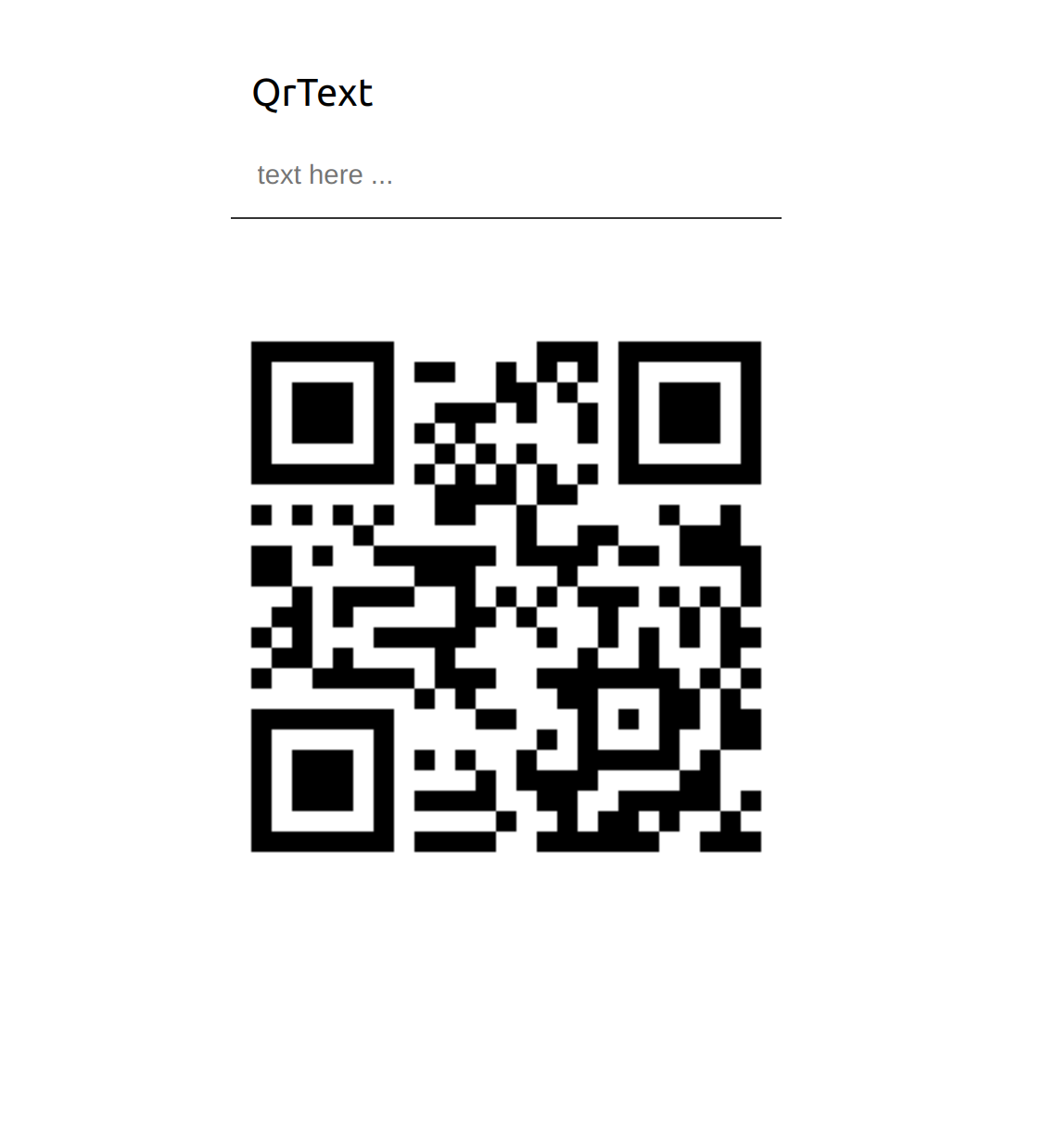
In this example will use the component with an input field, so you can insert the text you want to transform into the Qr Code.
<body>

    <div class="text">

      <input
        id="qrtext"
        type="text"
        name="qrtext"
        placeholder="text here ...">
      <label for="qrtext">QrText</label>

    </div>

    <qr-code-element
      error-correction="medium"
      mask-pattern="-1">
    </qr-code-element>

  <noscript>
    Please enable JavaScript to view this website.
  </noscript>

  <!-- Import Js Module from local file -->
  <script type="module" src="../qr-code-element.js"></script>

  <script>

    window.addEventListener('DOMContentLoaded', (e) => {

      const qrText = document.getElementById('qrtext')

      qrText.addEventListener('input', (e) => {

        const qrCodeElement = document.querySelector('qr-code-element')
        qrCodeElement.setAttribute('text', event.target.value)
      })

    })
  </script>

</body>
Check the examples folder if you need to copy some styles.
Contributing
Got something interesting you'd like to share? Learn about contributing.
Accessibility
🔧 TODO
- Slot the SVG image for center - Working on (1/2 functionality already in place)
- Basic Unit testing
- A11y compatible ?
License
GNU General Public License v3.0
Made 🧑💻 by @cicciosgamino

