0.1.0 • Published 4 years ago
@cityssm/bulma-reasonable-colors v0.1.0
bulma-reasonable-colors
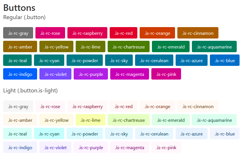
CSS classes for using Reasonable Colors with Bulma.

View the test page for more examples.
Features
- Includes Bulma-like class names for all six shades of all 25 colors in the reasonable-colors palette.
- Accessible defaults.
Usage
Download the SCSS, download the minified CSS, or install from NPM.
npm install @cityssm/bulma-reasonable-colorsTo avoid collisions with future Bulma updates,
all class names include rc- before the color name and shade.
The color palate is available on the Reasonable Colors website.
For example, to set the text color to the fourth shade of teal,
use the class .has-text-rc-teal-4.
Classes so Far
.has-text-rc-[colorName]-[shadeNumber].has-background-rc-[colorName]-[shadeNumber].button.is-rc-[colorName]
In the Works
- Alert colors, navbar colors, panel colors, and other Bulma elements and components.
0.1.0
4 years ago