@codewizard-dt/use-form-hook v1.3.23
- Dynamic React Forms
- Table of Contents
- Installation
- Usage
- Creating Fields
- License
- Contributing
- Tests
- Questions
Dynamic React Forms
A Form component exposed by a hook
Hooking up forms in React can be a real pain in the butt, but this package makes it EASY. It automatically handles form data in a way that prevents unnecessary component re-renders and helps you write the LEAST CODE possible. This package also relies on Semantic UI.
Table of Contents
Installation
npm i @codewizard-dt/use-form-hook- Run npm install
- Install peer dependencies
semantic-ui-csssemantic-ui-reactlodashpathreactof course
Usage
This is a reusable React form template, complete with buttons and submission/response handling. The logic is built in, so all you need to provide is the names and attributes of the form fields.
Import Semantic UI Global Css
First off, you need to install the Semantic UI style sheet. After installing via npm, make sure you import the file into a top-level component. In NextJs, you need to add this line in _app.(tsx|jsx).
import "semantic-ui-css/semantic.min.css";Put FormProvider in your app layout
The FormProvider gives a reusable context that stores the state of the form data, form errors, and the methods to update them. You MUST have the FormProvider in your DOM in order to use the hook. You can only have one active form at a time. If you need more, you'll have to provide multiple FormProviders.
import { FormProvider } from "@codewizard-dt/use-form-hook";
<FormProvider>
  ...
  {children} // Any child of `FormProvider` can use the hook */
  ...
</FormProvider>
Call useForm hook to expose the Form component
Any child component of FormProvider will have access to the form logic. Just use the hook by calling useForm. It return an object, the most important part of which is the Form component. Render the Form component and provide an array of fields.
There are defaults for the submit and respond properties. If you don't include them initially, the Form will console.log your data for you.
import { useForm } from "@codewizard-dt/use-form-hook";
const ChildComponent = (props) => {
  const { Form } = useForm();
  return <Form fields={[]} submit={submitHandler} respond={responseHandler} />;
};
Provide the Form element with fields, submit, and respond properties
| Form property | Description | Required |
|---|---|---|
| fields | Array(object) an array of objects with properties that will be mapped onto FormField components from Semantic UI | true |
| submit | (function) called with the form data when the form is submitted | false |
| respond | (function) called with the API response when the request is finished. Can contain data or errors | false |
| buttons | Array(object) an array of objects with properties that will be mapped onto Button components from Semantic UI. Accepts all properties of the Button component | false |
| submitBtnText | (string) custom text for the submit button | false |
Provide fields property as an array of objects
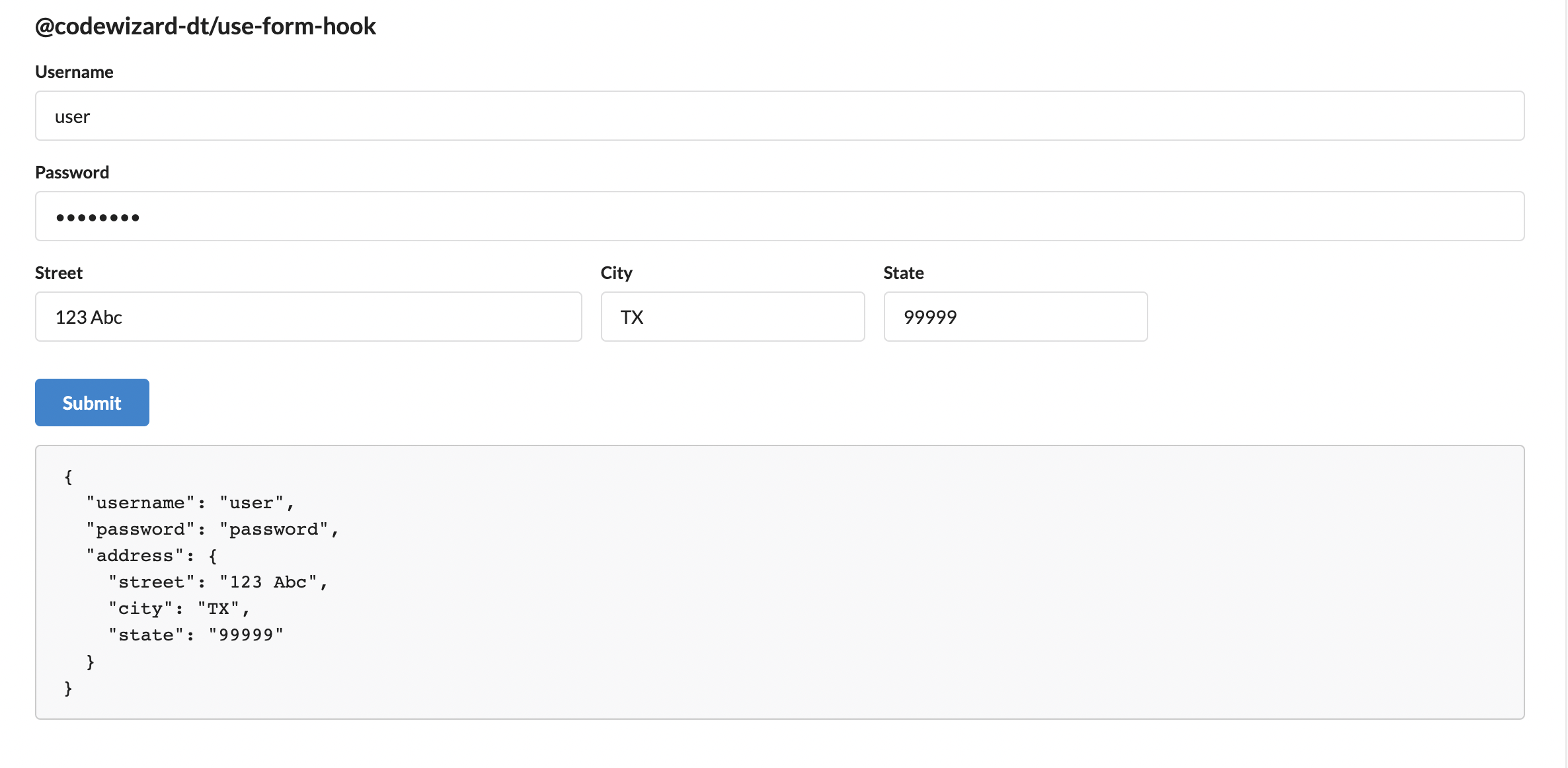
The smallest object that can render an input field is just a name. The Form component will construct all of the components and connect them for you.
// Example.. Notice all you need is a `name`
fields={[
  { name: "username" },
  { name: "password", type: "password" },
  { name: "address", fields: [
    {name: "street", width: "6"},
    {name: "city", width: "3"},
    {name: "state", width: "3"}
  ]}
]}
Creating Fields
The fields property is an array. It can include any number of Fields and/or FieldGroups, in any order. The form data object will reflect any nested structures that you create.
Field Properties
A field object can use any property that a FormField component from Semantic UI can use.
| Field Property | Description | Required |
| ----------- | ----------- | ----------- |
| name | (string) used as a string key for form data | true |
| initial | (string) initial field value | false |
| type | (string) describes data type, ie 'text', 'number', 'password' | false |
| label | (string) a label to display alongside | false |
| useLabel | (boolean) if true and label not given, name is used | false |
| required | (boolean) shows indicator and affects form behavior as normal | false |
| control | (any) HTML tag (ie 'input', 'select') or a Semantic UI form control component | false |
| options | Array(string|object) rendered as <option> for <select> tags | false |
| disabled | (boolean) | false |
| width | (SemanticWIDTHS) width as determined by Semantic UI | false |
Field Group Properties
A field group object can use any property that a FormGroup component from Semantic UI can use.
| Property | Description | Required |
| ----------- | ----------- | ----------- |
| name | (string) used as a string key for form data. If you use an empty string, the form data object will not be nested. | true |
| fields | Array(Field) creates nested form groups | false |
| widths | (SemanticWIDTHS) determines width for nested form fields | false |
The Form Data Object
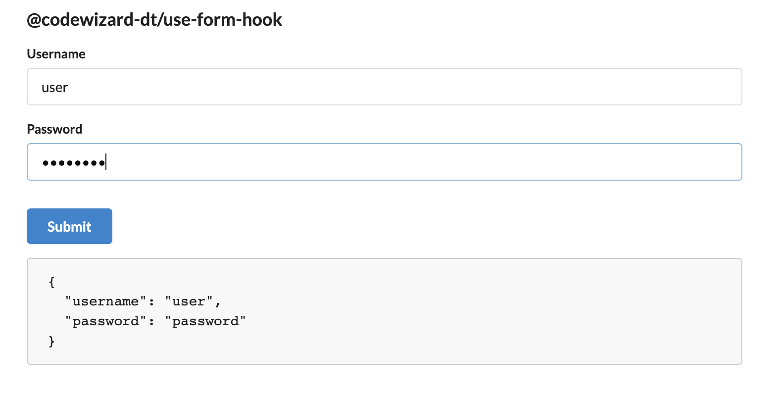
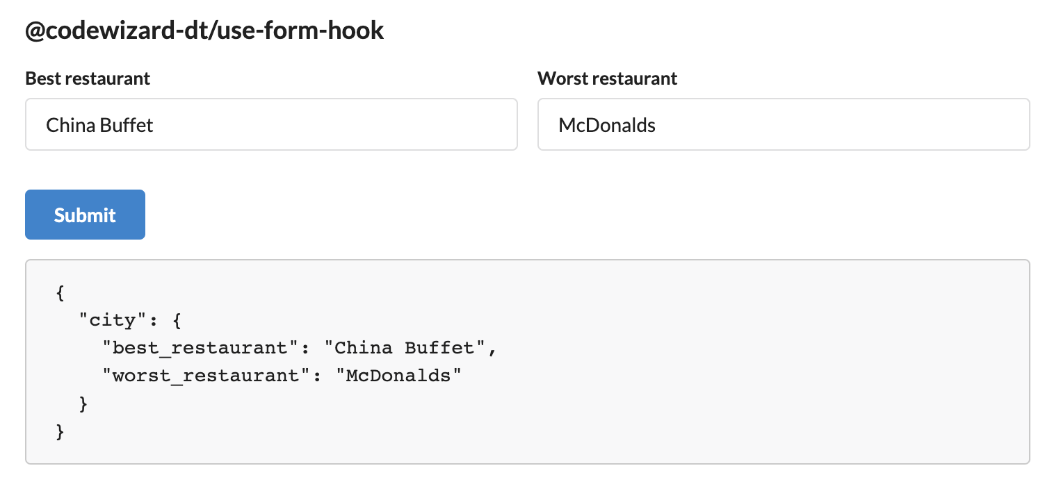
Automatically constructed data object for all fields in the form. If the form fields are nested, the data is nested too.
// Example, no nested fields
fields = {[
  { name: "username" },
  { name: "password", type: "password" },
]}

...

data = {
  username: '',
  password: ''
}
// Example, nested fields
fields = {[
  {
    name: "city",
    widths: "two",
    fields: [
      { name: 'best_restaurant' },
      { name: 'worst_restaurant' }
    ]
  }
]}

...

data = {
  city: {
    best_restaurant: '',
    worst_restaurant: ''
  }
} 
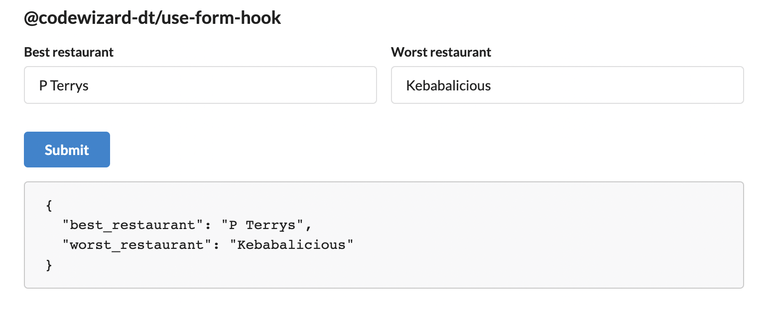
// Example, nested fields but the group has no name
// When group has no name, data is flattened
// You might want to do this for styling but don't want the data nested
fields = {[
  {
    name: "",
    fields: [
      { name: 'best_restaurant' },
      { name: 'worst_restaurant' }
    ]
  }
]}

...

data = {
  best_restaurant: '',
  worst_restaurant: ''
} 
Provide submit property as a function
/**
 * Defines the `submit` property which sends the form data to the Api
 * Must return a promise
 */

export type FormSubmitHandler = (data: ApiFormData) => Promise<ApiResponse<any>>

const submit:FormSubmitHanlder = (data) =>{
  return post('url',data)
}
Provide respond property as a function
/**
 * Defines the `respond` property which receives the ApiResponse
 * Where <T> is the data type you expect from the API
 */
export type ApiResponse<T> = {
  data?: T,
  error?: any,
  errors?: {
    [key: string]: string
  }
}
export type ApiResponseHandler<T> = (response: ApiResponse<T>) => void

const respond:ApiResponseHandler<YourDataType> = (response) =>{
  // data = your API data
  // error = generic error or specific form error, either way automatically displayed under the form
  // errors = specific form errors, validation for instance. Displayed under any Field whose name matches one of the objects' keys
  let { data, error, errors } = response
}
License
This project is provisioned under the MIT License
Contributing
Do you want to help make this project better? Visit the the repo to check out existing issues or create a new branch to start working on a suggested feature
Tests
None yet!
Questions
If you have any questions, please contact me on Github or email.
Gimme Readme
This file was initialized by the Gimme Readme command line README generator
1 year ago
3 years ago
3 years ago
3 years ago
3 years ago
3 years ago
3 years ago
3 years ago
3 years ago
3 years ago
3 years ago
3 years ago
3 years ago
3 years ago
3 years ago
3 years ago
3 years ago
3 years ago
3 years ago
3 years ago
3 years ago
3 years ago
3 years ago
3 years ago
3 years ago
3 years ago
3 years ago
3 years ago
3 years ago
3 years ago
3 years ago
3 years ago
3 years ago
3 years ago
3 years ago
3 years ago
3 years ago
3 years ago
3 years ago
3 years ago
3 years ago
3 years ago
3 years ago
3 years ago
3 years ago
3 years ago
3 years ago
3 years ago
3 years ago
3 years ago
3 years ago
3 years ago
3 years ago
3 years ago
3 years ago
3 years ago
3 years ago
3 years ago
4 years ago
4 years ago
4 years ago
4 years ago
4 years ago
4 years ago
4 years ago
4 years ago
4 years ago
4 years ago
4 years ago
4 years ago
4 years ago
4 years ago
4 years ago
4 years ago
4 years ago
4 years ago
4 years ago
4 years ago
4 years ago
4 years ago
4 years ago
4 years ago
4 years ago
4 years ago
4 years ago
4 years ago
4 years ago
4 years ago
4 years ago
4 years ago
4 years ago
4 years ago
4 years ago
4 years ago
4 years ago
4 years ago
4 years ago
4 years ago
4 years ago
4 years ago
4 years ago
4 years ago
4 years ago
4 years ago
4 years ago
4 years ago
4 years ago
4 years ago
4 years ago
4 years ago
4 years ago
