@daypilot/daypilot-lite-vue v4.1.0
DayPilot Lite for Vue
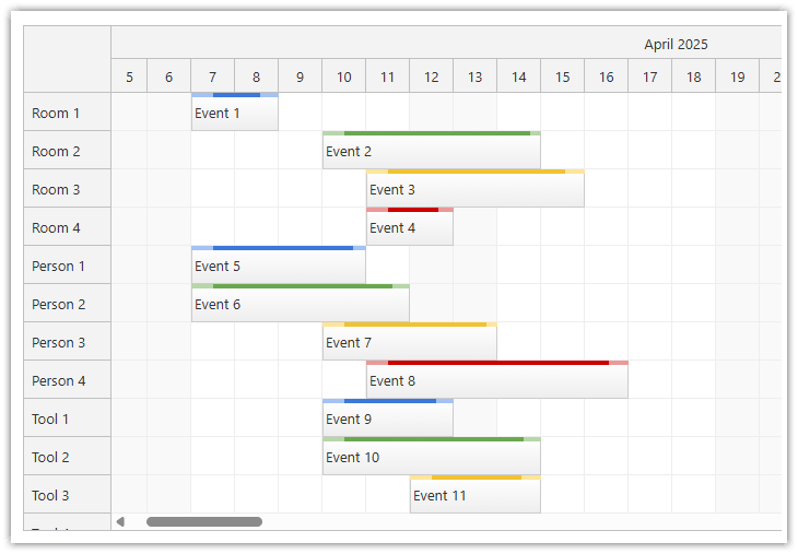
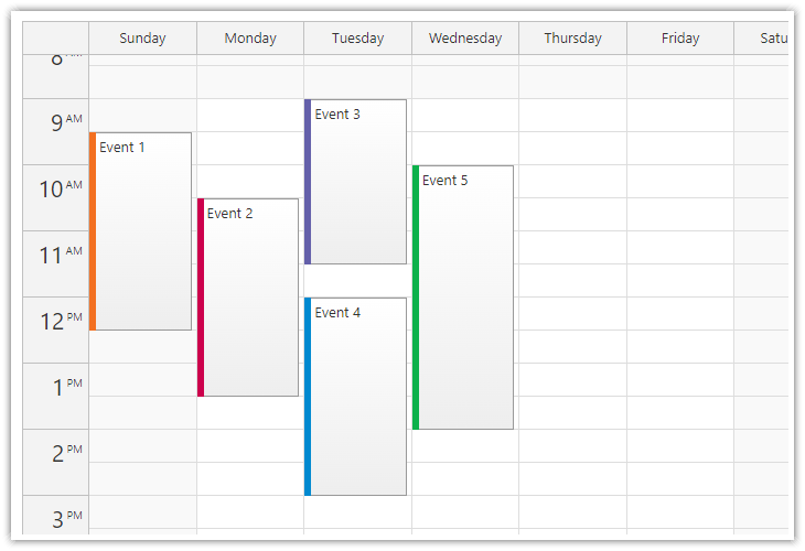
DayPilot Lite for JavaScript is a library of scheduling components that can display calendar/scheduler UI:
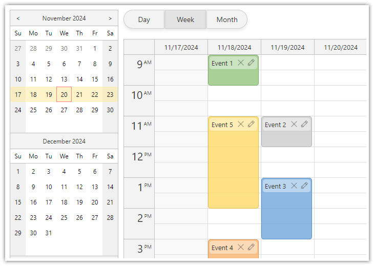
- day, week, month
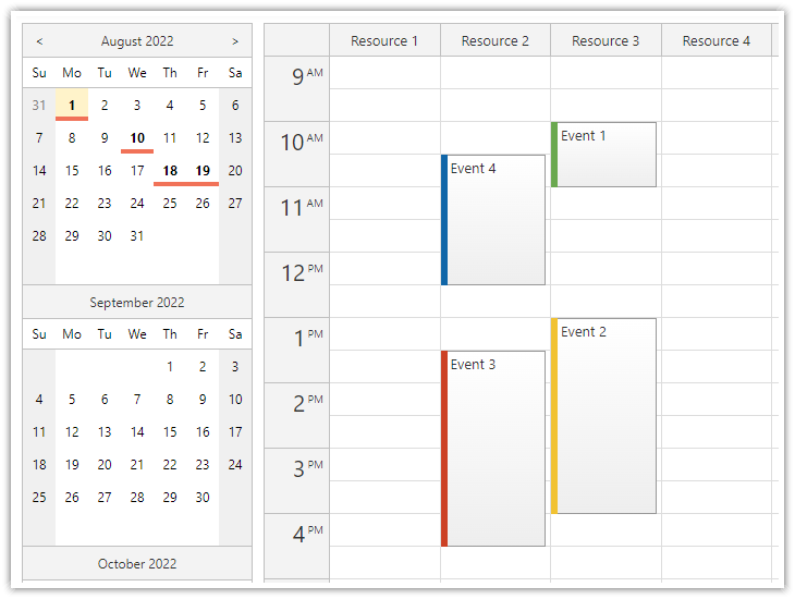
- resource calendar (resources as columns)
- horizontal timeline (resources as rows)
This is the DayPilot Lite for Vue package.
What's New
UI Builder
Customize the scheduling components using an online UI Builder application and download a ready-to-run Vue project.
Online Demo
Features
- Calendar/scheduler views: day, week, work week, month, resource calendar
- Horizontal timeline view
- Event creation using drag and drop
- Drag and drop event moving and resizing
- Integrated delete icon
- Event duration bar with customizable color
- Date picker with free/busy days highlighting, free-hand range selection, day cell customization
- CSS themes (use theme builder to create your own theme)
- Event customization (text, HTML, icons, colors, Vue components...)
- Grid cell customization
- Built-in XSS protection
- Localization support
- TypeScript definitions
- Vue template support
Tutorials
Vue Calendar with Day/Week/Month Views
Vue Calendar with Day/Week/Month Views (Open-Source)
Create a complex calendar UI in Vue.js with multiple views, view-switching buttons and an integrated date picker. Use a shared data source to make it fast and Vue templates to define event appearance.
Vue Resource Calendar Tutorial
Vue Resource Calendar (Open-Source)
Use the Vue calendar component to display an interactive schedule for multiple resources.
Vue Calendar: Using Event Templates
Vue Calendar: Using Templates to Add Icons, Buttons, or Progress Bars to Events (Open-Source)
Vue templates allow adding dynamic content to Vue Calendar events, including interactive elements and custom Vue components.
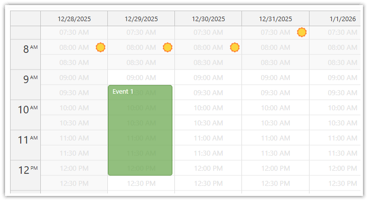
Cell Templates in Vue Calendar: Display Slot Start Times, Sunrise & Sunset
Cell Templates in Vue Calendar: Display Slot Start Times, Sunrise & Sunset (Open-Source)
Use Vue templates to add custom content to calendar cells: text, icons, or even Vue components. Use v-if to display content only in the cells you choose.
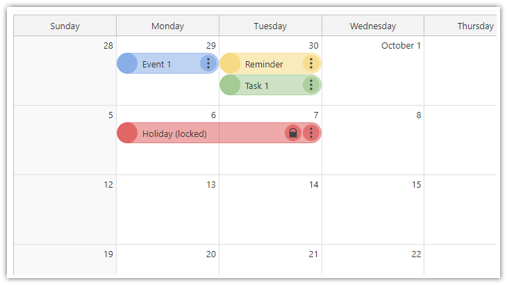
Vue Monthly Calendar/Scheduler Tutorial
Vue Monthly Calendar/Scheduler (Open-Source)
How to create a monthly calendar/scheduler view for planning events, tasks, and reminders in Vue. The downloadable Vue project uses the open-source DayPilot Lite library.
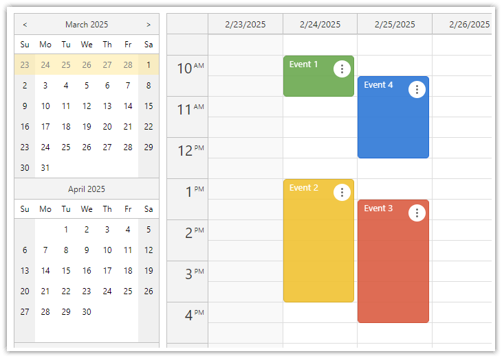
Vue Weekly Calendar Tutorial
Vue.js Weekly Calendar Tutorial (Open-Source)
How to create a weekly calendar web application using a Vue calendar component. The tutorial includes a Vue.js project with JavaScript source code for download.
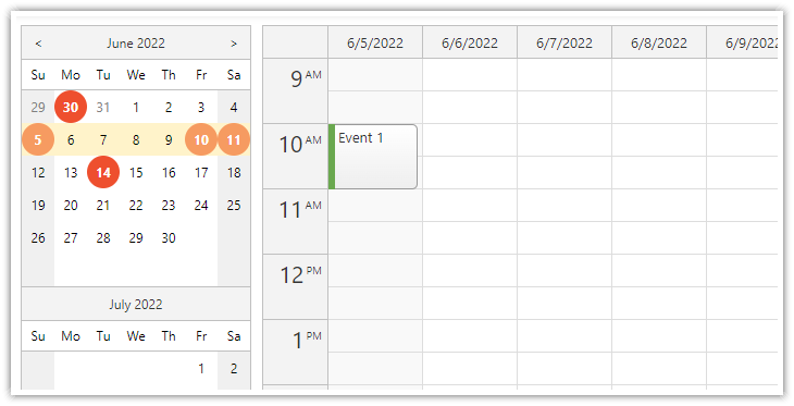
Vue Date Picker Tutorial
Vue Date Picker with Free/Busy Highlighting (Open-Source)
Use the Vue date picker component (Navigator) to change the current date. The date picker can highlight dates that already have events or are not available.
Example
<template>
    <DayPilotCalendar
        viewType="Week"
        :events="events"
        :durationBarVisible="false"
        :startDate="startDate"
        :eventBorderRadius="5"
        @timeRangeSelected="onTimeRangeSelected"
        @eventMoved="onEventMoved"
        @eventResized="onEventResized"
        ref="calendarRef"
    />
</template>

<script setup>
    import { DayPilot, DayPilotCalendar } from '@daypilot/daypilot-lite-vue';
    import { ref, onMounted } from 'vue';

    const startDate = ref("2025-02-28");
    const events = ref([]);

    const calendarRef = ref(null);

    const onTimeRangeSelected = async (args) => {
        const modal = await DayPilot.Modal.prompt("Create a new event:", "Event 1")
        const calendar = args.control
        calendar.clearSelection()
        if (modal.canceled) { return }
        calendar.events.add({
            start: args.start,
            end: args.end,
            id: DayPilot.guid(),
            text: modal.result
        })
    }

    const onEventMoved = () => {
        console.log("Event moved")
    }

    const onEventResized = () => {
        console.log("Event resized")
    }

    const loadEvents = () => {
        events.value = [
            {
                id: 1,
                start: "2025-02-28T10:00:00",
                end: "2025-02-28T11:00:00",
                text: "Event 1",
                backColor: "#6aa84faa",
                borderColor: "#38761d",
            },
            {
                id: 2,
                start: "2025-02-28T13:00:00",
                end: "2025-02-28T16:00:00",
                text: "Event 2",
                backColor: "#f1c232aa",
                borderColor: "#bf9000",
            },
        ]
    };

    onMounted(() => {
        loadEvents()
    })

</script>
Documentation
CSS Themes
The Theme Designer lets you create and download your own CSS theme using an online visual tool.
License
Apache License 2.0
1 year ago
11 months ago
11 months ago
11 months ago
11 months ago
11 months ago
1 year ago
1 year ago
1 year ago
1 year ago
11 months ago
10 months ago
1 year ago
1 year ago
1 year ago
2 years ago
2 years ago
2 years ago
2 years ago
2 years ago
2 years ago
2 years ago
2 years ago
2 years ago
2 years ago
3 years ago
3 years ago
2 years ago
3 years ago
3 years ago
3 years ago
3 years ago
3 years ago
3 years ago
3 years ago
3 years ago
4 years ago
4 years ago
4 years ago
4 years ago
4 years ago
4 years ago
4 years ago
4 years ago
4 years ago
4 years ago
4 years ago
4 years ago
4 years ago
4 years ago
4 years ago
