@delightfulstudio/react-native-wheel-picker-android v2.1.3
Note: this is a heavily modified fork, the original can be found here
@delightfulstudio/react-native-wheel-picker-android
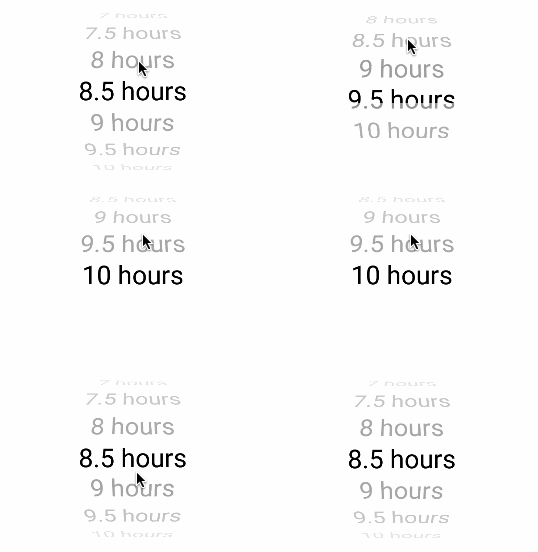
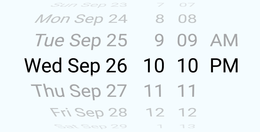
Android-only WheelPicker (based on https://github.com/AigeStudio/WheelPicker) and DatePicker components that mimic their standard iOS counterparts (PickerIOS
and DatePickerIOS, correspondingly).
DatePicker interface is mostly compatible with DatePickerIOS.
Installation
yarn add @delightfulstudio/react-native-wheel-picker-android
Auto linking
Note: Doesn't work with RN v0.55, not tested with v0.56
react-native link @delightfulstudio/react-native-wheel-picker-android
Manual linking
Open android/settings.gradle and add the following two lines right above include ':app':
include ':react-native-wheel-picker-android'
project(':react-native-wheel-picker-android').projectDir = new File(rootProject.projectDir, '../node_modules/@delightfulstudio/react-native-wheel-picker-android/android')
Open android/app/build.gradle and add the following line to dependencies section:
compile project(':react-native-wheel-picker-android')Open android/app/java/com/{your package name}/MainApplication.java and add the following line right below package com.{your package name}
import com.delightfulstudio.wheelpicker.WheelPickerPackage;In the same file find method getPackages() and add new WheelPickerPackage() at the end of the returned array, like this:
    @Override
    protected List<ReactPackage> getPackages() {
      return Arrays.<ReactPackage>asList(
          new MainReactPackage(),
          new WheelPickerPackage() // << add this line
      );
    }
Usage
import { WheelPicker, DatePicker } from '@delightfulstudio/react-native-wheel-picker-android'
import React, { Component } from 'react';
import {
    StyleSheet,
    View
} from 'react-native';

const wheelPickerData = ['Sunday', 'Monday', 'Tuesday', 'Wednesday', 'Thursday', 'Friday','Saturday'];
const now = new Date()

const styles = StyleSheet.create({
    container: {
        flex: 1,
        alignItems: 'center',
    },
    wheelPicker: {
        width: 200,
        height: 150
    }
});

export default class MyPickers extends Component {
    render() {
        return (
            <View style={ styles.container }>
                <WheelPicker
                    onItemSelected={ this.onItemSelected }
                    isCurved
                    data={ wheelPickerData }
                    visibleItemCount={5}
                    style={ styles.wheelPicker }/>
                <DatePicker
                    date={ now }
                    mode="datetime"
                    onDateChange={ this.onDateSelected }/>
                <DatePicker
                    date={ now }
                    mode="time"
                    onDateChange={ this.onTimeSelected }/>
            </View>
        );
    }

    onItemSelected = event => {
        // do something
    };

    onDateSelected = date => {
        // do something
    };

    onTimeSelected = date =>{
        // do something
    };
}
To check out working example:
1. Clone this repo
2. Install root packages: yarn or npm install
3. Install example packages: in the example folder, do yarn or npm install
4. Start metro server: in the example folder, do yarn start or npm start
5. Compile/start Android app: in the example folder, do yarn run-android or npm run-android
Wheel Picker

import { WheelPicker } from '@delightfulstudio/react-native-wheel-picker-android'
...

    render() {
        const arr = [1,2,3];
        return (
        <WheelPicker
            onItemSelected={ event => {/* do something */} }
            isCurved
            isCyclic
            data={arr}
            style={{width:300, height: 300}}/>
        );
  }
...
Props
| Prop | Default | Type | Description |
|---|---|---|---|
| onItemSelected | null | func | Callback when user select item {data: 'itemData', position: 'itemPosition'} |
| data | default string array | array | Data array (string or number type) |
| isCurved | false | bool | Make Wheel Picker curved |
| isCyclic | false | bool | Make Wheel Picker cyclic |
| isAtmospheric | false | bool | Design Wheel Picker's items |
| selectedItemTextColor | grey | string | Wheel Picker's selected Item Text Color |
| itemSpace | 20 | number | Wheel Picker's items spacing |
| visibleItemCount | 7 | number | Wheel Picker's items max visible count |
| renderIndicator | false | bool | Show Wheel Picker indicator |
| indicatorColor | transparent | string | Indicator color |
| indicatorSize | 5 | number | Indicator stroke size |
| isCurtain | false | bool | Wheel Picker curtain |
| curtainColor | transparent | string | Wheel Picker curtain color |
| itemTextColor | grey | string | Wheel Picker's items color |
| itemTextSize | 20 | number | Wheel Picker's items text size |
| itemTextFontFamily | null | string | Wheel Picker's items text font name |
| itemTextAlign | 'center' | enum('left', 'center', 'right') | Wheel Picker's items text alignment |
| selectedItemPosition | null | number | Select current item position |
| backgroundColor | transparent | string | Wheel Picker background color |
data
An array of options. This should be provided with an array of strings or array of numbers.
onItemSelected(event)
Callback with event in the form event = { data: 1, position: 0 }
Date Picker

import { DatePicker } from '@delightfulstudio/react-native-wheel-picker-android'
...

    render() {
        const now = new Date();
        return (
            <DatePicker
                date={ now }
                mode="datetime"
                onDateChange={ this.onDateSelected }/>
        );
    }

    onDateSelected = date => {
        // do something
    };
...
Props
| Prop | Required | Default | Type | DatePickerIOS | Description |
|---|---|---|---|---|---|
| date | now | Date | x | The currently selected date | |
| onDateChange | x | null | func | x | Date change handler |
| minimumDate | maximumDate - 1 year or date | Date | x | Minimum date - restricts the range of possible date/time values | |
| maximumDate | minimumDate + 1 year | Date | x | Maximum date - restricts the range of possible date/time values | |
| minuteInterval | 1 | enum(1, 2, 3, 4, 5, 6, 10, 12, 15, 20, 30) | x | The interval at which minutes can be selected | |
| mode* | 'date' | enum('date', 'time', 'datetime') | x | The date picker mode | |
| locale** | Locale ID | x | The locale for the date picker | ||
| style*** | null | obj | x | The control container style | |
| styles**** | { picker, date, hours, minutes, gap, AM } | The control part styles - allows to adjust control internal layout, each property is an object with style properties, ex: { picker: { height: 100 } } | |||
| todayTitle | 'Today' | string | The title for today date item |
* mode: 'date' doesn't support year selection, therefor it is not suitable for large range of dates, ex: birthdays.
** locale: {locale id} support is limited to 12/24 mode and names of months and days, it also requires explicit import 'moment/locale/{locale id}' somewhere in your script for any non-english locales to work properly.
*** style can be used to change background color and surrounding margin/padding
**** styles were tested only with size, padding and margin style properties, other properties may not work
Questions or suggestions?
Feel free to open an issue

