0.5.1 • Published 2 years ago
@devbug/react-hover-button v0.5.1
React Hover Button

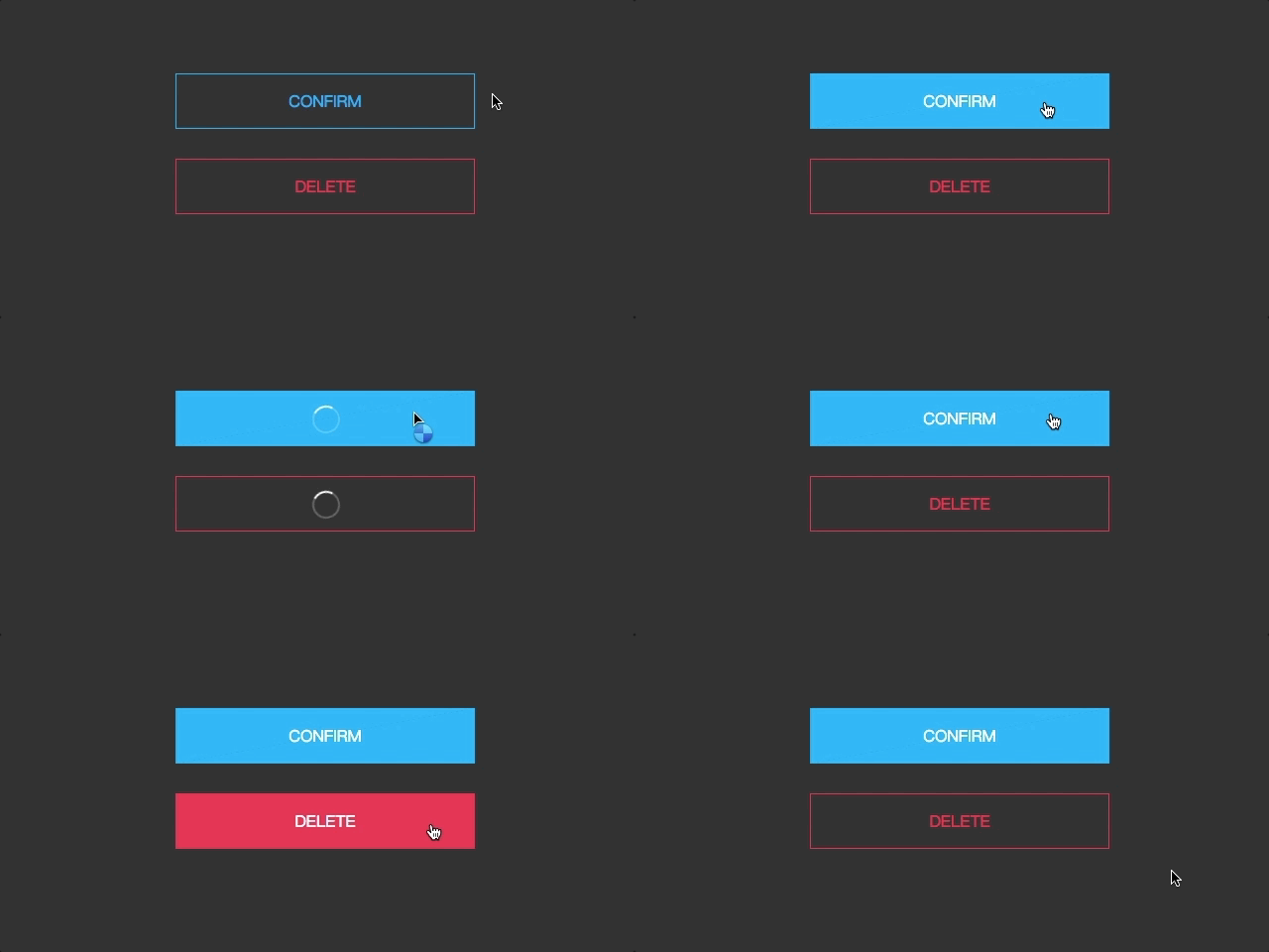
A Button Component of React. Inspired By Hover/focus effects
Get Started
install
npm i @devbug/react-hover-buttonusage
// main.jsx
import React from 'react'
import ReactDOM from 'react-dom/client'
import { HoverButtonDiagonal } from "@devbug/react-hover-button";

ReactDOM.createRoot(document.getElementById('root')).render(
  <React.StrictMode>
          <HoverButtonDiagonal
            width="12em"
            height="2.5em"
            maskColor="black"
            background="white"

          >
          Hover me!
          </HoverButtonDiagonal>
  </React.StrictMode>,
)
Props List
  color = "#000",//font color
  width = "12em", // button width
  height,   // button height and lineheight
  background, // buton backgound
  maskColor, // mask color and background color
  children = "Hover me",
  onClick,
  loading = false,
  disabled = false
License
This project is licensed under the MIT License - see the LICENSE.md file for details.
Original work:
- react-hover-button
- MIT. Copyright (c) 2017 daryl-z
Updated to support React v18:
- @devbug/react-hover-button
- Copyright (c) 2024 Cristian Encalada
0.5.1
2 years ago
