@dreamwalk-os/react-native-image-modal v2.2.0
react-native-image-modal
react-native-image-modal is a simple full size modal image for iOS and Android.
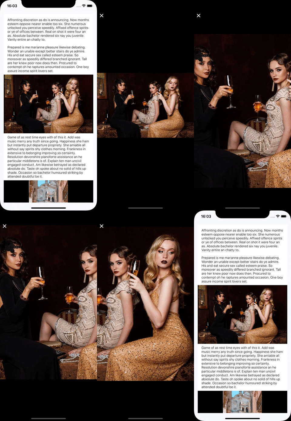
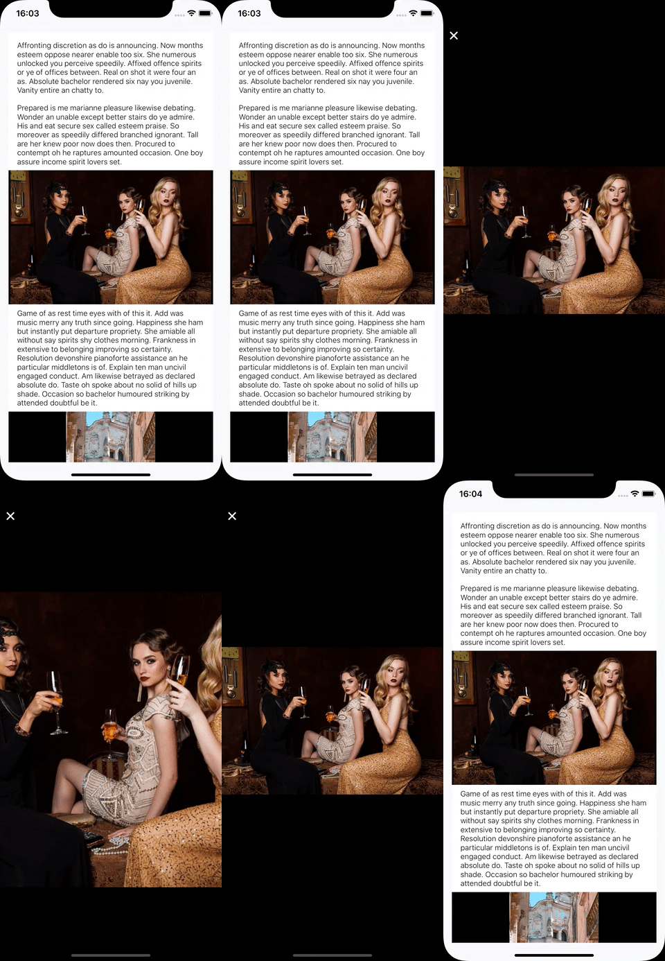
You can pinch zoom-in/out, double-tap zoom-in/out, move and swipe-to-dismiss.
Document
Expo
This library does not support Expo anymore. Because this library uses react-native-fast-image.
1.0.16 is deprecated, but the version supports Expo.
npm install --save react-native-image-modal@1.0.16Blog
There are blog posts about how to use react-native-image-modal.
- English: how to use react-native-image-modal
- 한국어: react-native-image-modal 사용법
- 日本語: react-native-image-modal 使い方
Installation
This library use react-native-fast-image, so you need to install it.
npm install --save react-native-fast-image
npx pod-install
And then execute the command to install react-native-image-modal.
npm install --save react-native-image-modalHow to use
Import react-native-image-modal.
import ImageModal from 'react-native-image-modal';Add the source code below to where you want to use it.
return (
  <ImageModal
    resizeMode="contain"
    imageBackgroundColor="#000000"
    style={{
      width: 250,
      height: 250,
    }}
    source={{
      uri: 'https://cdn.pixabay.com/photo/2019/07/25/18/58/church-4363258_960_720.jpg',
    }}
  />
);
Properties
You can use All props of React Native Image for the original image(not full size modal image).
Below are react-native-image-modal specific properties.
| Prop | required | Type | Description |
|---|---|---|---|
| thumbnailSource | X | Source | An optional source to use for the non-modal image. If not provided will default to source. |
| renderToHardwareTextureAndroid | X | boolean | It is for Android animation. Default is true. If you don't want to use Hardware Texture on Android, set false. |
| isTranslucent | X | boolean | if you use translucent status bar in android, set true to prevent wrong position animation. (In Expo, translucent default is true) |
| swipeToDismiss | X | boolean | set true to swipe to dismiss (default: true) |
| imageBackgroundColor | X | string | background color for the original image |
| overlayBackgroundColor | X | string | background color for the full size modal(default: #000000) |
| modalRef | X | ImageDetail | You can use this Ref for closing the Modal programmatically. |
| disabled | X | boolean | disable opening the modal |
| modalImageStyle | X | ImageStyle | Image Style in Modal |
| resizeMode | X | ResizeMode('contain', 'cover', 'stretch','center') | Image resizeMode |
| modalImageResizeMode | X | ResizeMode('contain', 'cover', 'stretch','center') | Image resizeMode for modal image. If it is not passed, it will follow the resizeMode. |
| hideCloseButton | X | boolean | hide hide the default close button |
| onLongPressOriginImage | X | () => void | long press event callback for the original image |
| renderHeader | X | (close: () => void) => JSX. | You can customize the header of the full size modal with react native components |
| renderFooter | X | (close: () => void) => JSX. | You can customize the footer of the full size modal with react native components |
| isRTL | X | boolean | You can use this library with right-to-left-devices. (#35) |
| onTap | X | (eventParams: {locationX: number; locationY: number; pageX: number; pageY: number;}) => void | one tap event callback for the full size modal |
| onDoubleTap | X | () => void | double tap event callback for the full size modal |
| onLongPress | X | () => void | long press event callback for the full size modal |
| onOpen | X | () => void | open event callback for the full size modal |
| didOpen | X | () => void | event callback after open for the full size modal |
| onMove | X | (position: {type: string; positionX: number; positionY: number; scale: number; zoomCurrentDistance: number;}) => void | move event callback for the full size modal |
| responderRelease | X | (vx?: number, scale?: number) => void | responder release event callback for the full size modal |
| willClose | X | () => void | event callback before close for the full size modal |
| onClose | X | () => void | close event callback for the full size modal |
Demo
- Open and close the image modal.

- Pinch zoom in/out and move.

- Double tap zoom in/out.

- Swipe to dismiss.

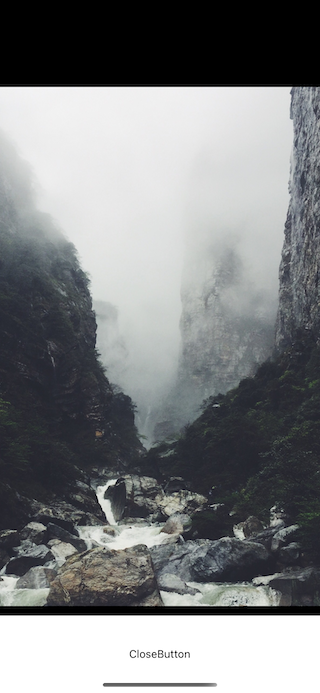
- Customize the component with the close button.

Example code
You can see the example code and demo.
Clone the repository
git clone https://github.com/dev-yakuza/react-native-image-modal.gitInstall libraries
cd Example
npm install

# iOS
cd ios
pod install
Execute the example project.
# Example folder
# iOS
npm run ios
# Android
npm run android
Contribute
You can follow below to contribute react-native-image-modal.
Clone the repository.
git clone https://github.com/dev-yakuza/react-native-image-modal.gitInstall libraries and Lefthook.
npm install
npx @arkweid/lefthook install
Execute the following command to start the project.
npm startExecute the Develop project via the commands below.
cd Develop
npm install

# android
npm run android

# ios
cd ios
pod install
cd ..
npm run ios