2.2.1 • Published 4 years ago
@ecancan/react-native-progress-circle v2.2.1
!!! Fixed deprecated-react-native-prop-types issue
React Native Progress Circle

Features
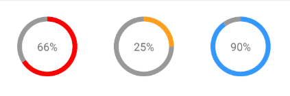
- Custom colors
- Custom size and border radius
- Light-weight: No other dependencies besides
react-native
Installation
yarn add @ecancan/react-native-progress-circle
or
npm install --save @ecancan/react-native-progress-circle
Usage
import ProgressCircle from '@ecancan/react-native-progress-circle'

const MyApp = () => {
  return (
    <ProgressCircle
      percent={30}
      radius={50}
      borderWidth={8}
      color="#3399FF"
      shadowColor="#999"
      bgColor="#fff"
    >
      <Text style={{ fontSize: 18 }}>{'30%'}</Text>
    </ProgressCircle>
  );
}
Props
| Name | Description | Type | Required | Default Value |
|---|---|---|---|---|
| percent | The percentage used for displaying the progress | Number | ✓ | |
| radius | The radius in px of the component (including border) | Number | ✓ | |
| borderWidth | The border width in px | Number | ✓ | |
| color | The border color | String | '#f00' | |
| shadowColor | The background color of the border | String | '#999' | |
| bgColor | The inner background color of the component | String | '#e9e9ef' | |
| children | The children to render inside this component | Node | null | |
| containerStyle | The custom styling which will be applied to the container of the children | Style | null | |
| outerCircleStyle | The custom styling which will be applied to the outer circle | Style | null |
Author
Implementation Details
License
MIT


