@ecohead/kondonizer v0.1.0


Kondonizer
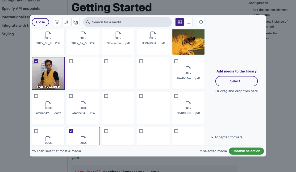
Kondonizer is a custom element (a native HTML tag) that can be integrated in any frontend code. It displays a media library based on a Media model, like WordPress does internally. You can select, upload, edit and delete one or multiple files, all based on a configuration object highly customizable.
This web component needs between 2 and 5 API endpoints to be fully working. More info in the documentation.
Documentation
The full documentation is accessible in a dedicated website.
Installation
You can use your preferred package manager.
npm install @ecohead/kondonizer --saveyarn add @ecohead/kondonizer --savepnpm install @ecohead/kondonizer --saveConfiguration
Add the custom-element to your page
The first step is to place the HTML tag where you need it in your template :
<!doctype html>
<html lang="en">
<head>
  <meta charset="UTF-8">
  <title></title>
</head>
<body>
  <!-- Calls the custom-element -->
  <eco-kondonizer></eco-kondonizer>
</body>
</html>
At this point, you will see any changes, because you need to create an instance of kondonizer to actually display the component UI.
Create a new instance of the component
The eco-kondonizer custom element provide a method to create a new instance with some options. To display the component UI, you need to create a new instance as follows :
  // At the top of the file
  import { EcoKondonizer, defineConfig } from "@ecohead/kondonizer";

  // Anywhere in the same file
  const kondonizer = document.querySelector('eco-kondonizer');

  if (!kondonizer) return;

  kondonizer.createInstance({
    // Create default options, but necessary to be customized
    config: defineConfig(),
    // Pass [] to no existing selection, or an array of ids (e.g. [12,28,46])
    selectedMedias: [],
    // Defaults to 'en-US'
    defaultLang: 'fr-FR'
  });
Note All the options available are listed here.
Warning Some config options are required (e.g. server endpoints), so you need to pass a correct config to view the component UI.
Listen to selection confirmation
A CustomEvent is emitted each time the user clicks on the confirm button in the modal. So, to get the user selection, you have to listen to this event as follows :
  kondonizer.addEventListener('kondoupdate', (e) => {
    console.log(e.detail)
  });

  /**
   * Outputs :
   * {
   *    identifier: 'some-uuid', // Unique identifier of the instance
   *    selection: [12,24] // All media ids selected in the modal
   * }
   */
Et voilà !
You now have a fully functional web component that you can integrate in any of your templates.
If you need more details in the integration in the most popular front-end frameworks and libraries, see Integrate with front-end frameworks.
Preview
You can also have a working demo on the documentation website.

Credits
- Bootstrap Icons for all icons
- Tailwind CSS for default color palette
- Unsplash for all demo images
- Adonis for demo API
- Docusaurus for documentation website
License
This library is MIT licensed.
4 years ago


