@eredessil/react-id-swiper v1.7.0
react-id-swiper ( Newest version 1.6.8 )
A library to use Swiper as a ReactJs component (Providing lightweight version of Swiper which reduces ~40kb of minified size)

What is Swiper?
Swiper - is the free and most modern mobile touch slider with hardware accelerated transitions and amazing native behavior. It is intended to be used in mobile websites, mobile web apps, and mobile native/hybrid apps. Designed mostly for iOS, but also works great on latest Android, Windows Phone 8 and modern Desktop browsers
Swiper is not compatible with all platforms, it is a modern touch slider which is focused only on modern apps/platforms to bring the best experience and simplicity.
React-id-swiper's original props
| Name | Type | Default value | Description |
|---|---|---|---|
| ContainerEl | String | 'div' | Element type for container |
| containerClass | String | swiper-container | Swiper container class name |
| WrapperEl | String | 'div' | Element type for wrapper |
| wrapperClass | String | swiper-wrapper | Swiper wrapper class name |
| slideClass | String | swiper-slide | Swiper slide class name |
| shouldSwiperUpdate | Boolean | false | Update swiper when component is updated |
| rebuildOnUpdate | Boolean | false | Rebuild swiper when component is updated |
| noSwiping | Boolean | false | Disable swiping by condition |
| activeSlideKey | String | null | Initial slide index |
| renderPrevButton | function | Render props function for prev button | |
| renderNextButton | function | Render props function for next button | |
| renderScrollbar | function | Render props function for scrollbar | |
| renderPagination | function | Render props function for pagination | |
| renderParallax | function | Render props function for parallax |
React-id-swiper's deprecated props (from v1.6.3)
- renderCustomPrevButton
- renderCustomNextButton
- renderCustomScrollbar
- renderCustomPagination
- renderCustomParallax
- prevButtonCustomizedClass,
- nextButtonCustomizedClass,
- paginationCustomizedClass,
- scrollbarCustomizedClass
NOTE: You can also use Swiper's original params too.Swiper API documentation HERE
DEMO
You can see the demo with example code HERE
Installation
By npm
npm install --save react-id-swiperBy Yarn
yarn add react-id-swiperYou can also use the standalone UMD build
<script src="https://unpkg.com/react-id-swiper@1.6.8/lib/react-id-swiper.js"></script>
<script src="https://unpkg.com/react-id-swiper@1.6.8/lib/react-id-swiper.min.js"></script>
Recommendation
Swiper stylesheet file is required
Use Swiper stylesheet file from CDN
<link rel="stylesheet" href="https://cdnjs.cloudflare.com/ajax/libs/Swiper/4.4.1/css/swiper.css"><link rel="stylesheet" href="https://cdnjs.cloudflare.com/ajax/libs/Swiper/4.4.1/css/swiper.min.css">OR
Use stylesheet file from src/styles/ folder (supporting css, scss)
Usage
Example with default
Example with default params
import React from 'react';
import Swiper from 'react-id-swiper';

class Example extends React.Component {
  render() {

    return (
      <Swiper>
        <div>Slide 1</div>
        <div>Slide 2</div>
        <div>Slide 3</div>
        <div>Slide 4</div>
        <div>Slide 5</div>
      </Swiper>
    )
  }
}

export default Example;
Example with params
Example with navigation buttons
import React from 'react';
import Swiper from 'react-id-swiper';

class Example extends React.Component {
  render() {
    const params = {
      pagination: {
        el: '.swiper-pagination',
        type: 'bullets',
        clickable: true
      },
      navigation: {
        nextEl: '.swiper-button-next',
        prevEl: '.swiper-button-prev'
      },
      spaceBetween: 30
    }

    return(
      <Swiper {...params}>
        <div>Slide 1</div>
        <div>Slide 2</div>
        <div>Slide 3</div>
        <div>Slide 4</div>
        <div>Slide 5</div>
      </Swiper>
    )
  }
}

export default Example;
Example with manipulating swiper from outside swiper component
Example with navigation button
import React from 'react';
import Swiper from 'react-id-swiper';

export default class Example extends React.Component {
  constructor(props) {
    super(props)
    this.goNext = this.goNext.bind(this)
    this.goPrev = this.goPrev.bind(this)
    this.swiper = null
  }

  goNext() {
    if (this.swiper) this.swiper.slideNext()
  }

  goPrev() {
    if (this.swiper) this.swiper.slidePrev()
  }

  render() {
    const params = {
      pagination: {
        el: '.swiper-pagination',
        type: 'bullets',
        clickable: true
      }
    }

    return(
      <div>
        <Swiper {...params} ref={node => if(node) this.swiper = node.swiper }>
          <div>Slide 1</div>
          <div>Slide 2</div>
          <div>Slide 3</div>
          <div>Slide 4</div>
          <div>Slide 5</div>
        </Swiper>
        <button onClick={this.goNext}>Next</button>
        <button onClick={this.goPrev}>Prev</button>
      </div>
    )
  }
}
How to add customized class for swiper?
Example with navigation button
const params = {
  pagination: {
    el: '.swiper-pagination.customized-swiper-pagination',
  }, // Add your class name for pagination container
  navigation: {
    nextEl: '.swiper-button-next.customized-swiper-button-next', // Add your class name for next button
    prevEl: '.swiper-button-prev.customized-swiper-button-prev' // Add your class name for prev button
  },
  containerClass: 'customized-swiper-container' // Replace swiper-container with customized-swiper-container
}
How to add customized components?
Example with customized navigation button
For customized rendering to work, you have to use same classname with params el.
const params = {
  navigation: {
    nextEl: '.swiper-button-next',
    prevEl: '.swiper-button-prev'
  },
  renderPrevButton: () => <button className="swiper-button-prev">Prev</button>,
  renderNextButton: () => <button className="swiper-button-next">Next</button>,
}
React-Id-Swiper also provides lightweight version for Swiper (reduce ~40kb of minified size)
Those features below are not included in lightweight version
- Virtual
- Keyboard
- Mouse wheel
- Zoom
- Lazy load image
- A11y
- Parallax
- History
- Hash-navigation
- Effect-cube
- Effect-flip
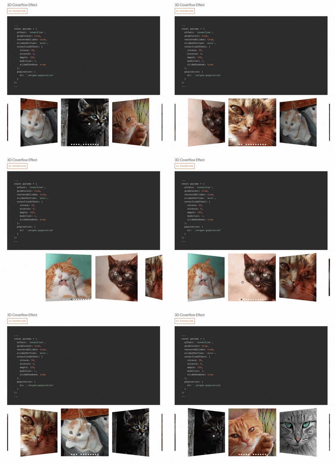
Effect-coverflow
Instead of
import Swiper from 'react-id-swiper';Use
import Swiper from 'react-id-swiper/lib/custom';
Build demo in local
First, clone this repo to your local
https://github.com/kidjp85/react-id-swiper-demo.gitInstall node packages
npm installor
yarnRun webpack server
yarn startRun tests
yarn test
yarn test --watch
License
MIT


