@fanchenbao/react-native-sliding-drawer v0.5.1
react-native-sliding-drawer
A React Native component that creates a sliding drawer on any side of the screen
Installation
npm install @fanchenbao/react-native-sliding-drawerUsage
<SlidingDrawer peekSize={90} openSize={270} fixedLoc="bottom">
  <DrawerContent />
</SlidingDrawer>
A minimal workable example is shown below.
import * as React from 'react';
import {View, Text} from 'react-native';
import {SlidingDrawer}  from '@fanchenbao/react-native-sliding-drawer';

const App = () => {
  const peekSize = 90;
  const openSize = 270;
  return (
    <View
      style={{
        flex: 1,
        justifyContent: 'center',
        alignItems: 'center',
        backgroundColor: 'yellow',
      }}>
      <Text>Minimal Example</Text>
      <SlidingDrawer peekSize={peekSize} openSize={openSize} fixedLoc="bottom">
        <View style={{flex: 1, backgroundColor: 'red'}}>
          <View style={{height: peekSize, backgroundColor: 'pink'}}>
            <Text>Peek Portion</Text>
          </View>
          <View>
            <Text>Open Portion</Text>
          </View>
        </View>
      </SlidingDrawer>
    </View>
  );
};

export default App;
Comprehensive Examples
Run Comprehensive Examples
Download this repo
git clone https://github.com/FanchenBao/react-native-sliding-drawer.gitGo to the example folder and sets up the example app
npm installThen go to the root folder to run the example app for iOS
yarn example iosor Android
yarn example androidThe example app is running from ./example/App.tsx
Props
| Props | Type | Default | Note |
|---|---|---|---|
peekSize | number | (required) | The height of the visible section of the drawer after it is closed. This is also referred to as the peek section. If set to 0, the drawer completely disappears after it is closed. |
openSize | number | (required) | The height of the entire visible drawer's after it is opened. Note that this is NOT the height of the drawer's open section, but the sum of the heights of the peek and open sections. |
fixedLoc | 'top' \| 'bottom' \| 'left' \| 'right' | (required) | The location where the sliding drawer is located. Can only be one of the four allowed strings. |
brand | string | '' | Brand of the device. Android only. Use react-native-device-info to obtain brand name. Brand name is necessary for Android devices because different brands might have different ways to configure drawer positions. Currently supported brand: 'google', 'samsung'. For an unsupported brand, the behavior defaults to that of a Samsung device. If the UI looks wanky, raise an issue or open a pull request to add support for that brand. |
drawerWidth | number | -1 | Manual override of the drawer's width. Applicable only when fixedLoc is top or bottom. Default to -1, meaning no manual override is present. |
drawerHeight | number | -1 | Manual override of the drawer's height. Applicable only when fixedLoc is left or right. Default to -1, meaning no manual override is present. |
screenWidth | number | -1 | Manual override of the screen's width. Generally speaking, this prop does not need to be set as screen width is obtained automatically. But in case the automatic screen width is inaccurate, use this prop to override it. Applicable only when fixedLoc is left or right. Default to -1, meaning no manual override is present. |
screenHeight | number | -1 | Manual override of the screen's height. Generally speaking, this prop does not need to be set as screen height is obtained automatically. But in case the automatic screen height is inaccurate, use this prop to override it. Applicable only when fixedLoc is top or bottom. Default to -1, meaning no manual override is present. |
maxPct | number | 0.5 | Maximum percentage of the height (when fixedLoc is top or bottom) or width (when fixedLoc is left or right) of a screen that a drawer cannot slide pass. Default to 0.5. |
sensitivity | number | 10 | The amount of pixels a drawer needs to slide to trigger state change (peek to open or open to peek). The smaller the value, the more sensitive the state change. Default to 10. |
expandable | boolean | true | A flag indicating whether a drawer is static (non-expandable) or dynamic (expandable). Default to true, i.e. the drawer is dynamic. |
isInitialPeek | boolean | true | A flag indicating whether the initial state of the drawer is peek or open. Default to true, i.e. the initial state is peek. |
enableSlideOpen | boolean | true | A flag indicating whether a drawer can be opened with sliding. Default to true. |
enableNonSlideOpen | boolean | false | A flag indicating whether a drawer can be opened without sliding (e.g. open upon a button press). Default to false. |
nonSlideOpen | boolean | false | A flag indicating whether to open or close a drawer. Applicable only when enableNonSlideOpen is set to true. Default to false, i.e. to close the drawer. |
onDrawerOpen | () => void | () => {} | A callback function when the drawer reaches the open state. See the caveat section for the particularity of its usage. Default to a no-operation function. |
onDrawerPeek | () => void | () => {} | A callback function when the drawer reaches the peek state. See the caveat section for the particularity of its usage. Default to a no-operation function. |
speed | number | 20 | The speed config in React Native's Animation.spring method. Default to 20. The larger it is, the faster the drawer opens and closes. |
useNativeDriver | boolean | false | A flag indicating whether to use native driver for animation. Default to false. |
enableFadeBackground | boolean | false | A flag indicating whether a fade in background is visible upon drawer movement. Specifically, as the drawer opens, the background darkens; as the drawer closes, the background brightens. |
maxFadeBackgroundOpacity | number | 0.5 | Max opacity the background reaches when the drawer is in the open state. Applicable only when enableFadeBackground is set to true. Default to 0.5. |
onFadeBackgroundPress | () => void | () => {} | A callback function when the fade background is pressed after the drawer is in the open state. Applicable only when enableFadeBackground is set to true. Default to a no-operation function. |
nonSlideableXRanges | Array<Array<number>> | [] | An array of x-coord ranges [[a1, b1], [a2, b2], ...] to specify within which x-coord ranges the sliding event of the sliding drawer shall be ignored. Use this prop if one wishes to include a horizontal scrolling view (e.g., ScrollView, FlatList, etc.) in a horizontal sliding drawer. If these ranges are not given, any horizontal sliding events will be captured by the sliding drawer, and thus ignored by the scrolling view. By supplying these ranges, the sliding event will be ignored by the sliding drawer and picked up by the scrolling view underneath. These ranges are ignored when the drawer is in its peek state. Default to empty array, which means NO x-coord range is ignored. For details, refer to the doc |
nonSlideableYRanges | Array<Array<number>> | [] | An array of y-coord ranges [[c1, d1], [c2, d2], ...] to specify within which y-coord ranges the sliding event of the sliding drawer shall be ignored. It functions exactly the same as nonSlideableXRanges, except for y-coords. Ignored when the drawer is in its peek state. Default to empty array, which means NO y-coord range is ignored. For details, refer to the doc |
elevation | number | 200 | Android only. It defines z-order of the drawer. The higher the value, the more on-top the drawer is. Default to 200, which is a very big elevation and should guarantee the drawer is on top of everything else. |
Caveats
Some caveats and gotchas while using react-native-sliding-drawer
1. <SlidingDrawer></SlidingDrawer> must NOT have restricting parent
<SlidingDrawer></SlidingDrawer> is sensitive to position. Its own position prop is set to "absolute", but if some of its parent components have restricting positioning or sizing, the rendered sliding drawer might have unexpected height, width, peek size, etc. It is thus highly recommended that <SlidingDrawer></SlidingDrawer> has as few parents as possible (i.e. it is coded as close to top level component as possible). This way, there is less risk of the sliding drawer being constraint by some other components. If, however, the sliding drawer must be deeply nested, make sure that each of its parent has loose positioning or sizing.
For instance, the minimal workable example is a valid way to use <SlidingDrawer></SlidingDrawer>, because its parent spreads the entire screen. However, if we put a restricting style on the parent such as the one shown below
import * as React from 'react';
import {View, Text} from 'react-native';
import {SlidingDrawer}  from '@fanchenbao/react-native-sliding-drawer';

const App = () => {
  const peekSize = 90;
  const openSize = 270;
  return (
    <View
      style={{
        flex: 1,
        justifyContent: 'center',
        alignItems: 'center',
        backgroundColor: 'yellow',
        width: 100, // restricting style
      }}>
      <Text>Minimal Example</Text>
      <SlidingDrawer peekSize={peekSize} openSize={openSize} fixedLoc="bottom">
        <View style={{flex: 1, backgroundColor: 'red'}}>
          <View style={{height: peekSize, backgroundColor: 'pink'}}>
            <Text>Peek Portion</Text>
          </View>
          <View>
            <Text>Open Portion</Text>
          </View>
        </View>
      </SlidingDrawer>
    </View>
  );
};

export default App;
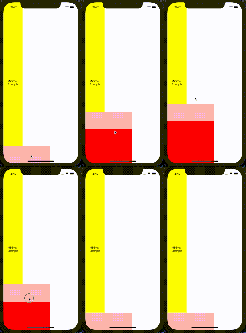
The sliding drawer no longer behaves as expected (it doesn't cover the entire width of the screen)

Note that the only difference between the erroneous example above and the minimal workable example is the addition of style width: 100 to the parent component.
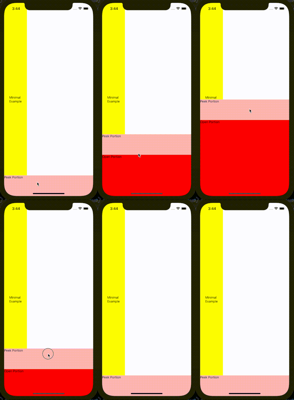
To resolve this issue, we can remove the restricting style. Yet, if the restricting style has to stay, another way to resolve the problem is to take <SlidingDrawer></SlidingDrawer> out of its restricting parent like this
const App = () => {
  const peekSize = 90;
  const openSize = 270;
  return (
    <>
      <View
        style={{
          flex: 1,
          justifyContent: 'center',
          alignItems: 'center',
          backgroundColor: 'yellow',
          width: 100, // restricting style
        }}>
        <Text>Minimal Example</Text>
      </View>
      <SlidingDrawer peekSize={peekSize} openSize={openSize} fixedLoc="bottom">
        <View style={{flex: 1, backgroundColor: 'red'}}>
          <View style={{height: peekSize, backgroundColor: 'pink'}}>
            <Text>Peek Portion</Text>
          </View>
          <View>
            <Text>Open Portion</Text>
          </View>
        </View>
      </SlidingDrawer>
    </>
  );
};
Now the sliding drawer behavior is normal (drawer covers the entire width of the screen)

At the end of the day, trial-and-error is our best friend to determine what parent is suitable for the sliding drawer.
2. onDrawerOpen and onDrawerPeek CANNOT handle dynamic variable when the drawer is opened or closed by sliding
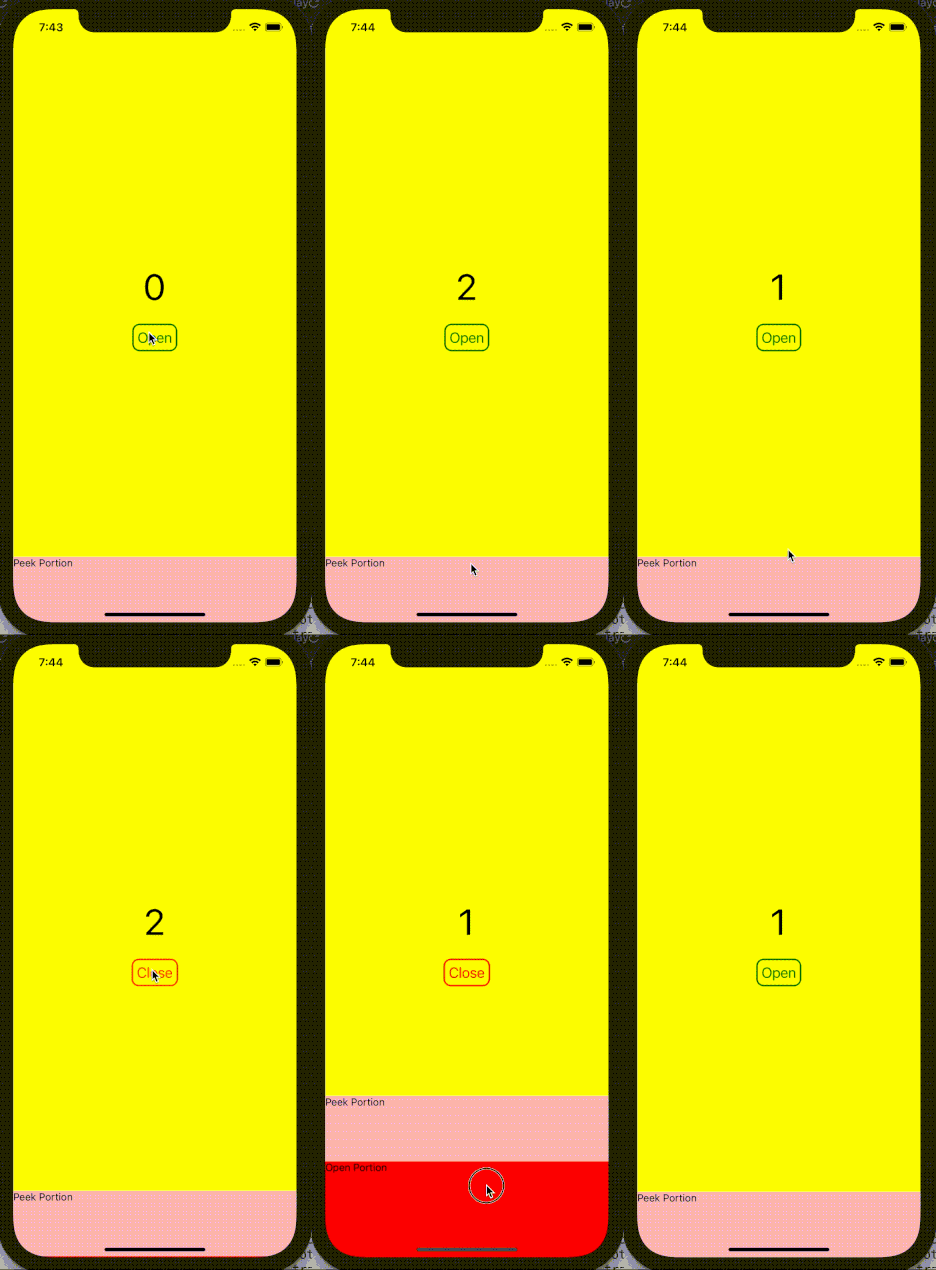
A good example of this behavior is demonstrated below.
import * as React from 'react';
import {View, Text, TouchableOpacity} from 'react-native';
import {SlidingDrawer}  from '@fanchenbao/react-native-sliding-drawer';

const App = () => {
  const peekSize = 90;
  const openSize = 270;
  const [count, setCount] = React.useState(0);
  const [isInitialPeek, setIsInitialPeek] = React.useState(true);
  const [nonSlideOpen, setNonSlideOpen] = React.useState(false);

  return (
    <View
      style={{
        flex: 1,
        justifyContent: 'center',
        alignItems: 'center',
        backgroundColor: 'yellow',
      }}>
      <Text style={{fontSize: 50}}>{count}</Text>
      <TouchableOpacity
        style={{
          margin: 20,
          padding: 5,
          borderWidth: 2,
          borderColor: isInitialPeek ? 'green' : 'red',
          borderRadius: 10,
        }}
        onPress={() => setNonSlideOpen(!nonSlideOpen)}>
        <Text style={{fontSize: 20, color: isInitialPeek ? 'green' : 'red'}}>
          {isInitialPeek ? 'Open' : 'Close'}
        </Text>
      </TouchableOpacity>
      <SlidingDrawer
        peekSize={peekSize}
        openSize={openSize}
        fixedLoc="bottom"
        isInitialPeek={isInitialPeek}
        enableNonSlideOpen={true}
        nonSlideOpen={nonSlideOpen}
        onDrawerOpen={() => {
          setIsInitialPeek(false);
          setNonSlideOpen(true);
          setCount(count + 1);
        }}
        onDrawerPeek={() => {
          setIsInitialPeek(true);
          setNonSlideOpen(false);
          setCount(count + 1);
        }}>
        <View style={{flex: 1, backgroundColor: 'red'}}>
          <View style={{height: peekSize, backgroundColor: 'pink'}}>
            <Text>Peek Portion</Text>
          </View>
          <View>
            <Text>Open Portion</Text>
          </View>
        </View>
      </SlidingDrawer>
    </View>
  );
};

export default App;
The desired behavior is that each time the drawer opens or closes, the counter counts up. We can see that the desired behavior is achieved using the non-slide open feature. However, when the drawer slides open or close, the counter gets stuck at 1. This is because onDrawerOpen and onDrawerPeek are cached in a ref when the drawer is opened or closed via sliding. Hence, the value in count is forever the initialized value, which is 0. Any further change to count does not alter its cached value inside the ref. On the other hand, if the drawer is opened or closed via the non-slide open feature, the callbacks are NOT cached; thus, their value in count does change.
There are two ways to work around this limtation.
- If the values in the callback can be hard coded, do it! For instance, instead of using
setIsInitialPeek(!isInitialPeek)for bothonDrawerOpenandonDrawerPeek, hard code the true and false value. - If including dynamic variables is inevitable for the two callbacks, consider disabling the slide open feature. In other words, force the user to open the drawer via the non-slide open feature, such that the callback is always executed as desired. This can be achieved by setting the prop
enableSlideOpento false.
Of course, if anyone has a solution to directly resolve this issue, please share your thoughts and open a pull request.
Contributing
See the contributing guide to learn how to contribute to the repository and the development workflow.
License
MIT