1.1.3 • Published 4 years ago
@galpop/themetoggler v1.1.3
ThemeToggler


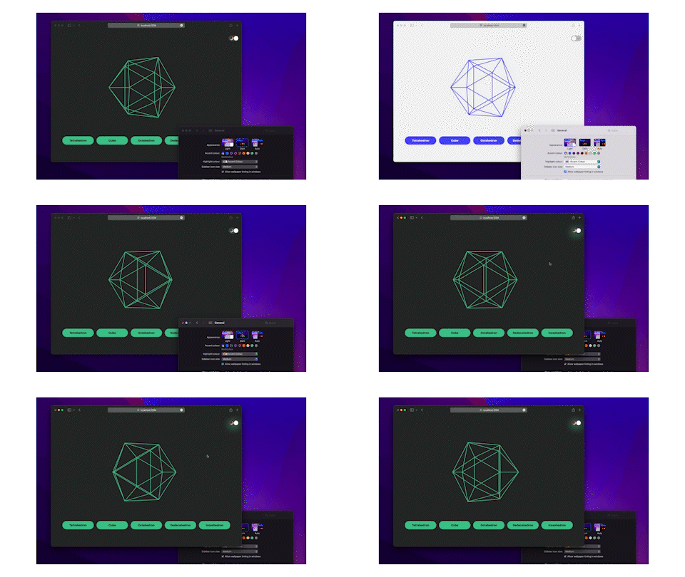
A Web component, accessible theme toggler adapting dynamically to prefers-color-scheme media query, so to the user settings of dark mode enabled or not. It's a vanilla javascript web component, hence can be intalled on an Angular, React or Vue app.
Example here : https://polyhedra-viewer.netlify.app/
Install
npm i @galpop/themetogglerUsage
This component is largely based on this wonderful article that lead to its own dark mode toggler webcomponent. Therefore, this assumes that you have your dark and light mode styles into different css files.
<link rel="stylesheet" href="/dark.css" media="(prefers-color-scheme: dark)" />
<link
  rel="stylesheet"
  href="/light.css"
  media="(prefers-color-scheme: light)"
/>
<!-- The main stylesheet -->
<link rel="stylesheet" href="/style.css" />
Then add the component this way in your html, lightFocusColor and darkFocusColor being optional.
<script type="module" src="../node_modules/@galpop/themetoggler/src/themetoggler.module.js"></script>
...
<theme-toggler lightFocusColor="#5859ff" darkFocusColor="#42c996"></theme-toggler>
Features
- focusable with the keyboard
- reacts dynamically to the user setting defining dark/light mode
Resources
This code is based on two main resources :
