@gerrico/react-components v0.1.27
React Components
This library provides a list of useful components for React projects
Install
To install the library, run this command:
npm install @gerrico/react-componentsIndex
BubbleLoader
A loader with twelve bubbles that increase and decrease their size.

Props
| Name | Description | Type | Required | Default |
|---|---|---|---|---|
| left? | Set the distance from the left margin | string | No | |
| top? | Set the distance from the top margin | string | No | |
| bubbleSize? | Set the size of the bubbles (the size of the component doesn't change) | number | No | 1 |
| color? | The color of the bubbles | string | No | #DDD |
| className? | Provide other style | string | No | undefined |
Example
import React from "react";
import { BubbleLoader } from "./components";

const App = () => {
  return (
    <div>
      <BubbleLoader left="50vw" top="50vh" color="#20E080" />
    </div>
  );
};

export default App;
BounceLoader
A loader with three bouncing balls.

Props
| Name | Description | Type | Required | Default |
|---|---|---|---|---|
| left? | Set the distance from the left margin | string | No | |
| top? | Set the distance from the top margin | string | No | |
| size? | A multiplying factor for balls size | number | No | 1 |
| color? | The color of the balls | string | No | #DDD |
| className? | Provide other style | string | No | undefined |
Example
import React from "react";
import { BounceLoader } from "./components";

const App = () => {
  return (
    <div>
      <BounceLoader left="50vw" top="50vh" color="#2080E0" size={0.8}/>
    </div>
  );
};

export default App;
RadarLoader
A loader that simulates a radar signal

Props
| Name | Description | Type | Required | Default |
|---|---|---|---|---|
| left? | Set the distance from the left margin | string | No | |
| top? | Set the distance from the top margin | string | No | |
| size? | A multiplying factor for radar size | number | No | 1 |
| color? | The color of the radar | string | No | #be97e8 |
| fill? | Only border (if false) or entire circle (if true) | boolean | No | false |
| className? | Provide other style | string | No | undefined |
Example
import React from "react";
import { RadarLoader } from "./components";

const App = () => {
  return (
    <div>
      <RadarLoader left="50vw" top="62vh" size={1} fill={false} />
    </div>
  );
};

export default App;
Selector
A button to toggle between states.

Props
| Name | Description | Type | Required | Default |
|---|---|---|---|---|
| id | Unique id for the component | string | Yes | |
| status | The status of the selector (false -> left, true -> right) | boolean | Yes | |
| onClick | Action to perform | function | Yes | |
| colorOff? | The color of the selector while is off | string | No | #444 |
| colorOff? | The color of the selector while is on | string | No | #444 |
| textColor? | The color of the text inside the selector | string | No | #FFF |
| disabled? | If true, the selector is disabled | boolean | No | false |
| className? | Provide other style | string | No | undefined |
Example
import React, { useState } from "react";
import { Selector } from "@gerrico/react-components";

const App = () => {
  const [status, setStatus] = useState(false);

  return (
    <div>
      <Selector
        id="selector"
        status={status}
        onClick={() => {
          setStatus(!status);
        }}
        items={["OFF", "ON"]}
        colorOff="#2080B0"
        colorOn="#20B080"
      />
    </div>
  );
}

export default App;
Checkbox
A simple and custom checkbox


Props
| Name | Description | Type | Required | Default |
|---|---|---|---|---|
| onClick | Action performed after clicking it | function | Yes | |
| text? | Custom text for the checkbox | string | No | |
| disabled? | If true, the component is disabled | boolean | No | false |
| className? | Provide other style | string | No | undefined |
Example
import React, { useState } from "react";
import { Checkbox } from "@gerrico/react-components";

const App = () => {
  const [status, setStatus] = useState(false);

  return (
    <div>
      <Checkbox
        status={status}
        onClick={() => {
          setStatus(!status);
        }}
        text="Checkbox"
      />
    </div>
  );
}

export default App;
Button
A simple button with background color selection and automatic text color.

Props
| Name | Description | Type | Required | Default |
|---|---|---|---|---|
| onClick | Action performed after clicking it | function | Yes | |
| color | Background color for the button (text color is always black or white, based on the background color | string | No | #2090F0 |
| disabled? | If true, the button is disabled | boolean | No | false |
| className? | Provide other style | string | No | undefined |
ATTENTION: currently, the color prop must be in hex format (#RRGGBB). This is due to the calculation of the text color. In future, there will be the possibility to set the color by:
- picking it from a list of standard colors (primary, info, warning, danger, etc.)
- writing the exact color (
red,blue,green, etc.) - by entering the color coding (rgb, hsl, etc.)
Example
import React from "react";
import { Button } from "./components";

const App = () => {
  return (
    <div>
      <Button onClick={() => alert("Pressed!")}>Press Me!</Button>
    </div>
  );
};

export default App;
Dropdown
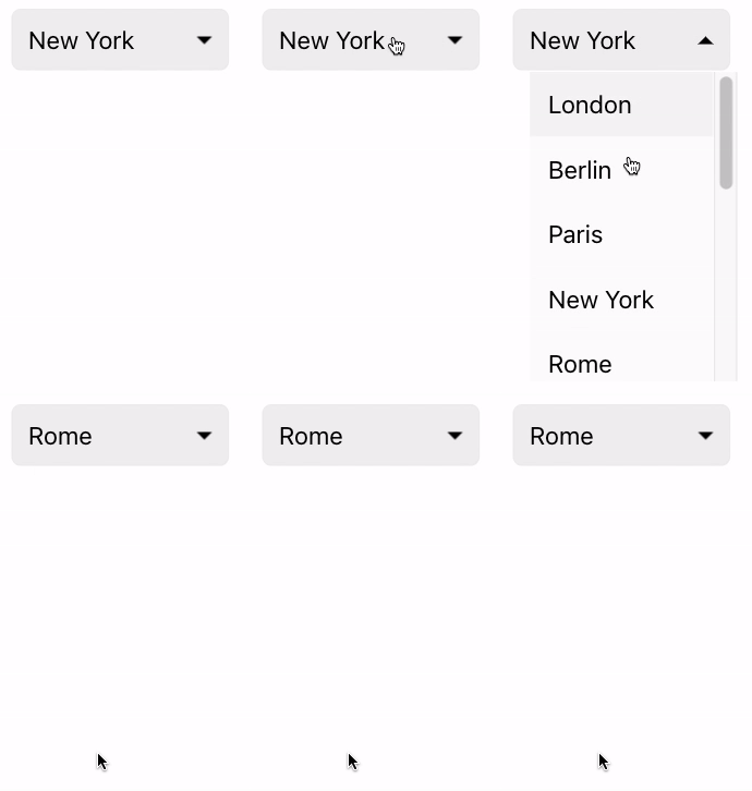
A dropdown control for items selection.
 |  |
Props
| Name | Description | Type | Required | Default |
|---|---|---|---|---|
| items | Array of items to show (props for items are described below) | array | Yes | |
| title? | The string to show inside the control. If not set, the selected values is shown | string | No | First item |
| selected? | The index of the selected item | number | No | 0 |
| onSelect? | Action to perform after selecting an item. It returns the text and the index of the selected item | function | No | |
| disabled? | If true, the dropdown is disabled | boolean | No | false |
| className? | Provide other style | string | No | undefined |
Each item of the array can have these props:
| Name | Description | Type | Required | Default |
|---|---|---|---|---|
| text? | The text of the item | string | No | |
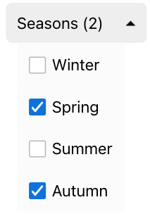
| checkbox? | Set if the item is a normal string or a checkbox | boolean | No | false |
| status? | The status of the checkbox (if checkbox is true) | boolean | No | false |
| onSelect? | Action to perform after selecting a checkbox item | function | No | |
| disabled? | If true, the item is disabled | boolean | No | false |
| header? | If true, the item has a different style and it cannot be selected | boolean | No | false |
| divider? | A line that divides the previous and the following item. Other props are ignored | boolean | No | false |
Example
import React from "react";
import { Dropdown } from "./components";

const App = () => {
  const [dropdownSelected, setDropdownSelected] = useState(0);

  const onChangeDropdownValue = (value, index) => {
    // `values` is the text of the item
    // `index` is the index of the item
    setDropdownSelected(index);
  };

  return (
    <div>
      <Dropdown
          items={[
            {
              text: "London",
            },
            {
              text: "Berlin",
            },
            {
              text: "Paris",
            },
            {
              text: "New York",
            },
            {
              text: "Rome",
            }
          ]}
          onSelect={onChangeDropdownValue}
          selected={dropdownSelected}
        />
    </div>
  );
};

export default App;4 years ago
4 years ago
4 years ago
4 years ago
4 years ago
4 years ago
4 years ago
4 years ago
4 years ago
4 years ago
4 years ago
4 years ago
4 years ago
4 years ago
4 years ago
4 years ago
4 years ago
4 years ago
4 years ago
4 years ago
4 years ago
4 years ago
4 years ago
4 years ago
4 years ago
4 years ago
4 years ago