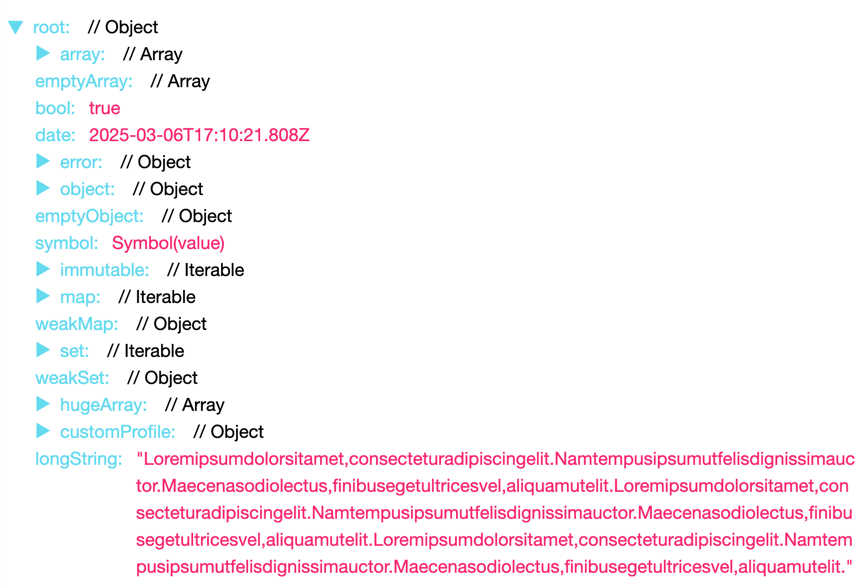
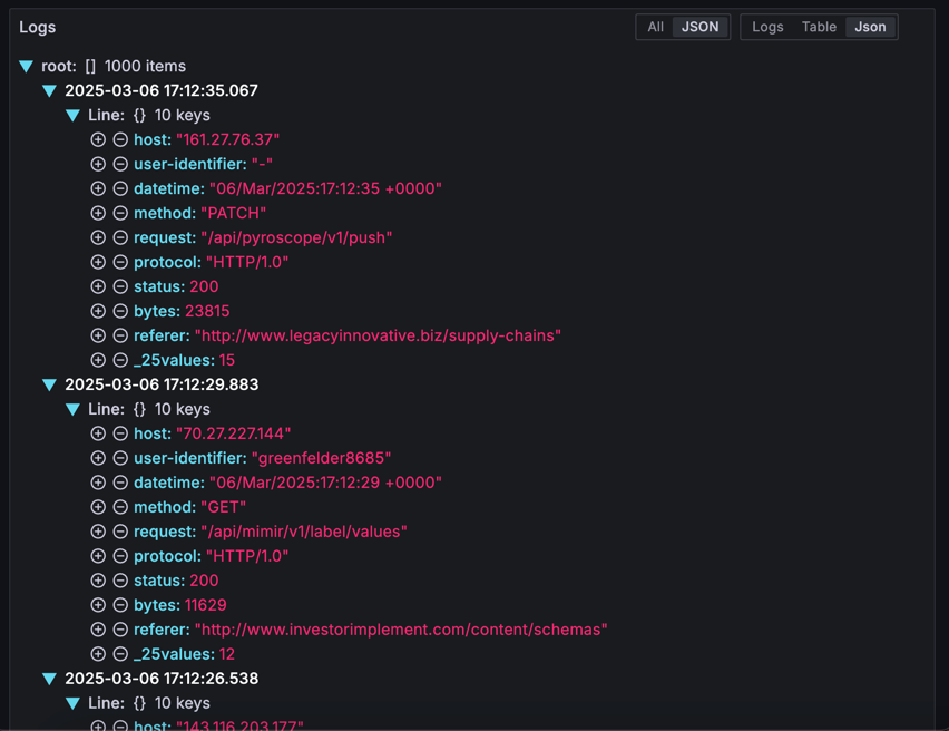
@gtk-grafana/react-json-tree v0.0.9
react-json-tree
React JSON Viewer Component, Extracted from redux-devtools. Supports iterable objects, such as Immutable.js.
Usage
import { JSONTree } from "react-json-tree";
// If you're using Immutable.js: `npm i --save immutable`
import { Map } from "immutable";

// Inside a React component:
const json = {
  array: [1, 2, 3],
  bool: true,
  object: {
    foo: "bar",
  },
  immutable: Map({ key: "value" }),
};

<JSONTree data={json} />;
Theming
Styling is managed via scss modules and css variables, it should be straight-forward to override these styles in the consuming application. Basic theming is possible by overwriting the CSS variables in the _variables.scss.
For example:
<div
    style={
        {
            "--json-tree-label-color": "rgb(12, 127, 149)",
            "--json-tree-key-label-color": "rgb(71, 131, 0)",
            "--json-tree-label-value-color": "rgb(255, 48, 124)",
            "--json-tree-arrow-color": "rgb(12, 127, 149)",
            "--json-tree-value-text-wrap": "nowrap",
        } as React.CSSProperties
    }
>
    <JSONTree data={data}/>
</div>
#### Advanced Customization
```jsx
<div>
<JSONTree
data={data}
/>
</div>Customize Labels for Arrays, Objects, and Iterables
You can pass getItemString to customize the way arrays, objects, and iterable nodes are displayed (optional).
By default, it'll be:
<JSONTree getItemString={(type, data, itemType, itemString, keyPath)
  => <span>{itemType} {itemString}</span>}
But if you pass the following:
const getItemString = (type, data, itemType, itemString, keyPath)
    => (<span> // {type}</span>);
Then the preview of child elements now look like this:

Customize Rendering
You can pass the following properties to customize rendered labels and values:
<JSONTree
  labelRenderer={([key]) => <strong>{key}</strong>}
  valueRenderer={(raw) => <em>{raw}</em>}
/>
In this example the label and value will be rendered with <strong> and <em> wrappers respectively.
For labelRenderer, you can provide a full path - see this PR.
Their full signatures are:
labelRenderer: function(keyPath, nodeType, expanded, expandable)valueRenderer: function(valueAsString, value, ...keyPath)
Adding interactive elements:
Using the labelRenderer method, you can add interactive elements to the labels:
// ...
<JSONTree
    data={data}
    labelRenderer={(keyPath, nodeType, expanded) => {
        <span>
            <IconButton name={"plus-circle"} />
            <IconButton name={"minus-circle"} />
            <strong>{keyPath[0]}</strong>
        </span>
    }}
/>
More Options
shouldExpandNodeInitially: function(keyPath, data, level)- determines if node should be expanded when it first renders (root is expanded by default)hideRoot: boolean- iftrue, the root node is hidden.sortObjectKeys: boolean | function(a, b)- sorts object keys with compare function (optional). Isn't applied to iterable maps likeImmutable.Map.postprocessValue: function(value)- mapsvalueto a newvalueisCustomNode: function(value)- overrides the default object type detection and renders the value as a single valuecollectionLimit: number- sets the number of nodes that will be rendered in a collection before rendering them in collapsed rangeskeyPath: (string | number)[]- overrides the initial key path for the root node (defaults to[root])
Credits
- All credits to Dave Vedder (veddermatic@gmail.com), who wrote the original code as JSONViewer.
- Extracted from redux-devtools, which contained ES6 + inline style port of JSONViewer by Daniele Zannotti (dzannotti@me.com)
- Iterable support thanks to Daniel K.
- npm package created by Shu Uesugi (shu@chibicode.com) per this issue.
- Improved and maintained by Alexander Kuznetsov. The repository was merged into
redux-devtoolsmonorepo fromalexkuz/react-json-tree. - Forked out of redux-devtools monorepo and stripped out all external dependencies by Galen Kistler
Similar Libraries
License
MIT