@gullerya/spotlight v1.6.0
Summary
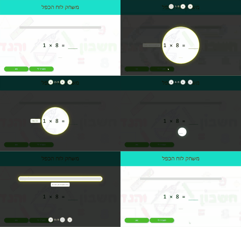
spotlight let's you to visually highlight a chosen element; this is done by shading over the surrounding content
Below is an example of spotlight used in a callout framework:

Support matrix:  61+ |
61+ |  60+ |
60+ |  16+
16+
Last versions (full changelog is here)
1.5.1
1.4.0
- Implemented Issue #2 - allow to create spotlight without a target for the beginning
- overrode
getBoundingClientRectmethod to return useful dimensions of the spotted area - minor styling adjustements of the transitions
1.3.2
- Fixed Issue #1 - misposition of the inner fence on window resize
- minor styling adjustements of the inner fence
Base API
spotlight library consists of a single entry-level API,
allowing to create a spotlight-scene with a given parameters,
applied to the DOM.
Additionally, some constant enumerators provided for convenience.
This component may then be further interacted via component's own APIs as described below, to change its appearance, flavor or spot target, and to be removed at the end of usage.
Each spotlight-scene is self-contained and isolated,
therefore it is possible to create as many 'spotlights' as needed,
even if in the real use-cases one would rarely need more than a single instance.
import:
Import the library and it's constants as in example below:
import { spotlight, SHAPES } from './dist/spotlight.min.js';syntax:
Imported spotlight is a function syntaxed as below:
const slsElement = function spotlight(target[, container[, options]]) { ... }parameters:
targetoptional- a target element to place the spot over
- MAY NOT be a
document.body
containeroptional- a container to shadow contents around the
target - when provided,
containerMUST be an ancestor of thetarget - default
containerisdocument.body
- a container to shadow contents around the
optionsoptionalshape- seeshapeproperty definition below,shadowColor- seeshadowColorproperty definition belowtransitionDuration- seetransitionDurationproperty definition below
spotlight-scene component APIs
The base API outlined above serves as an entry point for the interop with the library.
The result of that function is the spotlight-scene component instance.
It is already applied to the DOM, unless explicitly opted out via the options above.
This component may by further interacted via it's own APIs. Common use-case for this is to move smoothly the spotlight from one element to another, given that all of them are children of the same parent.
Another obvious need is to remove the spotlight-scene from the DOM
when not needed anymore.
In all of the further APIs I'll use
slsterm to represent the concretespotlight-sceneinstance that the properties and methods belong to.
properties:
sls.containerDOM element- returns the
containerelement that the component was initialized with (see base API above) containerMAY NOT be changed
- returns the
sls.targetDOM element - 'spotted' element- setting this property will move the 'spotlight' to another
target - acceptible values are subject to the same constraints as in the main API
- MUST be an element
- MUST be a descendend of the
container
- setting this property will move the 'spotlight' to another
sls.shapeenum - shape of the spotlight, defaults tocircle- setting this property on a 'living' component will be immediatelly applied
- acceptible values:
circleovalbox
- values better to be taken from the
SHAPESenum, likeSHAPES.circle
sls.shadowColorArray forrgba(CSS) function - valid Array forrgbaCSS function; defaults to[0, 0, 0, 0.8]- setting this property will have an immediate effect
sls.transitionDurationnumber - duration in millis of spotlight's transitions (move from target to target, shape change, etc); defaults to333- setting this property will be effective from the next transition forth
methods:
sls.close()- returns
Promise, resolved when all done - removes the
spotlight-scenecomponent and performs all relevant cleanups
- returns
sls.moveTo(targetElement)- returns
Promise, resolved when move it finished targetElementsubject to the same constraintstargetproperty above
- returns
sls.getBoundingClientRect()- overrides the native method
- returns the bounding client rectangle of the spotted area
Typical usage example
The flow below exemplifies typical usage of the library:
const t1 = <... the element to be spotted>;
const t2 = <... another one>;
const t3 = <... another one>;

const sl = spotlight(t1);   //  the spotlight is shown now

...

sl.target = t2;             //  spotlight moved to a new target
sl.style.color = '#110';    //  color of the shade is adjusted...
sl.shape = SHAPES.oval;     //  ... and spot's shape too

...

sl.transitionDuration = 500;    //  slow it down a bit
sl.moveTo(t3)
    .then(() => console.log('spotlight moved, do something...'));

sl.close();


