
Tagify - tags input component
Transforms an input field or a textarea into a Tags component, in an easy, customizable way,
with great performance and small code footprint, exploded with features.
Vanilla React Vue Angular
See Demos


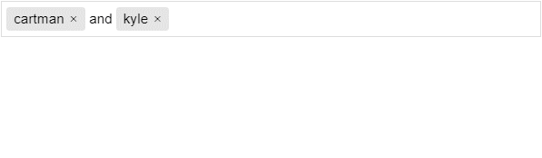
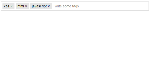
Table of Contents
- Installation
- What can Tagify do
- Building the project
- Adding tags dynamically
- Output value
- Ajax whitelist
- Edit tags
- Drag & Sort
- DOM Templates
- Suggestions selectbox
- Tags mixed with text
- Single-Value Only
- React wrapper
- Angular wrapper
- Vue Example
- jQuery version
- FAQ
- CSS Variables
- Methods
- Events
- Hooks
- Settings
Installation
npm i @yaireo/tagify --saveUsage (in your bundle):
import Tagify from '@yaireo/tagify'

var tagify = new Tagify(...)
Don't forget to include
tagify.cssfile in your project. CSS location:@yaireo/tagify/dist/tagify.cssSCSS location:@yaireo/tagify/src/tagify.scssSee SCSS usecase & example
Features
- Can be applied on input & textarea elements
- Supports mix content (text and tags together)
- Supports single-value mode (like
<select>) - Supports whitelist/blacklist
- Supports Templates for: component wrapper, tag items, suggestion list & suggestion items
- Shows suggestions selectbox (flexiable settings & styling) at full (component) width or next to the typed texted (caret)
- Allows setting suggestions' aliases for easier fuzzy-searching
- Auto-suggest input as-you-type with ability to auto-complete
- Can paste in multiple values:
tag 1, tag 2, tag 3or even newline-separated tags - Tags can be created by Regex delimiter or by pressing the "Enter" key / focusing of the input
- Validate tags by Regex pattern
- Tags may be editable (double-click)
ARIA accessibility support(Component too generic for any meaningful ARIA)- Supports read-only mode to the whole componenet or per-tag
- Each tag can have any properties desired (class, data-whatever, readonly...)
- Automatically disallow duplicate tags (vis "settings" object)
- Has built-in CSS loader, if needed (Ex. AJAX whitelist pulling)
- Tags can be trimmed via
hellipby givingmax-widthto thetagelement in yourCSS - Easily change direction to RTL (via the SCSS file)
- Internet Explorer - A polyfill script should be used:
tagify.polyfills.min.js(in/dist) - Many useful custom events
- Original input/textarea element values kept in sync with Tagify
Building the project
Simply run gulp in your terminal, from the project's path (Gulp should be installed first).
Source files are this path: /src/
Output files, which are automatically generated using Gulp, are in: /dist/
The rest of the files are most likely irrelevant.
Adding tags dynamically
var tagify = new Tagify(...);

tagify.addTags(["banana", "orange", "apple"])

// or add tags with pre-defined propeties

tagify.addTags([{value:"banana", color:"yellow"}, {value:"apple", color:"red"}, {value:"watermelon", color:"green"}])
Output value
There are two possible ways to get the value of the tags:
- Access the tagify's instance's
valueprop:tagify.value(Array of tags) - Access the original input's value:
inputElm.value(Stringified Array of tags)
The most common way is to simply listen to the change event on the original input
var inputElm = document.querySelector,
    tagify = new Tagify (inputElm);

inputElm.addEventListener('change', onChange)

function onChange(e){
  // outputs a String
  console.log(e.target.value)
}
Modify original input value format
Default format is a JSON string:
'[{"value":"cat"}, {"value":"dog"}]'
I recommend keeping this because some situations might have values such as addresses (tags contain commas):
'[{"value":"Apt. 2A, Jacksonville, FL 39404"}, {"value":"Forrest Ray, 191-103 Integer Rd., Corona New Mexico"}]'
Another example for complex tags state might be disabled tags, or ones with custom identifier class:
(tags can be clicked, so delevopers can choose to use this to disable/enable tags)
'[{"value":"cat", "disabled":true}, {"value":"dog"}, {"value":"bird", "class":"color-green"}]'
To change the format, assuming your tags have no commas and are fairly simple:
var tagify = new Tagify(inputElm, {
  originalInputValueFormat: valuesArr => valuesArr.map(item => item.value).join(',')
})
Output:
"cat,dog"
Ajax whitelist
Dynamically-loaded suggestions list (whitelist) from the server (as the user types) is a frequent need to many.
Tagify comes with its own loading animation, which is a very lightweight CSS-only code, and the loading
state is controlled by the method tagify.loading which accepts true or false as arguments.
Below is a basic example using the fetch API. I advise to abort the last request on any input before starting a new request.
Example:
var input = document.querySelector('input'),
    tagify = new Tagify(input, {whitelist:[]}),
    controller; // for aborting the call

// listen to any keystrokes which modify tagify's input
tagify.on('input', onInput)

function onInput( e ){
  var value = e.detail.value;
  tagify.settings.whitelist.length = 0; // reset the whitelist

  // https://developer.mozilla.org/en-US/docs/Web/API/AbortController/abort
  controller && controller.abort();
  controller = new AbortController();

  // show loading animation and hide the suggestions dropdown
  tagify.loading(true).dropdown.hide.call(tagify)

  fetch('http://get_suggestions.com?value=' + value, {signal:controller.signal})
    .then(RES => RES.json())
    .then(function(whitelist){
      // update inwhitelist Array in-place
      tagify.settings.whitelist.splice(0, whitelist.length, ...whitelist)
      tagify.loading(false).dropdown.show.call(tagify, value); // render the suggestions dropdown
    })
}
Edit tags
Tags which aren't read-only can be edited by double-clicking them (by default)
or by changing the editTags setting to 1, making tags editable by single-clicking them.
The value is saved on blur or by pressing enter key. Pressing Escape will revert the change trigger blur.
ctrlz will revert the change if an edited tag was marked as not valid (perhaps duplicate or blacklisted)
To prevent all tags from being allowed to be editable, set the editTags setting to false (or null).
To do the same but for specific tag(s), set those tags' data with editable property set to false:
<input value='[{"value":"foo", "editable":false}, {"value":"bar"}]'>Drag & Sort
To be able to sort tags by draging, a 3rd-party script is needed.
I have made a very simple drag & drop (~`11kb` unminified) script which uses HTML5 native API and it is available to download via NPM or Github but any other drag & drop script may possibly work. I could not find in the whole internet a decent lightweight script.
Integration example:
var tagify = new Tagify(inputElement)

// bind "DragSort" to Tagify's main element and tell
// it that all the items with the below "selector" are "draggable"
var dragsort = new DragSort(tagify.DOM.scope, {
    selector: '.'+tagify.settings.classNames.tag,
    callbacks: {
        dragEnd: onDragEnd
    }
})

// must update Tagify's value according to the re-ordered nodes in the DOM
function onDragEnd(elm){
    tagify.updateValueByDOMTags()
}
DOM Templates
It's possible to control the templates for some of the HTML elements tagify is using by
modifying the settings.templates Object with your own custom functions which must return an HTML string.
Available templates are: wrapper, tag, dropdown, dropdownItem and the optional dropdownItemNoMatch
which is a special template for rendering a suggestion item (in the dropdown list) only if there were no matches found for the typed input.
Suggestions selectbox
The suggestions selectbox is shown is a whitelist Array of Strings or Objects was passed in the settings when the Tagify instance was created. Suggestions list will only be rendered if there are at least two matching suggestions (case-insensitive).
The selectbox dropdown will be appended to the document's <body> element and will be rendered by default in a position below (bottom of) the Tagify element.
Using the keyboard arrows up/down will highlight an option from the list, and hitting the Enter key to select.
It is possible to tweak the selectbox dropdown via 2 settings:
enabled- this is a numeral value which tells Tagify when to show the suggestions dropdown, when a minimum of N characters were typed.maxItems- Limits the number of items the suggestions selectbox will render
var input = document.querySelector('input'),
    tagify = new Tagify(input, {
        whitelist : ['aaa', 'aaab', 'aaabb', 'aaabc', 'aaabd', 'aaabe', 'aaac', 'aaacc'],
        dropdown : {
            classname     : "color-blue",
            enabled       : 0,              // show the dropdown immediately on focus
            maxItems      : 5,
            position      : "text",         // place the dropdown near the typed text
            closeOnSelect : false,          // keep the dropdown open after selecting a suggestion
            highlightFirst: true
        }
    });
Will render
<div class="tagify__dropdown tagify__dropdown--text" style="left:993.5px; top:106.375px; width:616px;">
    <div class="tagify__dropdown__wrapper">
      <div class="tagify__dropdown__item tagify__dropdown__item--active" value="aaab">aaab</div>
      <div class="tagify__dropdown__item" value="aaabb">aaabb</div>
      <div class="tagify__dropdown__item" value="aaabc">aaabc</div>
      <div class="tagify__dropdown__item" value="aaabd">aaabd</div>
      <div class="tagify__dropdown__item" value="aaabe">aaabe</div>
    </div>
</div>
By default searching the suggestions is using fuzzy-search (see settings).
If you wish to assign alias to items (in your suggestion list), add the searchBy property to whitelist items you wish
to have an alias for.
In the below example, typing a part of a string which is included in the searchBy property, for example land midd" -
the suggested item which match the value "Israel" will be rendered in the suggestions (dropdown) list.
Example for a suggestion item alias
whitelist = [
    ...
    { value:'Israel', code:'IL', searchBy:'holy land, desert, middle east' },
    ...
]
Another handy setting is dropdown.searchKeys which, like the above dropdown.searchBy setting, allows
expanding the search of any typed terms to more than the value property of the whitelist items (if items are a Collection).
Example whitelist:
[
  {
    value    : 123456,
    nickname : "foo",
    email    : "foo@mail.com"
  },
  {
    value    : 987654,
    nickname : "bar",
    email    : "bar@mail.com"
  },
  ...more..
]
// setting to search in other keys:
{
  dropdown: {
    searchKeys: ["nickname", "email"] //  fuzzy-search matching for those whitelist items' properties
  }
}
Mixed-Content
To use this feature it must be toggled - see settings.
When mixing text with tags, the original textarea (or input) element will have a value as follows:
[[cartman]] and [[kyle]] do not know [[Homer simpson]]If the inital value of the textarea or input is formatted as the above example, tagify will try to
automatically convert everything between [[ & ]] to a tag, if tag exists in the whitelist, so make
sure when the Tagify instance is initialized, that it has tags with the correct value property that match
the same values that appear between [[ & ]].
Applying the setting dropdown.position:"text" is encouraged for mixed-content tags, because the suggestions list
will be rendered right next to the caret location and not the the bottom of the Tagify componenet, which might look
weird when there is already a lot of content at multiple lines.
If a tag does not exists in the whitelist, it may be created by the user and all you should do is listen to the add event and update your local/remote state.
Single-Value
Similar to native <Select> element, but allows typing text as value.
React
A Tagify React component is exported from react.tagify.js:
Note: You will need to inport Tagify's CSS also, either by javasceript or by SCSS
@import(which is preferable)
import Tags from "@yaireo/tagify/dist/react.tagify" // React-wrapper file
import "@yaireo/tagify/dist/tagify.css" // Tagify CSS

const App = () => {
  return (
    <Tags
      tagifyRef={tagifyRef} // optional Ref object for the Tagify instance itself, to get access to  inner-methods
      settings={settings}  // tagify settings object
      value="a,b,c"
      {...tagifyProps}   // dynamic props such as "loading", "showDropdown:'abc'", "value"
      onChange={e => (e.persist(), console.log("CHANGED:", e.target.value))}
    />
  )
})
To gain full acess to Tagify's inner methods, A custom ref can be used:
<Tags tagifyRef={tagifyRef} ... />See live demo for React integration examples.
Angular
TagifyComponent which will be used by your template as <tagify>
Example:
<div>
  testing tagify wrapper
  <tagify [settings]="settings"
          (add)="onAdd($event)"
          (remove)="onRemove($event)">
  </tagify>
  <button (click)="clearTags()">clear</button>
  <button (click)="addTags()">add Tags</button>
</div>
TagifyService
(The tagifyService is a singletone injected by angular, do not create a new instance of it) Remember to add
TagifyServiceto your module definition.
Example:
import {Component, OnDestroy} from '@angular/core';
import {TagifyService} from '@yaireo/tagify';

@Component({
  selector: 'app-root',
  templateUrl: './app.component.html',
  styleUrls: ['./app.component.css']
})
export class AppComponent implements OnDestroy {

  constructor(private tagifyService: TagifyService) {}
  public settings = { blacklist: ['fucking', 'shit']};

  onAdd(tagify) {
    console.log('added a tag', tagify);
  }

  onRemove(tags) {
    console.log('removed a tag', tags);
  }
  clearTags() {
    this.tagifyService.removeAll();
  }
  addTags() {
    this.tagifyService.addTags(['this', 'is', 'cool']);
  }
  ngOnDestroy() {
    this.tagifyService.destroy();
  }
}
jQuery version
jQuery.tagify.js
A jQuery wrapper verison is also available, but I advise not using it because it's basically the exact same as the "normal" script (non-jqueryfied) and all the jQuery's wrapper does is allowing to chain the event listeners for ('add', 'remove', 'invalid')
$('[name=tags]')
    .tagify()
    .on('add', function(e, tagData){
        console.log('added', ...tagData)  // data, index, and DOM node
    });
Accessing methods can be done via the .data('tagify'):
$('[name=tags]').tagify();
// get tags from the server (ajax) and add them:
$('[name=tags]').data('tagify').addTags('aaa, bbb, ccc')
HTML input & textarea attributes
The below list of attributes affect Tagify.
These can also be set by Tagify settings Object manually, and not declerativly (via attributes).
| Attribute | Example | Info |
|---|---|---|
| pattern | |
Tag Regex pattern which tag input is validated by. |
| placeholder | |
This attribute's value will be used as a constant placeholder, which is visible unless something is being typed. |
| readOnly | |
No user-interaction (add/remove/edit) allowed. |
| autofocus | |
Automatically focus the the Tagify component when the component is loaded |
| required | |
Adds a required attribute to the Tagify wrapper element. Does nothing more. |
FAQ
List of questions & scenarios which might come up during development with Tagify:
tags/whitelist data strcture
Tagify does not accept just any kind of data structure.
If a tag data is represented as an Object, it must contain a unique property value
which Tagify uses to check if a tag already exists, among other things, so make sure it is present.
Incorrect
[{ "id":1, "name":"foo bar" }]Correct
[{ "id":1, "value": 1, "name":"foo bar" }][{ "value":1, "name":"foo bar" }][{ "value":"foo bar" }]// ad a simple array of Strings
["foo bar"]Save changes (Ex. to a server)
In framework-less projects, the developer should save the state of the Tagify component (somewhere), and
the question is:
when should the state be saved?
On every change made to Tagify's internal state (tagify.value via the update() method).
var tagify = new Tagify(...)

// listen to "change" events on the "original" input/textarea element
tagify.DOM.originalInput.addEventListener('change', onTagsChange)

// This example uses async/await but you can use Promises, of course, if you prefer.
async function onTagsChange(e){
  const {name, value} = e.target
  // "imaginary" async function "saveToServer" should get the field's name & value
  await saveToServer(name, value)
}
If you are using React/Vue/Angular or any "modern" framework, then you already know how to
attach "onChange" event listeners to your <input>/<textarea> elements, so the above is irrelevant.
Render tags in one single line
Stopping tags from wrapping to new lines, add this to your .tagify CSS Rule:
flex-wrap: nowrap;- Double-click tag fires both "edit" & "click" custom events
- Manualy open the suggestions dropdown
- Render your own suggestions dropdown
- Allow max length on mix mode
- Always show dropdown
- Limit the length of a tag value (minimum & maximum)
- Mixed mode initial value
- Random colors for each tag
- Format input value for server side
- Writing to tagify textarea
- Scroll all tags within one line, instead of growing vertically
- Insert emoji at caret location when editing a tag
- propagate
changeevent - Manually update tag data after it was added
- Ajax Whitelist with "enforceWhitelist" setting enabled
- Custom (mutiple) tag valitation & AJAX
- Make tags from pasted multi-line text
CSS Variables
Learn more about CSS Variables) (custom properties)
Tagify's utilizes CSS variables which allow easy customization without the need to manually write CSS. If you do wish to heavily style your Tagify components, then you can (and should) use the below variables within your modified styles as much as you can.
For a live example, see the demos page.
| Name | Info |
|---|---|
| --tags-border-color | The outer border color which surrounds tagify |
| --tags-hover-border-color | hover state |
| --tags-focus-border-color | focus state |
| --tag-bg | Tag background color |
| --tag-hover | Tag background color on hover (mouse) |
| --tag-text-color | Tag text color |
| --tag-text-color--edit | Tag text color when a Tag is being edited |
| --tag-pad | Tag padding, from all sides. Ex. .3em .5em |
| --tag--min-width | Minimum Tag width |
| --tag--max-width | Maximum tag width, which gets trimmed with hellip after |
| --tag-inset-shadow-size | This is the inner shadow size, which dictates the color of the Tags. It's important the size fits exactly to the tag. Change this if you change the --tag-pad or fontsize. |
| --tag-invalid-color | For border color of edited tags with invalid value being typed into them |
| --tag-invalid-bg | Background color for invalid Tags. |
| --tag-remove-bg | Tag background color when hovering the × button. |
| --tag-remove-btn-color | Remove (×) button text color |
| --tag-remove-btn-bg | Remove (×) button background color |
| --tag-remove-btn-bg--hover | Remove (×) button hover background color |
| --loader-size | Loading animation size. 1em is pretty big, default is a bit less. |
| --tag-hide-transition | Controls the transition property when a tag is removed. default is '.3s' |
| --placeholder-color | Placeholder text color |
| --placeholder-color-focus | Placeholder text color when Tagify has focus and no input was typed |
| --input-color | Input text color |
Full list of Tagify's SCSS variables
Methods
Tagify is prototype based and There are many methods, but I've chosen to list the most relevant ones:
| Name | Parameters | Info |
|---|---|---|
destroy |
Reverts the input element back as it was before Tagify was applied | |
removeAllTags |
Removes all tags and resets the original input tag's value property | |
addTags |
|
Accepts a String (word, single or multiple with a delimiter), an Array of Objects (see above) or Strings |
removeTags |
|
(#502) Remove single/multiple Tags. When nothing passed, removes last tag.
|
loadOriginalValues |
String/Array |
Converts the input's value into tags. This method gets called automatically when instansiating Tagify. Also works for mixed-tags |
getWhitelistItemsByValue |
Object |
{value} - return an Array of found matching items (case-insensitive) |
getTagIndexByValue |
String |
Returns the index of a specific tag, by value |
getTagElmByValue |
String |
Returns the first matched tag node, if found |
isTagDuplicate |
String |
Returns how many tags already exists with that value |
parseMixTags |
String |
Converts a String argument ([[foo]] and [[bar]] are..) into HTML with mixed tags & texts |
getTagElms |
Returns a DOM nodes list of all the tags | |
getTagElmByValue |
String |
Returns a specific tag DOM node by value |
tagData |
HTMLElement, Object |
set/get tag data on a tag element (has.tagify__tag class by default) |
editTag |
HTMLElement |
Goes to edit-mode in a specific tag |
replaceTag |
tagElm, Object (tagData) |
Exit a tag's edit-mode. if "tagData" exists, replace the tag element with new data and update Tagify value |
loading |
Boolean |
Toogle loading state on/off (Ex. AJAX whitelist pulling) |
tagLoading |
HTMLElement, Boolean |
same as above but for a specific tag element |
createTagElem |
Object (tagData) |
Returns a tag element from the supplied tag data |
injectAtCaret |
HTMLElement (injectedNode), Object (range) |
Injects text or HTML node at last caret position. range parameter is optional |
insertAfterTag |
HTMLElement (tag element), HTMLElement/String (whatever to insert after) |
|
toggleInvalidClass |
Boolean |
Toggles tagify--invalid class to the Tagify wrapper element |
dropdown.selectAll |
Add all whitelist items as tags and close the suggestion dropdown | |
updateValueByDOMTags |
Iterate tag DOM nodes and re-build the tagify.value array (call this if tags get sorted manually) |
|
parseTemplate |
String/Function (template name or function), Array (data) |
converts a template string (by selecting one from the settings.templates by name or supplying a template function which returns a String) into a DOM node |
Events
All triggered events return the instance's scope (tagify).
See e.detail for custom event additional data.
Example 1
var tagify = new Tagify(...)

// events can be chainable, and multiple events may be binded for the same callback
tagify
  .on('input', e => console.log(e.detail))
  .on('edit:input edit:updated edit:start edit:keydown', e => console.log(e.type, e.detail))
Example 2
var tagify = new Tagify(inputNode, {
  callbacks: {
    "change": (e) => console.log(e.detail))
    "dropdown:show": (e) => console.log(e.detail))
  }
})| Name | Info |
|---|---|
| change | Any change to the value has occured. e.details.value callback listener argument is a String |
| add | A tag has been added |
| remove | A tag has been removed (use removeTag instead with jQuery) |
| invalid | A tag has been added but did not pass vaildation. See event detail |
| input | Input event, when a tag is being typed/edited. e.detail exposes value, inputElm & isValid |
| click | Clicking a tag. Exposes the tag element, its index & data |
| dblclick | Double-clicking a tag |
| keydown | When tagify input has focus and a key was pressed |
| focus | The component currently has focus |
| blur | The component lost focus |
| edit:input | Typing inside an edited tag |
| edit:beforeUpdate | Just before a tag has been updated, while still in "edit" mode |
| edit:updated | A tag as been updated (changed view editing or by directly calling the replaceTag() method) |
| edit:start | A tag is now in "edit mode" |
| edit:keydown | keydown event while an edited tag is in focus |
| dropdown:show | Suggestions dropdown is to be rendered. The dropdown DOM node is passed in the callback, see demo. |
| dropdown:hide | Suggestions dropdown has been removed from the DOM |
| dropdown:select | Suggestions dropdown item selected (by mouse/keyboard/touch) |
| dropdown:scroll | Tells the percentage scrolled. (event.detail.percentage) |
| dropdown:noMatch | No whitelist suggestion item matched for the the typed input. At this point it is possible to manually set tagify.suggestedListItems to any possible custom value, for example: [{ value:"default" }] |
Hooks
Promise-based hooks for async program flow scenarios.
Allows to "hook" (intervene) at certain points of the program, which were selected as a suitable place to pause the program flow and wait for further instructions on how/if to procceed.
For example, if a developer wishes to add a (native) confirmation popup before a tag is removed (by a user action):
var input = document.querySelector('input')
var tagify = new Tagify(input,{
    hooks: {
        /**
         * Removes a tag
         * @param  {Array}  tags [Array of Objects [{node:..., data:...}, {...}, ...]]
         */
        beforeRemoveTag : function( tags ){
            return new Promise((resolve, reject) => {
                confirm("Remove " + tags[0].data.value + "?")
                    ? resolve()
                    : reject()
            })
        }
    }
})| Name | Parameters | Info |
|---|---|---|
| beforeRemoveTag | Array (of Objects) | Example |
| suggestionClick | Object (click event data) | Example |
Settings
| Name | Type | Default | Info |
|---|---|---|---|
| placeholder | String | Placeholder text. If this attribute is set on an input/textarea element it will override this setting | |
| delimiters | String | , |
[RegEx string] split tags by any of these delimiters. Example: `", |
| pattern | String/RegEx | null | Validate input by RegEx pattern (can also be applied on the input itself as an attribute) Ex: /[1-9]/ |
| mode | String | null | Use select for single-value dropdown-like select box. See mix as value to allow mixed-content. The 'pattern' setting must be set to some character. |
| mixTagsInterpolator | Array | ['[[', ']]'] |
Interpolation for mix mode. Everything between these will become a tag |
| mixTagsAllowedAfter | RegEx | /,|\.|\:|\s/ |
Define conditions in which typed mix-tags content is allowing a tag to be created after. |
| duplicates | Boolean | false | Should duplicate tags be allowed or not |
| trim | Boolean | true | If true trim the tag's value (remove before/after whitespaces) |
| enforceWhitelist | Boolean | false | Should ONLY use tags allowed in whitelist. In mix-mode, setting it to false will not allow creating new tags. |
| autoComplete.enabled | Boolean | true | Tries to suggest the input's value while typing (match from whitelist) by adding the rest of term as grayed-out text |
| autoComplete.rightKey | Boolean | false | If true, when → is pressed, use the suggested value to create a tag, else just auto-completes the input. In mixed-mode this is ignored and treated as "true" |
| whitelist | Array | [] | An array of tags which only they are allowed |
| blacklist | Array | [] | An array of tags which aren't allowed |
| addTagOnBlur | Boolean | true | Automatically adds the text which was inputed as a tag when blur event happens |
| callbacks | Object | {} | Exposed callbacks object to be triggered on events: 'add' / 'remove' tags |
| maxTags | Number | Infinity | Maximum number of allowed tags. when reached, adds a class "tagify--hasMaxTags" to <Tags> |
| editTags | Number | 2 | Number of clicks on a tag to enter "edit" mode. Only 1 or 2 work. false or null will disallow editing |
| templates | Object | wrapper, tag, dropdownItem |
Object consisting of functions which return template strings |
| transformTag | Function | undefined | Takes a tag input as argument and returns a transformed value |
| keepInvalidTags | Boolean | false | If true, do not remove tags which did not pass validation |
| skipInvalid | Boolean | false | If true, do not add invalid, temporary, tags before automatically removing them |
| backspace | * | true | On pressing backspace key:true - remove last tag edit - edit last tag |
| originalInputValueFormat | Function | If you wish your original input/textarea value property format to other than the default (which I recommend keeping) you may use this and make sure it returns a string. |
|
| mixMode.insertAfterTag | Node/String | \u00A0 |
node or string to add after a tag added |
| dropdown.enabled | Number | 2 | Minimum characters input for showing a suggestions list. false will not render a suggestions list. |
| dropdown.caseSensitive | Boolean | false | if true, match exact item when a suggestion is selected (from the dropdown) and also more strict matching for dulpicate items. Ensure fuzzySearch is false for this to work. |
| dropdown.maxItems | Number | 10 | Maximum items to show in the suggestions list |
| dropdown.classname | String | "" |
Custom classname for the dropdown suggestions selectbox |
| dropdown.fuzzySearch | Boolean | true | Enables filtering dropdown items values' by string containing and not only beginning |
| dropdown.accentedSearch | Boolean | true | Enable searching for accented items in the whitelist without typing exact match (#491) |
| dropdown.position | String | null |
|
| dropdown.highlightFirst | Boolean | false | When a suggestions list is shown, highlight the first item, and also suggest it in the input (The suggestion can be accepted with → key) |
| dropdown.closeOnSelect | Boolean | true | close the dropdown after selecting an item, if enabled:0 is set (which means always show dropdown on focus) |
| dropdown.clearOnSelect | Boolean | true | Keep typed text after selecting a suggestion |
| dropdown.mapValueTo | Function/String | if whitelist is an Array of Objects: Ex. [{value:'foo', email:'foo@a.com'},...])this setting controlls which data key will be printed in the dropdown. Ex. mapValueTo: data => "To:" + data.emailEx. mapValueTo: "email" |
|
| dropdown.searchKeys | Array | ["value", "searchBy"] |
When a user types something and trying to match the whitelist items for suggestions, this setting allows matching other keys of a whitelist objects |
| dropdown.appendTarget | HTMLNode | document.body |
Target-Node which the suggestions dropdown is appended to (only when rendered) |
FAQ
List of questions & scenarios which might come up during development with Tagify:
tags/whitelist data strcture
Tagify does not accept just any kind of data structure.
If a tag data is represented as an __INLINE_CODE_69__, it must contain a unique property __INLINE_CODE_70__
which Tagify uses to check if a tag already exists, among other things, so make sure it is present.
Incorrect
__CODE_BLOCK_25__Correct
__CODE_BLOCK_26__ __CODE_BLOCK_27__ __CODE_BLOCK_28__ __CODE_BLOCK_29__Save changes (Ex. to a server)
In framework-less projects, the developer should save the state of the Tagify component (somewhere), and
the question is:
when should the state be saved?
On every change made to Tagify's internal state (__INLINE_CODE_71__ via the __INLINE_CODE_72__ method).
If you are using React/Vue/Angular or any "modern" framework, then you already know how to attach "onChange" event listeners to your __INLINE_CODE_73__/__INLINE_CODE_74__ elements, so the above is irrelevant.
Render tags in one single line
Stopping tags from wrapping to new lines, add this to your __INLINE_CODE_75__ CSS Rule:
__CODE_BLOCK_31__- Double-click tag fires both "edit" & "click" custom events
- Manualy open the suggestions dropdown
- Render your own suggestions dropdown
- Allow max length on mix mode
- Always show dropdown
- Limit the length of a tag value (minimum & maximum)
- Mixed mode initial value
- Random colors for each tag
- Format input value for server side
- Writing to tagify textarea
- Scroll all tags within one line, instead of growing vertically
- Insert emoji at caret location when editing a tag
- propagate __INLINE_CODE_76__ event
- Manually update tag data after it was added
- Ajax Whitelist with "enforceWhitelist" setting enabled
- Custom (mutiple) tag valitation & AJAX
- Make tags from pasted multi-line text
CSS Variables
Learn more about CSS Variables) (custom properties)
Tagify's utilizes CSS variables which allow easy customization without the need to manually write CSS. If you do wish to heavily style your Tagify components, then you can (and should) use the below variables within your modified styles as much as you can.
For a live example, see the demos page.
| Name | Info |
|---|---|
| --tags-border-color | The outer border color which surrounds tagify |
| --tags-hover-border-color | hover state |
| --tags-focus-border-color | focus state |
| --tag-bg | Tag background color |
| --tag-hover | Tag background color on hover (mouse) |
| --tag-text-color | Tag text color |
| --tag-text-color--edit | Tag text color when a Tag is being edited |
| --tag-pad | Tag padding, from all sides. Ex. __INLINE_CODE_77__ |
| --tag--min-width | Minimum Tag width |
| --tag--max-width | Maximum tag width, which gets trimmed with hellip after |
| --tag-inset-shadow-size | This is the inner shadow size, which dictates the color of the Tags. It's important the size fits exactly to the tag. Change this if you change the __INLINE_CODE_78__ or fontsize. |
| --tag-invalid-color | For border color of edited tags with invalid value being typed into them |
| --tag-invalid-bg | Background color for invalid Tags. |
| --tag-remove-bg | Tag background color when hovering the __INLINE_CODE_79__ button. |
| --tag-remove-btn-color | Remove (__INLINE_CODE_80__) button text color |
| --tag-remove-btn-bg | Remove (__INLINE_CODE_81__) button background color |
| --tag-remove-btn-bg--hover | Remove (__INLINE_CODE_82__) button hover background color |
| --loader-size | Loading animation size. __INLINE_CODE_83__ is pretty big, default is a bit less. |
| --tag-hide-transition | Controls the transition property when a tag is removed. default is '.3s' |
| --placeholder-color | Placeholder text color |
| --placeholder-color-focus | Placeholder text color when Tagify has focus and no input was typed |
| --input-color | Input text color |
Full list of Tagify's SCSS variables
Methods
__INLINE_CODE_84__ is prototype based and There are many methods, but I've chosen to list the most relevant ones:
| Name | Parameters | Info |
|---|---|---|
| __INLINE_CODE_85__ | Reverts the input element back as it was before Tagify was applied | |
| __INLINE_CODE_86__ | Removes all tags and resets the original input tag's value property | |
| __INLINE_CODE_87__ |
|
Accepts a String (word, single or multiple with a delimiter), an Array of Objects (see above) or Strings |
| __INLINE_CODE_93__ |
|
(#502) Remove single/multiple Tags. When nothing passed, removes last tag.
|
| __INLINE_CODE_102__ | __INLINE_CODE_103__/__INLINE_CODE_104__ | Converts the input's value into tags. This method gets called automatically when instansiating Tagify. Also works for mixed-tags |
| __INLINE_CODE_105__ | __INLINE_CODE_106__ | __INLINE_CODE_107__ - return an Array of found matching items (case-insensitive) |
| __INLINE_CODE_108__ | __INLINE_CODE_109__ | Returns the index of a specific tag, by value |
| __INLINE_CODE_110__ | __INLINE_CODE_111__ | Returns the first matched tag node, if found |
| __INLINE_CODE_112__ | __INLINE_CODE_113__ | Returns how many tags already exists with that value |
| __INLINE_CODE_114__ | __INLINE_CODE_115__ | Converts a String argument (__INLINE_CODE_116__) into HTML with mixed tags & texts |
| __INLINE_CODE_117__ | Returns a DOM nodes list of all the tags | |
| __INLINE_CODE_118__ | __INLINE_CODE_119__ | Returns a specific tag DOM node by value |
| __INLINE_CODE_120__ | __INLINE_CODE_121__, __INLINE_CODE_122__ | set/get tag data on a tag element (has__INLINE_CODE_123__ class by default) |
| __INLINE_CODE_124__ | __INLINE_CODE_125__ | Goes to edit-mode in a specific tag |
| __INLINE_CODE_126__ | __INLINE_CODE_127__, __INLINE_CODE_128__ (__INLINE_CODE_129__) | Exit a tag's edit-mode. if "tagData" exists, replace the tag element with new data and update Tagify value |
| __INLINE_CODE_130__ | __INLINE_CODE_131__ | Toogle loading state on/off (Ex. AJAX whitelist pulling) |
| __INLINE_CODE_132__ | __INLINE_CODE_133__, Boolean | same as above but for a specific tag element |
| __INLINE_CODE_134__ | __INLINE_CODE_135__ (__INLINE_CODE_136__) | Returns a tag element from the supplied tag data |
| __INLINE_CODE_137__ | __INLINE_CODE_138__ (__INLINE_CODE_139__), __INLINE_CODE_140__ (__INLINE_CODE_141__) | Injects text or HTML node at last caret position. __INLINE_CODE_142__ parameter is optional |
| __INLINE_CODE_143__ | __INLINE_CODE_144__ (tag element), __INLINE_CODE_145__/__INLINE_CODE_146__ (whatever to insert after) | |
| __INLINE_CODE_147__ | __INLINE_CODE_148__ | Toggles __INLINE_CODE_149__ class to the Tagify wrapper element |
| __INLINE_CODE_150__ | Add all whitelist items as tags and close the suggestion dropdown | |
| __INLINE_CODE_151__ | Iterate tag DOM nodes and re-build the __INLINE_CODE_152__ array (call this if tags get sorted manually) | |
| __INLINE_CODE_153__ | __INLINE_CODE_154__/__INLINE_CODE_155__ (template name or function), __INLINE_CODE_156__ (data) | converts a template string (by selecting one from the __INLINE_CODE_157__ by name or supplying a template function which returns a String) into a DOM node |
Events
All triggered events return the instance's scope (tagify).
See __INLINE_CODE_158__ for custom event additional data.
Example 1
__CODE_BLOCK_32__Example 2
__CODE_BLOCK_33__| Name | Info |
|---|---|
| change | Any change to the value has occured. __INLINE_CODE_159__ callback listener argument is a String |
| add | A tag has been added |
| remove | A tag has been removed (use __INLINE_CODE_160__ instead with jQuery) |
| invalid | A tag has been added but did not pass vaildation. See event detail |
| input | Input event, when a tag is being typed/edited. __INLINE_CODE_161__ exposes __INLINE_CODE_162__, __INLINE_CODE_163__ & __INLINE_CODE_164__ |
| click | Clicking a tag. Exposes the tag element, its index & data |
| dblclick | Double-clicking a tag |
| keydown | When tagify input has focus and a key was pressed |
| focus | The component currently has focus |
| blur | The component lost focus |
| edit:input | Typing inside an edited tag |
| edit:beforeUpdate | Just before a tag has been updated, while still in "edit" mode |
| edit:updated | A tag as been updated (changed view editing or by directly calling the __INLINE_CODE_165__ method) |
| edit:start | A tag is now in "edit mode" |
| edit:keydown | keydown event while an edited tag is in focus |
| dropdown:show | Suggestions dropdown is to be rendered. The dropdown DOM node is passed in the callback, see demo. |
| dropdown:hide | Suggestions dropdown has been removed from the DOM |
| dropdown:select | Suggestions dropdown item selected (by mouse/keyboard/touch) |
| dropdown:scroll | Tells the percentage scrolled. (__INLINE_CODE_166__) |
| dropdown:noMatch | No whitelist suggestion item matched for the the typed input. At this point it is possible to manually set __INLINE_CODE_167__ to any possible custom value, for example: __INLINE_CODE_168__ |
Hooks
Promise-based hooks for async program flow scenarios.
Allows to "hook" (intervene) at certain points of the program, which were selected as a suitable place to pause the program flow and wait for further instructions on how/if to procceed.
For example, if a developer wishes to add a (native) confirmation popup before a tag is removed (by a user action):
__CODE_BLOCK_34__| Name | Parameters | Info |
|---|---|---|
| beforeRemoveTag | Array (of Objects) | Example |
| suggestionClick | Object (click event data) | Example |
Settings
| Name | Type | Default | Info |
|---|---|---|---|
| placeholder | String | Placeholder text. If this attribute is set on an input/textarea element it will override this setting | |
| delimiters | String | __INLINE_CODE_169__ | [RegEx string] split tags by any of these delimiters. Example: `", |
| pattern | String/RegEx | null | Validate input by RegEx pattern (can also be applied on the input itself as an attribute) Ex: __INLINE_CODE_170__ |
| mode | String | null | Use __INLINE_CODE_171__ for single-value dropdown-like select box. See __INLINE_CODE_172__ as value to allow mixed-content. The 'pattern' setting must be set to some character. |
| mixTagsInterpolator | Array | __INLINE_CODE_173__ | Interpolation for mix mode. Everything between these will become a tag |
| mixTagsAllowedAfter | RegEx | __INLINE_CODE_174__ | Define conditions in which typed mix-tags content is allowing a tag to be created after. |
| duplicates | Boolean | false | Should duplicate tags be allowed or not |
| trim | Boolean | true | If __INLINE_CODE_175__ trim the tag's value (remove before/after whitespaces) |
| enforceWhitelist | Boolean | false | Should ONLY use tags allowed in whitelist. In __INLINE_CODE_176__, setting it to __INLINE_CODE_177__ will not allow creating new tags. |
| autoComplete.enabled | Boolean | true | Tries to suggest the input's value while typing (match from whitelist) by adding the rest of term as grayed-out text |
| autoComplete.rightKey | Boolean | false | If __INLINE_CODE_178__, when __INLINE_CODE_179__ is pressed, use the suggested value to create a tag, else just auto-completes the input. In mixed-mode this is ignored and treated as "true" |
| whitelist | Array | [] | An array of tags which only they are allowed |
| blacklist | Array | [] | An array of tags which aren't allowed |
| addTagOnBlur | Boolean | true | Automatically adds the text which was inputed as a tag when blur event happens |
| callbacks | Object | {} | Exposed callbacks object to be triggered on events: __INLINE_CODE_180__ / __INLINE_CODE_181__ tags |
| maxTags | Number | Infinity | Maximum number of allowed tags. when reached, adds a class "tagify--hasMaxTags" to __INLINE_CODE_182__ |
| editTags | Number | 2 | Number of clicks on a tag to enter "edit" mode. Only __INLINE_CODE_183__ or __INLINE_CODE_184__ work. __INLINE_CODE_185__ or __INLINE_CODE_186__ will disallow editing |
| templates | Object | __INLINE_CODE_187__, __INLINE_CODE_188__, __INLINE_CODE_189__ | Object consisting of functions which return template strings |
| transformTag | Function | undefined | Takes a tag input as argument and returns a transformed value |
| keepInvalidTags | Boolean | false | If __INLINE_CODE_190__, do not remove tags which did not pass validation |
| skipInvalid | Boolean | false | If __INLINE_CODE_191__, do not add invalid, temporary, tags before automatically removing them |
| backspace | * | true | On pressing backspace key: __INLINE_CODE_192__ - remove last tag __INLINE_CODE_193__ - edit last tag |
| originalInputValueFormat | Function | If you wish your original input/textarea __INLINE_CODE_194__ property format to other than the default (which I recommend keeping) you may use this and make sure it returns a string. | |
| mixMode.insertAfterTag | Node/String | __INLINE_CODE_195__ | __INLINE_CODE_196__ or __INLINE_CODE_197__ to add after a tag added |
| dropdown.enabled | Number | 2 | Minimum characters input for showing a suggestions list. __INLINE_CODE_198__ will not render a suggestions list. |
| dropdown.caseSensitive | Boolean | false | if __INLINE_CODE_199__, match exact item when a suggestion is selected (from the dropdown) and also more strict matching for dulpicate items. Ensure __INLINE_CODE_200__ is __INLINE_CODE_201__ for this to work. |
| dropdown.maxItems | Number | 10 | Maximum items to show in the suggestions list |
| dropdown.classname | String | __INLINE_CODE_202__ | Custom classname for the dropdown suggestions selectbox |
| dropdown.fuzzySearch | Boolean | true | Enables filtering dropdown items values' by string containing and not only beginning |
| dropdown.accentedSearch | Boolean | true | Enable searching for accented items in the whitelist without typing exact match (#491) |
| dropdown.position | String | null |
|
| dropdown.highlightFirst | Boolean | false | When a suggestions list is shown, highlight the first item, and also suggest it in the input (The suggestion can be accepted with → key) |
| dropdown.closeOnSelect | Boolean | true | close the dropdown after selecting an item, if __INLINE_CODE_207__ is set (which means always show dropdown on focus) |
| dropdown.clearOnSelect | Boolean | true | Keep typed text after selecting a suggestion |
| dropdown.mapValueTo | Function/String | if whitelist is an Array of Objects: Ex. __INLINE_CODE_208__) this setting controlls which data key will be printed in the dropdown. Ex. __INLINE_CODE_209__ Ex. __INLINE_CODE_210__ |
|
| dropdown.searchKeys | Array | __INLINE_CODE_211__ | When a user types something and trying to match the whitelist items for suggestions, this setting allows matching other keys of a whitelist objects |
| dropdown.appendTarget | HTMLNode | __INLINE_CODE_212__ | Target-Node which the suggestions dropdown is appended to (only when rendered) |