@hashiprobr/react-native-paper-datetimepicker v1.2.0
react-native-paper-datetimepicker
A React Native Paper TextInput for picking date or time
In Android and iOS, the DateTimePicker component is a non-editable TextInput wrapped by a TouchableRipple. When the touchable is clicked, the component uses Matteo Mazzarolo's react-native-modal-datetime-picker to change the input value. The code was heavily inspired by Fateh Farooqui's react-native-paper-dropdown and my own fork of it.
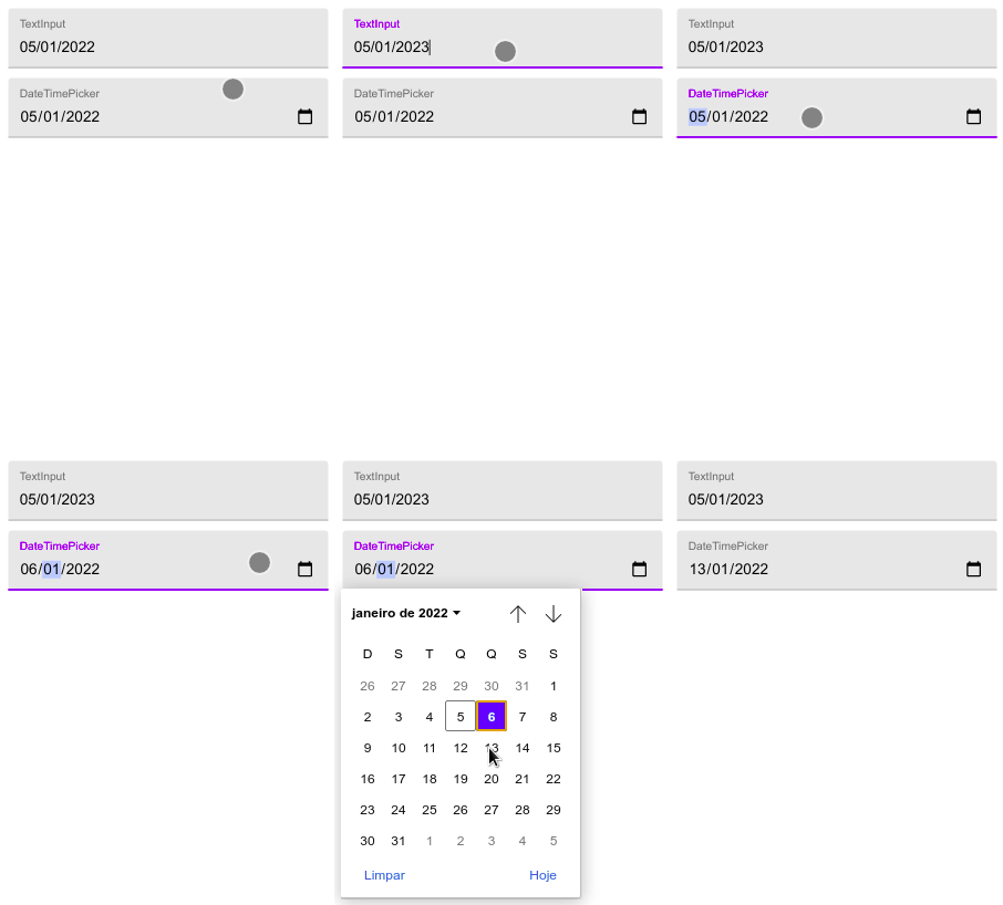
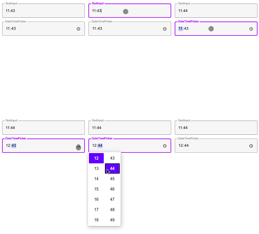
In the web, the DateTimePicker component is a date input or time input wrapped by a TextInput. The value can be either typed or chosen from a popup.


Peer dependencies
{
    "@react-native-community/datetimepicker": "6.1.2",
    "react": "17.0.2",
    "react-native": "0.68.2",
    "react-native-modal-datetime-picker": "13.1.2",
    "react-native-paper": "4.12.3"
}
Install
With npm:
npm install @hashiprobr/react-native-paper-datetimepickerWith yarn:
yarn add @hashiprobr/react-native-paper-datetimepickerIf using Expo, add the module to webpack.config.js:
const createExpoWebpackConfigAsync = require('@expo/webpack-config');

module.exports = async function (env, argv) {
    const config = await createExpoWebpackConfigAsync({
        ...env,
        babel: {
            dangerouslyAddModulePathsToTranspile: [
                '@hashiprobr/react-native-paper-datetimepicker',
            ],
        },
    }, argv);
    return config;
};
If webpack.config.js does not exist, create it with:
expo customize:webProps
| name | description |
|---|---|
| type | 'date' or 'time' (default 'date') |
| value | the current date (required) |
| onChangeDate | called when the date has changed (required) |
| disabled | equivalent to the TouchableRipple disabled prop and the TextInput disabled prop |
| onFocus | equivalent to the TouchableRipple onFocus prop |
| onBlur | equivalent to the TouchableRipple onBlur prop |
| style | all properties except flexGrow, alignSelf, and margins are applied to the inner TextInput; flexGrow, alignSelf, and margins are applied to the outer TouchableRipple |
| theme | equivalent to the TouchableRipple theme prop and the TextInput theme prop |
| editable | if false, clicking on the component has no effect (default true) |
| borderless | equivalent to the TouchableRipple borderless prop |
| background | equivalent to the TouchableRipple background prop |
| centered | equivalent to the TouchableRipple centered prop |
| rippleColor | equivalent to the TouchableRipple rippleColor prop |
| underlayColor | equivalent to the TouchableRipple underlayColor prop |
| touchableStyle | all properties except flexGrow, alignSelf, and margins are applied to the outer TouchableRipple |
| mode | equivalent to the TextInput mode prop |
| label | equivalent to the TextInput label prop |
| error | equivalent to the TextInput error prop |
| selectionColor | equivalent to the TextInput selectionColor prop |
| underlineColor | equivalent to the TextInput underlineColor prop |
| activeUnderlineColor | equivalent to the TextInput activeUnderlineColor prop |
| outlineColor | equivalent to the TextInput outlineColor prop |
| activeOutlineColor | equivalent to the TextInput activeOutlineColor prop |
| dense | equivalent to the TextInput dense prop |
| iconColor | equivalent to the TextInput.Icon color prop |
| iconStyle | equivalent to the TextInput.Icon style prop |
Example
import React, { useState } from 'react';

import { View } from 'react-native';

import { Provider } from 'react-native-paper';

import { DateTimePicker } from '@hashiprobr/react-native-paper-datetimepicker';

export default function MyComponent() {
    const [date, setDate] = useState(new Date());

    return (
        <Provider>
            <View>
                <DateTimePicker
                    type="date"
                    value={date}
                    onChangeDate={setDate}
                />
            </View>
        </Provider>
    );
}3 years ago
4 years ago
4 years ago
4 years ago
4 years ago
4 years ago
4 years ago
4 years ago
4 years ago
4 years ago
4 years ago
4 years ago
4 years ago
4 years ago
4 years ago
4 years ago
4 years ago
4 years ago
4 years ago
4 years ago
4 years ago
4 years ago