@iladiro/angular-slider v0.0.12
IladiroAngularSliderLibrary Documentation
This library is compatible with Angular versions >=15.0.0
Note: Please use version from 0.0.12, which is compatible with Angular versions >=15.0.0, older versions are only compatible with Angular version ^15.2.0. It was my mistake! Thank you
Angular Slider plugin is flexible and easily customizable
Description
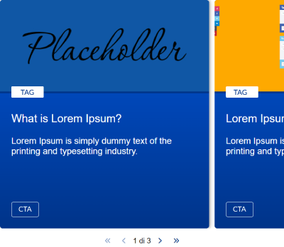
You can use the default template or pass your custom template following some configurations.

Before start
- npm i @iladiro/angular-slider
- Import
IladiroAngularSliderLibraryModuleinto your module fromimport { IladiroAngularSliderLibraryModule } from '@iladiro/angular-slider';
Getting Setup
Use <iladiro-angular-slider></iladiro-angular-slider> selector to show the slider
Note: The example below shows the mandatory data! Slider Widget accept only Slide object type array.
<iladiro-angular-slider [slideList]="list"></iladiro-angular-slider>Note: As default I used font awesome icons, but you can use which icons you prefer
Interface
Convert your array in an Slide object array. As you can see, all properties are not required.
Import IladiroAngularSlide from import { IladiroAngularSlide } from '@iladiro/angular-slider/lib/interfaces/slide.interface';
interface IladiroAngularSlide {
    link?: string;
    mediaSrc?: string;
    tag?: string;
    title?: string;
    description?: string;
    cta?: string;
}
Examples
Note: Default template
<pre>
    ```
    <iladiro-angular-slider
        [slideList]="list">
    </iladiro-angular-slider>
    ```
</pre>
Note: Custom template
<pre>
    ```
    <iladiro-angular-slider
        [slideList]="list">
        [maxVisibleSlides]="2"
        [paginatorArrowNext]="'fa fa-arrow-circle-o-right fa-4x'"
        [paginatorArrowPrev]="'fa fa-arrow-circle-o-left fa-4x'"
        [paginatorTemplate]="'templateOne'">
    </iladiro-angular-slider>
    ```
</pre>
Note: Custom dynamic template
<pre>
    ```
    <iladiro-angular-slider
        [maxVisibleSlides]="1"
        [paginatorArrowNext]="'fa fa-arrow-circle-o-right fa-4x'"
        [paginatorArrowPrev]="'fa fa-arrow-circle-o-left fa-4x'"
        [paginatorTemplate]="'templateOne'"
        [slideList]="list">
        <ng-template
            #customTemplate
            let-slide="slide"
            let-first="first"
            let-last="last"
            let-index="index"
            let-activeIndex="activeIndex"
            let-direction="direction">
            <your-template
                [slide]="slide"
                [index]="index"
                [activeIndex]="activeIndex"
                [first]="first"
                [last]="last"
                [direction]="direction">
            </your-template>
        </ng-template>
    </iladiro-angular-slider>
    ```
</pre>
Paginator
You can choose which type of paginator to use, there are three different types.
- default
- templateOne
- templateTwo
Options
Other options are available besides the mandatory ones
| property | type | required | default | notes |
|---|---|---|---|---|
| slideList | Array<IladiroAngularSlide> | yes | undefined | This widget expect a list of Slide to show it. |
| maxVisibleSlides | Number | no | undefined | You can choose how many slides to show at a time |
| paginatorTemplate | String | no | default | You can choose which type of pagination you want to use between: default, templateOne, templateTwo |
| paginatorArrowStart | String | no | fa fa-angle-double-left | You can change the arrow that jumps to the first item in the list |
| paginatorArrowEnd | String | no | fa fa-angle-double-right | You can change the arrow that jumps to the last item in the list |
| paginatorArrowNext | String | no | fa fa-chevron-right | You can change the arrow that goes to the next item |
| paginatorArrowPrev | String | no | fa fa-chevron-left | You can change the arrow that moves to the previous item |
| paginatorMaxVisiblePages | Number | no | 5 | If you were to use the templateTwo template, you might need this option, i.e. it allows you to tell the paginator that you want to display maximum n numbers of pages |
| customClass | String | no | undefined | You can also pass a class or a list of classes to add to the parent slide tag. It can be useful, for example, to use the default card but customize it specifically for that section |
| clickableSlide | boolean | no | false | Set if slide is clickable or not. If set on true css cursor is type pointer |
Events
| Event name | Return | Description | Example |
|---|---|---|---|
| goNextEvent | Object Es. {page: 2, direction: 'next'} | Allows you to capture the event when the pager is used to move to the next slide | <iladiro-angular-slider (goNextEvent)="console.log($event)"></iladiro-angular-slider> |
| goPrevEvent | Object Es. {page: 2, direction: 'prev'} | Allows you to capture the event when the pager is used to move to the previous slide | <iladiro-angular-slider (goPrevEvent)="console.log($event)"></iladiro-angular-slider> |
| goFirstEvent | Object Es. {page: 2, direction: 'first'} | Allows you to capture the event when the pager is used to return to the first slide | <iladiro-angular-slider (goFirstEvent)="console.log($event)"></iladiro-angular-slider> |
| goLastEvent | Object Es. {page: 2, direction: 'last'} | Allows you to capture the event when the pager is used to go to the last slide | <iladiro-angular-slider (goLastEvent)="console.log($event)"></iladiro-angular-slider> |
| clickSlideEvent | Object of IladiroAngularSlide | Allows you to capture the event when user click on Slide | <iladiro-angular-slider (clickSlideEvent)="console.log($event)"></iladiro-angular-slider> |